How to Add Backgrounds to Screenshots (2026)
A screenshot background is the colored or textured area surrounding your captured screen content. On Mac, you have several native and third-party options for adding professional backgrounds to your screenshots, including dedicated apps like ScreenSnap Pro. Adding backgrounds transforms raw screenshots into polished visuals ready for social media, presentations, and documentation. Whether you need a simple gradient, device mockup, or branded template — this guide covers everything you need to style your screenshots like a pro on Mac.
Why Plain Screenshots Look Amateur
Raw screenshots suffer from harsh edges, inconsistent sizing, and lack of visual context. They look copy-pasted onto documents and posts — because they are.
The problems:
- No breathing room. Content touches the edges, feeling cramped
- Missing depth. Flat images blend into surrounding content
- Inconsistent branding. Random colors and sizes across posts
- Unprofessional appearance. Viewers subconsciously associate raw screenshots with amateur work
Professional teams at Apple, Stripe, and Linear all style their screenshots. It's not vanity — polished visuals build trust and improve comprehension.
A well-styled screenshot takes 10 seconds longer to create but performs significantly better. Higher engagement on social posts, clearer documentation, and more professional presentations.
Types of Screenshot Backgrounds
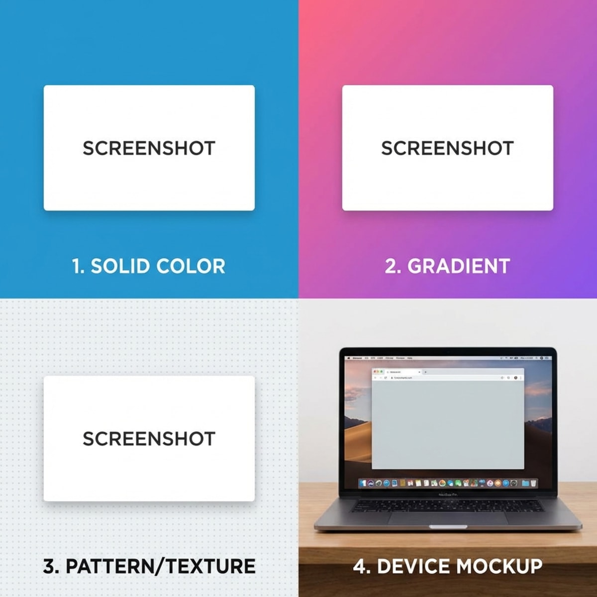
Solid Colors
The simplest option. Pick a single color that complements your screenshot content.
Best for: Documentation, minimal aesthetics, brand consistency
Tips:
- Use your brand's primary or secondary color
- Avoid pure white (blends into most pages)
- Light gray (#F5F5F5) works universally
Gradients
Two or more colors blending smoothly create depth and visual interest without complexity.
Best for: Social media posts, marketing materials, hero images
Popular combinations:
- Purple to pink (modern, tech)
- Blue to teal (professional, calm)
- Orange to yellow (energetic, warm)
- Dark gray to black (sleek, premium)
Avoid gradients with more than 3 colors — they get busy fast.
Images and Patterns
Background images or subtle patterns add texture and context.
Best for: Creative work, themed content, brand storytelling
Options:
- Abstract shapes
- Subtle textures (paper, fabric)
- Blurred photos
- Geometric patterns
Keep patterns subtle. The screenshot content should remain the focus.
Device Mockups
Place your screenshot inside a MacBook, iPhone, or browser frame. This adds context and makes the content feel more tangible.
Best for: App showcases, website presentations, App Store screenshots, portfolio pieces
Device mockups answer "where does this live?" instantly. Viewers understand they're looking at an app, website, or desktop tool.
Best Mac Tools for Screenshot Backgrounds
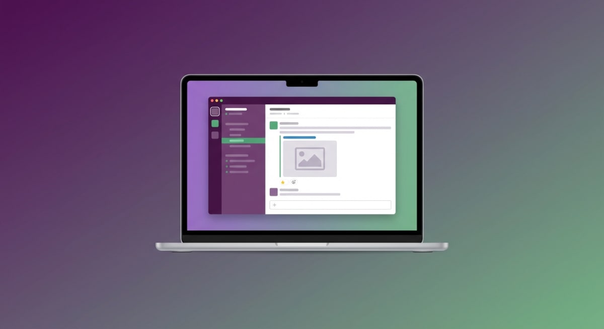
ScreenSnap Pro (Mac Native)
ScreenSnap Pro includes built-in background styling with one-click presets. Capture a screenshot and apply backgrounds instantly — no export/import cycle required.
Key features:
- Gradient presets optimized for social media
- Custom colors matching your brand
- Automatic padding and rounded corners
- Drop shadows with adjustable intensity
The workflow stays in one app: capture, style, share. If you already take screenshots on Mac regularly, this is the most efficient approach.
Xnapper
Xnapper is a Mac app focused on making screenshots beautiful automatically. It analyzes your content and applies balanced backgrounds without manual adjustment.
Highlights:
- Automatic color detection
- Smart content balancing
- One-time purchase ($24.99)
- Sensitive info redaction built-in
Good for users who want automation over control.
Pika.style (Web)
Pika is a browser-based tool for creating screenshot mockups. Upload your image, choose a template, and export.
Highlights:
- 50+ templates including device mockups
- Social media presets
- Chrome extension for capture
- $15/month subscription
Best for occasional use or teams without Mac apps.
Free Alternatives
Preview (Built-in macOS):
Limited but functional. Use Edit → Adjust Size to add padding, then Markup to draw a background rectangle. Works but clunky.
Canva:
Upload screenshots and place on colored/gradient backgrounds. Free tier available. More steps but no cost.
ScreenSnap Pro Online Tool:
If you want something quick without installing an app, try our free screenshot background generator. It runs in your browser — upload a screenshot, pick a gradient or solid color, and download the styled result in seconds.
Figma:
Create frames with background colors, drop screenshots inside. Overkill for simple backgrounds, but powerful if you're already designing in Figma.
Step-by-Step: Adding Backgrounds with ScreenSnap Pro
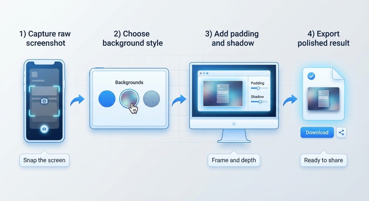
Here's the fastest way to style a screenshot on Mac:
- Capture your screenshot
Use ⌘ + Shift + 4 and select your area. ScreenSnap Pro captures it instantly.
- Open the background panel
Click the background icon or press B to reveal styling options.
- Choose your background style
- Select a preset gradient (recommended for social media)
- Pick a solid color from your palette
- Or upload a custom background image
- Adjust padding
Use the slider to add breathing room. 40-60px padding works for most uses.
- Add shadow and corners
Enable drop shadow for depth. Rounded corners (8-16px) soften the look.
- Export or share
Copy to clipboard for immediate paste, or export to your preferred format.
Total time: under 10 seconds.
Best Backgrounds for Different Uses
Social Media
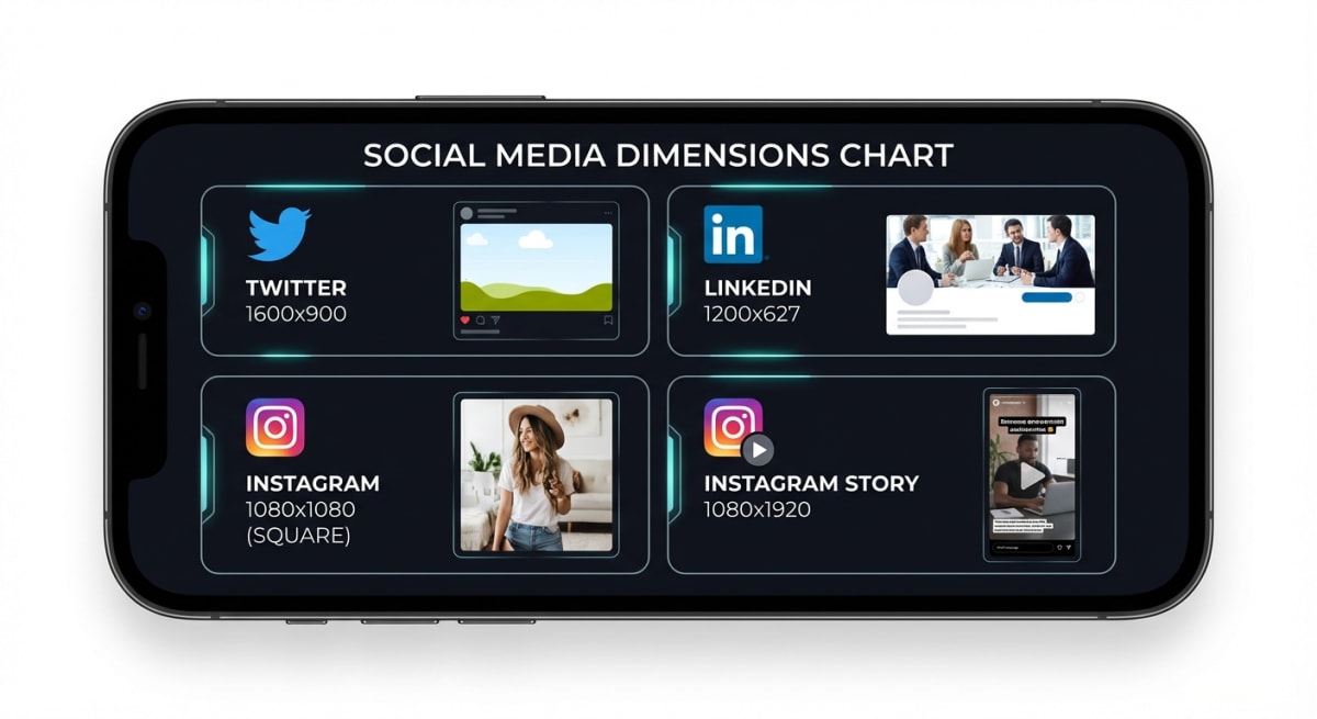
Each platform has optimal dimensions:
| Platform | Dimensions | Background Tips |
|---|---|---|
| Twitter/X | 1600×900 | Bold gradients, high contrast |
| 1200×627 | Professional, muted colors | |
| 1080×1080 | Vibrant, trendy palettes | |
| Instagram Story | 1080×1920 | Full gradients, vertical focus |
Pro tip: Create 3-4 preset backgrounds matching your brand. Apply them consistently across all posts for instant recognition.
Twitter audiences respond well to purple/blue gradients. LinkedIn prefers subtle grays and blues. Instagram thrives on bold, saturated colors.
Presentations
Presentations need screenshots that pop without distracting.
Recommendations:
- Match your slide deck's color palette
- Use consistent padding across all screenshots
- Add subtle shadows (nothing harsh)
- Consider device mockups for app/web demos
If you're using scrolling screenshots in presentations, extra padding prevents the tall format from overwhelming slides.
App Store Screenshots
Apple's Human Interface Guidelines emphasize clarity. Your App Store screenshots need:
- Device frames (MacBook for Mac apps)
- Clean, uncluttered backgrounds
- Consistent styling across all screenshots
- Ample padding around content
Device mockups aren't optional here — they're expected. Users want to visualize your app in context.
Documentation
Technical documentation benefits from subtle styling:
- Light gray backgrounds (#F5F5F5 or #FAFAFA)
- Consistent 2px border in soft gray
- Minimal shadows
- No rounded corners (feels more technical)
Consistency matters most. Every screenshot in your docs should look like it belongs.
Tired of plain screenshots? Try ScreenSnap Pro.
Beautiful backgrounds, pro annotations, GIF recording, and instant cloud sharing — all in one app. Pay $29 once, own it forever.
See what it doesTips for Professional Results
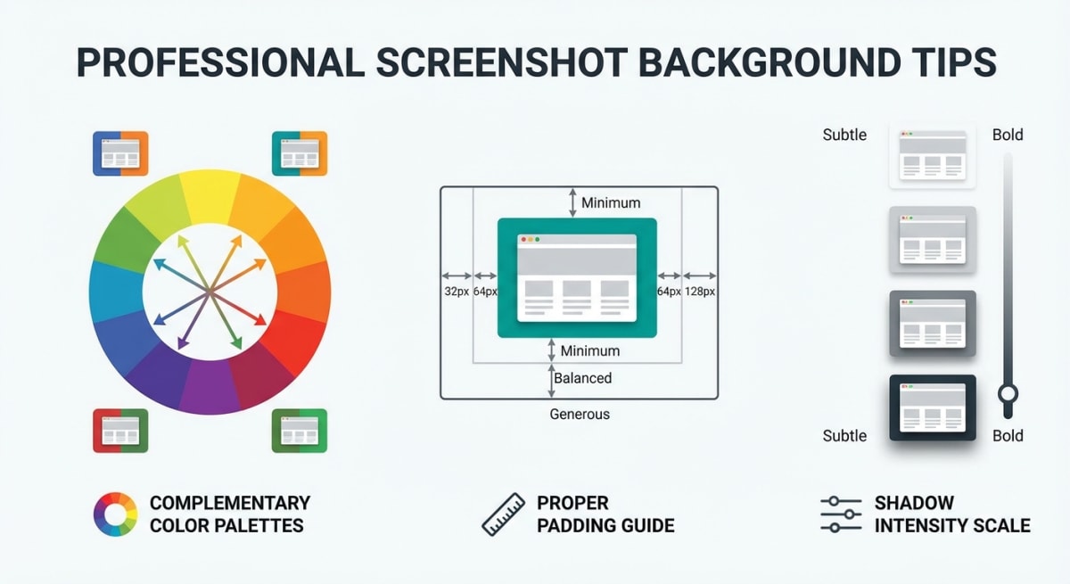
Match Colors Intentionally
Pull accent colors from your screenshot content. If your app has a blue header, a blue-to-teal gradient creates visual harmony.
Complementary colors work too — a purple gradient behind green-accented content creates pleasing contrast.
Avoid random colors. Intentional choices feel professional.
Use Consistent Padding
Uneven padding looks sloppy. Aim for equal spacing on all sides, or slightly more padding on top/bottom for landscape screenshots.
Standard padding ranges:
- Tight: 20-30px (documentation)
- Normal: 40-60px (general use)
- Spacious: 80-100px (hero images)
Shadow Intensity Matters
Heavy shadows feel dated. Modern design favors subtle shadows:
- Distance: 10-20px
- Blur: 20-40px
- Opacity: 10-20%
The shadow should create depth without drawing attention to itself.
Don't Overcomplicate
The best screenshot backgrounds are invisible. Viewers should focus on your content, not the styling.
When in doubt: solid color, subtle shadow, moderate padding. Done.
Create Presets
If you're styling screenshots regularly, save your preferred settings as presets. Most tools support this:
- ScreenSnap Pro: Save to preset library
- Pika: Save as template
- Figma: Create component
Presets ensure consistency and save time.
Common Screenshot Background Mistakes
Even experienced designers make these mistakes. Avoid them for consistently professional results.
Using Backgrounds That Clash
The most common mistake: choosing a background color that fights with your screenshot content. A red gradient behind a screenshot with green UI elements creates visual chaos.
The fix: Before picking a background, scan your screenshot for dominant colors. Choose backgrounds that complement these colors, not compete with them. Color wheels help — colors opposite each other (complementary) create contrast, while colors next to each other (analogous) create harmony.
Inconsistent Styling Across Projects
Your screenshots should feel like they belong to the same family. Different gradients, random padding values, and varied corner radii across posts scream "amateur."
The fix: Create 2-3 preset styles for your common use cases. One for social media posts, one for documentation, one for presentations. Use these consistently. Most Mac screenshot tools let you save presets — take the 5 minutes to set them up.
Over-Designed Backgrounds
Complex patterns, extreme gradients, and heavy textures compete for attention with your actual content. The background should enhance, not dominate.
The fix: When in doubt, simplify. A solid color with subtle shadow often outperforms elaborate designs. Test by squinting at your final image — your screenshot content should remain the obvious focal point.
Ignoring Platform Requirements
A beautiful 1600×900 image looks terrible when Instagram crops it to a square. Each platform has specific dimension requirements, and ignoring them wastes your styling effort.
The fix: Check target dimensions before styling. Twitter wants 16:9 horizontal, Instagram feed wants 1:1 square, LinkedIn prefers 1.91:1 horizontal. Size your canvas first, then style within those constraints.
Using Pure White Backgrounds
Pure white (#FFFFFF) backgrounds disappear into most websites and documents. Your screenshot floats in a void, looking pasted rather than designed.
The fix: Use off-white (#FAFAFA or #F5F5F5) or light gray. The subtle contrast separates your image from the surrounding page while maintaining a clean, professional look.
Skipping Mobile Preview
Your screenshot looks great on a 27-inch monitor but becomes illegible on a phone screen. Tiny details, thin lines, and subtle gradients vanish on smaller displays.
The fix: Preview at mobile dimensions before exporting. Most social media views happen on phones. If something's hard to read at 375px width, increase contrast, padding, or element size.
Real-World Use Cases
Understanding when and how to apply backgrounds helps you make better styling decisions.
Developer Documentation
Technical docs need clarity above all. Screenshot apps for developers typically use minimal backgrounds — light gray with thin borders, no rounded corners, no shadows. The focus is purely on the code or UI being documented.
Example: GitHub's documentation uses consistent gray backgrounds with precise 1px borders. Every screenshot looks like it belongs, creating a cohesive reading experience.
Marketing Team Announcements
Product launches and feature announcements deserve more visual punch. Bold gradients, device mockups, and branded colors help screenshots stand out in crowded feeds.
Example: Stripe's product announcements use purple gradients matching their brand, with generous padding and subtle shadows. Each image is immediately recognizable as Stripe content.
Customer Support Responses
Support screenshots need to be quick and clear. Minimal styling — just enough padding to avoid harsh edges, maybe a subtle border. Customers want to see the exact UI element you're referencing, not admire your design skills.
Example: A support agent showing where to click should prioritize clarity over aesthetics. Circle the element with a bright annotation, use a neutral background, and get the customer unstuck fast.
Adding Annotations After Backgrounds
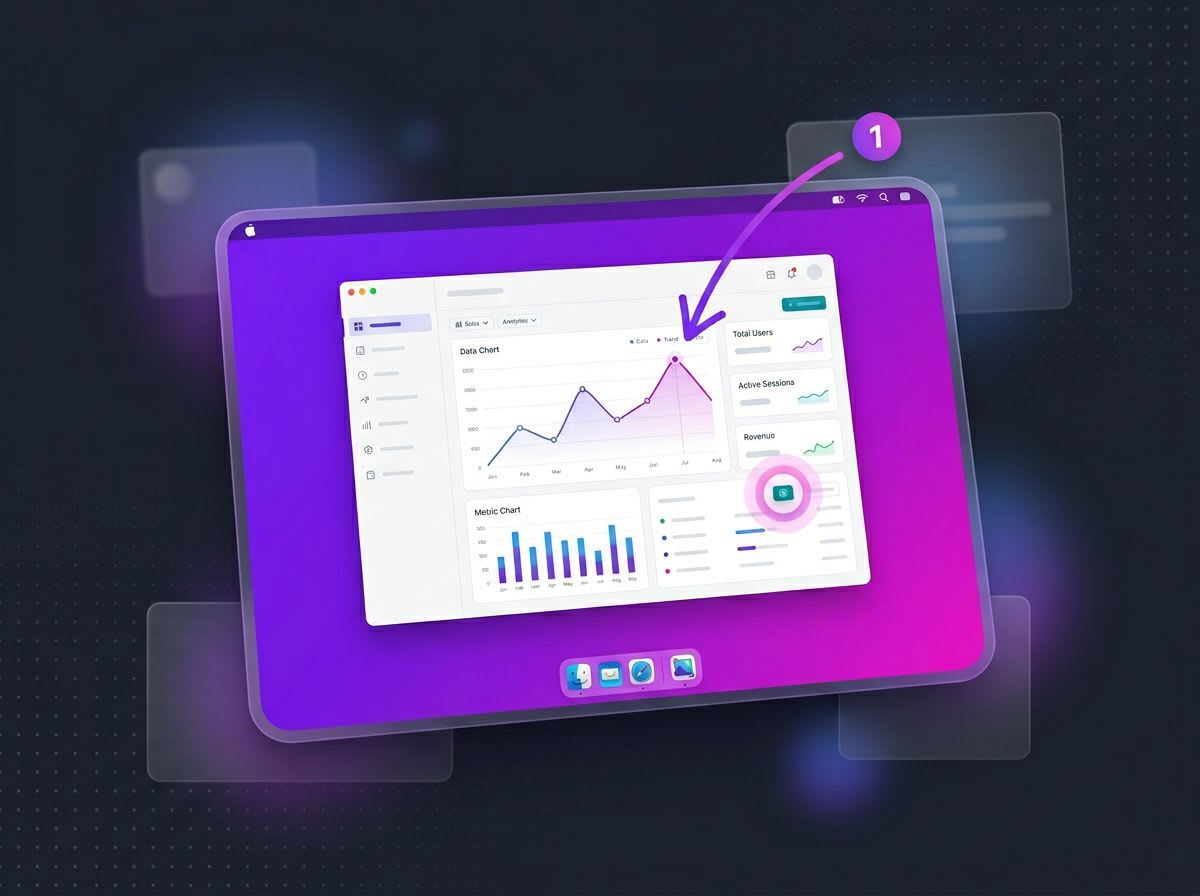
Once your background is set, you might want to add annotations like arrows, boxes, and text. The order matters:
- Apply background first
- Add annotations second
- Export final image
This keeps annotations on top of your styled screenshot. Reversing the order buries annotations under shadows.
When Not to Use Backgrounds
Backgrounds aren't always appropriate:
- Bug reports: Developers need raw screenshots for accuracy
- Legal/compliance: Unmodified evidence may be required
- Technical support: Authentic screenshots help troubleshooting
- Print documentation: Some print workflows prefer raw images
If your screenshot isn't working at all, fix the capture first before worrying about styling.
FAQ
Morgan
Indie DeveloperIndie developer, founder of ScreenSnap Pro. A decade of shipping consumer Mac apps and developer tools. Read full bio
@m_0_r_g_a_n_