Technical Documentation Screenshots Guide (2026)
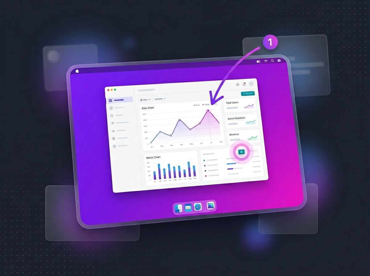
Documentation screenshots are visual captures of software interfaces that help users understand how to complete tasks, navigate features, and troubleshoot issues. When done well, they reduce confusion, speed up learning, and make your documentation genuinely useful — and tools like ScreenSnap Pro make it easier to capture and annotate them consistently across a doc set.
But here's the problem: most technical writers treat screenshots as an afterthought. They capture whatever's on screen, drop it into the document, and move on. The result? Documentation cluttered with oversized images, missing context, and visuals that confuse more than they clarify.
This guide covers everything you need to create professional documentation screenshots—from when to use them (and when not to) to annotation standards, file organization, and the best tools for Mac users. Whether you're documenting software for developers, writing user manuals, or creating internal knowledge bases, these practices will level up your visual communication.
Why Screenshots Matter in Technical Documentation
Screenshots serve a simple purpose: they show users exactly what they should see on their screen. But their impact goes deeper than that.
Reduce cognitive load. Reading a paragraph about clicking a button in the upper-right corner requires mental effort. A screenshot with a red box around that button? Instant understanding.
Bridge language gaps. For international users or non-native speakers, screenshots transcend language barriers. The visual reference works even when the written instructions don't fully land.
Build confidence. Users who can verify they're in the right place—because their screen matches your screenshot—feel more confident proceeding with instructions.
Decrease support tickets. Good documentation screenshots answer questions before users ask them. When people can see exactly what to do, they don't need to contact support.
A study by the Nielsen Norman Group found that users pay close attention to images that carry information, while ignoring decorative imagery. Your documentation screenshots need to be the former—purposeful, informative, and clear.
When to Use Screenshots (and When Not To)
Not every step needs a screenshot. Overusing them clutters your documentation and actually makes it harder to follow. Here's how to decide.
Use Screenshots When:
Multi-step processes require navigation. If users need to click through menus, tabs, or nested settings, screenshots help them stay oriented.
UI elements are hard to describe. Some buttons, icons, or interface elements are easier shown than described. Instead of writing "click the three-dot menu icon in the upper-right corner of the card," show it.
Context matters. When users need to know where something is relative to other elements, a screenshot provides that spatial context.
You're introducing new features. When documenting UI changes or new functionality, screenshots help users recognize what's new versus what they already know.
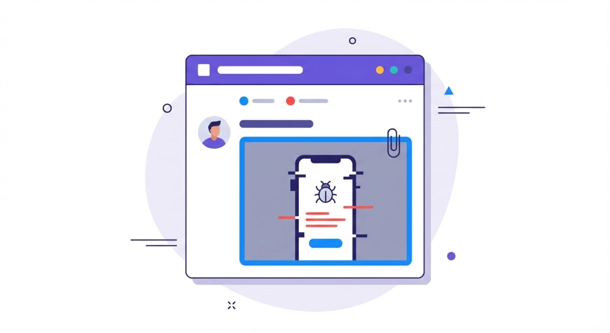
Error states need clarification. Showing what an error looks like helps users identify when something's gone wrong and confirms they're following the right troubleshooting steps.
Skip Screenshots When:
The action is self-explanatory. "Click Save" doesn't need a screenshot of a Save button. Users know what Save buttons look like.
You're showing code or text content. Use code blocks instead—they're searchable, accessible, and copy-paste friendly. Screenshots of code are one of the most common documentation mistakes.
The UI changes frequently. If you're documenting a beta feature that's still being iterated, consider whether the maintenance burden is worth it. You'll need to update every screenshot when the UI changes.
It duplicates the written instructions. A screenshot that shows exactly what you just described adds bulk without value. Screenshots should complement text, not repeat it.
The sweet spot: include screenshots at decision points and moments where users might get lost, but trust your written instructions for straightforward steps.
Screenshot Best Practices for Documentation
Creating effective documentation screenshots requires intention at every step—from capture to annotation to file management.
Sizing and Resolution
Capture at 2x resolution when possible. On Mac, use a Retina display and capture at native resolution. This ensures screenshots look crisp on high-DPI screens. If you're using macOS's built-in screenshot tool, it automatically captures at Retina resolution.
Keep file sizes reasonable. Each screenshot should ideally be under 200KB—certainly under 500KB. Large images slow page load times, especially when documentation pages have multiple screenshots. Use tools like TinyPNG or ImageOptim to compress without visible quality loss.
Show the relevant window, not the entire screen. Full-screen captures force users to hunt for the relevant area. Instead, capture just the window or panel you're referencing. On Mac, press ⌘ + Shift + 4, then Space to capture a specific window.
Maintain consistency across screenshots. If one screenshot shows a window at 1200px wide, keep that consistent throughout your documentation. Inconsistent sizing is visually jarring and suggests disorganization.
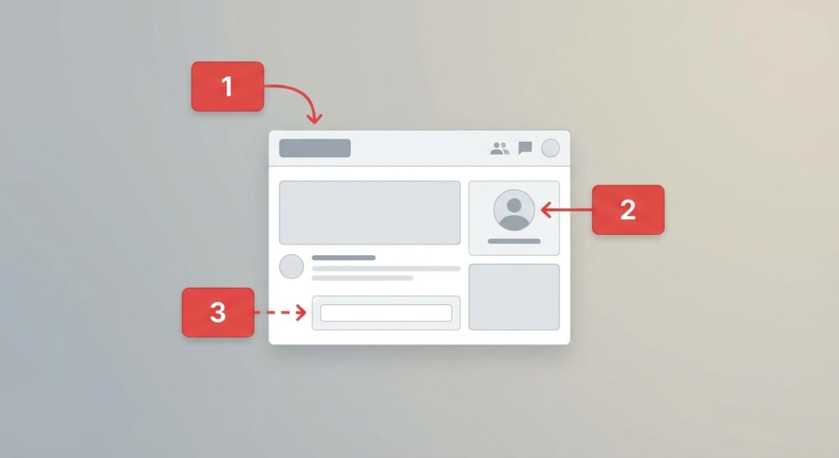
Annotation Standards
Annotations direct attention and add clarity. But bad annotations make screenshots harder to understand, not easier.
Use red for callouts (usually). Red is the standard for documentation callouts because it contrasts well with most interface colors. Exception: if the UI you're documenting is primarily red, switch to blue or black.
Keep annotations minimal. Three to four callout elements per screenshot is usually the maximum before things get cluttered. If you need more, consider breaking the process into multiple screenshots.
Use rectangles for UI elements. Circles and ovals tend to obscure what they're highlighting. Rectangles that "hug" buttons and input fields work better because they follow the natural shapes of UI components.
Add numbered sequences for multi-step actions. When a single screenshot shows multiple actions (click here, then type here, then click there), numbered callouts like (1), (2), (3) clarify the order.
Be consistent with callout placement. If you put numbered callouts inside rectangles and to the right of the element, maintain that positioning across all screenshots in your documentation.
For more on annotation techniques, check out our guide on how to annotate screenshots on Mac professionally. If you need a quick markup without installing anything, our free image annotation tool lets you add callouts, arrows, and numbered steps right in your browser.
What to Capture (and What to Leave Out)
Include enough context. A screenshot of just a button is useless—users won't know where to find it. Show the button within its section, with enough surrounding interface to orient the user.
Remove personal information. Blur or replace names, email addresses, and any other personally identifiable information. For sensitive documentation, use dummy accounts with obviously fake data (think "Jane Doe" or "test@example.com"). Learn more about how to blur or pixelate sensitive information on Mac.
Keep the focus area prominent. If you're highlighting a small element, consider cropping tighter rather than showing the entire window. The element you're documenting should be immediately visible.
Clean up your desktop and browser. Bookmarks, tabs, desktop icons, and notifications in screenshots look unprofessional and can distract from the content. Before capturing, close unnecessary tabs and hide personal bookmarks.
File Organization
Organized screenshot files save hours during documentation updates. When the UI changes, you need to find and replace specific images quickly.
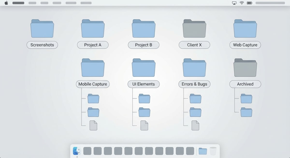
Use descriptive file names. export-table-settings.png is infinitely more useful than IMG_2847.png or Screenshot 2026-01-31.png. Name files so you can identify their content without opening them.
Organize by feature or section. Create folder structures that mirror your documentation. If you have sections for "Settings," "Dashboard," and "Reports," create corresponding screenshot folders.
Include version indicators when relevant. For products with significant UI versions, consider naming conventions like v3-user-profile-settings.png so you know which screenshots need updating after releases.
Standardize on one format. PNG for screenshots with UI elements (lossless, supports transparency). JPEG for photographs if you use them. Don't mix formats unnecessarily.
For Mac users, you can change where screenshots are saved by default to keep things organized from the start.
Best Screenshot Tools for Tech Writers
The right tool makes capturing, annotating, and organizing screenshots dramatically easier. Here's what actually works for documentation professionals on Mac.
macOS Built-in Screenshot
Best for: Quick captures without annotation needs
The native macOS screenshot tool (⌘ + Shift + 3/4/5) handles basic captures well. It saves at Retina resolution automatically and integrates with the system clipboard. But it lacks annotation features—you'll need Preview or another tool for markup.
Shortcut reference:
⌘ + Shift + 3— Capture entire screen⌘ + Shift + 4— Select area to capture⌘ + Shift + 4 + Space— Capture specific window⌘ + Shift + 5— Screenshot toolbar with options
For a complete guide, see our Mac screenshot shortcuts article.
ScreenSnap Pro
Best for: Documentation professionals who need annotation and cloud sharing
ScreenSnap Pro combines capture, annotation, and instant cloud sharing in one workflow. Capture with a shortcut, annotate with arrows and callouts, and get a shareable link immediately—no saving files, no manual upload.
What makes it particularly useful for documentation:
- Professional annotation tools (boxes, arrows, numbered steps)
- Instant cloud links for team collaboration
- One-time purchase (no subscription)
If you're creating documentation for distributed teams or need to quickly share annotated screenshots during reviews, the cloud sharing feature alone saves significant time.
CleanShot X
Best for: Power users who want extensive features
CleanShot X offers robust capture options including scrolling screenshots, video recording, and OCR. The annotation tools are solid, though the subscription model ($29/year after the first year) adds ongoing cost.
Compare CleanShot X alternatives if you're weighing options.
Shottr
Best for: Free option with good annotation features
Shottr is surprisingly capable for a free tool—scrolling screenshots, OCR, and basic annotation. It lacks cloud sharing and some polish, but for individuals or small teams on a budget, it's excellent.
See our detailed ScreenSnap Pro vs Shottr comparison.
Tool Comparison for Documentation
| Feature | macOS Built-in | ScreenSnap Pro | CleanShot X | Shottr |
|---|---|---|---|---|
| Area capture | ✓ | ✓ | ✓ | ✓ |
| Window capture | ✓ | ✓ | ✓ | ✓ |
| Scrolling capture | ✗ | ✗ | ✓ | ✓ |
| Annotation tools | ✗ | ✓ | ✓ | ✓ |
| Cloud sharing | ✗ | ✓ | ✓ | ✗ |
| Numbered callouts | ✗ | ✓ | ✓ | ✓ |
| Pricing | Free | $29 one-time | $29/year | Free |
For documentation teams, the ability to capture, annotate, and share in one workflow matters more than having every possible feature. Choose based on your actual workflow needs.
Need to capture content that extends beyond the visible screen? Check out our guide on how to take scrolling screenshots on Mac.
Tired of plain screenshots? Try ScreenSnap Pro.
Beautiful backgrounds, pro annotations, GIF recording, and instant cloud sharing — all in one app. Pay $29 once, own it forever.
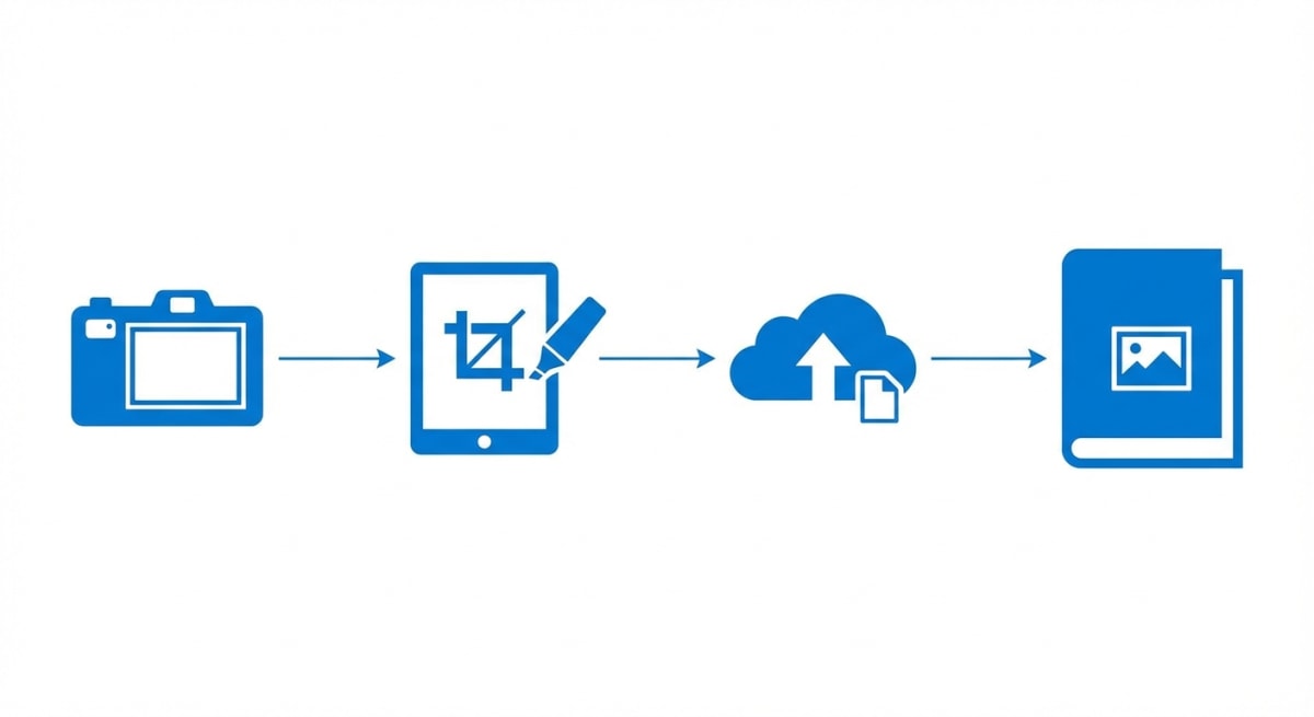
See what it doesWorkflow: From Capture to Publication
A consistent workflow prevents inconsistencies and speeds up documentation creation. Here's a process that scales from individual writers to documentation teams.
Step 1: Plan Your Screenshots
Before opening your screenshot tool, outline what you need:
- List each step that requires a screenshot
- Identify any data or UI states you'll need to set up
- Note any sensitive information that needs to be hidden or replaced
This prevents the common problem of getting halfway through documentation and realizing you forgot to capture a critical screen.
Step 2: Prepare the Environment
Clean your workspace. Close unnecessary apps, hide personal bookmarks, and ensure no notifications will pop up mid-capture.
Set up realistic demo data. Use plausible names, email addresses, and content that make screenshots look professional. "John Doe" and "acme-corp.com" work better than "asdfasdf" and "test123@test.com."
Verify the UI state. Make sure the interface shows exactly what you want to document—correct page, correct settings, correct view.
Step 3: Capture
Follow your plan, capturing each screenshot in sequence. Naming files immediately saves time later—don't accept default names like "Screenshot 2026-01-31 at 3.42.17 PM.png."
For complex processes, capture extra screenshots. It's easier to discard unneeded images than to recreate the exact UI state later.
Step 4: Annotate
Apply annotations consistently:
- Same red (or your chosen color) for all callouts
- Same line thickness for rectangles and arrows
- Same style for numbered sequences
- Same positioning conventions (callout numbers always inside rectangles, always to the right, etc.)
Create a style guide for your team if multiple people contribute to documentation. Inconsistency across authors creates visual chaos.
Step 5: Optimize and Export
Before adding screenshots to documentation:
- Compress file sizes (TinyPNG, ImageOptim)
- Verify consistent dimensions across related screenshots
- Double-check that no sensitive information is visible
- Export to your standard format (PNG recommended)
Step 6: Integrate with Documentation
Place screenshots immediately after the step they illustrate—not before, not at the end of a section. The visual should confirm what the user just read.
Add alt text for accessibility. Describe what the screenshot shows in a way that helps users who can't see the image understand the content.
Common Mistakes to Avoid
Even experienced documentation writers make these errors. Watch for them in your own work.
Oversized Screenshots
Capturing the entire screen when you only need to show a small dialog creates unnecessary visual noise. Users have to hunt for the relevant area, which defeats the purpose of the screenshot.
Fix: Crop to show only the relevant window or section, with just enough context for orientation.
Screenshot Walls
Five consecutive screenshots with no text between them overwhelm readers. They can't tell which step they're on or what each image represents.
Fix: Alternate between text instructions and screenshots. Each screenshot should have accompanying text that explains what the user should do.
Missing Context
A screenshot of just a button or icon, with no surrounding interface visible, doesn't help users find that element in the actual application.
Fix: Include enough of the surrounding interface that users can orient themselves. Show the navigation, the page section, or whatever helps users locate the element.
Inconsistent Styling
Different annotation colors, varying callout styles, and inconsistent screenshot sizes across a documentation set look unprofessional and create cognitive friction.
Fix: Establish annotation standards and apply them consistently. Use templates or presets in your screenshot tool if available.
Outdated Screenshots
Nothing erodes user trust faster than screenshots that don't match the current interface. Users wonder if the instructions are still valid.
Fix: Build screenshot updates into your release process. When the UI changes, documentation screenshots should change too.
Screenshots of Text and Code
Code snippets captured as images can't be copied, can't be searched, and aren't accessible to screen readers.
Fix: Use code blocks for code. Use tables for tabular data. Only screenshot these elements if you specifically need to show their appearance rather than their content.
Maintaining Documentation Screenshots
Screenshots require maintenance. UI changes, rebranding, and feature updates all trigger the need for updates.
Track screenshot dependencies. Know which screenshots appear in which documentation pages. A spreadsheet or documentation tool that links images to pages helps you know what to update when the UI changes.
Review screenshots during each release cycle. When features change, add "update documentation screenshots" to the release checklist.
Batch updates when possible. If you're updating one screenshot on a page, scan the entire page for other outdated images. Updating everything at once is more efficient than multiple passes.
Archive old screenshots. Don't delete immediately—you might need to reference them for historical documentation or rollback situations. Move to an archive folder instead.
Frequently Asked Questions
Conclusion
Great documentation screenshots share a few qualities: they're sized appropriately, annotated clearly, organized consistently, and updated when the UI changes. They show exactly what users need to see—no more, no less.
The investment in screenshot quality pays off in reduced support tickets, faster user onboarding, and documentation that people actually use instead of abandoning in frustration.
Start with the basics: consistent sizing, clean annotations, descriptive file names. Once those habits are established, the maintenance and update workflows become manageable rather than overwhelming.
For Mac users looking to streamline their documentation workflow, a dedicated screenshot tool like ScreenSnap Pro can consolidate capture, annotation, and sharing into a single efficient process—making professional documentation screenshots the default rather than the exception.
Morgan
Indie DeveloperIndie developer, founder of ScreenSnap Pro. A decade of shipping consumer Mac apps and developer tools. Read full bio
@m_0_r_g_a_n_