Color Blindness Simulator
Upload any image or screenshot to see how it looks to people with color vision deficiency. Supports 8 simulation types. Free, private, and runs entirely in your browser.
Drop an image here, or click to upload
PNG, JPG, WebP, GIF — any size. You can also paste from clipboard with ⌘V
Understanding Color Blindness
👁️ What is color blindness?
Color blindness (color vision deficiency) affects roughly 8% of males and 0.5% of females worldwide. People with color blindness have missing or deficient cone cells in their retina, making it harder to distinguish certain colors. It is usually inherited and present from birth.
🔴🟢 Red-green color blindness
The most common type by far. Protanopia and deuteranopia (and their milder forms, protanomaly and deuteranomaly) make reds, oranges, and greens look similar. Deuteranomaly alone affects about 5% of males, making it the single most prevalent form.
🔵 Blue-yellow color blindness
Tritanopia and tritanomaly affect blue and yellow perception. Much rarer than red-green deficiency, it makes blues appear greener and yellows appear violet or light gray. Unlike other forms, it affects males and females equally.
⚫ Complete color blindness
Achromatopsia — seeing only in shades of gray — is extremely rare (roughly 1 in 33,000 people). Achromatomaly, the partial version, causes severely muted color perception. Both conditions often come with light sensitivity and reduced visual acuity.
Why Designers Should Test for Color Blindness
If 1 in 12 male users may struggle to distinguish your red error messages from green success indicators, you have a usability problem. A color blindness simulator lets you catch these issues before they reach users.
The fix is usually straightforward: pair color with other visual cues. Use icons alongside status colors, add text labels to colored indicators, or choose a color palette with enough contrast. Running your mockups through this simulator takes seconds and can save hours of accessibility remediation later.
WCAG 2.1 Guideline 1.4.1 (Use of Color) requires that color is not the only visual means of conveying information. Testing with a color blind simulator helps you meet this criterion.
Tips for Color-Accessible Design
Pair color with icons or patterns
Use ✓ and ✗ alongside green/red. Add stripes or textures to chart segments.
Add text labels to status colors
Instead of just a red dot, display “Error” or “Offline” alongside it.
Choose a safe color palette
Blue + orange works well for most deficiencies. Avoid red + green combinations for critical info.
Test with real images
Upload your actual screenshots, mockups, or charts. Abstract color swatches can miss context-dependent issues.
Frequently Asked Questions
What is color blindness?+
What are the main types of color blindness?+
How does a color blindness simulator work?+
Why should designers test for color blindness?+
Is this tool free and private?+
Learn More
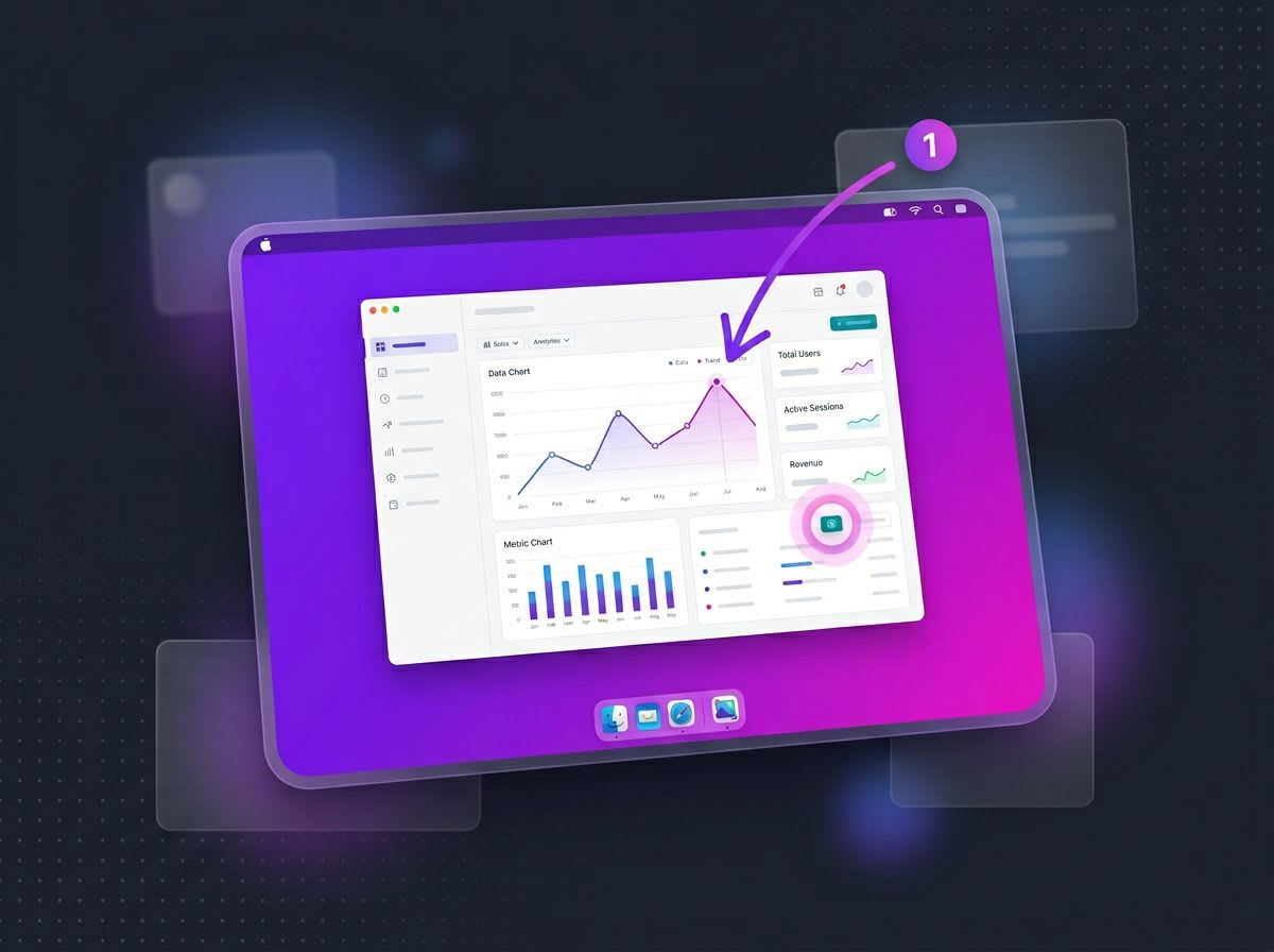
Make every screenshot look pro.
ScreenSnap Pro turns plain screenshots into polished visuals — backgrounds, annotations, GIF recording, and instant cloud links.
See ScreenSnap Pro