How to Test Your Designs for Color Blindness: 4 Vision Types and What to Fix (2026)
# Color Blindness Simulator: See Your Designs Through Color-Blind Eyes
A color blindness simulator shows how people with color vision gaps see your images. About 8% of men and 0.5% of women have some form of color blindness. If your designs use color alone to share meaning, millions of users miss key details. If you capture UI mockups with a screenshot tool like ScreenSnap Pro, running the export through a simulator is a quick accessibility check before you ship.
Our free Color Blindness Simulator lets you upload any image and preview how color blind users see it — no signup, no install. Your files stay in your browser the whole time.
How the color blind simulator works
Upload an image, pick a type, and see the result right away. The original sits next to the changed version for easy comparison.
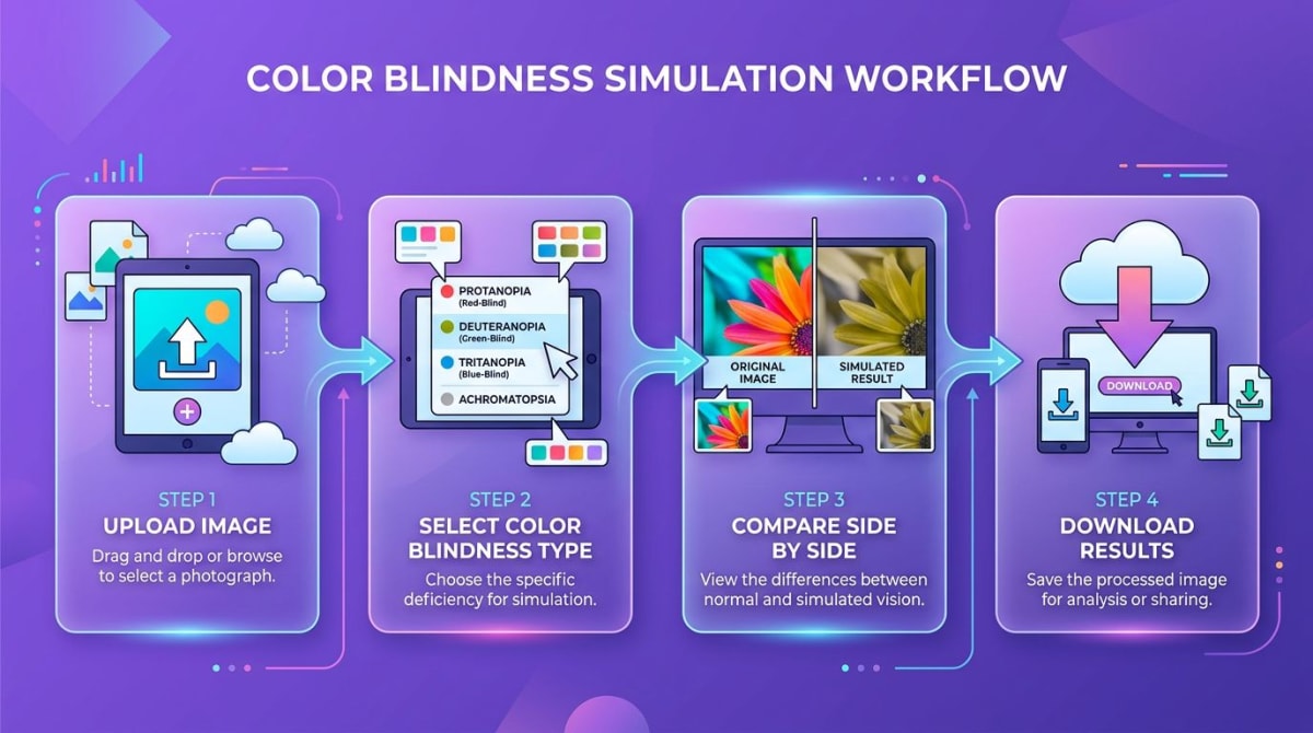
- Open the Color Blindness Simulator
- Upload an image — drag and drop or click to browse
- Choose a type: protanopia, deuteranopia, tritanopia, or achromatopsia
- Compare original and simulated views side by side
- Download the result to share with your team
All processing runs on your device via the Canvas API. Nothing gets sent to a server.
Types of color blindness you can test
Here is what our color blindness test tool covers and how each type changes what people see:
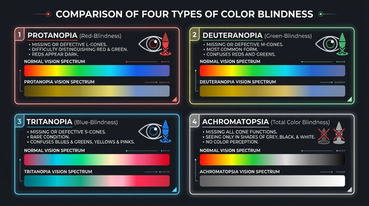
Protanopia (red-blind)
Affects about 1% of men. Reds look dark and muddy, blending with greens and browns. Traffic lights and error states become hard to tell apart.
Deuteranopia (green-blind)
The most common type — about 5% of men have it. Greens shift toward reds and browns. Red-green color coding in charts breaks down for these users.
Tritanopia (blue-yellow blind)
Rare — under 0.01% of people. Blues look greenish. Yellows turn pinkish or light gray.
Achromatopsia (total color blindness)
Very rare. Everything looks like shades of gray. Designs that pass this test rely on contrast and brightness — which helps all users.
Tired of plain screenshots? Try ScreenSnap Pro.
Beautiful backgrounds, pro annotations, GIF recording, and instant cloud sharing — all in one app. Pay $29 once, own it forever.
See what it doesWhy designers need a color blindness simulator app
A green success badge and red error badge can look the same to someone with deuteranopia. If you have tried a color blind screen filter like Color Oracle, you know how surprising the results can be.
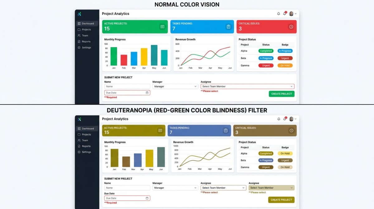
Common problems the simulator catches:
- Charts and graphs using only red and green for data series
- Form errors where a red border is the only cue
- Status badges told apart by color alone
- Buttons that blend into the background
Pair the simulator with our Color Contrast Checker to verify your designs meet WCAG contrast standards.
Tips for accessible design
Finding problems is step one. Fixing them is what counts.
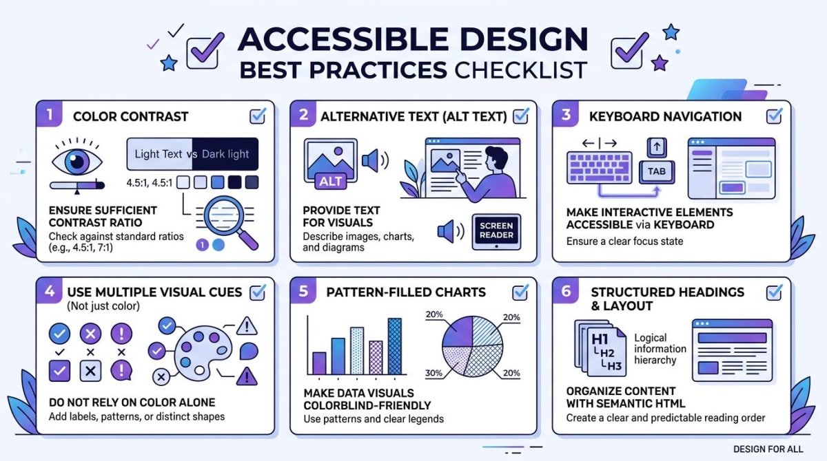
- Add icons next to color cues. A checkmark plus green beats green alone.
- Hit 4.5:1 contrast minimum. Check values with our Color Picker or extract a full palette to audit your colors.
- Write clear error text. "Please enter a valid email" beats a red outline on its own.
- Use patterns in charts. Stripes, dots, and hatching tell data apart without color.
- Test full workflows. Capture each step, run it through the simulator, and annotate problem areas for your team.
Pro tip: Take a screenshot of your app with ScreenSnap Pro ($29 one-time, works on Mac and Windows), drop it into the simulator, and share marked-up results in Slack or Jira.
Frequently Asked Questions
Morgan
Indie DeveloperIndie developer, founder of ScreenSnap Pro. A decade of shipping consumer Mac apps and developer tools. Read full bio
@m_0_r_g_a_n_