Twitter X Banner Size 2026: Dimensions Guide
# Twitter / X Banner Size: 2026 Dimensions & Design Guide
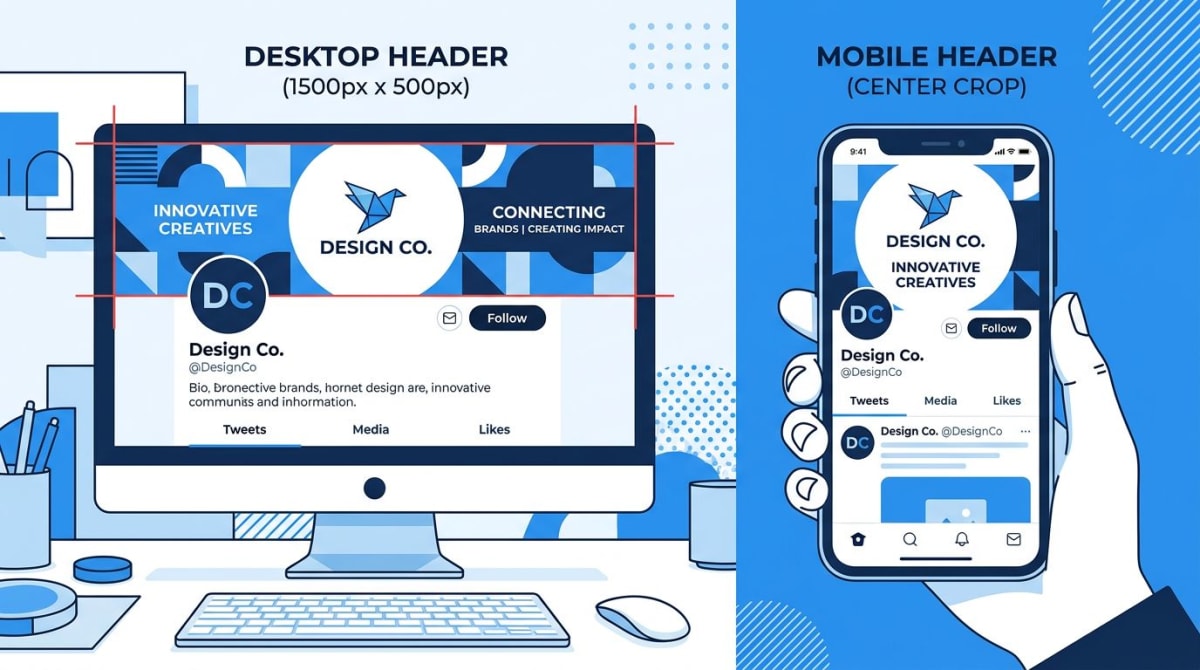
The Twitter banner size in 2026 (now X) is 1500×500 pixels with a 3:1 aspect ratio. Max file size is 5MB. JPG and PNG both work. The profile photo overlaps the lower-left of the banner, so keep important content centered or to the right. That one paragraph answers the search. (If your banner uses a screenshot, ScreenSnap Pro can capture and crop it cleanly to 1500×500 before upload.)
The rest of this guide shows you how to design a header that looks sharp on every device. X crops it differently on phones. It hides part behind your avatar. And the old 1024×512 spec you may still see online is out of date.
Quick-spec box: every X header dimension you need
If you only came for the numbers, here they are. Save this table.
| Surface | Pixel size | Aspect ratio | Max file size | Format | Mobile crop notes |
|---|---|---|---|---|---|
| X (Twitter) header banner | 1500×500 | 3:1 | 5MB | JPG, PNG | Roughly center 1500×400 visible on phones |
| Profile photo | 400×400 | 1:1 | 2MB | JPG, PNG | Round mask, overlaps banner lower-left |
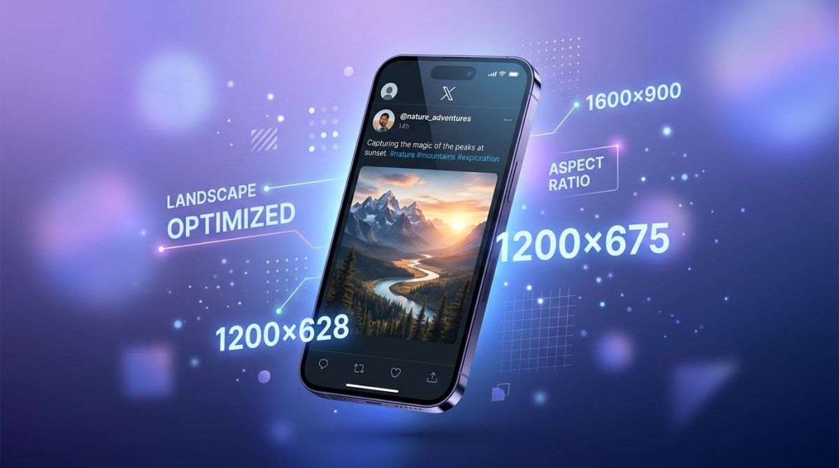
| In-feed image | 1200×675 | 16:9 | 5MB | JPG, PNG, GIF | Letterboxed on tall phones |
| Card image | 1200×628 | 1.91:1 | 5MB | JPG, PNG | Used for link previews |
A few rules apply across every X image:
- Format: JPG or PNG. GIF uploads still work in feed posts, but animated GIFs in headers were disabled in August 2024 — they freeze on the first frame.
- Color profile: sRGB. CMYK files often look washed out on web.
- DPI: 72 DPI is fine. X renders by pixels, not print size.
- File size: keep your banner under 2MB if you can. Smaller files load faster on mobile, and over 80% of X traffic is mobile.
The profile-photo overlap problem (the part most templates miss)
Here is the trap. Your banner is 1500×500. Your round avatar sits on top of it on the lower-left. On desktop the avatar is roughly 200×200 pixels, anchored about 30 pixels from the left edge and overlapping the bottom 130 or so pixels of the banner.
Most templates ignore this. They place a logo, name, or call-to-action right where your avatar will land. Then the user uploads, refreshes, and half the design is hidden behind a circle.
The fix: treat the lower-left 220×220 pixel zone as dead space. Put text, logos, and key content in the upper-right two-thirds. The next section has exact numbers.
If you already designed something at the wrong dimensions, the easiest path is our free image cropper. Drop the file in, set the 3:1 ratio, and export. For multi-platform planning, our social media image resizer preps the same source for X, LinkedIn, Facebook, and YouTube in one pass.
Safe zones: where your X banner gets cut off
The "safe zone" is the box of pixels that shows up on every screen size. Anything outside it might get cropped, hidden behind your profile photo, or covered by X's UI buttons.
For a 1500×500 X header:
- Avatar overlap zone (avoid): roughly the lower-left 220×220 pixels. On mobile the avatar shifts to the bottom-center under the banner, but the upload still crops behind it on the lower edge.
- Action button overlap (mobile): the "Follow" or "Edit profile" button sits over the lower-right corner on phones. Keep that 200×100 pixel area clear too.
- Top-edge safe margin: about 30 pixels — X sometimes clips a hair off the top on smaller laptops.
- Safe text area: the upper-right 1100×280 pixel box, slightly above center, shows on every device.

Pro tip: when you design in Canva or Figma, drop a 220-pixel circle on the lower-left as a guide layer. Add a 200×100 rectangle on the lower-right for the button. Hide both before exporting. This one trick saves hours of redos.
Mobile vs desktop crop: why your banner looks different on a phone
X shows banners differently across devices. The full 3:1 image you upload is not what every viewer sees.
- Desktop: the full 1500×500 banner shows. Avatar circle is in the lower-left.
- Mobile (iOS and Android apps): X trims roughly 50 pixels off the top and bottom on most phones. The visible area gets closer to 1500×400 — closer to a 3.75:1 ratio. The avatar moves to the bottom-center under the banner.
- Tablet: crop depends on orientation. Expect something between desktop and mobile.
The takeaway: design mobile first. Keep your hero text inside the central 1500×400 strip. Put backup graphics in the outer 50-pixel margins so they fill desktop without being mission-critical.
Step-by-step: design an X banner that works everywhere
Here is the workflow we use for client banners that look right the first time.
1. Start with the right canvas
Open Canva, Figma, Photoshop, or your tool of choice. Create a new file at exactly 1500×500 pixels, RGB color, 72 DPI. Do not start at 1024×512 — that was the old spec and it scales up blurry.
2. Add safe-zone guides
Drop these guide layers on top of your canvas:
- A 220-pixel circle in the lower-left (the avatar)
- A 200×100 rectangle in the lower-right (the mobile action button)
- A 1500×400 box centered vertically (the mobile-safe area)
Lock them. Hide them before export. Keep all important content inside the 1500×400 box and outside the avatar and button zones.
3. Place text in the upper-right
Headlines, your tagline, and any CTA text belong in the upper-right two-thirds of the canvas. That area is visible on every device and clear of every overlay. Aim for at least 32-pixel font size. Anything smaller is unreadable on mobile.
4. Pick high-contrast colors
X's UI overlays small icons and a follow button onto your banner. Low-contrast designs lose those elements. Pick a background and text combo with at least a 4.5:1 contrast ratio. Our free color contrast checker tests it in seconds.
5. Export at the right format
Save as PNG if your design has flat colors, sharp edges, or text. Save as JPG if it is mostly a photo. Aim for under 2MB. If your file is larger, run it through our image compressor first — X will accept up to 5MB but will compress aggressively above 2MB and drop image quality.
6. Upload and check on three devices
Upload through X's profile editor (web or app). Then check the result on:
- A laptop or desktop browser
- Your phone in the X app
- Either a tablet or another phone in mobile web
If any element gets clipped or hidden, return to your design and adjust. This three-device check catches 95% of problems.
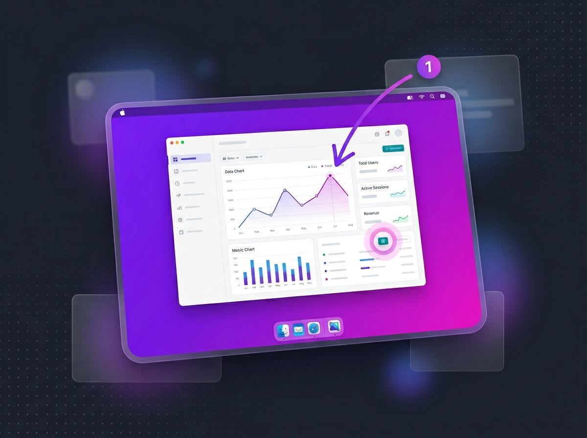
Tired of plain screenshots? Try ScreenSnap Pro.
Beautiful backgrounds, pro annotations, GIF recording, and instant cloud sharing — all in one app. Pay $29 once, own it forever.
See what it doesFile specs: format, size, and the GIF quirk
X's official upload limits for the header banner:
- Maximum file size: 5MB
- Accepted formats: JPG, PNG, GIF
- Animated GIFs: since August 2024, animated GIFs no longer animate in headers. They freeze on the first frame. Use a static image instead.
- Minimum resolution: X will accept smaller files but upscales them. Quality drops fast below 1500×500. Always design at the full target size.
- Recommended file size: under 2MB to avoid X's compression pass.
A common workflow trip-up: people export at 4K or 8K to "future-proof" the design. X scales it down anyway, so the only thing you gained is a slow upload. Stick to 1500×500 native.
Free X banner templates and tools
You do not need a full design suite to ship a clean header. These free templates and tools cover most use cases:
- Canva X header templates — search "Twitter header" and pick the 1500×500 size.
- Figma Community — search "X banner" or "Twitter header" for editable wireframes with safe zones.
- Adobe Express — free header templates with avatar guides built in.
Once you have the design, our free workflow tools handle the cleanup:
- Image cropper — crop a wider photo to the 3:1 X ratio
- Image resizer — scale anything to exactly 1500×500
- Social media image resizer — prep the same source for X, LinkedIn, Facebook, and YouTube at once
- Image compressor — trim file size before upload
Common X banner mistakes (and the fixes)
After auditing thousands of profile pages, the same mistakes appear over and over. Here are the top five.
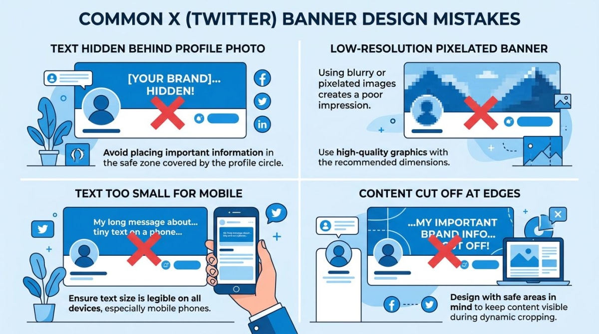
1. Text or logo hidden behind the profile photo
The classic. Designer puts the brand mark dead-center-left "for balance." Avatar lands on top. Half the brand mark disappears.
Fix: keep important text and logos in the upper-right two-thirds. Use a real-size avatar guide circle while designing.
2. Tiny text that no one can read on mobile
Looks fine on a 27-inch monitor at 200% zoom. Disappears on a phone.
Fix: preview at 100% zoom on a 13-inch screen. If you cannot read your tagline at that size, increase the font. Aim for 32 pixels or larger.
3. Low-resolution upload
People upload a 600-pixel-wide JPG and wonder why it looks fuzzy. X scales it up, and scaling adds blur.
Fix: always work at a native 1500×500. If you only have a smaller source, use our image resizer to get the dimensions right, but accept that quality may suffer.
4. Designing at the old 1024×512 spec
Some templates and old tutorials still reference 1024×512 — that was the spec before X (then Twitter) updated header dimensions. Using it now means your banner gets stretched and looks soft.
Fix: always 1500×500. If a template you found is sized differently, do not use it.
5. Action-button overlap on mobile
Designers focus on the avatar overlap and forget the "Follow" button. On mobile, that button covers the lower-right corner. Critical CTAs there get hidden.
Fix: keep a 200×100 pixel margin clear in the lower-right corner for the mobile button overlay.
Capture banner inspiration with ScreenSnap Pro
When researching banner ideas, you will probably end up screenshotting other profiles to mood-board against. ScreenSnap Pro makes that fast — region capture pulls just the banner area, the annotation toolkit (15 tools including arrows, blur, and counter) lets you mark up safe zones on top of the screenshot, and you can save drafts to a pinned overlay while you iterate. It runs on Mac and Windows, ships with 150+ gradient backgrounds for your own assets, and is a one-time $29 purchase — no subscription. Useful when you are designing a banner and a profile photo together and need a quick way to test how they look as a pair.
Frequently Asked Questions
Wrapping up
The headline numbers are easy: 1500×500, 3:1, under 5MB, JPG or PNG. The harder part is the safe zone — the lower-left avatar overlap, the mobile crop, and the action button overlay are what trip up most designs.
Design at the full 1500×500 native size. Keep important content in the upper-right two-thirds. Test on three devices before you call it done. And if you are managing banners across X, LinkedIn, and YouTube, our social media image resizer preps one source for every platform.
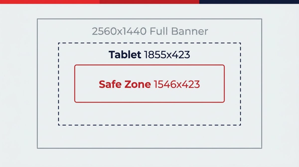
For more cross-platform sizing, our social media image sizes cheat sheet has every dimension you need in one place. If you also run a LinkedIn presence, our LinkedIn banner size guide covers the 1584×396 personal banner and 1128×191 company page banner. And for YouTube, the YouTube banner size guide walks through the 2560×1440 channel art spec.
Morgan
Indie DeveloperIndie developer, founder of ScreenSnap Pro. A decade of shipping consumer Mac apps and developer tools. Read full bio
@m_0_r_g_a_n_