YouTube Banner Size 2026: Dimensions + Templates
The recommended YouTube banner size is 2560×1440 pixels with a maximum file size of 6MB. The safe zone where text and logos won't get cropped on any device is 1546×423 pixels, centered. Use PNG or JPG, RGB color mode, and design with the smartphone preview area as your hero. (If your banner art uses a screenshot, ScreenSnap Pro exports straight to those dimensions.)
If you want one fact to remember, that's it. The rest of this guide explains why YouTube uses three different crops, how to design once and look good everywhere, and how to fix the most common banner mistakes — like text getting cut off on phones or a blurry upload on a 4K TV.
Quick answer: YouTube channel banner specs
Here are the exact specs YouTube wants in 2026:
| Spec | Value |
|---|---|
| Recommended upload size | 2560×1440 px |
| Minimum upload size | 2048×1152 px |
| Safe zone (TV + mobile) | 1546×423 px (centered) |
| Aspect ratio | 16:9 |
| Maximum file size | 6 MB |
| Accepted formats | JPG, PNG, GIF (static), BMP |
| Color mode | RGB |
The 2560×1440 figure is the master canvas. YouTube takes that single file and crops it differently for TVs, desktops, tablets, and phones. Your design needs to work in every crop — that's where the safe zone comes in.
For a one-stop reference covering banners on every other platform too, our social media image sizes cheat sheet lists every dimension Instagram, Facebook, LinkedIn, X, and TikTok ask for in 2026.
Why YouTube banners get cropped on different devices
YouTube renders your banner at a different width depending on where someone is watching. The exact same upload appears wider on a TV, narrower on a desktop, and almost square on a phone.
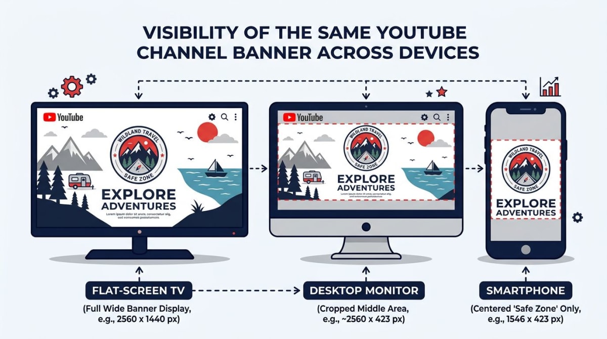
Here's how the same 2560×1440 file gets sliced across devices:
| Device | Visible area |
|---|---|
| TV | 2560×1440 px (full image) |
| Desktop | 2560×423 px (top center strip) |
| Tablet | 1855×423 px |
| Mobile | 1546×423 px |
Notice the height never goes higher than 423 pixels outside of TV. That means the vertical center band of your design is what most viewers will actually see. If you put your channel name or logo near the top or bottom corners, mobile users will never see it.
The 1546×423 safe zone is the area visible on every device. Anything you put there will show up on a Smart TV, a 27-inch monitor, an iPad, and a phone. Anything outside it might show on some devices and disappear on others.
What goes inside (and outside) the safe zone
The safe zone is for the stuff readers can't miss:
- Channel name or wordmark — front and center
- Tagline or value prop — one short line
- Logo or face — your brand identity
- Upload schedule — "New videos every Monday"
The outer area (the part that only shows on TV) is for visual flourish:
- Background photography or gradients
- Decorative elements that bleed off the edge
- Texture, patterns, secondary illustrations
A common mistake: cramming everything into the safe zone and leaving the outer area blank. On TV that looks like a tiny postage stamp floating in dead space. Treat the outer area as a stage for your hero element, not a blank margin.
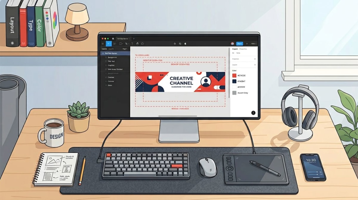
How to design a banner that works everywhere
The trick is to design on the full 2560×1440 canvas while keeping critical content inside the 1546×423 safe zone. Here's the workflow most pros use.
Step 1: Start with the master canvas
Open your design tool — Figma, Photoshop, Canva, Affinity, or any editor that supports custom dimensions. Create a new file at 2560×1440 pixels, RGB color mode, 72 DPI.
Step 2: Add safe zone guides
Draw a centered rectangle at 1546×423 pixels. Lock it as a guide layer. This is the inner box. Anything important goes here.
In Figma you can place a frame, set the constraint to "center" both ways, and lock the layer. In Photoshop, use View → New Guide Layout and set the values manually. In Canva, the YouTube channel art template has the safe zone built in.
Step 3: Build outward from the center
Place your text, logo, and any focal point first, inside the safe zone. Then build the wider design around it — backgrounds, patterns, decorative elements. This way you're always designing the part that everyone sees first.
Pro tip: if you're using a screenshot of your product or app inside the banner, our free image cropper makes it easy to grab the exact aspect ratio you need before placing it.
Step 4: Test the crops
Hide everything outside the safe zone temporarily and check what mobile viewers will see. Then expand to the tablet width (1855×423), then desktop (2560×423), then the full TV view. If the design only looks good at one size, rework it.
Step 5: Export at the right size
Export as JPG for photographic banners (better compression). Export as PNG if your banner has flat colors, sharp logos, or transparency you want to preserve. Either way, target a final file under 6MB — YouTube will reject anything bigger.
If your file is over 6MB, use our free image resizer or the dedicated social media image resizer to bring it under the limit without rebuilding the whole design.
File format and size: PNG vs JPG for YouTube banners
YouTube accepts JPG, PNG, GIF (static only — animated frames get flattened), and BMP. In practice, PNG and JPG are the only two worth using.
| Format | Best for | Drawback |
|---|---|---|
| JPG | Photographic banners, gradients, full-bleed photos | Lossy compression — fine details soften |
| PNG | Logo-heavy banners, sharp text, flat colors | Larger file size — easy to hit the 6MB cap |
| GIF | Almost never (gets flattened) | No animation, no real upside |
| BMP | Almost never | Huge files, no compression |
A 2560×1440 PNG with detailed artwork can easily blow past 6MB. If yours does, try one of these in order:
- Switch to JPG at quality 85–90. Most banners look identical to PNG at JPG 85.
- Export at 2048×1152. This is the minimum size YouTube allows. Smaller export = smaller file.
- Compress the final file. Run it through a quality-aware compressor before uploading.
- Flatten effects. Hidden alpha channels and unused layer effects bloat PNG exports.
The 6MB cap is hard. Uploads over 6MB fail silently or display an error in YouTube Studio. There's no override.
Common YouTube banner mistakes to avoid
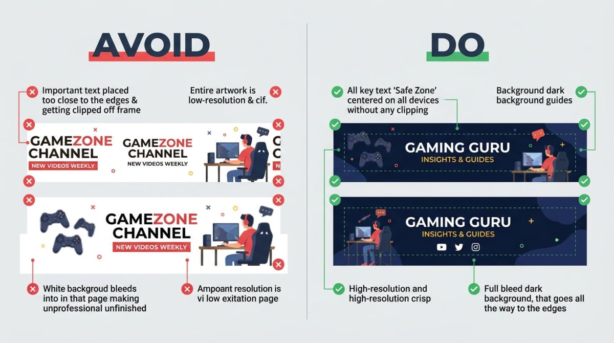
These are the issues we see again and again on real channels:
- Text outside the safe zone. Channel name reads fine on desktop, then the phone crop chops off the last few letters. Always pull text in.
- Critical info on the right or left edge. "Subscribe" arrows pointing toward the corner where the avatar will sit on desktop is a good idea — but the arrow itself often gets cropped on mobile.
- Low-resolution upscale. Designing at 1280×720 and stretching to 2560×1440 produces a soft, pixelated banner on TV. Always start at 2560×1440.
- White background bleeding into the page. YouTube's interface is usually dark mode now. A pure white background can clash. Try a soft off-white, a gradient, or a dark photographic background.
- Tiny logo, lost in the canvas. If your logo is under 200 pixels tall on the master canvas, it'll be invisible on phones. Push it bigger.
- Inconsistent brand vs your videos. Your banner sets the tone. If it's clean and minimal but your thumbnails are chaotic, viewers feel a disconnect.
- Forgetting the avatar overlap. On desktop, the channel avatar (98×98 px circle) sits in the lower-left corner of the banner area. Don't put critical text there — it gets covered.
- No call to action. Banners are prime real estate. "New videos every Tuesday" or your handle alone will do more than a pretty pattern.
Tired of plain screenshots? Try ScreenSnap Pro.
Beautiful backgrounds, pro annotations, GIF recording, and instant cloud sharing — all in one app. Pay $29 once, own it forever.
See what it doesFree YouTube banner templates worth using
You don't have to start from scratch. Here are the template sources we recommend, in rough order of design quality:
- Canva — the largest free template library. Filter by "YouTube channel art" and you'll see thousands of pre-sized designs with the safe zone built in. Free with attribution; Pro removes that.
- Figma Community — search "YouTube banner template." Free, fully editable, great for designers who want to remix layouts and components.
- Adobe Express — clean templates if you already pay for Creative Cloud. Has a built-in resize-to-platform tool.
- Snappa — focused on social media graphics. The free tier covers most banner needs.
- Visme — heavier on infographic-style templates. Good if your channel is education or business.
- Crello (now VistaCreate) — animated banner templates if you ever want to test a moving-style design (though YouTube flattens these).
A real workflow: pick a template you like, change the colors and text to match your brand, swap the photo for one of yours, and export. Most channels can land a polished banner in under 30 minutes this way.
How your banner shows up on a real channel page
Here's the rough layout when someone visits your channel on desktop:
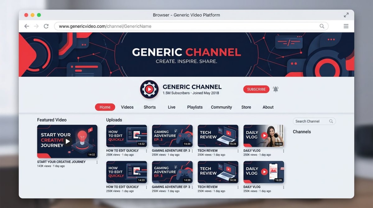
A few things worth knowing about how YouTube renders the banner:
- The channel avatar overlaps. On desktop, the round avatar sits low-left, partially over the banner. The lower-left ~150×150 px area is effectively blocked.
- Below the banner, you have tabs. Home, Videos, Shorts, Live, Playlists, Community, About. Your banner sets the tone for all of them.
- Mobile shows a tighter crop. Around 1546×423 is what fits. Above that, YouTube fills with the avatar and channel name in a card.
- TV shows the full image. Smart TV, console, and Apple TV apps render the full 2560×1440. This is where outer-zone art shines.
If you want to grab a clean reference of how a banner appears in the wild — to compare against your own design — capturing the YouTube channel page at full resolution works well for mockups. ScreenSnap Pro handles that on Mac and Windows: it grabs the YouTube page at the exact 2560×1440 source, lets you annotate the safe-zone overlay on top, and exports to PNG without watermarks.
Best practices for banner design
A few patterns we see on banners that consistently work:
- High contrast text. If you're putting text over a photo, add a subtle dark overlay (40–50% black) so the text reads on every device. Skipping this is the most common reason banners look bad in mobile dark mode.
- One clear focal point. Channels with great banners usually have one element your eye lands on — a face, a wordmark, or a single bold object. Multiple focal points fight each other.
- Brand colors, not random palettes. Pick two or three brand colors and stick with them across the banner, thumbnails, and end screens. Consistency beats variety here.
- Test in the YouTube Studio preview. Studio has a built-in preview that shows the TV/desktop/tablet/mobile crops on top of your upload. Use it before you click Publish.
- Update seasonally, not constantly. Refreshing your banner every 3–6 months signals an active channel. Refreshing it every week makes you look indecisive.
For more guidance on what YouTube officially requires, the YouTube Help Center channel art guidelines is the canonical source. Bookmark it for spec changes.
How to upload your banner to YouTube
Once your design is ready:
- Open YouTube Studio.
- Click Customization in the left sidebar.
- Switch to the Branding tab.
- Under Banner image, click Upload.
- Drag in your 2560×1440 file (under 6MB).
- Use the on-screen crop tool to fine-tune the centered position.
- Click Done, then Publish.
Changes take a few minutes to propagate. If yours doesn't show right away, refresh, and check on a private/incognito window to bypass cached versions.
Banner sizes for related YouTube assets
While you're updating your channel art, take a look at the rest of your visual identity. The other YouTube image specs that matter:
| Asset | Recommended size |
|---|---|
| Channel banner | 2560×1440 px |
| Channel avatar (profile picture) | 800×800 px (renders at 98×98) |
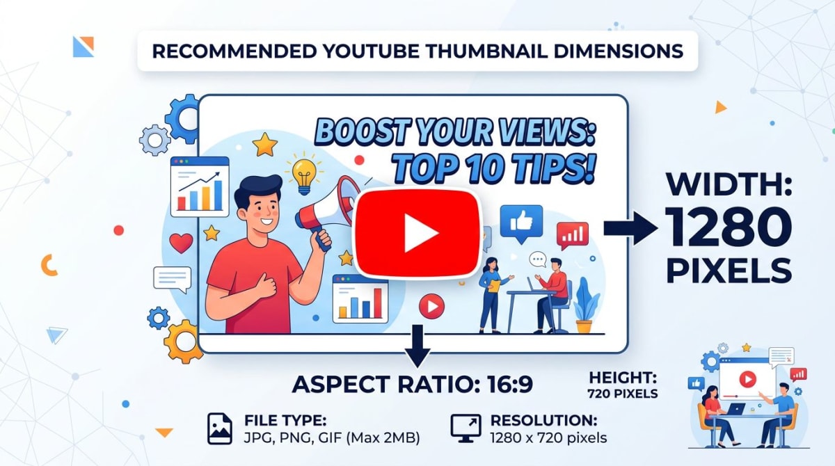
| Video thumbnail | 1280×720 px |
| End screen | 1280×720 px (matches video) |
| Watermark | 150×150 px transparent PNG |
For platforms like the App Store that have their own equally strict rules, our App Store screenshot sizes guide covers every device-specific dimension Apple expects. And if you're producing screenshots for your videos or thumbnails, our Canva screenshot guide walks through exporting at the right size.
Frequently Asked Questions
Wrapping up
The headline number is 2560×1440 with a 1546×423 safe zone. Design once at the master canvas, keep critical content centered, export under 6MB, and your banner will look right on every screen.
If your banner workflow involves capturing your app, product, or screen for use in the design — annotating it, beautifying it with a gradient background, or grabbing reference shots of competitor channels — ScreenSnap Pro covers all of that on Mac and Windows. It's a one-time $29 purchase with 150+ background presets, 15 annotation tools, and zero watermarks. Capture, mark up, export at the exact size you need.
Save this page, run through the checklist next time you redesign, and your channel art will look sharp from a phone screen all the way to a 4K TV.
Morgan
Indie DeveloperIndie developer, founder of ScreenSnap Pro. A decade of shipping consumer Mac apps and developer tools. Read full bio
@m_0_r_g_a_n_