LinkedIn Banner Size 2026: Profile + Company
LinkedIn personal banner size is 1584×396 pixels (4:1 aspect ratio), and LinkedIn company page banner is 1128×191 pixels (5.91:1). Both should be JPG or PNG under 8MB. Important content stays within the central safe zone, since the profile photo overlaps the bottom-left corner.
That one line answers the search. The rest of this guide shows you how to get a banner that looks good on every device. LinkedIn squashes it on phones. It hides part of it behind your avatar. And company pages use a totally different shape.
Quick-spec box: every LinkedIn image you might need
If you only came here for numbers, here they are. Save this table.
| Image type | Pixel size | Aspect ratio | Max file size | Recommended format |
|---|---|---|---|---|
| Personal profile banner | 1584×396 | 4:1 | 8MB | PNG or JPG |
| Company page banner | 1128×191 | 5.91:1 | 8MB | PNG or JPG |
| Personal profile photo | 400×400 | 1:1 | 8MB | PNG or JPG |
| Company page logo | 300×300 | 1:1 | 8MB | PNG or JPG |
| LinkedIn post image | 1200×627 | 1.91:1 | 5MB | PNG or JPG |
| LinkedIn Live event cover | 1920×1080 | 16:9 | 5MB | PNG or JPG |
A few rules apply across every image:
- Format: JPG or PNG. GIF uploads work, but animated GIFs do not animate on LinkedIn. They freeze on the first frame.
- Color space: sRGB. CMYK files often look dim or off.
- DPI: 72 DPI is fine. LinkedIn renders by pixels, not print size. A higher DPI does not help. Match the pixel target instead.
- File size: keep your banner under 2MB if you can. Smaller files load faster on mobile, where most LinkedIn traffic lives.
The profile-photo overlap problem (the part everyone gets wrong)
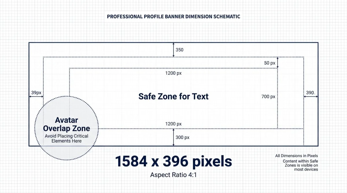
Here is the trap. Your banner is 1584×396 pixels. But your round profile photo sits on top of it on the bottom-left of desktop view. On mobile, the avatar moves to the center-bottom. The banner also crops shorter on the sides.
Most templates ignore this. They place a logo, name, or call-to-action right in the middle-left of the banner. That is exactly where your avatar will land.
The fix: treat the bottom-left third as dead space. Put text, logos, and key content in the right half or upper-center. The next section has the exact safe zone in pixels.
If you already designed a banner and only need to adjust dimensions, the easiest way is to crop or scale it with our free image cropper: drop your file in, set the 4:1 ratio, and export.
Safe zones: where your banner gets cut off
The "safe zone" is the box of pixels that shows up on every screen size. Anything outside this zone might get cropped. It could also get hidden behind your profile photo or LinkedIn's UI.
For a personal banner (1584×396):
- Avatar overlap zone (avoid): roughly the bottom-left 220×220 pixels on desktop. On mobile the avatar shifts to bottom-center.
- Mobile crop margins: LinkedIn trims about 60 pixels from each side on phones. Keep key text at least 80 pixels from the left and right edges.
- Safe text area: the central 1100×280 pixel box, shifted slightly to the right, shows on every device.
For a company banner (1128×191):
- The company logo is a square. It overlaps the left side of the banner from the bottom.
- Avatar overlap zone: the bottom-left 90×90 pixels.
- Safe text area: keep your tagline, pitch, and CTAs in the right two-thirds of the image.
Pro tip: when you design in Canva or Figma, drop a circle the same size as the LinkedIn avatar onto your canvas as a guide layer. Hide it before exporting. This one trick saves hours of redos.
Mobile vs desktop crop: why your banner looks different on a phone
LinkedIn shows banners in a different way across devices. The full 4:1 image you upload is not what every viewer sees.
- Desktop: the full banner shows, with the avatar circle in the bottom-left.
- Mobile (iOS and Android apps): LinkedIn crops about 60 pixels off each side. The avatar moves to the bottom-center. The visible area gets closer to 5:1.
- Tablet: crop depends on how you hold it. Expect something between desktop and mobile.
The takeaway: design for mobile first. Over 60% of LinkedIn sessions happen on phones. Keep your key content in the central box that survives the mobile crop.
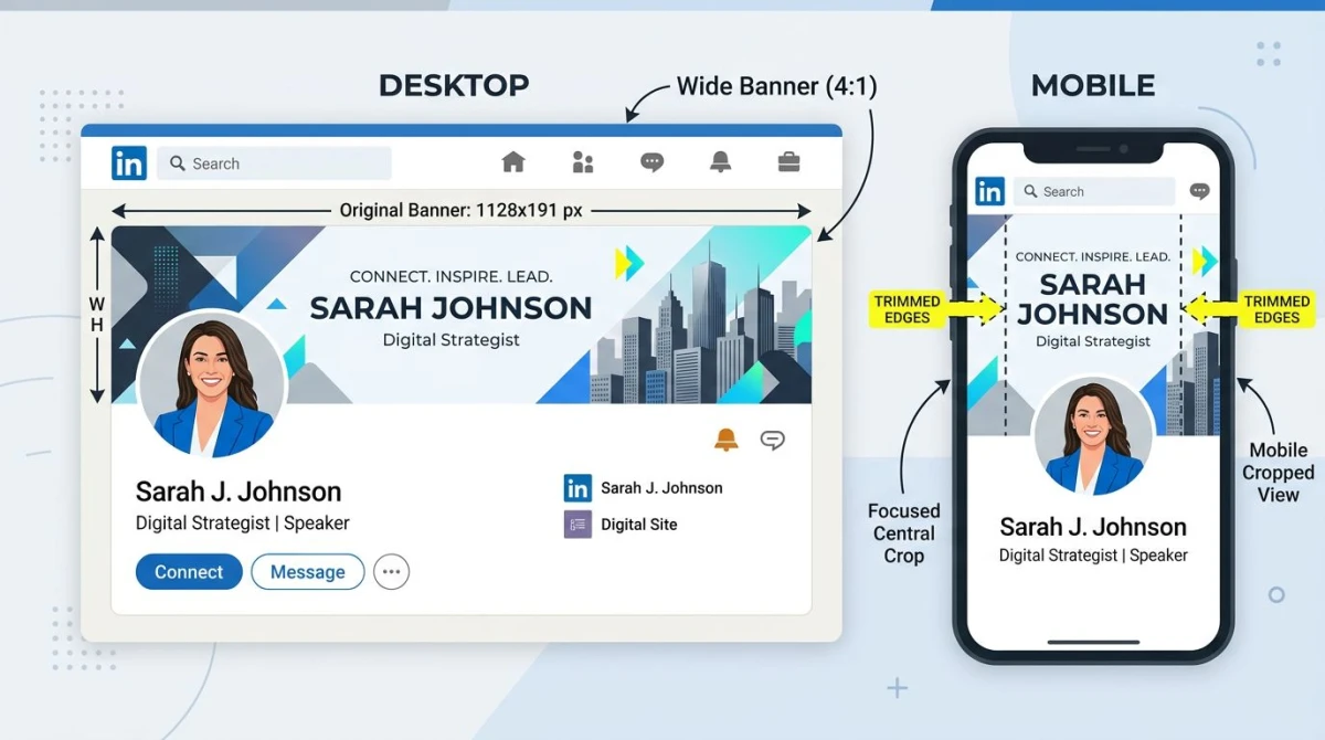
Personal LinkedIn profile banner: full specs
Here is everything you need for a personal banner.
Dimensions and format
- Recommended size: 1584×396 pixels
- Aspect ratio: 4:1
- Minimum size: 800×200 pixels (LinkedIn will scale up, but quality drops)
- Maximum file size: 8MB
- Accepted formats: JPG, PNG, GIF (animated GIFs freeze on first frame)
- Color profile: sRGB
Design conventions that work
Personal banners tend to fall into a few patterns. The ones that get the most clicks usually do one of these things:
- Identity statement. Your name, role, and a short tagline. Example: "Sarah Chen: product designer, ex-Stripe, helping early-stage founders ship faster." This works because viewers see context right away.
- Social proof showcase. Logos of past employers, podcasts you joined, or media outlets that featured you. Useful for consultants, freelancers, and speakers.
- Lead magnet. A free resource, course, or newsletter offer with a clear visual CTA. Best for creators and coaches.
- Branded scenery. A photo or art that signals your field. A stage shot for speakers. Code on a screen for devs. A desk-and-coffee scene for writers.
What does not work: stock photos of handshakes, generic quotes, or text crammed into the bottom-left where the avatar sits.
File size and compression
LinkedIn allows banners up to 8MB. Aim for under 2MB. Larger files load slowly on mobile. They can also look softer after LinkedIn re-compresses them.
If your PNG is too big, save it as a JPG at 80% quality. Most banners look the same. The file shrinks by 60% or more. Our free image format converter handles PNG-to-JPG in your browser. Nothing leaves your device.
LinkedIn company page banner: full specs
Company banners have different rules. The shape is wider. The safe zone is smaller. The audience is different.
Dimensions and format
- Recommended size: 1128×191 pixels
- Aspect ratio: 5.91:1
- Minimum size: 1192×220 pixels (LinkedIn's minimum for upload)
- Maximum file size: 8MB
- Accepted formats: JPG, PNG, GIF (no animation)
The company banner uses a totally different ratio than the personal one. It is wider and shorter. A personal banner uploaded to a company page will look squashed.
What goes on a company banner
The best company banners do one job well, not three jobs poorly. Pick one:
- Brand identifier: logo plus tagline. Clean, on-brand colors.
- Product showcase: a hero shot of your app, hardware, or service in use.
- Campaign or event: a current launch, conference, or push.
- People and culture: team photos, office shots, or behind-the-scenes content. Great for hiring.
Avoid: tiny text, busy collages, or generic stock photos. Company banners show up at small sizes. Simple wins.
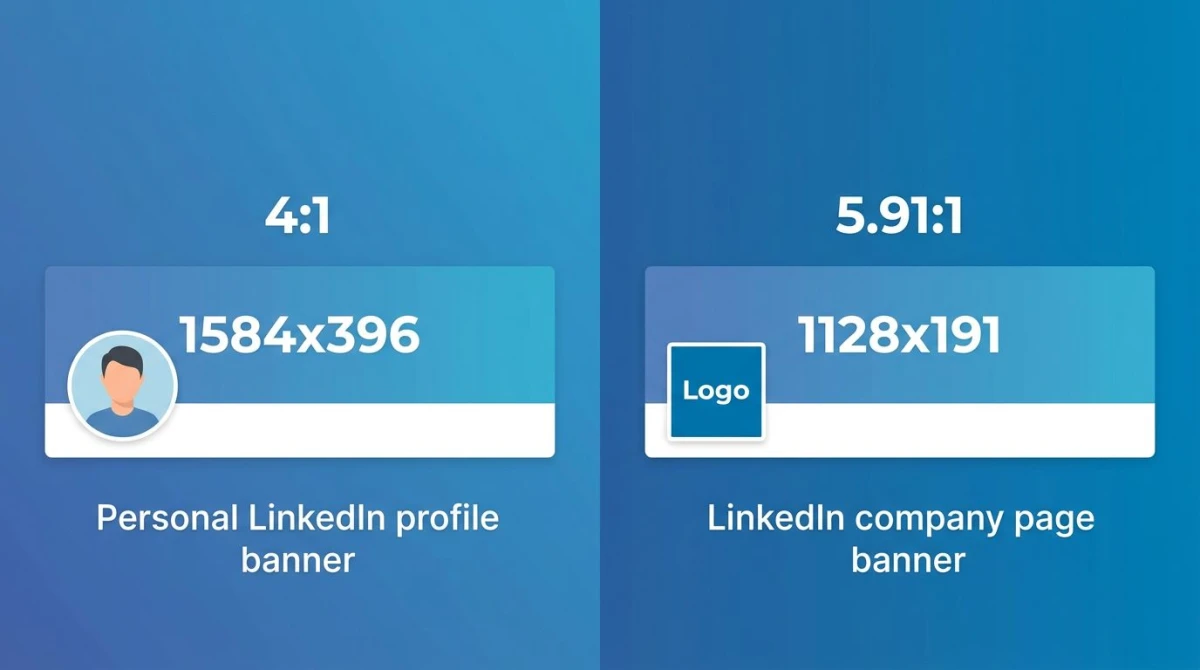
Differences between personal and company banners
| Spec | Personal banner | Company banner |
|---|---|---|
| Pixel size | 1584×396 | 1128×191 |
| Aspect ratio | 4:1 | 5.91:1 |
| Avatar overlap shape | Circle, bottom-left | Square, bottom-left |
| Safe zone position | Right two-thirds | Right two-thirds |
| Typical content | Identity, story, lead magnet | Brand, product, campaign |
| Mobile crop | About 60px each side | Similar crop, shorter banner |

Tired of plain screenshots? Try ScreenSnap Pro.
Beautiful backgrounds, pro annotations, GIF recording, and instant cloud sharing, all in one app. Pay $34 once, own it forever.
See pricing and featuresFree template sources for LinkedIn banners
You do not need to start from a blank canvas. Three free tools let you grab pre-sized templates and edit them in minutes.
- Canva: search "LinkedIn banner" and you get hundreds of templates already at 1584×396. Free tier covers most needs. Drag-and-drop editor, no design skills needed.
- Figma Community: search "LinkedIn banner" for templates by working designers. Free, fully editable, and great if you want fine control over fonts.
- Adobe Express: similar to Canva with a stronger photo toolkit. Free tier is generous.
A template solves the layout, not the photo that goes inside it. If you need a background image, Barnimages keeps a hand-picked library of free high-resolution stock photos, cleared for commercial use with no attribution required.
For company banners, look for templates labeled "LinkedIn company page" or "1128×191". Generic LinkedIn banner templates tend to be the personal size.
Step-by-step: design a banner with safe-zone overlay
Here is the workflow that produces banners that look good on every device.
- Open your template at 1584×396 (or 1128×191 for company). Whatever tool you use, the canvas must match the target pixels exactly.
- Add a guide layer. Drop a circle 220 pixels wide at the bottom-left for personal banners. Use a 90-pixel square for company banners. This shows where the avatar overlaps.
- Mark the mobile-crop margins. Add vertical guides 80 pixels in from the left and right edges. Anything outside risks getting trimmed on mobile.
- Place your content in the safe zone. Headline, logo, CTA. Keep them in the central box that survives all crops.
- Test at small sizes. Zoom out to 25% of the canvas. Check if the design still reads. If text vanishes, make it bigger.
- Export in the right format. PNG for graphics with sharp edges. JPG at 80 to 90% quality for photo-heavy banners.
- Compress before upload. Run the export through a compressor to keep the file under 2MB. Our image compressor handles this in seconds.
- Upload and check. Open your LinkedIn profile on both desktop and mobile. Make sure nothing key got cropped or hidden.
If the size still feels off after upload, our social media image resizer snaps any image to LinkedIn's exact specs. No stretching.
Common LinkedIn banner mistakes (and quick fixes)
These are the issues that come up over and over in audits.
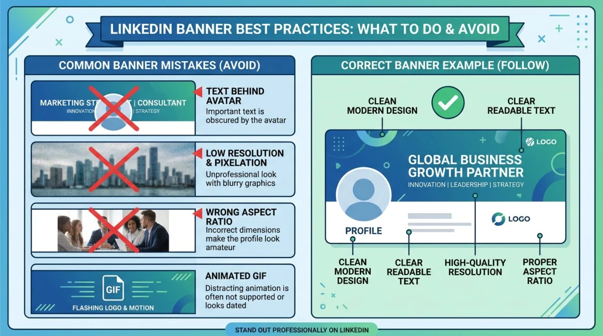
Text behind the profile photo
The most common mistake by far. Your name or logo lands right under the avatar circle. It stays hidden on every desktop view.
Fix: move all text and logos to the right two-thirds of the banner. If the design feels off-balance, add a small graphic on the left to anchor it.
Low-resolution image
You uploaded a 600×150 image. LinkedIn stretched it to 1584×396. The result looks fuzzy on retina screens.
Fix: always upload at the right size or larger. If your only option is a smaller original, use an upscaler before uploading.
Wrong aspect ratio
You uploaded a 1920×1080 banner because that is what your design tool gave you. LinkedIn either crops it badly or scales it in odd ways.
Fix: match the exact 4:1 (personal) or 5.91:1 (company) ratio. If your source image is the wrong shape, crop it to ratio first. Do not let LinkedIn guess.
Animated GIF that does not animate
GIF uploads work. But LinkedIn only shows the first frame on banners.
Fix: save the best frame as a static JPG or PNG. Animated banners are not a thing on LinkedIn, at least not yet.
Text too small to read on mobile
Your headline looks great on desktop. On a phone screen it is too small to read.
Fix: test at 25% zoom on desktop. If you cannot read the text, neither can a phone user. Bump the font size up by 30 to 50% and re-export.
Wrong color profile
Your banner looks vibrant in Photoshop. On LinkedIn it looks dim and washed-out.
Fix: export in sRGB. CMYK and Adobe RGB color spaces render in odd ways on the web.
Best practices for high-performing banners
A few patterns from banners that drive profile views and connection requests.
- Use one font, one color palette. Banners with three fonts and five colors look amateur. Want to reuse the exact typeface from a design you admire? A font identifier can name it from a screenshot.
- Match your pro photo. Your banner and headshot should feel like the same brand.
- Refresh every quarter. A banner that says "Speaking at SaaStr 2024" in 2026 signals neglect. Update at least every 90 days.
- Include one CTA. Your banner is prime real estate. Put one offer there. A link. A tagline. An event. Not three.
- Test the avatar gap. Before you save, drop a circle where your profile photo will sit. If it covers key content, redesign.
- Capture ideas from rival banners. Browse banners of people in your field. Save the ones that work. Adapt the patterns. ScreenSnap Pro makes this easy. Capture, add notes on what works, and reference later.
ScreenSnap Pro for banner design and inspiration
If you design LinkedIn banners often, you likely already screenshot rival profiles, mockups, and product UI to drop into your banners. ScreenSnap Pro is built for that workflow.
- 500+ gradient backgrounds. Drop a UI screenshot onto a branded background and use it as banner art in seconds.
- 17 annotation tools. Mark up draft banners with feedback before you ship them.
- Region capture for grabbing exact slices of a website or design tool.
- One-time purchase at $34. No subscription. Works on Mac and Windows.
It will not design your banner for you. But it removes the friction between "I saw a great example" and "I have a clean reference saved with notes."
For more on combining screenshots with design tools, see our guide to editing screenshots on Mac. If you publish to many platforms, check the parent guide to social media image sizes. Designing app store assets too? Read App Store screenshot sizes.
Frequently asked questions
Wrapping up
The two numbers to remember are 1584×396 for personal and 1128×191 for company. Everything else flows from those. Safe zones, mobile crops, file formats. All downstream of those two specs.
The biggest gain you can make today is checking your current banner for the avatar overlap. Open your LinkedIn profile now. Look at where your profile photo sits. Check if anything key is hidden behind it. If yes, redesign with the safe zone in mind. That one fix usually beats any other tip.
When you are ready to resize an image, the social media image resizer snaps any photo to LinkedIn's exact specs in one click. If you want to get serious about branded screenshots and banner mockups, ScreenSnap Pro is the workflow we use ourselves.
For more LinkedIn-specific help, the LinkedIn Help Center has the official specs straight from the source.

Morgan
Indie DeveloperIndie developer, founder of ScreenSnap Pro. A decade of shipping consumer Mac apps and developer tools. Read full bio
@m_0_r_g_a_n_