Facebook Cover Photo Size 2026: Dimensions + Tips
The Facebook cover photo size in 2026 is 820×312 pixels on desktop and 640×360 pixels on mobile. To look sharp across every device, upload at 1640×624 pixels (2× resolution), keep critical content inside the central 640×360 mobile-safe zone, and stay under 100KB after compression for fast load.
That sounds simple, but Facebook actually has four different cover surfaces (personal profile, business Page, Group, and Event), and each one crops your image in its own way. This guide covers the exact dimensions for all four, plus the safe-zone tricks that stop your text from getting chopped off on phones. (For Facebook's own current spec, see the Facebook Help Center.)
Design at 1640×624 with the mobile-safe zone marked, then export. That's the whole trick.
Quick-Answer Dimension Table
Here are the exact specs for every Facebook cover surface, side by side:
| Surface | Desktop Display | Mobile Display | Recommended Upload | Aspect Ratio | File Size |
|---|---|---|---|---|---|
| Personal Profile Cover | 820×312 px | 640×360 px | 1640×624 px | ~2.63:1 | <100KB ideal, 4MB max |
| Business Page Cover | 820×312 px | 640×360 px | 1640×624 px | ~2.63:1 | <100KB ideal, 4MB max |
| Group Cover | 1640×856 px | 640×334 px | 1640×856 px | ~1.91:1 | <100KB ideal, 4MB max |
| Event Cover | 1920×1005 px | 1080×566 px | 1920×1005 px | ~1.91:1 | <100KB ideal, 4MB max |
Pro tip: the easiest way to size your cover correctly is with our social media image resizer, which ships with Facebook presets for every surface, no Photoshop needed.
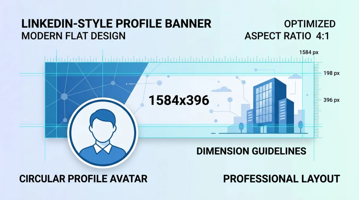
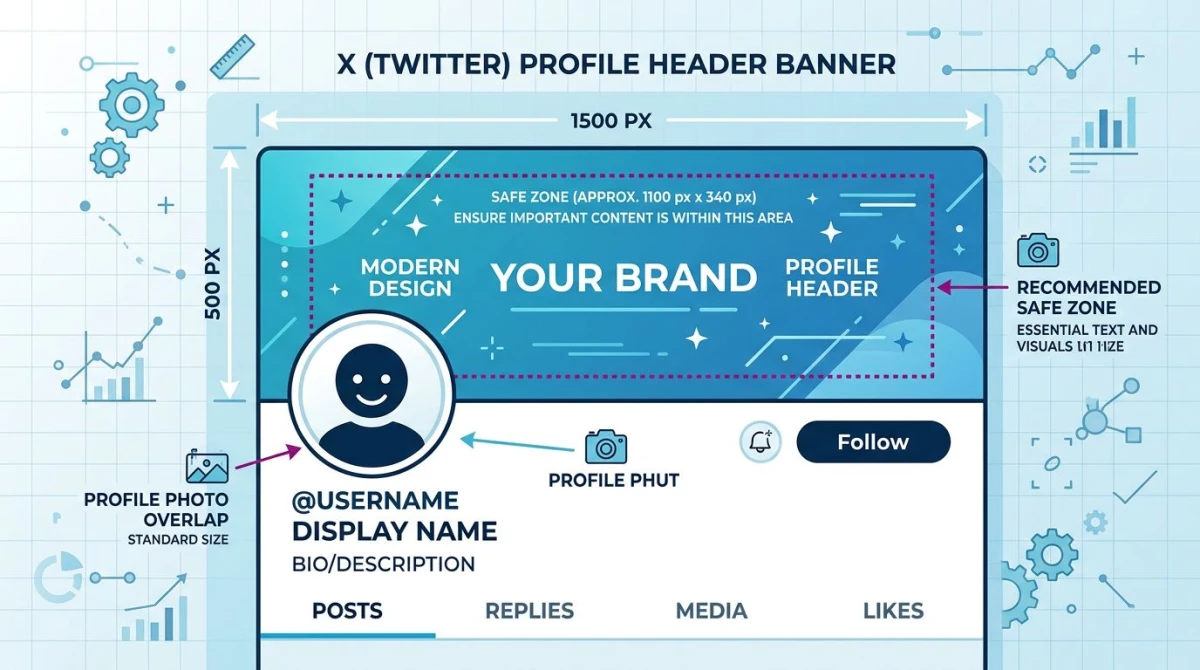
If you also need other platforms, our broader social media image sizes guide covers Instagram, Twitter/X, LinkedIn, and TikTok in one place.
The Mobile vs Desktop Crop Problem
Here's the catch nobody warns you about: Facebook does not show the same crop on desktop and mobile. The desktop view is wider and shorter. The mobile view is narrower and taller. A face or logo that sits perfectly framed on your laptop can be cut in half on a phone.
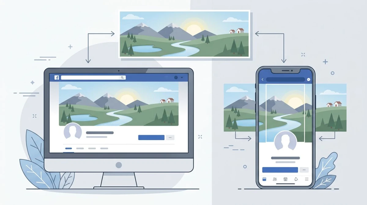
Same upload, two crops. The mobile view trims the sides; the desktop view trims the top and bottom.
The mobile-safe zone
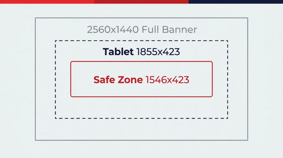
Think of your 1640×624 upload as having a smaller safe rectangle in the middle: 640×360 pixels wide, centered. Anything inside that rectangle shows on both desktop and mobile. Anything outside it is at risk.
Quick rule: put your logo, headline, faces, and CTAs inside that 640×360 center. Use the outer pixels for background texture, gradients, or scenery: stuff that can lose a few inches without anyone noticing.
What gets cut on each surface
- Desktop crop: ~12 pixels trimmed from the top and bottom on personal/Page covers, more on the sides.
- Mobile crop: the left and right edges get trimmed; the centerline stays put.
- Tablet: somewhere between the two, with no exact spec, so design for the mobile crop and you'll be safe.
Personal Profile vs Business Page Cover
The dimensions are identical. The rules are not.
Personal profile cover (820×312)
- Your circular profile picture overlaps the lower-left corner. Roughly the bottom 168 pixels and left 168 pixels are blocked behind it.
- No restrictions on text-to-image ratio.
- You can change it as often as you like, and it shows in your friends' feeds each time.
- Video covers are not currently supported on personal profiles in 2026.
Business Page cover (820×312)
- The profile picture overlaps the lower-left the same way (about 170×170 pixels covered).
- A call-to-action button ("Send Message", "Shop Now", "Book Now") sits to the lower-right. Keep that area clear.
- Facebook previously restricted text to 20% of the image for ads. This rule was scrapped in 2020, but heavy text still hurts engagement.
- Video covers are supported on Pages: 820×462 pixels, 20 to 90 seconds, MP4 recommended.
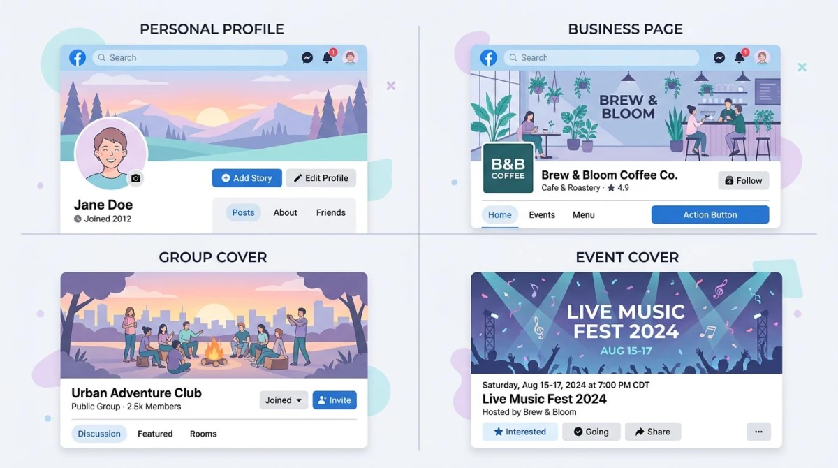
Personal, Page, Group, and Event covers each have a different shape and overlay.
Group Cover Photo (1640×856)
Facebook Groups got a redesign in 2020 and the cover went big. The display is 1640 pixels wide by 856 pixels tall on desktop, with a 1.91:1 aspect ratio that's much closer to a square than the old skinny banner.
- Upload at the full 1640×856, because anything smaller looks soft.
- The group name overlays the bottom-left in white text. Keep that area visually quiet (dark or low-contrast).
- On mobile, the cover is roughly 640×334 pixels, so the bottom 522 pixels of your design get cropped off. Keep important content in the upper two-thirds.
Event Cover Photo (1920×1005)
Event covers are the largest and use a slightly different aspect ratio: 1920×1005 pixels, about 1.91:1. They appear at the top of the event page and in News Feed previews when someone shares your event.
- Upload PNG for graphics with sharp text; JPG for photos.
- The event title and date overlay the bottom-left in News Feed previews, so leave that quiet.
- Mobile crop is roughly 1080×566 pixels, and the top and bottom edges trim slightly.
File Specs: What Facebook Actually Compresses
Facebook re-compresses every image you upload, no matter what. That means a 4MB JPEG and a 200KB JPEG often look the same after upload, and the larger file just wastes your bandwidth and slows your page load.
Here's what works in 2026:
- Format: PNG for logos, screenshots, or graphics with text. JPG for photographs.
- File size: under 100KB is plenty. The 4MB ceiling is for emergencies only.
- Color profile: sRGB. Anything else gets shifted on upload.
- DPI: Facebook ignores DPI metadata, so only pixel dimensions matter.
If your file is too big, compress the image before uploading. A well-compressed JPG at quality 80 to 85 is virtually indistinguishable from the original to anyone scrolling.
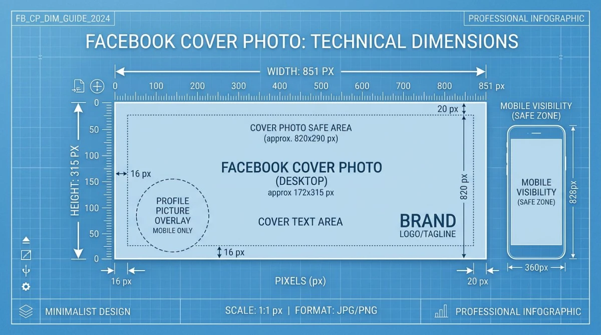
Pixel dimensions matter more than DPI. Design at 1640×624 and you're set.

Tired of plain screenshots? Try ScreenSnap Pro.
Beautiful backgrounds, pro annotations, GIF recording, and instant cloud sharing, all in one app. Pay $34 once, own it forever.
See pricing and featuresStep-by-Step: Design a Cover That Works on Every Device
Here's the workflow that gives you a sharp, safe cover in under 15 minutes.
1. Start a 1640×624 canvas at 2× resolution
That's double the desktop size of 820×312. Designing at 2× keeps your image crisp on Retina displays and high-DPI Windows screens.
2. Drop a mobile safe-zone overlay
Place a 640×360 rectangle, centered horizontally on your canvas. Anchor it to roughly the vertical middle of the design. Set it to 30% opacity dashed outline so you can see through it. Treat that rectangle as your "anything important goes here" zone.
3. Block out the profile-pic and CTA zones
For Page or personal covers:
- Lower-left corner: mark a 340×340 px circle (170×170 px on desktop, doubled). Don't put a face or logo behind it.
- Lower-right corner (Page only): mark a 280×120 px rectangle for the action button.
4. Design with high contrast
Text-over-photo is the most-screwed-up Facebook cover. Either:
- Darken the background with a black 30 to 40% overlay before adding white text, or
- Use a solid color block behind your text (the old "lower-third caption" trick still works).
A free color contrast checker will tell you if your text-to-background ratio passes WCAG AA. Aim for 4.5:1 or better.
5. Export checklist
- File format: JPG (photos) or PNG (graphics with text)
- Width: 1640 px (or 1640 / 1920 for Group / Event)
- Color profile: sRGB
- Quality: 80 to 85% for JPG; lossless for PNG
- File size: under 100KB if possible
If you save and the file is huge, run it through an image resizer or image cropper to shave it down before upload.
Free Cover Photo Templates
Don't start from a blank canvas if you don't have to. Every major design tool has a Facebook cover preset:
- Canva. Search "Facebook cover" in templates. Sized to 820×312 (Page) and 1640×856 (Group). Free tier covers most needs.
- Adobe Express. Free Facebook cover templates with brand-kit support if you have a Creative Cloud account.
- Figma Community. Designer-made templates with safe-zone guides already drawn in. Better for teams who want full design control.
- Snappa and Crello (now VistaCreate): fast, free, and template-heavy.
For ScreenSnap Pro users: capture an inspiration cover from Facebook with the region screenshot tool, annotate your draft with the safe-zone box, then export at the right dimensions.
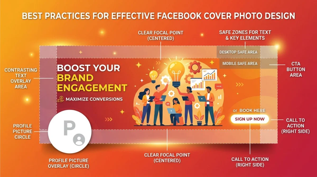
A working cover layout: focal point centered, profile-pic zone respected, CTA area clear.
Best Practices for Cover Design
A few habits that separate covers that look pro from covers that look DIY.
Build around the profile-pic overlap
Your cover and profile photo are read as one unit. Use a continuous background or a subtle gradient that flows behind both. Avoid sharp edges or busy details near the lower-left, since they collide with the profile circle.
Decide where the logo sits
The 640×360 safe zone tells you where a logo survives both crops. It does not tell you which corner reads best, or how to size it against the profile picture and the action button. This guide to logo placement across social formats covers Facebook, LinkedIn and Instagram specifically, which helps when you are producing the same brand mark at several sizes.
Park your CTA on the right
For business Pages, the action button is bottom-right. Aim any text-CTA in your cover toward that corner, using "Shop Now" arrows, "Visit website →" lines, and so on. The visual flow lines up with the actual click target.
Keep text to one short line
A six-word headline at 60 to 80px is more readable on mobile than a paragraph at 24px. If you can't make it short, ditch the text and let the imagery carry the message.
Test on actual phones, not just the preview
Facebook's preview tool is OK but not perfect. Upload, then view on iPhone and Android. Things that look fine in Chrome DevTools sometimes shift on real devices.
Update for context
Seasonal swaps (summer sale, holiday hours, product launch) keep your Page feeling alive. Change your cover when the context changes. Not every week, but every month or two is healthy.
Why Does My Cover Look Stretched, Blurry, or Wrong?
If your upload didn't land right, one of these five issues is almost always the cause.
Wrong aspect ratio
You uploaded a 1080×1080 square. Facebook stretches it horizontally to fit the cover slot, so everything looks fat. Fix: re-export at 1640×624 (Page/profile) or 1640×856 (Group).
Too small (low resolution)
Anything under 820×312 gets upscaled, and upscaling looks blurry. Fix: always start at the 2× upload size.
Heavy compression
You uploaded an already-compressed JPG. Facebook compresses it again, and now you see banding and noise. Fix: upload PNG for graphics with text; JPG quality 80 to 85 for photos. Don't pre-compress to under 50KB, and let Facebook do its pass.
Color shift
Your design looked vibrant in Photoshop and dull on Facebook. That's the color profile. Facebook converts everything to sRGB. Fix: export in sRGB from your design tool.
Mobile crop ate your text
Your text was too close to the left or right edge. The mobile view trimmed it. Fix: keep text inside the 640×360 center safe zone.
When ScreenSnap Pro Helps
If a chunk of your job involves creating, capturing, and annotating images for Facebook, a good capture-and-annotate tool saves real time. ScreenSnap Pro is a $34 one-time-purchase desktop app for Mac and Windows with 17 annotation tools, 500+ gradient backgrounds, and a region capture that snaps cleanly to design grids, which is useful when you need to grab a competitor's cover for a moodboard or document your own template's safe-zone overlay.
It won't design your cover for you. But for the capture-annotate-share loop around social work, it's a fast tool that respects your time.
Frequently Asked Questions
Wrapping Up
Three things to remember:
- Upload at 2× the display size: 1640×624 for profiles and Pages, 1640×856 for Groups, 1920×1005 for Events.
- Park important content in the 640×360 center safe zone so it survives the mobile crop.
- Keep the file under 100KB in PNG (graphics) or JPG (photos), sRGB color profile.
Get those right and your cover looks sharp on every screen, every time. If you'd rather skip the math, our social media image resizer ships with Facebook cover presets for all four surfaces. Drop in your image, pick the surface, download.

Morgan
Indie DeveloperIndie developer, founder of ScreenSnap Pro. A decade of shipping consumer Mac apps and developer tools. Read full bio
@m_0_r_g_a_n_