Twitter X Image Size 2026: All Dimensions
# Twitter / X Image Size: The Complete 2026 Specs Guide
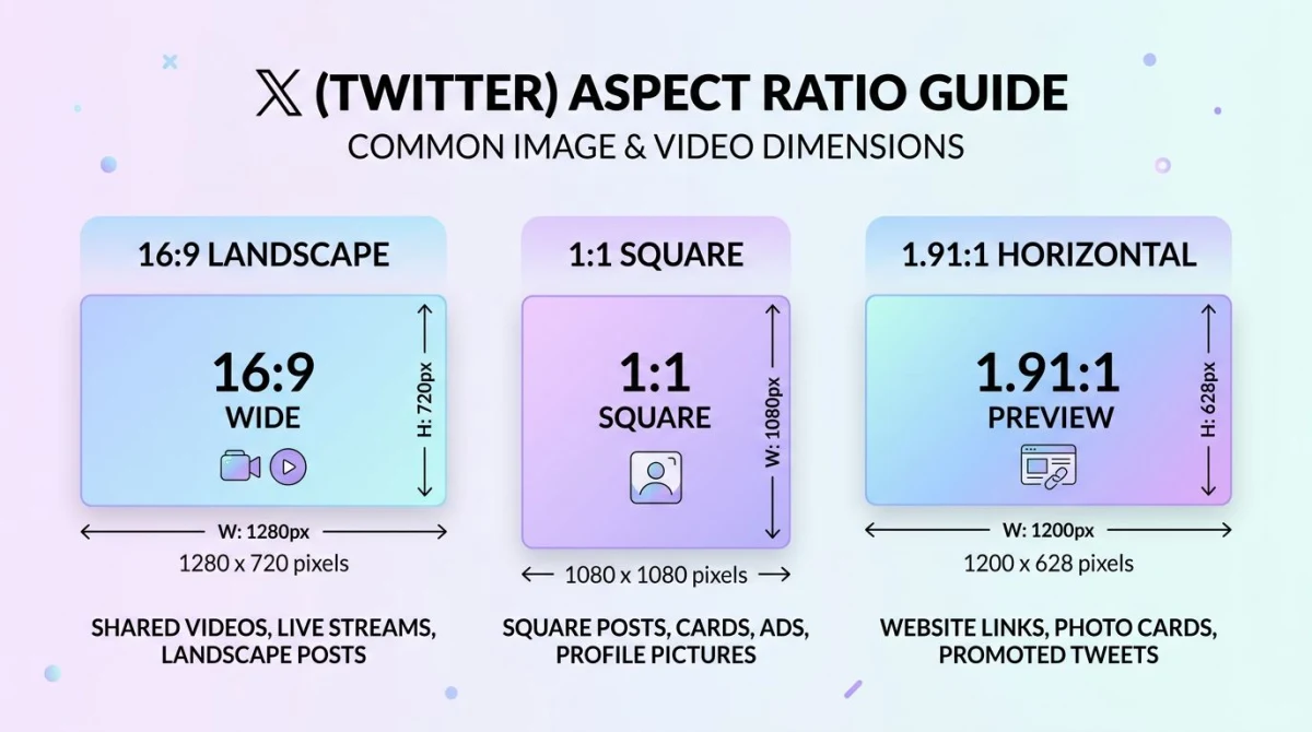
The best Twitter image size in 2026 (now X) for an in-feed post is 1200×675 pixels at a 16:9 aspect ratio, with a 5MB max file size for JPG, PNG, or WebP. Square 1200×1200 (1:1) also works well, especially in multi-image posts. GIFs go up to 15MB. That single paragraph gets most readers home.
Everything below is the long version. Multi-image grids crop differently than singles. Twitter Cards use a different ratio than feed photos. Mobile phones cut your image in ways desktops don't. And the platform compresses every upload, so a sharp source file matters more than a big one.
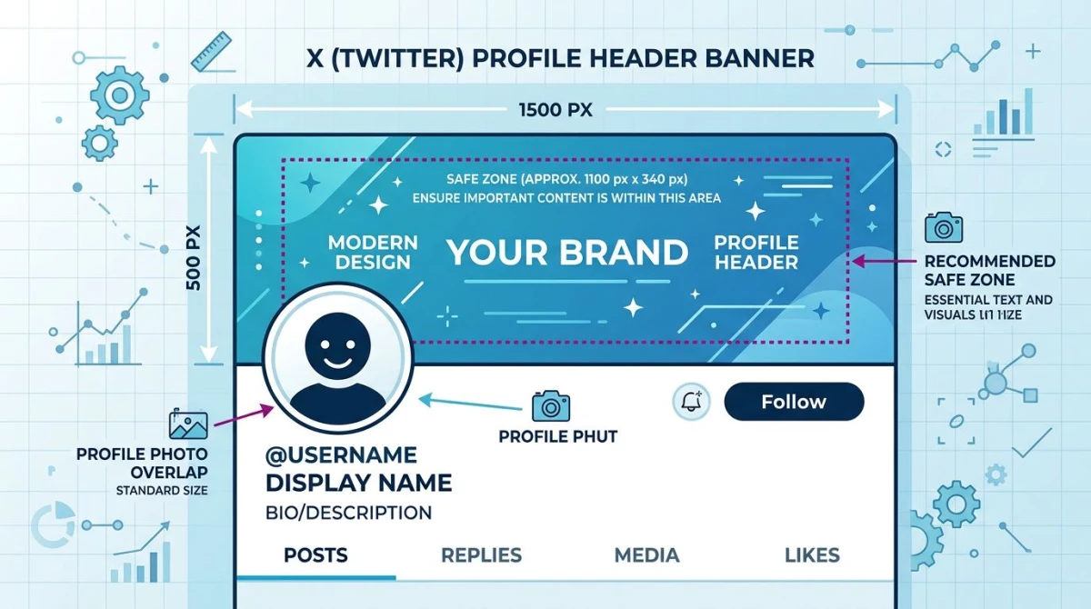
This guide covers in-post images. If you came looking for the header banner across the top of your profile, that lives in our Twitter banner size guide — it's a different spec (1500×500, 3:1) and has its own avatar-overlap rules. Bookmark both.
Quick-spec table: every X image dimension
If you only need the numbers, here they are. Save this table or copy it into a Notion doc.
| Image type | Recommended size | Aspect ratio | Max file size | Format | Best for |
|---|---|---|---|---|---|
| Single in-feed post | 1200×675 | 16:9 | 5MB | JPG, PNG, WebP, HEIC | Photos, screenshots, marketing visuals |
| Single in-feed post (square) | 1200×1200 | 1:1 | 5MB | JPG, PNG, WebP, HEIC | Quotes, portraits, product shots |
| Tall in-feed post | 1080×1350 | 4:5 | 5MB | JPG, PNG, WebP | Mobile-first content (capped to ~16:9 preview) |
| 2-image post | 1200×600 each | 2:1 each | 5MB each | JPG, PNG, WebP | Side-by-side comparisons |
| 3-image post | 1200×675 lead + 1200×600 stacked | mixed | 5MB each | JPG, PNG, WebP | Lead photo with detail shots |
| 4-image post (grid) | 1200×675 each | 16:9 each | 5MB each | JPG, PNG, WebP | Galleries, before/afters |
| Twitter Card (link preview) | 1200×628 | 1.91:1 | 5MB | JPG, PNG | Article shares with summary_large_image |
| Summary card (small) | 144×144 minimum | 1:1 | 5MB | JPG, PNG | Compact link previews |
| Animated GIF | 1200×675 | 16:9 | 15MB | GIF | Reactions, demos, loops |
| Profile photo | 400×400 | 1:1 | 2MB | JPG, PNG | Avatar (round mask) |
| Header banner | 1500×500 | 3:1 | 5MB | JPG, PNG | Top of profile (separate spec) |
The safe default is 1200×675. Almost every other size is a variation on that one — same width, different height. Keep your text legible at the smallest crop and you'll be fine on every device.
A quick rule about formats. JPG and PNG both work everywhere. WebP works for upload but X re-encodes to JPG on display. HEIC (iPhone Live Photos and high-efficiency exports) is supported and converts cleanly. GIFs stay animated in posts — though they no longer animate inside profile headers, only in feed posts and DMs.
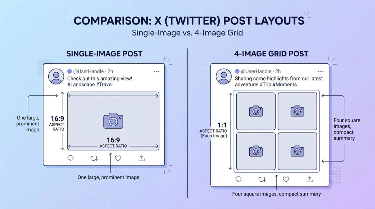
Single image post: 1200×675 vs 1200×1200
If you upload one image to a tweet, X gives it a big preview slot. The best Twitter image size for that slot is 1200×675 pixels (16:9). It fills the preview without cropping, looks sharp on retina screens, and doesn't waste bytes.
Why not larger? X compresses every image. The platform downsamples uploads above roughly 1600×900 to a smaller working file before showing it to followers. So a 4096×4096 source gets squeezed back down anyway. A 1200×675 PNG at high quality gives X less room to mangle.
Square (1200×1200) is the second choice. It works well for product photography, head shots, and quote graphics where you want vertical breathing room. The catch: in feed, square images get a slightly smaller preview than 16:9 ones. They use less screen real estate, which means less stopping power.
Tall portraits (4:5 like 1080×1350) get cropped to roughly 16:9 in the feed preview. Followers tap through to see the full image, but most don't tap. So if a vertical composition matters, post it square or build the key content into the top 56% of the frame.
Pro tip: whatever ratio you pick, design like the image will be viewed on a 6-inch phone screen. Over 80% of X traffic is mobile. Big text, high contrast, no fine print.
Multi-image posts: how X builds the grid
Post 2, 3, or 4 images and X stitches them into a layout. You don't pick the layout — the platform does. Here's how it lays out, and how to design for each case.
2 images: stacked side by side. Each one displays at roughly 1200×600 (2:1). Both get the same width, both get the same height. Composition should sit in the center of each photo — the inside edges face each other and might get a thin gutter between them.
3 images: the first photo takes the full left column. The second and third stack on the right. The lead photo shows at roughly 600×600, the two side photos at roughly 600×300 each. Pick your strongest image first.
4 images: clean 2×2 grid. Every photo crops to a square preview (~600×600) even if you uploaded 16:9. The full image only shows when a follower taps it. Design with that square preview in mind.
A few practical rules across multi-image posts:
- Match the heights. If one image is 1200×675 and another is 1200×900, the grid scales them to match — and the shorter one gets letterboxed or cropped.
- Keep faces and key content centered. The grid crops to fit, and the center of the image is the part that always survives.
- Order matters. Image 1 is the most prominent in the 3-image layout. Lead with your best.
- Same color palette helps. Mismatched white balance or color casts make the grid look like a hostage video.
If you need to prep four images at the same size fast, our free image resizer takes a folder and exports them all at 1200×675 in one click. The social media image resizer handles the same job across X, LinkedIn, Instagram, and Facebook in one pass — useful when you cross-post.
Twitter Card images: 1200×628 for link previews
When you paste a link into a tweet, X scrapes that page for an Open Graph image and turns it into a card preview. There are four card types:
| Card type | Image size | Aspect ratio | Use case |
|---|---|---|---|
| Summary | 144×144 min, 4096×4096 max | 1:1 | Small thumbnail next to title |
| Summary with Large Image | 1200×628 | 1.91:1 | The big preview most sites use |
| Player | 1200×628 (poster frame) | 1.91:1 | Embedded video/audio cards |
| App | 1200×628 | 1.91:1 | iOS/Android app install cards |
For most blog posts, marketing pages, and news articles, you want summary_large_image at 1200×628 pixels (1.91:1). That's the same Open Graph spec Facebook and LinkedIn use, so one image works everywhere.
The card image gets pulled from your page's tag. If you've ever seen a beautiful website show a sad cropped thumbnail when shared on X, it's because someone forgot to set that tag. Set it. Use 1200×628. Validate with the X Cards Validator (now bundled into the X Developer docs) before you ship.
A common mistake: putting important text at the edges of the card image. X will sometimes crop the very top and bottom on mobile. Keep text in the center 60% of the frame. A safer working size is 1200×600 with a 14-pixel safe margin on every side.
GIFs: 15MB, animated, supported
GIFs in feed posts still work, and they still animate. The cap is 15MB, with no firm pixel limit but a recommended 1200×675 for sharpness. Frame rate is uncapped on upload but X re-encodes longer GIFs into MP4 silently — the user sees the animation, but technically it's now a video.
What this means in practice:
- A 5-second loop at 1200×675 should be well under 15MB.
- Anything longer than ~8 seconds is better posted as a native video — the file size and quality come out cleaner.
- GIFs do not animate inside profile headers — they freeze on the first frame. In-feed posts and DMs still animate normally.
- If your source is a screen recording or video, our free GIF compressor trims the file under 15MB without trashing the quality.
For tutorials, product demos, and reaction loops, GIFs still pull more engagement than static images on X. They auto-play in feed, which catches the eye on a fast scroll.
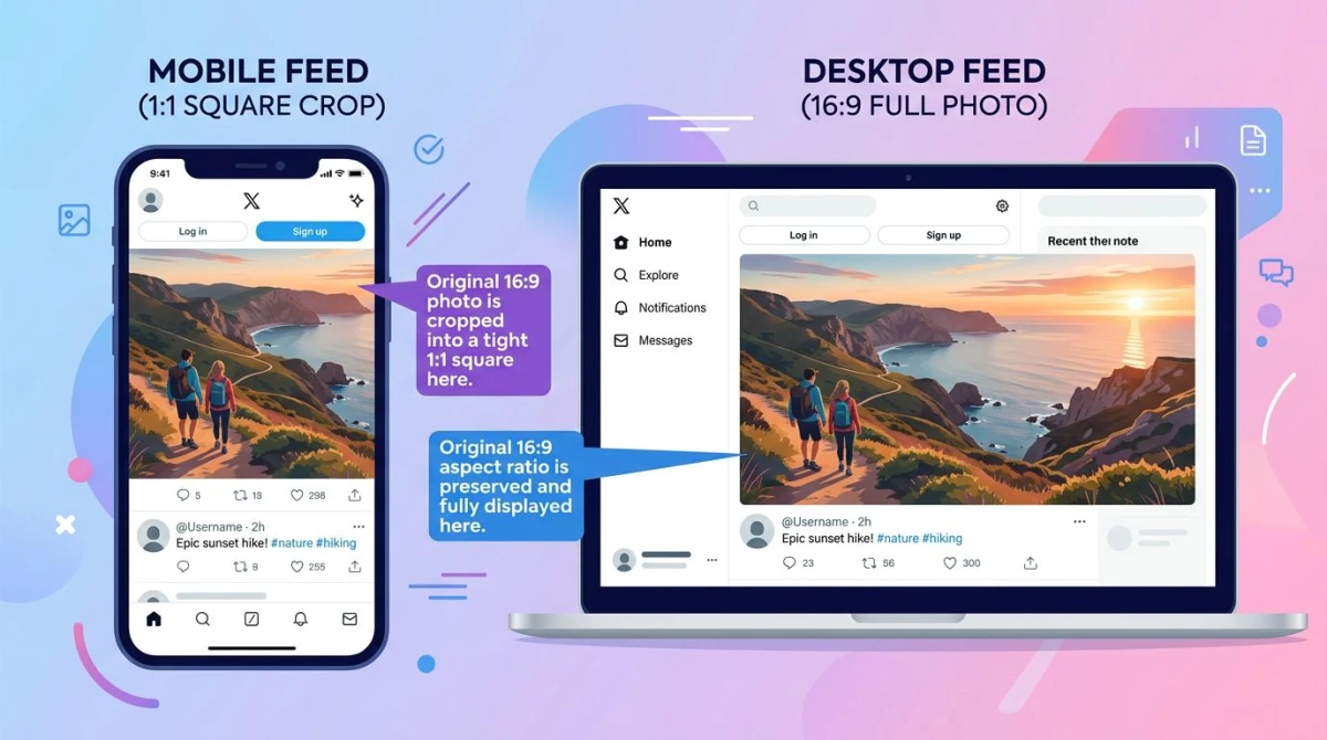
Mobile vs desktop crop: the silent killer
Here's the part most guides skip. Your image looks one way in your tweet composer on desktop, then totally different to a follower scrolling on a phone.
A few examples of where the mobile crop bites:
- A 4:5 portrait shows full on desktop, but mobile feed crops it to roughly 16:9. The top and bottom 20% disappear from the preview.
- A wide 21:9 landscape shows full on desktop but mobile letterboxes it with gray bars. Followers see your work but with empty space top and bottom.
- A 4-image grid shows as four equal squares on desktop. On mobile, it's the same — but each square is much smaller, so any text under 32 pixels in the source becomes unreadable.
The fix is not complicated. Pretend every image is going to be viewed at 375 pixels wide (the standard iPhone width in CSS pixels). If your text is legible, your color contrast is strong, and your subject is centered there, you're safe everywhere else too.
For tools that double-check this for you: drop your image into the free image cropper, set the 16:9 ratio, and preview the safe zone before you upload.
Tired of plain screenshots? Try ScreenSnap Pro.
Beautiful backgrounds, pro annotations, GIF recording, and instant cloud sharing — all in one app. Pay $39 once, own it forever.
See what it doesCompression: design for it, don't fight it
Twitter aggressively re-encodes uploads. Even a perfect PNG comes back out as a JPG that's 30–60% smaller than what you sent in. There's no way to opt out. So design with compression in mind:
- Use PNG only when you need transparency or sharp text on flat color. Otherwise JPG saves you a step.
- Avoid heavy gradients and noise patterns. They show banding and blocky compression artifacts the worst.
- Boost contrast and saturation slightly. The compressor tends to flatten both. If your source image already looks slightly muted, the final post will look washed out.
- Compress before upload. Counterintuitively, a pre-compressed 800KB JPG often looks better than a 4MB PNG, because X applies fewer extra passes.
Our free image compressor handles this in one click — drop in a PNG, get a high-quality JPG out around 200–500KB. Upload that.
For screenshots specifically, the trick is to keep them at native resolution and convert to JPG at 90% quality before upload. That keeps text crisp without giving X room to mangle.
Alt text: 1000 characters, accessibility, and discoverability
X supports alt text up to 1000 characters per image. Most users skip it. Don't be most users.
Alt text helps blind and low-vision users understand your image. It also helps Google index image content from public X posts (X opened parts of its index back to search engines in 2025). And it gives you a small ranking and reach signal in the algorithm — posts with alt text consistently get marginally more impressions.
Good alt text is descriptive but not poetic. Three rules:
- Describe what's there, not what it means. "Bar chart showing Q1 revenue at $1.2M" beats "our great results."
- Skip "image of" or "photo of." Screen readers already announce that.
- Include important text from the image. If your screenshot has a quote or stat, repeat the text in the alt.
To add it: tap the image after upload, then "Add description" (mobile) or "+ALT" (desktop). Save before you tweet. There's no edit-after-post for alt, so get it right the first time.
Best practices for tweet images that actually perform
A few patterns that consistently win across X analytics:
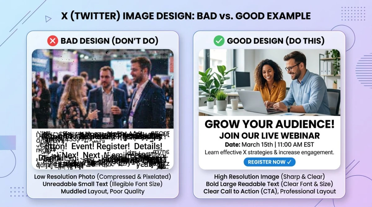
Strong contrast. A huge chunk of X users run dark mode. Your image needs to read on both light and dark backgrounds. Test by previewing in both modes (Settings → Display → Dark mode toggle). If your image disappears into either, increase the foreground contrast.
Big, readable text. If you put text on the image — quote, stat, headline — make it at least 32 pixels tall in your source file. Anything smaller becomes a smudge on a phone. Use the free color contrast checker to verify your text passes WCAG AA.
Lead with the subject. The first 30% of the image (left side on desktop, top on mobile) sets whether someone keeps scrolling. Faces, large text, and bright color blocks earn more stops than landscape backgrounds.
One image > four images, usually. Single-image posts get a bigger feed preview, which means more attention. Use the 4-grid only when you genuinely need four photos — otherwise it dilutes the impact.
Native upload beats link cards. A photo posted directly performs better than a link with a card preview. If you want both, post the image natively and put the link in a reply.
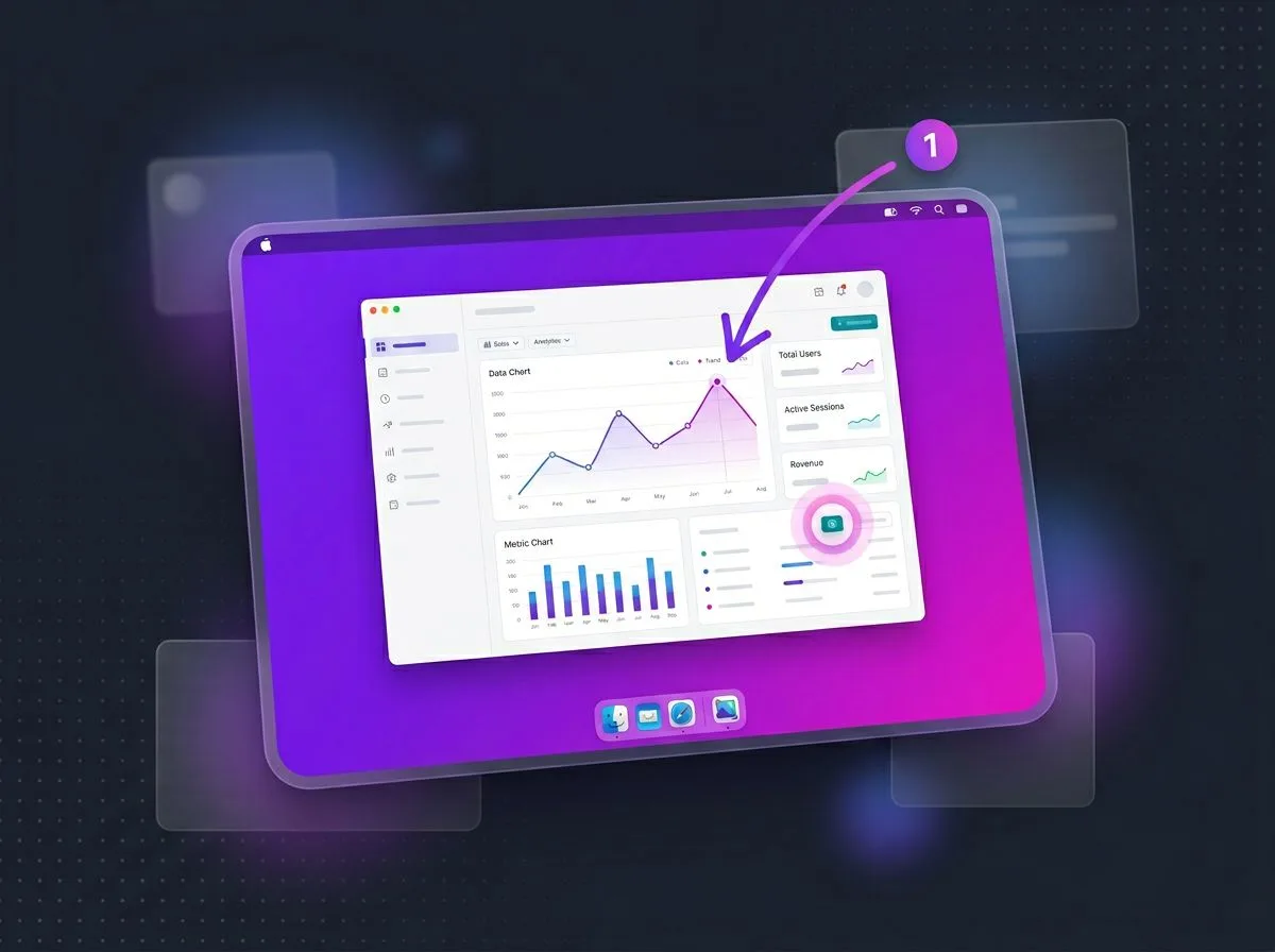
ScreenSnap Pro: capture, polish, post
For a lot of X users, the image is a screenshot — a code snippet, a stat from a dashboard, a UI bug, a dunk on a quote tweet. The default OS screenshot tool on Mac and Windows captures the pixels, but the result usually looks raw on a polished feed.
ScreenSnap Pro is built for that workflow. It captures the screen, drops the result on one of 500+ gradient backgrounds at the right ratio for X, and gives you 15 annotation tools (arrows, blur for sensitive info, highlighter, counter for tutorials, text labels) before you share. One-time $39 purchase, Mac and Windows, no subscription, no watermark on the export. From capture to tweet in under 60 seconds.
For the screenshot-heavy crowd — devs, designers, marketers shipping product updates — that's the difference between an image that looks like a screenshot and an image that looks like content.
Why is my Twitter image cropped, blurry, or compressed?
Three different problems with three different fixes.
"X is cropping my image." You uploaded an aspect ratio X doesn't fit cleanly into the feed preview. Fix: re-export at 16:9 (1200×675) or 1:1 (1200×1200). Crop it yourself before upload so you control what stays in frame, instead of letting X make the call.
"My image looks blurry on Twitter." Your source file is too small or too compressed. X applies its own compression on top of yours. Fix: upload a 1200×675 source at high quality (90%+ JPG, or PNG if it has flat color and text). Don't upload anything smaller than 1200 pixels wide.
"Colors look washed out." X's compressor flattens saturation. Fix: bump saturation +5 to +10 in your source, and use sRGB color profile (not CMYK or Adobe RGB). Most editors default to sRGB now, but if you exported from a print-design tool, double-check.
"Text in my image is unreadable." Either the text is under 32 pixels, the contrast is too low, or compression killed it. Fix: bigger type, higher contrast, and post the image as PNG if it's mostly text on a flat background.
For pre-flight checks across all of these, the free image compressor, image cropper, and color contrast checker cover most cases. Run your image through them before you hit Post.
Cross-posting: one image, every platform
If you post the same content across X, LinkedIn, Instagram, and Facebook, the dimensions overlap more than you'd think.
| Platform | Best in-feed size | Aspect ratio | Match for X |
|---|---|---|---|
| X (Twitter) | 1200×675 | 16:9 | — |
| 1200×627 | ~1.91:1 | Use 1200×675, scales fine | |
| 1200×630 | 1.91:1 | Same as above | |
| Instagram feed | 1080×1080 or 1080×1350 | 1:1 / 4:5 | Square 1200×1200 works on both |
For the full breakdown, our social media image sizes cheat sheet has every platform with crop notes. It's the one to bookmark if you run multi-platform content.
The rough rule: design at 1200×675 for X-first content, 1200×1200 if Instagram is also a target. Anything else is over-engineering.
Frequently Asked Questions
Wrap-up
The short version: post at 1200×675 for almost everything, 1200×1200 if you want square, 1200×628 for link card previews, and keep every file under 5MB. Add alt text. Boost contrast a touch to survive compression. Crop on the way in so X doesn't crop on the way out.
For the matching guide on header images (the wide banner across the top of your profile), the Twitter banner size guide covers the safe zones, the avatar overlap, and why the old 1024×512 spec is wrong. And if you cross-post, the social media image sizes cheat sheet keeps every platform's specs in one table.
Morgan
Indie DeveloperIndie developer, founder of ScreenSnap Pro. A decade of shipping consumer Mac apps and developer tools. Read full bio
@m_0_r_g_a_n_