# What is WCAG? A Plain-English Guide to Web Accessibility (2026)
WCAG (Web Content Accessibility Guidelines) is the global standard for digital accessibility, published by the World Wide Web Consortium (W3C). The current version is WCAG 2.2, and most teams target conformance level AA. The guidelines are built on four principles (Perceivable, Operable, Understandable, and Robust) that together cover how people with disabilities use the web.
If you build websites or apps in 2026, the word "WCAG" is going to come up. It will come up in design reviews. It will come up in vendor security questionnaires. And, increasingly, it will come up in legal letters. ADA Title III lawsuits have set new records year after year, the European Accessibility Act (EAA) became enforceable on June 28, 2025, and the U.S. Department of Justice has finalized a rule under ADA Title II that points state and local governments straight at WCAG 2.1 Level AA.
So this is the primer. What WCAG actually is, who has to follow it, what the levels and principles mean, and where to start if you only have an afternoon. No legalese, no jargon, just the parts that matter for shipping accessible work.
On this page The 4-step afternoon plan for when you only have a few hoursA short history of WCAG Who WCAG applies to , with laws by region and sectorThe 4 POUR principles : Perceivable, Operable, Understandable, RobustWCAG levels: A, AA, AAA and which one to targetThe most-violated WCAG criteria , the 8 issues to fix firstHow to test for WCAG compliance : automated, manual, professionalCommon WCAG myths, busted What's coming: WCAG 3.0 Resources and where to go next FAQ The 4-step afternoon plan If you have one afternoon and want maximum impact before reading the rest of this guide, do these four things in order. Each step on its own moves the needle; together they fix most of what an automated tool would flag in a real audit.
Run axe DevTools on your three highest-traffic pages. Note every contrast and label failure. Fix every contrast failure with our color contrast checker . This alone clears the single most common WCAG violation on the web. Tab through each page with the keyboard. Note any traps, dead ends, or invisible focus rings. Audit alt text on the homepage and main product pages. See image alt text for what good looks like. That alone moves you a long way toward AA. The rest of this article gives you the why , the framework, and the deeper testing playbook so the work compounds instead of becoming busywork.
A short history of WCAG The web's accessibility standard is older than most of the frameworks you use day to day. Here is the rough timeline:
WCAG 1.0 (1999). The original guidelines. Heavily focused on HTML, written before single-page apps existed.WCAG 2.0 (2008). The rewrite that introduced the POUR principles and the A/AA/AAA conformance model. Still cited in many laws.WCAG 2.1 (2018). Added 17 new criteria covering mobile, low vision, and cognitive disabilities.WCAG 2.2 (2023). Published in October 2023. Adds 9 new criteria (focus appearance, dragging movements, target size, and more).WCAG 3.0 (in development). A complete rethink with a scoring model instead of pass/fail. Still a working draft, no firm release date.The W3C is the standards body. Inside the W3C, the Web Accessibility Initiative (WAI) does the actual writing. Both governments and private companies cite WCAG by version number, so "WCAG 2.1 AA" and "WCAG 2.2 AA" mean different (though similar) things in a contract.
Who WCAG applies to Government, retail, school, and healthcare icons orbiting a globe, showing the wide reach of WCAG accessibility rules Short answer: in 2026, WCAG applies to a lot more sites than it used to. The reach depends on where you operate and who your users are.
Government and public sector In the United States, Section 508 of the Rehabilitation Act requires federal agencies and their contractors to meet WCAG 2.0 Level AA. The 2024 ADA Title II rule extends similar requirements to state and local governments by 2026 or 2027, depending on size. Public universities are covered under Section 504 of the Rehabilitation Act.
In the European Union, public sector bodies have been subject to the Web Accessibility Directive since 2018. That directive points to WCAG 2.1 AA via the EN 301 549 harmonized standard.
Public-facing commercial sites (ADA Title III) This is the big one for businesses. ADA Title III covers "places of public accommodation," and U.S. courts have ruled that this includes websites with a clear nexus to a physical business, and increasingly websites on their own.
ADA Title III web-accessibility lawsuits run in the thousands of federal filings every year, with retail, food service, and entertainment consistently leading the pack. See the latest Seyfarth ADA Title III filings tracker for the current count. Most settlements require WCAG 2.1 AA conformance with annual audits.
European Accessibility Act (EAA) The EAA went into force on June 28, 2025. It applies to private companies selling certain products and services to EU consumers: e-commerce, banking, e-books, transport ticketing, telecoms, and more. Even if you are based outside the EU, if you sell to EU consumers, you are likely in scope. The technical baseline is WCAG 2.1 AA.
Education and healthcare Section 504 of the Rehabilitation Act and Title II of the ADA pull most U.S. schools and universities in. Healthcare providers receiving federal funding (basically all of them) are covered by Section 1557 of the Affordable Care Act, which has been read to require WCAG conformance for patient-facing tools.
Voluntary adoption Plenty of private companies follow WCAG even when not strictly required. Reasons range from procurement (enterprise customers ask for VPATs), to talent (accessibility-minded designers want to work somewhere that takes it seriously), to plain good design, since accessible products tend to be clearer for everyone.
The 4 POUR principles Four colorful icons in a 2x2 grid representing the WCAG POUR principles: Perceivable, Operable, Understandable, Robust Every WCAG success criterion sits under one of four principles. The acronym is POUR, and once you know it, the rest of the standard makes a lot more sense.
Perceivable Content has to be presentable to users in ways they can perceive. If a user cannot see, hear, or otherwise sense the content, nothing else matters.
This principle covers alternative text for images, captions and transcripts for video, color contrast, and content that adapts to assistive tech. It does not mean every user must be able to use every sense. It means there is always at least one way to perceive the content.
Two example success criteria:
1.1.1 Non-text Content (Level A). Every image, icon, and chart has a text alternative. We dig into this in our image alt text guide .1.4.3 Contrast (Minimum) (Level AA). Text needs a contrast ratio of at least 4.5:1 against its background (3:1 for large text). For the deep dive, see color contrast and WCAG .Operable Users have to be able to operate the interface. The page has to respond whether they use a keyboard, a mouse, touch, or voice.
This is where keyboard navigation lives. It is also where you find rules about giving users enough time, avoiding seizure-inducing flashes, and helping people find their way around with skip links and clear focus rings.
Two example success criteria:
2.1.1 Keyboard (Level A). All functionality must work from a keyboard alone, no mouse required.2.4.7 Focus Visible (Level AA). When an element gets keyboard focus, the focus state must be visible. Removing default focus rings without replacing them is a classic violation.Understandable Content and the interface must be understandable. That covers readable text, predictable navigation, and helpful error messages on forms.
Understandable does not mean dumbed down. It means consistent: buttons that look like buttons, labels that say what they do, and forms that explain what went wrong instead of just turning red.
Two example success criteria:
3.1.1 Language of Page (Level A). Set a lang attribute on the 3.3.2 Labels or Instructions (Level A). Every form field needs a visible label or clear instructions, not just placeholder text.Robust Content must work across user agents: current browsers, current screen readers, and the assistive tech of five years from now. In practice, this is the principle that says "use semantic HTML and valid ARIA."
If you build a custom dropdown out of tags with click handlers and skip the keyboard and ARIA roles, you fail this principle. Robust is also why screen reader teams care so much about clean markup.
Two example success criteria:
4.1.2 Name, Role, Value (Level A). Every interactive element exposes a name, a role, and any state to assistive tech. Custom components must do this through ARIA.4.1.3 Status Messages (Level AA). Toast notifications, form validation, and other status updates must be announced to screen readers without changing focus.WCAG levels: A, AA, AAA Three rising steps on a podium representing WCAG conformance levels A, AA, and AAA, with badges floating above each step WCAG has three conformance levels. Each one is a higher bar, and each higher bar includes everything below it. In WCAG 2.2, the criteria break down like this:
Level Criteria What it means A 30 The minimum. Failing any of these makes content unusable for some people. AA 50 (cumulative) The industry standard and the level most laws require. AAA 28 (cumulative 78) Enhanced accessibility. Not all content can meet this.
Level A: the floor Level A criteria are baseline. They cover things like "images have alt text," "video has captions," "the page works without a mouse," and "you do not use color alone to convey information." If you fail Level A, real users are locked out.
You should consider Level A the absolute minimum. No serious organization claims Level A as their target. It is what you meet on the way to AA.
Level AA: the standard Level AA is the level cited in ADA settlements, the EAA, Section 508, and most procurement contracts. When someone says a site is "WCAG-compliant," they almost always mean AA.
AA adds tighter contrast requirements, captions for live video, focus indicators, consistent navigation, and resizing without loss of content. It is achievable for nearly all content, and meeting it gets you most of the way to genuine accessibility.
Level AAA: the ceiling AAA is the gold standard. It includes things like 7:1 contrast for normal text, sign language interpretation for prerecorded video, and reading level no higher than lower secondary education.
W3C explicitly says you should not target full AAA conformance for entire sites , because some criteria simply cannot be met by some content. Instead, teams aim for "AA + some AAA where it matters," for example AAA contrast on safety-critical interfaces, or AAA reading level on government information pages.
When someone tells you their site is "WCAG AA compliant," that is the right answer 95 percent of the time. AAA claims should make you ask follow-up questions.
From the makers of this site
Tired of plain screenshots? Try ScreenSnap Pro. Beautiful backgrounds, pro annotations, GIF recording, and instant cloud sharing, all in one app. Pay $39 once, own it forever.
See pricing and features The most-violated WCAG criteria Grid of common web accessibility violations: low contrast text, missing alt text, broken keyboard, unlabeled form, hidden focus ring, and generic links WebAIM publishes an annual analysis of the top one million homepages. The same handful of issues come up year after year. If you fix these, you have done most of the work.
1. Low color contrast (1.4.3) The single most common WCAG failure. WebAIM's annual Million analysis consistently finds low-contrast text on around 80% of homepages. That ratio has barely moved in years.
The rule itself is simple. Normal text needs a 4.5:1 contrast ratio against its background. Large text (24px or 18.66px bold and up) needs 3:1. Logos and incidental decoration are exempt.
The trouble is that designers love light gray on white. It feels modern. It also fails AA in seconds. Run any link, body text, or muted helper copy through our free color contrast checker , or read the longer explainer at color contrast and WCAG for ratios, formulas, and worked fixes.
2. Missing alt text (1.1.1) The second-most-common failure: images without alt attributes, or with placeholder values like alt="image" or alt="picture". Both are barriers: the first leaves screen reader users guessing, the second wastes their time with noise.
Useful alt text describes the image's purpose, not just its contents. Decorative images get alt="" (empty, but the attribute is there). For everything else, our image alt text guide walks through the rules.
3. Form labels missing or wrong (1.3.1, 3.3.2) Forms break under WCAG when fields lack visible labels, when labels are not programmatically connected to inputs, or when placeholder text is used as a label. Once the placeholder disappears on focus, screen reader users have no way to know what the field is for.
The fix is one HTML attribute: Email
4. Keyboard inaccessibility (2.1.1) Custom components built with and click handlers (modals, menus, tabs, sliders) almost always fail keyboard access. Tab into them, and nothing happens. Tab past them, and you are trapped.
The pragmatic fix is to use real elements: tabindex, key handlers for Enter/Space/Arrow keys, and the right ARIA roles.
5. Focus not visible (2.4.7) Designers strip default focus rings because they look "ugly," and then forget to add a replacement. Keyboard users tab into the page and have no idea where they are.
Modern CSS has the answer: :focus-visible lets you show a focus ring only for keyboard users, not mouse clicks. Just do not delete the indicator without replacing it.
6. Empty page titles (2.4.2) Every page needs a unique, descriptive </code>. "Home | Acme" works. "Untitled Document," "Page 2," or just "Acme" do not. Screen reader users hear the title first when a page loads, and tab order in browsers depends on it too.</p><h3 id="7-generic-link-text-244" class="text-xl font-semibold text-white mt-8 mb-3">7. Generic link text (2.4.4)</h3><p class="text-gray-300 leading-relaxed mb-4">"Click here," "read more," and "learn more" are all bad. A screen reader user navigating links-only on a page hears "click here, click here, click here." Useful link text describes the destination: "Read our refund policy," "Download the iOS app."</p><h3 id="8-heading-hierarchy-issues-131" class="text-xl font-semibold text-white mt-8 mb-3">8. Heading hierarchy issues (1.3.1)</h3><p class="text-gray-300 leading-relaxed mb-4">Skipping from <code class="bg-white/10 px-1.5 py-0.5 rounded text-purple-300 text-sm"><h1></code> to <code class="bg-white/10 px-1.5 py-0.5 rounded text-purple-300 text-sm"><h4></code>, using headings for visual styling, or having multiple <code class="bg-white/10 px-1.5 py-0.5 rounded text-purple-300 text-sm"><h1></code> tags on a page all break the document outline that assistive tech relies on. Headings are the table of contents, so they should make sense if you read them in order.</p><h2 id="how-to-test-for-wcag-compliance" class="text-2xl font-bold text-white mt-10 mb-4">How to test for WCAG compliance</h2><figure class="my-8"><img src="https://files.screensnap.pro/blog/cvldntabi3lavvzhcvdt.webp" srcSet="https://files.screensnap.pro/cdn-cgi/image/width=480,format=auto/blog/cvldntabi3lavvzhcvdt.webp 480w, https://files.screensnap.pro/cdn-cgi/image/width=720,format=auto/blog/cvldntabi3lavvzhcvdt.webp 720w, https://files.screensnap.pro/cdn-cgi/image/width=1080,format=auto/blog/cvldntabi3lavvzhcvdt.webp 1080w, https://files.screensnap.pro/cdn-cgi/image/width=1440,format=auto/blog/cvldntabi3lavvzhcvdt.webp 1440w" sizes="(max-width: 768px) calc(100vw - 3rem), 720px" alt="Isometric illustration of a developer's desk showing accessibility audit panels, dev tools, and a magnifying glass over a webpage" class="rounded-xl w-full border border-white/10 shadow-lg" loading="lazy" fetchPriority="auto"/><figcaption class="text-center text-gray-400 text-sm mt-2">Isometric illustration of a developer's desk showing accessibility audit panels, dev tools, and a magnifying glass over a webpage</figcaption></figure><p class="text-gray-300 leading-relaxed mb-4">Testing for WCAG conformance is a layered job. No single tool catches everything. Here is the realistic stack.</p><h3 id="automated-tools-catch-about-30" class="text-xl font-semibold text-white mt-8 mb-3">Automated tools (catch about 30%)</h3><p class="text-gray-300 leading-relaxed mb-4">These are the fast, free, repeatable checks you should run on every page.</p><ul class="list-disc list-inside mb-4 text-gray-300 space-y-2 ml-4"><li><strong class="text-white font-semibold"><a href="https://www.deque.com/axe/devtools/" rel="noopener" target="_blank" class="text-purple-300 hover:text-purple-200 underline">axe DevTools</a>.</strong> Browser extension and CI plugin from Deque. The de facto standard for automated checks.</li><li><strong class="text-white font-semibold"><a href="https://wave.webaim.org/" rel="noopener" target="_blank" class="text-purple-300 hover:text-purple-200 underline">WAVE</a>.</strong> WebAIM's tool, browser extension or web form. Visual and friendly for non-developers.</li><li><strong class="text-white font-semibold">Lighthouse.</strong> Built into Chrome DevTools. Includes an accessibility section, though shallower than axe.</li><li><strong class="text-white font-semibold"><a href="https://pa11y.org/" rel="noopener" target="_blank" class="text-purple-300 hover:text-purple-200 underline">Pa11y</a>.</strong> Command-line accessibility testing. Good for CI pipelines and bulk site audits.</li></ul><p class="text-gray-300 leading-relaxed mb-4">These tools catch missing alt text, low contrast, missing labels, invalid ARIA, and a long list of programmatic checks. They will not catch whether your alt text is meaningful, whether the focus order makes sense, or whether your custom dropdown is actually usable. That is what manual testing is for.</p><h3 id="manual-testing" class="text-xl font-semibold text-white mt-8 mb-3">Manual testing</h3><p class="text-gray-300 leading-relaxed mb-4">The other 70 percent of WCAG issues need a human. The basics:</p><ol class="list-decimal list-inside mb-4 text-gray-300 space-y-2 ml-4"><li><strong class="text-white font-semibold">Keyboard nav.</strong> Unplug your mouse. Tab through every page. Can you reach everything? Can you escape every modal? Is the focus visible?</li><li><strong class="text-white font-semibold">Screen reader.</strong> VoiceOver on Mac, NVDA on Windows. Listen to a few flows and see whether they actually make sense.</li><li><strong class="text-white font-semibold">Zoom.</strong> Zoom the browser to 200% and 400%. Does the layout still work, or do controls disappear off-screen?</li><li><strong class="text-white font-semibold">Reduced motion.</strong> Turn on "Reduce motion" in your OS. Are autoplaying animations disabled?</li></ol><p class="text-gray-300 leading-relaxed mb-4">The MDN team's <a href="https://developer.mozilla.org/en-US/docs/Web/Accessibility/Guides/Understanding_WCAG" rel="noopener" target="_blank" class="text-purple-300 hover:text-purple-200 underline">Understanding WCAG guide</a> is a good reference if you want to dig deeper into specific criteria during a manual pass.</p><h3 id="professional-audits" class="text-xl font-semibold text-white mt-8 mb-3">Professional audits</h3><p class="text-gray-300 leading-relaxed mb-4">When the stakes are high (government contracts, healthcare, financial services, anything with regulatory exposure), bring in a professional team. Vendors like Deque, <a href="https://www.levelaccess.com/" rel="noopener" target="_blank" class="text-purple-300 hover:text-purple-200 underline">Level Access</a>, and TPGi do full WCAG audits with expert reviewers and produce VPAT documents your procurement team will ask for.</p><p class="text-gray-300 leading-relaxed mb-4">A serious audit costs in the low thousands per site for small projects and tens of thousands for large platforms. The output is a list of specific failures, severity ratings, and recommended fixes, typically delivered as both a WCAG conformance report and a VPAT.</p><h3 id="pro-tip-capture-issues-with-annotated-screenshots" class="text-xl font-semibold text-white mt-8 mb-3">Pro tip: capture issues with annotated screenshots</h3><p class="text-gray-300 leading-relaxed mb-4">When you find a WCAG issue, the fix often lives in a different codebase than where you found it. A short Loom or an annotated screenshot in your bug tracker is way faster than describing "the focus ring disappears on the third tab inside the search modal" in words.</p><p class="text-gray-300 leading-relaxed mb-4">This is where a quick capture-and-annotate tool earns its keep. ScreenSnap Pro lets you grab a region, draw an arrow on the broken focus state, blur any sensitive data, and drop the result straight into Linear or GitHub, which is useful when you are filing accessibility tickets day after day. It also runs on both Mac and Windows for cross-platform teams. Pay once, $39, and you keep it forever, which beats the per-seat pricing of most subscription capture tools.</p><h2 id="common-wcag-myths-busted" class="text-2xl font-bold text-white mt-10 mb-4">Common WCAG myths, busted</h2><p class="text-gray-300 leading-relaxed mb-4">A few patterns come up over and over again. They are wrong, and they cost teams real time.</p><p class="text-gray-300 leading-relaxed mb-4"><strong class="text-white font-semibold">Myth: "Automated tools catch everything."</strong> False. Independent studies put automated coverage at around 30% of WCAG issues. Tools tell you that alt text exists; they cannot tell you whether the alt text is useful. Tools tell you that focus is visible; they cannot tell you whether the focus order makes sense.</p><p class="text-gray-300 leading-relaxed mb-4"><strong class="text-white font-semibold">Myth: "WCAG is only for blind users."</strong> False. WCAG covers visual, auditory, motor, cognitive, and speech disabilities. It also helps users with temporary impairments (broken arm, eye strain), situational ones (bright sun, noisy environment), and aging-related changes.</p><p class="text-gray-300 leading-relaxed mb-4"><strong class="text-white font-semibold">Myth: "AA is mandatory by law everywhere."</strong> Depends on jurisdiction. ADA Title III in the U.S. does not name a specific WCAG version, though courts and the DOJ consistently point at WCAG 2.1 AA. Section 508 does name a version. The EAA names WCAG 2.1 AA via EN 301 549. If you operate in multiple countries, talk to a lawyer who knows accessibility law.</p><p class="text-gray-300 leading-relaxed mb-4"><strong class="text-white font-semibold">Myth: "Adding <code class="bg-white/10 px-1.5 py-0.5 rounded text-purple-300 text-sm">alt="image"</code> is enough."</strong> Painfully false. That kind of placeholder is sometimes worse than nothing, because it tells screen readers "there is an image here, called image." Useful alt text describes the purpose. Our <a href="/blog/image-alt-text" class="text-purple-300 hover:text-purple-200 underline">image alt text guide</a> covers what good looks like.</p><p class="text-gray-300 leading-relaxed mb-4"><strong class="text-white font-semibold">Myth: "Overlay widgets make my site WCAG-compliant."</strong> Heavily disputed. Most accessibility experts and disability advocates argue that overlays do not fix underlying WCAG failures and sometimes introduce new ones. They are not a substitute for accessible code.</p><p class="text-gray-300 leading-relaxed mb-4"><strong class="text-white font-semibold">Myth: "WCAG conflicts with good design."</strong> Not really. Most WCAG criteria are about clear hierarchy, readable text, predictable behavior, and meaningful labels. Those are good design.</p><h2 id="whats-coming-wcag-30" class="text-2xl font-bold text-white mt-10 mb-4">What's coming: WCAG 3.0</h2><figure class="my-8"><img src="https://files.screensnap.pro/blog/mvgjnmqktmitca0k3iug.webp" srcSet="https://files.screensnap.pro/cdn-cgi/image/width=480,format=auto/blog/mvgjnmqktmitca0k3iug.webp 480w, https://files.screensnap.pro/cdn-cgi/image/width=720,format=auto/blog/mvgjnmqktmitca0k3iug.webp 720w, https://files.screensnap.pro/cdn-cgi/image/width=1080,format=auto/blog/mvgjnmqktmitca0k3iug.webp 1080w, https://files.screensnap.pro/cdn-cgi/image/width=1440,format=auto/blog/mvgjnmqktmitca0k3iug.webp 1440w" sizes="(max-width: 768px) calc(100vw - 3rem), 720px" alt="Glowing roadmap path leading to floating blueprint sketches of future WCAG 3.0 accessibility features" class="rounded-xl w-full border border-white/10 shadow-lg" loading="lazy" fetchPriority="auto"/><figcaption class="text-center text-gray-400 text-sm mt-2">Glowing roadmap path leading to floating blueprint sketches of future WCAG 3.0 accessibility features</figcaption></figure><p class="text-gray-300 leading-relaxed mb-4">WCAG 3.0 is the next major version, and it is a big rewrite. It is still a working draft with no firm release date, and most observers expect a full Recommendation no earlier than 2027.</p><p class="text-gray-300 leading-relaxed mb-4">Two changes worth knowing now:</p><ol class="list-decimal list-inside mb-4 text-gray-300 space-y-2 ml-4"><li><strong class="text-white font-semibold">Scoring instead of pass/fail.</strong> WCAG 2.x is binary: you either meet the criterion or you fail. WCAG 3.0 introduces a scoring model with bronze, silver, and gold levels, weighting more impactful issues more heavily. The aim is to better reflect real user experience.</li><li><strong class="text-white font-semibold">Broader scope.</strong> WCAG 3.0 covers more than web pages. It explicitly includes apps, tools, AR/VR, and emerging interaction models.</li></ol><p class="text-gray-300 leading-relaxed mb-4">You do not need to chase WCAG 3.0 today. Most laws and contracts will reference WCAG 2.1 or 2.2 AA for years. But if you are reading the <a href="https://www.w3.org/WAI/standards-guidelines/wcag/wcag3-intro/" rel="noopener" target="_blank" class="text-purple-300 hover:text-purple-200 underline">W3C's WCAG 3 introduction</a> and seeing your team in the silver-level descriptions, you are in good shape for the transition.</p><h2 id="resources-and-where-to-go-next" class="text-2xl font-bold text-white mt-10 mb-4">Resources and where to go next</h2><p class="text-gray-300 leading-relaxed mb-4">A short curated list of the resources that are actually worth bookmarking.</p><h3 id="official-sources-start-here" class="text-xl font-semibold text-white mt-8 mb-3">Official sources (start here)</h3><ul class="list-disc list-inside mb-4 text-gray-300 space-y-2 ml-4"><li><strong class="text-white font-semibold"><a href="https://www.w3.org/WAI/standards-guidelines/wcag/" rel="noopener" target="_blank" class="text-purple-300 hover:text-purple-200 underline">W3C WAI's WCAG overview</a>.</strong> The canonical home of the standard.</li><li><strong class="text-white font-semibold"><a href="https://www.w3.org/WAI/WCAG22/quickref/" rel="noopener" target="_blank" class="text-purple-300 hover:text-purple-200 underline">WCAG 2.2 Quick Reference</a>.</strong> Every success criterion, filterable by level and version. The single most useful page for day-to-day work.</li><li><strong class="text-white font-semibold"><a href="https://webaim.org/intro/" rel="noopener" target="_blank" class="text-purple-300 hover:text-purple-200 underline">WebAIM intro</a>.</strong> The practical, plain-English explainer. Good to share with stakeholders who do not want to read the spec.</li></ul><h3 id="tooling" class="text-xl font-semibold text-white mt-8 mb-3">Tooling</h3><ul class="list-disc list-inside mb-4 text-gray-300 space-y-2 ml-4"><li><strong class="text-white font-semibold"><a href="https://www.deque.com/axe/devtools/" rel="noopener" target="_blank" class="text-purple-300 hover:text-purple-200 underline">axe DevTools</a>.</strong> Browser extension for fast checks.</li><li><strong class="text-white font-semibold"><a href="https://wave.webaim.org/" rel="noopener" target="_blank" class="text-purple-300 hover:text-purple-200 underline">WAVE</a>.</strong> Visual reports for non-developers.</li><li><strong class="text-white font-semibold"><a href="https://pa11y.org/" rel="noopener" target="_blank" class="text-purple-300 hover:text-purple-200 underline">Pa11y</a>.</strong> Automated accessibility testing for CI.</li><li><strong class="text-white font-semibold"><a href="https://www.section508.gov/" rel="noopener" target="_blank" class="text-purple-300 hover:text-purple-200 underline">Section508.gov</a>.</strong> U.S. federal accessibility resources, including buying and policy guidance.</li></ul><h3 id="hands-on-tools-we-maintain" class="text-xl font-semibold text-white mt-8 mb-3">Hands-on tools we maintain</h3><ul class="list-disc list-inside mb-4 text-gray-300 space-y-2 ml-4"><li><a href="/tools/color-contrast-checker" class="text-purple-300 hover:text-purple-200 underline">Color contrast checker</a>: paste two colors, get an instant WCAG AA/AAA verdict.</li><li><a href="/tools/color-blindness-simulator" class="text-purple-300 hover:text-purple-200 underline">Color blindness simulator</a>: see how your design looks under common forms of color vision deficiency.</li><li><a href="/blog/color-theory" class="text-purple-300 hover:text-purple-200 underline">Color theory primer</a>: broader background on choosing palettes that hold up.</li></ul><h3 id="where-to-go-after-the-afternoon-plan" class="text-xl font-semibold text-white mt-8 mb-3">Where to go after the afternoon plan</h3><p class="text-gray-300 leading-relaxed mb-4">You've already seen the <a href="#the-4-step-afternoon-plan" class="text-purple-300 hover:text-purple-200 underline">4-step afternoon plan</a> at the top of this article. Once that's done, the next layer of work is:</p><ol class="list-decimal list-inside mb-4 text-gray-300 space-y-2 ml-4"><li>Schedule a manual screen reader pass (VoiceOver on Mac, NVDA on Windows) on your top user flows.</li><li>Run a zoom test at 200% and 400% on every key page.</li><li>Add accessibility checks (axe-core or pa11y) to your CI pipeline so regressions don't ship.</li><li>If you have regulatory exposure (government, healthcare, finance), book a professional audit and get a VPAT.</li></ol><p class="text-gray-300 leading-relaxed mb-4">Each step is a multiple of the one before it in effort, but each catches a layer of issues automated tools miss.</p><h2 id="frequently-asked-questions" class="text-2xl font-bold text-white mt-10 mb-4">Frequently Asked Questions</h2><div class="space-y-3 mb-6"><div class="border border-white/10 rounded-xl overflow-hidden"><button class="w-full flex items-center justify-between px-5 py-4 text-left text-white font-semibold hover:bg-white/5 transition-colors"><span>What does WCAG stand for?</span><svg xmlns="http://www.w3.org/2000/svg" fill="none" viewBox="0 0 24 24" stroke-width="1.5" stroke="currentColor" aria-hidden="true" data-slot="icon" class="w-5 h-5 text-gray-400 transition-transform duration-200 flex-shrink-0 ml-4 "><path stroke-linecap="round" stroke-linejoin="round" d="m19.5 8.25-7.5 7.5-7.5-7.5"></path></svg></button></div><div class="border border-white/10 rounded-xl overflow-hidden"><button class="w-full flex items-center justify-between px-5 py-4 text-left text-white font-semibold hover:bg-white/5 transition-colors"><span>Is WCAG legally required?</span><svg xmlns="http://www.w3.org/2000/svg" fill="none" viewBox="0 0 24 24" stroke-width="1.5" stroke="currentColor" aria-hidden="true" data-slot="icon" class="w-5 h-5 text-gray-400 transition-transform duration-200 flex-shrink-0 ml-4 "><path stroke-linecap="round" stroke-linejoin="round" d="m19.5 8.25-7.5 7.5-7.5-7.5"></path></svg></button></div><div class="border border-white/10 rounded-xl overflow-hidden"><button class="w-full flex items-center justify-between px-5 py-4 text-left text-white font-semibold hover:bg-white/5 transition-colors"><span>What's the difference between WCAG A, AA, and AAA?</span><svg xmlns="http://www.w3.org/2000/svg" fill="none" viewBox="0 0 24 24" stroke-width="1.5" stroke="currentColor" aria-hidden="true" data-slot="icon" class="w-5 h-5 text-gray-400 transition-transform duration-200 flex-shrink-0 ml-4 "><path stroke-linecap="round" stroke-linejoin="round" d="m19.5 8.25-7.5 7.5-7.5-7.5"></path></svg></button></div><div class="border border-white/10 rounded-xl overflow-hidden"><button class="w-full flex items-center justify-between px-5 py-4 text-left text-white font-semibold hover:bg-white/5 transition-colors"><span>What is WCAG 2.2?</span><svg xmlns="http://www.w3.org/2000/svg" fill="none" viewBox="0 0 24 24" stroke-width="1.5" stroke="currentColor" aria-hidden="true" data-slot="icon" class="w-5 h-5 text-gray-400 transition-transform duration-200 flex-shrink-0 ml-4 "><path stroke-linecap="round" stroke-linejoin="round" d="m19.5 8.25-7.5 7.5-7.5-7.5"></path></svg></button></div><div class="border border-white/10 rounded-xl overflow-hidden"><button class="w-full flex items-center justify-between px-5 py-4 text-left text-white font-semibold hover:bg-white/5 transition-colors"><span>How do I check if my site is WCAG compliant?</span><svg xmlns="http://www.w3.org/2000/svg" fill="none" viewBox="0 0 24 24" stroke-width="1.5" stroke="currentColor" aria-hidden="true" data-slot="icon" class="w-5 h-5 text-gray-400 transition-transform duration-200 flex-shrink-0 ml-4 "><path stroke-linecap="round" stroke-linejoin="round" d="m19.5 8.25-7.5 7.5-7.5-7.5"></path></svg></button></div><div class="border border-white/10 rounded-xl overflow-hidden"><button class="w-full flex items-center justify-between px-5 py-4 text-left text-white font-semibold hover:bg-white/5 transition-colors"><span>What are the POUR principles?</span><svg xmlns="http://www.w3.org/2000/svg" fill="none" viewBox="0 0 24 24" stroke-width="1.5" stroke="currentColor" aria-hidden="true" data-slot="icon" class="w-5 h-5 text-gray-400 transition-transform duration-200 flex-shrink-0 ml-4 "><path stroke-linecap="round" stroke-linejoin="round" d="m19.5 8.25-7.5 7.5-7.5-7.5"></path></svg></button></div><div class="border border-white/10 rounded-xl overflow-hidden"><button class="w-full flex items-center justify-between px-5 py-4 text-left text-white font-semibold hover:bg-white/5 transition-colors"><span>Does WCAG apply to mobile apps?</span><svg xmlns="http://www.w3.org/2000/svg" fill="none" viewBox="0 0 24 24" stroke-width="1.5" stroke="currentColor" aria-hidden="true" data-slot="icon" class="w-5 h-5 text-gray-400 transition-transform duration-200 flex-shrink-0 ml-4 "><path stroke-linecap="round" stroke-linejoin="round" d="m19.5 8.25-7.5 7.5-7.5-7.5"></path></svg></button></div><div class="border border-white/10 rounded-xl overflow-hidden"><button class="w-full flex items-center justify-between px-5 py-4 text-left text-white font-semibold hover:bg-white/5 transition-colors"><span>What's the fastest accessibility win I can ship today?</span><svg xmlns="http://www.w3.org/2000/svg" fill="none" viewBox="0 0 24 24" stroke-width="1.5" stroke="currentColor" aria-hidden="true" data-slot="icon" class="w-5 h-5 text-gray-400 transition-transform duration-200 flex-shrink-0 ml-4 "><path stroke-linecap="round" stroke-linejoin="round" d="m19.5 8.25-7.5 7.5-7.5-7.5"></path></svg></button></div></div><h2 id="bottom-line" class="text-2xl font-bold text-white mt-10 mb-4">Bottom line</h2><p class="text-gray-300 leading-relaxed mb-4">WCAG is the standard. The current version is 2.2, the level most teams aim for is AA, and the four principles you will keep coming back to are Perceivable, Operable, Understandable, and Robust. Color contrast, alt text, keyboard access, and visible focus are the four areas where most sites fall short, and also the four areas where a small fix delivers the biggest user benefit.</p><p class="text-gray-300 leading-relaxed mb-4">If you want a free starting point, run your colors through our <a href="/tools/color-contrast-checker" class="text-purple-300 hover:text-purple-200 underline">color contrast checker</a>, tab through your homepage, and check your alt text. That is enough to ship a measurably more accessible product this week.</p></div><div class="mt-12 bg-gradient-to-br from-white/[0.06] to-white/[0.02] backdrop-blur-2xl rounded-2xl p-6 border border-white/[0.15]"><div class="text-xs font-semibold uppercase tracking-wider text-purple-300 mb-4">Author</div><div class="flex items-start gap-4 sm:gap-5"><img src="/images/morgan-avatar.webp" alt="Morgan" class="w-16 h-16 sm:w-20 sm:h-20 rounded-full object-cover ring-2 ring-white/10 flex-shrink-0"/><div class="flex-1 min-w-0"><div class="flex flex-wrap items-baseline gap-x-3 gap-y-1"><h3 class="text-lg sm:text-xl font-bold text-white"><a class="hover:text-purple-200 transition-colors" href="/author/morgan">Morgan</a></h3><span class="text-sm text-gray-400">Indie Developer</span></div><p class="mt-2 text-sm text-gray-300 leading-relaxed">Indie developer, founder of ScreenSnap Pro. A decade of shipping consumer Mac apps and developer tools.<!-- --> <a class="text-purple-300 hover:text-purple-200 underline decoration-purple-300/30 underline-offset-2" href="/author/morgan">Read full bio</a></p><a href="https://x.com/m_0_r_g_a_n_" target="_blank" rel="noopener" class="inline-flex items-center gap-1.5 mt-3 text-sm text-purple-300 hover:text-purple-200 font-medium group"><svg class="w-3.5 h-3.5" viewBox="0 0 24 24" fill="currentColor" aria-hidden="true"><path d="M18.244 2.25h3.308l-7.227 8.26 8.502 11.24H16.17l-5.214-6.817L4.99 21.75H1.68l7.73-8.835L1.254 2.25H8.08l4.713 6.231zm-1.161 17.52h1.833L7.084 4.126H5.117z"></path></svg><span class="border-b border-purple-300/40 group-hover:border-purple-200 transition-colors">@<!-- -->m_0_r_g_a_n_</span></a></div></div></div></article><div class="max-w-5xl mx-auto px-6 lg:px-8 mt-20"><h2 class="text-2xl font-bold text-white mb-8">Related articles</h2><div class="grid md:grid-cols-3 gap-6"><a class="block" href="/blog/color-contrast-wcag"><div class="bg-gradient-to-br from-white/[0.06] to-white/[0.02] backdrop-blur-2xl rounded-2xl shadow-[0_4px_20px_0_rgba(0,0,0,0.3)] border border-white/[0.15] overflow-hidden transition-all duration-500 hover:shadow-[0_8px_32px_0_rgba(0,0,0,0.4)] hover:from-white/[0.10] hover:to-white/[0.04] hover:border-white/25 hover:scale-[1.02] group h-full"><div class="aspect-[16/9] overflow-hidden"><img src="https://files.screensnap.pro/blog/o8uclmn1kfyc08zqspwa.webp" alt="WCAG Color Contrast: AA, AAA Rules & How to Test (2026)" class="w-full h-full object-cover group-hover:scale-105 transition-transform duration-500" loading="lazy"/></div><div class="p-5"><div class="flex items-center gap-2 text-gray-400 text-xs mb-2"><span>8 min</span><span>•</span><span>July 12, 2026</span></div><h3 class="text-base font-semibold text-white group-hover:text-purple-200 transition-colors line-clamp-2">WCAG Color Contrast: AA, AAA Rules & How to Test (2026)</h3></div></div></a><a class="block" href="/blog/image-alt-text"><div class="bg-gradient-to-br from-white/[0.06] to-white/[0.02] backdrop-blur-2xl rounded-2xl shadow-[0_4px_20px_0_rgba(0,0,0,0.3)] border border-white/[0.15] overflow-hidden transition-all duration-500 hover:shadow-[0_8px_32px_0_rgba(0,0,0,0.4)] hover:from-white/[0.10] hover:to-white/[0.04] hover:border-white/25 hover:scale-[1.02] group h-full"><div class="aspect-[16/9] overflow-hidden"><img src="https://files.screensnap.pro/blog/cclmpmn1ylne0bdh12up.webp" alt="Image Alt Text Guide: A11y + SEO + Screenshots (2026)" class="w-full h-full object-cover group-hover:scale-105 transition-transform duration-500" loading="lazy"/></div><div class="p-5"><div class="flex items-center gap-2 text-gray-400 text-xs mb-2"><span>16 min</span><span>•</span><span>July 8, 2026</span></div><h3 class="text-base font-semibold text-white group-hover:text-purple-200 transition-colors line-clamp-2">Image Alt Text Guide: A11y + SEO + Screenshots (2026)</h3></div></div></a><a class="block" href="/blog/color-theory"><div class="bg-gradient-to-br from-white/[0.06] to-white/[0.02] backdrop-blur-2xl rounded-2xl shadow-[0_4px_20px_0_rgba(0,0,0,0.3)] border border-white/[0.15] overflow-hidden transition-all duration-500 hover:shadow-[0_8px_32px_0_rgba(0,0,0,0.4)] hover:from-white/[0.10] hover:to-white/[0.04] hover:border-white/25 hover:scale-[1.02] group h-full"><div class="aspect-[16/9] overflow-hidden"><img src="https://files.screensnap.pro/blog/mvunbbo5gae1zso5h2b5.webp" alt="Color Theory for Designers (2026 Guide & Cheat Sheet)" class="w-full h-full object-cover group-hover:scale-105 transition-transform duration-500" loading="lazy"/></div><div class="p-5"><div class="flex items-center gap-2 text-gray-400 text-xs mb-2"><span>18 min</span><span>•</span><span>July 2, 2026</span></div><h3 class="text-base font-semibold text-white group-hover:text-purple-200 transition-colors line-clamp-2">Color Theory for Designers (2026 Guide & Cheat Sheet)</h3></div></div></a></div></div></div></div><footer class="relative bg-slate-950 overflow-hidden" aria-labelledby="footer-heading"><h2 id="footer-heading" class="sr-only">Footer</h2><div class="h-px bg-gradient-to-r from-transparent via-white/[0.12] to-transparent"></div><div class="mx-auto max-w-7xl px-6 lg:px-8"><div class="flex flex-col md:flex-row md:items-center md:justify-between gap-8 py-12 border-b border-white/[0.06]"><div class="max-w-md"><a class="inline-flex items-center gap-3 select-none" href="/"><div class="p-1.5 bg-white/[0.06] rounded-xl border border-white/[0.08] transition-all duration-300"><img alt="ScreenSnap Pro" fetchpriority="high" width="28" height="28" decoding="async" data-nimg="1" class="rounded-lg" style="color:transparent" srcSet="/_next/image?url=%2Fimages%2Ficon.png&w=32&q=75 1x, /_next/image?url=%2Fimages%2Ficon.png&w=64&q=75 2x" src="/_next/image?url=%2Fimages%2Ficon.png&w=64&q=75"/></div><span class="text-lg font-bold text-white">ScreenSnap Pro</span></a><p class="mt-4 text-sm leading-relaxed text-gray-400">Beautiful screenshots with stunning backgrounds and powerful annotation tools. Create, edit, and share professional-quality screenshots with ease.</p></div><a class="group inline-flex items-center gap-2.5 bg-white/[0.07] hover:bg-white/[0.12] border border-white/[0.10] hover:border-white/[0.18] text-white text-sm font-medium px-6 py-3 rounded-xl transition-all duration-300 self-start md:self-center" href="/pricing">Get ScreenSnap Pro — $39<svg class="w-4 h-4 text-white/50 group-hover:text-white/80 transition-all group-hover:translate-x-0.5" fill="none" viewBox="0 0 24 24" stroke="currentColor" stroke-width="2"><path stroke-linecap="round" stroke-linejoin="round" d="M13.5 4.5L21 12m0 0l-7.5 7.5M21 12H3"></path></svg></a></div><div class="grid grid-cols-2 sm:grid-cols-3 lg:grid-cols-5 gap-x-8 gap-y-10 py-12"><div><h3 class="text-[13px] font-bold text-white uppercase tracking-wider">Product</h3><ul role="list" class="mt-5 space-y-3"><li><a class="text-sm text-gray-400 hover:text-white transition-colors duration-200" href="/download">Download</a></li><li><a class="text-sm text-gray-400 hover:text-white transition-colors duration-200" href="/documentation">Documentation</a></li><li><a class="text-sm text-gray-400 hover:text-white transition-colors duration-200" href="/changelog">Changelog</a></li><li><a class="text-sm text-gray-400 hover:text-white transition-colors duration-200" href="/pricing">Pricing</a></li><li><a class="text-sm text-gray-400 hover:text-white transition-colors duration-200" href="/support">Support</a></li><li><a class="text-sm text-gray-400 hover:text-white transition-colors duration-200" href="/faq">FAQ</a></li><li><a class="text-sm text-gray-400 hover:text-white transition-colors duration-200" href="/what-is-screensnap-pro">What is ScreenSnap Pro?</a></li><li><a class="text-sm text-gray-400 hover:text-white transition-colors duration-200" href="/blog">Blog</a></li><li><a class="text-sm text-gray-400 hover:text-white transition-colors duration-200" href="/blog/best-screenshot-apps-for-mac">Best Screenshot Apps</a></li><li><a class="text-sm text-gray-400 hover:text-white transition-colors duration-200" href="/sitemap">Sitemap</a></li></ul></div><div><h3 class="text-[13px] font-bold text-white uppercase tracking-wider">Free Tools</h3><ul role="list" class="mt-5 space-y-3"><li><a class="text-sm text-gray-400 hover:text-white transition-colors duration-200" href="/tools">All Free Tools</a></li><li><a class="text-sm text-gray-400 hover:text-white transition-colors duration-200" href="/tools/screenshot-background-generator">Screenshot Backgrounds</a></li><li><a class="text-sm text-gray-400 hover:text-white transition-colors duration-200" href="/tools/image-resizer">Image Resizer</a></li><li><a class="text-sm text-gray-400 hover:text-white transition-colors duration-200" href="/tools/image-format-converter">Image Format Converter</a></li><li><a class="text-sm text-gray-400 hover:text-white transition-colors duration-200" href="/tools/color-palette-extractor">Color Palette Extractor</a></li><li><a class="text-sm text-gray-400 hover:text-white transition-colors duration-200" href="/tools/gif-compressor">GIF Compressor</a></li><li><a class="text-sm text-gray-400 hover:text-white transition-colors duration-200" href="/tools/mac-keyboard-shortcuts">Mac Keyboard Shortcuts</a></li><li><a class="text-sm text-gray-400 hover:text-white transition-colors duration-200" href="/tools/image-to-pdf">Image to PDF</a></li></ul></div><div><h3 class="text-[13px] font-bold text-white uppercase tracking-wider">Converters</h3><ul role="list" class="mt-5 space-y-3"><li><a class="text-sm text-gray-400 hover:text-white transition-colors duration-200" href="/tools/heic-to-jpg">HEIC to JPG</a></li><li><a class="text-sm text-gray-400 hover:text-white transition-colors duration-200" href="/tools/webp-to-jpg">WebP to JPG</a></li><li><a class="text-sm text-gray-400 hover:text-white transition-colors duration-200" href="/tools/png-to-jpg">PNG to JPG</a></li><li><a class="text-sm text-gray-400 hover:text-white transition-colors duration-200" href="/tools/jpg-to-webp">JPG to WebP</a></li><li><a class="text-sm text-gray-400 hover:text-white transition-colors duration-200" href="/tools/svg-to-png">SVG to PNG</a></li><li><a class="text-sm text-gray-400 hover:text-white transition-colors duration-200" href="/tools/png-to-webp">PNG to WebP</a></li><li><a class="text-sm text-gray-400 hover:text-white transition-colors duration-200" href="/tools/pdf-to-image">PDF to Image</a></li></ul></div><div><h3 class="text-[13px] font-bold text-white uppercase tracking-wider">Compare</h3><ul role="list" class="mt-5 space-y-3"><li><a class="text-sm text-gray-400 hover:text-white transition-colors duration-200" href="/compare/screensnap-pro-vs-cleanshot-x">vs CleanShot X</a></li><li><a class="text-sm text-gray-400 hover:text-white transition-colors duration-200" href="/compare/screensnap-pro-vs-snagit">vs Snagit</a></li><li><a class="text-sm text-gray-400 hover:text-white transition-colors duration-200" href="/blog/screensnap-pro-vs-shottr">vs Shottr</a></li><li><a class="text-sm text-gray-400 hover:text-white transition-colors duration-200" href="/compare/screensnap-pro-vs-lightshot">vs Lightshot</a></li><li><a class="text-sm text-gray-400 hover:text-white transition-colors duration-200" href="/compare/screensnap-pro-vs-sharex">vs ShareX</a></li><li><a class="text-sm text-gray-400 hover:text-white transition-colors duration-200" href="/compare/screensnap-pro-vs-greenshot">vs Greenshot</a></li><li><a class="text-sm text-gray-400 hover:text-white transition-colors duration-200" href="/compare/screensnap-pro-vs-monosnap">vs Monosnap</a></li><li><a class="text-sm text-gray-400 hover:text-white transition-colors duration-200" href="/compare/screensnap-pro-vs-macos-screenshot">vs macOS Screenshot</a></li><li><a class="text-sm text-gray-400 hover:text-white transition-colors duration-200" href="/loom-alternative">Loom Alternative</a></li></ul></div><div class="space-y-10"><div><h3 class="text-[13px] font-bold text-white uppercase tracking-wider">Legal</h3><ul role="list" class="mt-5 space-y-3"><li><a class="text-sm text-gray-400 hover:text-white transition-colors duration-200" href="/about">About</a></li><li><a class="text-sm text-gray-400 hover:text-white transition-colors duration-200" href="/legal/privacy.html">Privacy Policy</a></li><li><a class="text-sm text-gray-400 hover:text-white transition-colors duration-200" href="/legal/terms-of-use.html">Terms of Use</a></li></ul></div><div><h3 class="text-[13px] font-bold text-white uppercase tracking-wider">Affiliate</h3><ul role="list" class="mt-5 space-y-3"><li><a rel="nofollow" class="text-sm text-gray-400 hover:text-white transition-colors duration-200" href="/affiliates">Affiliate Program</a></li></ul></div></div></div><div class="border-t border-white/[0.06] py-6 flex flex-col sm:flex-row sm:items-center sm:justify-between gap-3 sm:gap-4"><div class="text-center sm:text-left"><p class="text-xs text-gray-400">© <!-- -->2026<!-- --> ScreenSnap Pro. <!-- -->All rights reserved.</p><p class="text-xs text-gray-500 mt-1.5 max-w-xl">Some links on this site are affiliate links. If you buy through one, we may earn a commission at no extra cost to you. It never changes what we recommend.</p></div><div class="flex items-center gap-4 self-center sm:self-auto"><div class="inline-flex items-center gap-1" role="group" aria-label="Language"><a hrefLang="en" aria-label="Switch to English" aria-current="true" class="flex items-center gap-1.5 text-xs px-2 py-1 rounded transition-colors duration-200 text-white bg-white/[0.08]" href="/blog/what-is-wcag"><svg class="w-4 h-3 rounded-[1px] overflow-hidden" viewBox="0 0 60 30" aria-hidden="true"><clipPath id="lang-en-clip"><path d="M0 0v30h60V0z"></path></clipPath><clipPath id="lang-en-clip2"><path d="M30 15h30v15zv15H0zH0V0zV0h30z"></path></clipPath><g clip-path="url(#lang-en-clip)"><path d="M0 0v30h60V0z" fill="#012169"></path><path d="M0 0l60 30m0-30L0 30" stroke="#fff" stroke-width="6"></path><path d="M0 0l60 30m0-30L0 30" clip-path="url(#lang-en-clip2)" stroke="#C8102E" stroke-width="4"></path><path d="M30 0v30M0 15h60" stroke="#fff" stroke-width="10"></path><path d="M30 0v30M0 15h60" stroke="#C8102E" stroke-width="6"></path></g></svg><span>EN</span></a><a hrefLang="de" aria-label="Auf Deutsch umschalten" class="flex items-center gap-1.5 text-xs px-2 py-1 rounded transition-colors duration-200 text-gray-500 hover:text-white hover:bg-white/[0.04]" href="/de/blog/what-is-wcag"><svg class="w-4 h-3 rounded-[1px] overflow-hidden" viewBox="0 0 5 3" aria-hidden="true"><rect width="5" height="3" y="0" fill="#000"></rect><rect width="5" height="2" y="1" fill="#D00"></rect><rect width="5" height="1" y="2" fill="#FFCE00"></rect></svg><span>DE</span></a><a hrefLang="es" aria-label="Cambiar a español" class="flex items-center gap-1.5 text-xs px-2 py-1 rounded transition-colors duration-200 text-gray-500 hover:text-white hover:bg-white/[0.04]" href="/es"><svg class="w-4 h-3 rounded-[1px] overflow-hidden" viewBox="0 0 3 2" aria-hidden="true"><rect width="3" height="2" fill="#AA151B"></rect><rect width="3" height="1" y="0.5" fill="#F1BF00"></rect></svg><span>ES</span></a></div><a aria-label="Get ScreenSnap Pro for macOS or Windows" class="group inline-flex items-center gap-2 text-xs text-gray-400 hover:text-white transition-colors duration-200" href="/pricing"><span>Get ScreenSnap Pro for</span><svg class="w-3.5 h-3.5" viewBox="0 0 24 24" fill="currentColor" aria-hidden="true"><path d="M18.71 19.5c-.83 1.24-1.71 2.45-3.05 2.47-1.34.03-1.77-.79-3.29-.79-1.53 0-2 .77-3.27.82-1.31.05-2.3-1.32-3.14-2.53C4.25 17 2.94 12.45 4.7 9.39c.87-1.52 2.43-2.48 4.12-2.51 1.28-.02 2.5.87 3.29.87.78 0 2.26-1.07 3.81-.91.65.03 2.47.26 3.64 1.98-.09.06-2.17 1.28-2.15 3.81.03 3.02 2.65 4.03 2.68 4.04-.03.07-.42 1.44-1.38 2.83M13 3.5c.73-.83 1.94-1.46 2.94-1.5.13 1.17-.34 2.35-1.04 3.19-.69.85-1.83 1.51-2.95 1.42-.15-1.15.41-2.35 1.05-3.11z"></path></svg><span>macOS</span><span class="text-gray-500">&</span><svg class="w-3.5 h-3.5" viewBox="0 0 24 24" fill="currentColor" aria-hidden="true"><path d="M3 5.479 10.5 4.45v7.05H3V5.479ZM3 12.5h7.5v7.05L3 18.521V12.5Zm8.5-8.188L21 3v8.5h-9.5V4.312ZM11.5 12.5H21V21l-9.5-1.313V12.5Z"></path></svg><span>Windows</span></a></div></div></div></footer><div class="fixed bottom-4 right-4 z-[90] hidden transition-all duration-500 ease-out md:block translate-y-4 opacity-0"><div class="group relative rounded-2xl bg-gradient-to-br from-amber-300 to-yellow-400 shadow-[0_12px_40px_-8px_rgba(245,158,11,0.55)] ring-1 ring-amber-500/50"><button type="button" aria-label="Dismiss offer" class="absolute -top-2 -right-2 z-10 flex h-6 w-6 items-center justify-center rounded-full border border-amber-200/60 bg-slate-900 text-amber-200 shadow-md transition-colors hover:bg-slate-800 hover:text-white"><svg xmlns="http://www.w3.org/2000/svg" width="24" height="24" viewBox="0 0 24 24" fill="none" stroke="currentColor" stroke-width="2" stroke-linecap="round" stroke-linejoin="round" class="h-3.5 w-3.5"><path d="M18 6 6 18"></path><path d="m6 6 12 12"></path></svg></button><button type="button" aria-label="Open the 30% discount offer" class="flex w-full items-center gap-3 rounded-2xl px-3.5 py-3 text-left transition-transform duration-200 hover:scale-[1.02] active:scale-[0.98]"><img alt="ScreenSnap Pro" loading="lazy" width="40" height="40" decoding="async" data-nimg="1" class="h-10 w-10 flex-shrink-0 rounded-xl shadow-sm" style="color:transparent" srcSet="/_next/image?url=%2Fimages%2Ficon.png&w=48&q=75 1x, /_next/image?url=%2Fimages%2Ficon.png&w=96&q=75 2x" src="/_next/image?url=%2Fimages%2Ficon.png&w=96&q=75"/><div class="min-w-0"><span class="inline-flex items-center gap-1.5 rounded-full bg-slate-900 px-2 py-0.5 text-[10px] font-bold uppercase tracking-wide text-amber-300"><span class="h-1.5 w-1.5 animate-pulse rounded-full bg-amber-400"></span>30% OFF</span><p class="mt-1 text-sm font-bold leading-tight text-slate-900">ScreenSnap Pro deal</p><p class="text-xs leading-tight text-slate-700"><span class="text-slate-500 line-through">$39</span> <span class="font-bold text-slate-900">$27.30</span> <!-- -->one-time</p></div><svg xmlns="http://www.w3.org/2000/svg" width="24" height="24" viewBox="0 0 24 24" fill="none" stroke="currentColor" stroke-width="2" stroke-linecap="round" stroke-linejoin="round" class="h-5 w-5 flex-shrink-0 text-slate-900 transition-transform duration-200 group-hover:translate-x-0.5"><path d="m9 18 6-6-6-6"></path></svg></button></div></div></div><script id="__NEXT_DATA__" type="application/json" crossorigin="">{"props":{"pageProps":{"post":{"slug":"what-is-wcag","title":"What is WCAG? Plain-English Web Accessibility Guide (2026)","description":"WCAG 2.2 explained for designers: the 4 POUR principles, 3 conformance levels, key criteria, and where to start with accessibility audits.","date":"2026-07-14","lastModified":null,"publishDate":"2026-07-14","readTime":"22 min","author":{"name":"Morgan","role":"Indie Developer","twitter":"m_0_r_g_a_n_","guest":false,"bio":null,"hidden":false},"content":"\n# What is WCAG? A Plain-English Guide to Web Accessibility (2026)\n\n\n\n**WCAG (Web Content Accessibility Guidelines) is the global standard for digital accessibility, published by the World Wide Web Consortium (W3C). The current version is WCAG 2.2, and most teams target conformance level AA. The guidelines are built on four principles (Perceivable, Operable, Understandable, and Robust) that together cover how people with disabilities use the web.**\n\nIf you build websites or apps in 2026, the word \"WCAG\" is going to come up. It will come up in design reviews. It will come up in vendor security questionnaires. And, increasingly, it will come up in legal letters. ADA Title III lawsuits have set new records year after year, the European Accessibility Act (EAA) became enforceable on June 28, 2025, and the U.S. Department of Justice has finalized a rule under [ADA Title II](https://www.ada.gov/resources/2024-03-08-web-rule/) that points state and local governments straight at WCAG 2.1 Level AA.\n\nSo this is the primer. What WCAG actually is, who has to follow it, what the levels and principles mean, and where to start if you only have an afternoon. No legalese, no jargon, just the parts that matter for shipping accessible work.\n\n## On this page\n\n- [The 4-step afternoon plan](#the-4-step-afternoon-plan) for when you only have a few hours\n- [A short history of WCAG](#a-short-history-of-wcag)\n- [Who WCAG applies to](#who-wcag-applies-to), with laws by region and sector\n- [The 4 POUR principles](#the-4-pour-principles): Perceivable, Operable, Understandable, Robust\n- [WCAG levels: A, AA, AAA](#wcag-levels-a-aa-aaa) and which one to target\n- [The most-violated WCAG criteria](#the-most-violated-wcag-criteria), the 8 issues to fix first\n- [How to test for WCAG compliance](#how-to-test-for-wcag-compliance): automated, manual, professional\n- [Common WCAG myths, busted](#common-wcag-myths-busted)\n- [What's coming: WCAG 3.0](#whats-coming-wcag-30)\n- [Resources and where to go next](#resources-and-where-to-go-next)\n- [FAQ](#frequently-asked-questions)\n\n## The 4-step afternoon plan\n\nIf you have one afternoon and want maximum impact before reading the rest of this guide, do these four things in order. Each step on its own moves the needle; together they fix most of what an automated tool would flag in a real audit.\n\n1. Run [axe DevTools](https://www.deque.com/axe/devtools/) on your three highest-traffic pages. Note every contrast and label failure.\n2. Fix every contrast failure with our [color contrast checker](/tools/color-contrast-checker). This alone clears the single most common WCAG violation on the web.\n3. Tab through each page with the keyboard. Note any traps, dead ends, or invisible focus rings.\n4. Audit alt text on the homepage and main product pages. See [image alt text](/blog/image-alt-text) for what good looks like.\n\nThat alone moves you a long way toward AA. The rest of this article gives you the *why*, the framework, and the deeper testing playbook so the work compounds instead of becoming busywork.\n\n## A short history of WCAG\n\nThe web's accessibility standard is older than most of the frameworks you use day to day. Here is the rough timeline:\n\n- **WCAG 1.0 (1999).** The original guidelines. Heavily focused on HTML, written before single-page apps existed.\n- **WCAG 2.0 (2008).** The rewrite that introduced the POUR principles and the A/AA/AAA conformance model. Still cited in many laws.\n- **WCAG 2.1 (2018).** Added 17 new criteria covering mobile, low vision, and cognitive disabilities.\n- **WCAG 2.2 (2023).** Published in October 2023. Adds 9 new criteria (focus appearance, dragging movements, target size, and more).\n- **WCAG 3.0 (in development).** A complete rethink with a scoring model instead of pass/fail. Still a working draft, no firm release date.\n\nThe W3C is the standards body. Inside the W3C, the [Web Accessibility Initiative (WAI)](https://www.w3.org/WAI/standards-guidelines/wcag/) does the actual writing. Both governments and private companies cite WCAG by version number, so \"WCAG 2.1 AA\" and \"WCAG 2.2 AA\" mean different (though similar) things in a contract.\n\n## Who WCAG applies to\n\n\n\nShort answer: in 2026, WCAG applies to a lot more sites than it used to. The reach depends on where you operate and who your users are.\n\n### Government and public sector\n\nIn the United States, [Section 508](https://www.section508.gov/) of the Rehabilitation Act requires federal agencies and their contractors to meet WCAG 2.0 Level AA. The 2024 ADA Title II rule extends similar requirements to state and local governments by 2026 or 2027, depending on size. Public universities are covered under Section 504 of the Rehabilitation Act.\n\nIn the European Union, public sector bodies have been subject to the Web Accessibility Directive since 2018. That directive points to WCAG 2.1 AA via the EN 301 549 harmonized standard.\n\n### Public-facing commercial sites (ADA Title III)\n\nThis is the big one for businesses. ADA Title III covers \"places of public accommodation,\" and U.S. courts have ruled that this includes websites with a clear nexus to a physical business, and increasingly websites on their own.\n\nADA Title III web-accessibility lawsuits run in the thousands of federal filings every year, with retail, food service, and entertainment consistently leading the pack. See the latest [Seyfarth ADA Title III filings tracker](https://www.adatitleiii.com/) for the current count. Most settlements require WCAG 2.1 AA conformance with annual audits.\n\n### European Accessibility Act (EAA)\n\nThe EAA went into force on June 28, 2025. It applies to private companies selling certain products and services to EU consumers: e-commerce, banking, e-books, transport ticketing, telecoms, and more. Even if you are based outside the EU, if you sell to EU consumers, you are likely in scope. The technical baseline is WCAG 2.1 AA.\n\n### Education and healthcare\n\nSection 504 of the Rehabilitation Act and Title II of the ADA pull most U.S. schools and universities in. Healthcare providers receiving federal funding (basically all of them) are covered by Section 1557 of the Affordable Care Act, which has been read to require WCAG conformance for patient-facing tools.\n\n### Voluntary adoption\n\nPlenty of private companies follow WCAG even when not strictly required. Reasons range from procurement (enterprise customers ask for VPATs), to talent (accessibility-minded designers want to work somewhere that takes it seriously), to plain good design, since accessible products tend to be clearer for everyone.\n\n## The 4 POUR principles\n\n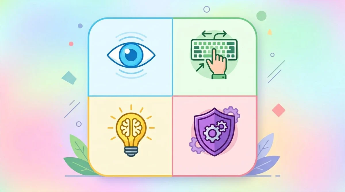\n\nEvery WCAG success criterion sits under one of four principles. The acronym is POUR, and once you know it, the rest of the standard makes a lot more sense.\n\n### Perceivable\n\nContent has to be presentable to users in ways they can perceive. If a user cannot see, hear, or otherwise sense the content, nothing else matters.\n\nThis principle covers alternative text for images, captions and transcripts for video, color contrast, and content that adapts to assistive tech. It does not mean every user must be able to use every sense. It means there is always at least one way to perceive the content.\n\nTwo example success criteria:\n\n- **1.1.1 Non-text Content (Level A).** Every image, icon, and chart has a text alternative. We dig into this in our [image alt text guide](/blog/image-alt-text).\n- **1.4.3 Contrast (Minimum) (Level AA).** Text needs a contrast ratio of at least 4.5:1 against its background (3:1 for large text). For the deep dive, see [color contrast and WCAG](/blog/color-contrast-wcag).\n\n### Operable\n\nUsers have to be able to operate the interface. The page has to respond whether they use a keyboard, a mouse, touch, or voice.\n\nThis is where keyboard navigation lives. It is also where you find rules about giving users enough time, avoiding seizure-inducing flashes, and helping people find their way around with skip links and clear focus rings.\n\nTwo example success criteria:\n\n- **2.1.1 Keyboard (Level A).** All functionality must work from a keyboard alone, no mouse required.\n- **2.4.7 Focus Visible (Level AA).** When an element gets keyboard focus, the focus state must be visible. Removing default focus rings without replacing them is a classic violation.\n\n### Understandable\n\nContent and the interface must be understandable. That covers readable text, predictable navigation, and helpful error messages on forms.\n\nUnderstandable does not mean dumbed down. It means consistent: buttons that look like buttons, labels that say what they do, and forms that explain what went wrong instead of just turning red.\n\nTwo example success criteria:\n\n- **3.1.1 Language of Page (Level A).** Set a `lang` attribute on the `\u003chtml\u003e` element so screen readers pronounce content correctly.\n- **3.3.2 Labels or Instructions (Level A).** Every form field needs a visible label or clear instructions, not just placeholder text.\n\n### Robust\n\nContent must work across user agents: current browsers, current screen readers, and the assistive tech of five years from now. In practice, this is the principle that says \"use semantic HTML and valid ARIA.\"\n\nIf you build a custom dropdown out of `\u003cdiv\u003e` tags with click handlers and skip the keyboard and ARIA roles, you fail this principle. Robust is also why screen reader teams care so much about clean markup.\n\nTwo example success criteria:\n\n- **4.1.2 Name, Role, Value (Level A).** Every interactive element exposes a name, a role, and any state to assistive tech. Custom components must do this through ARIA.\n- **4.1.3 Status Messages (Level AA).** Toast notifications, form validation, and other status updates must be announced to screen readers without changing focus.\n\n## WCAG levels: A, AA, AAA\n\n\n\nWCAG has three conformance levels. Each one is a higher bar, and each higher bar includes everything below it. In WCAG 2.2, the criteria break down like this:\n\n| Level | Criteria | What it means |\n|-------|----------|---------------|\n| **A** | 30 | The minimum. Failing any of these makes content unusable for some people. |\n| **AA** | 50 (cumulative) | The industry standard and the level most laws require. |\n| **AAA** | 28 (cumulative 78) | Enhanced accessibility. Not all content can meet this. |\n\n### Level A: the floor\n\nLevel A criteria are baseline. They cover things like \"images have alt text,\" \"video has captions,\" \"the page works without a mouse,\" and \"you do not use color alone to convey information.\" If you fail Level A, real users are locked out.\n\nYou should consider Level A the absolute minimum. No serious organization claims Level A as their target. It is what you meet on the way to AA.\n\n### Level AA: the standard\n\nLevel AA is the level cited in ADA settlements, the EAA, Section 508, and most procurement contracts. When someone says a site is \"WCAG-compliant,\" they almost always mean AA.\n\nAA adds tighter contrast requirements, captions for live video, focus indicators, consistent navigation, and resizing without loss of content. It is achievable for nearly all content, and meeting it gets you most of the way to genuine accessibility.\n\n### Level AAA: the ceiling\n\nAAA is the gold standard. It includes things like 7:1 contrast for normal text, sign language interpretation for prerecorded video, and reading level no higher than lower secondary education.\n\nW3C explicitly says **you should not target full AAA conformance for entire sites**, because some criteria simply cannot be met by some content. Instead, teams aim for \"AA + some AAA where it matters,\" for example AAA contrast on safety-critical interfaces, or AAA reading level on government information pages.\n\nWhen someone tells you their site is \"WCAG AA compliant,\" that is the right answer 95 percent of the time. AAA claims should make you ask follow-up questions.\n\n## The most-violated WCAG criteria\n\n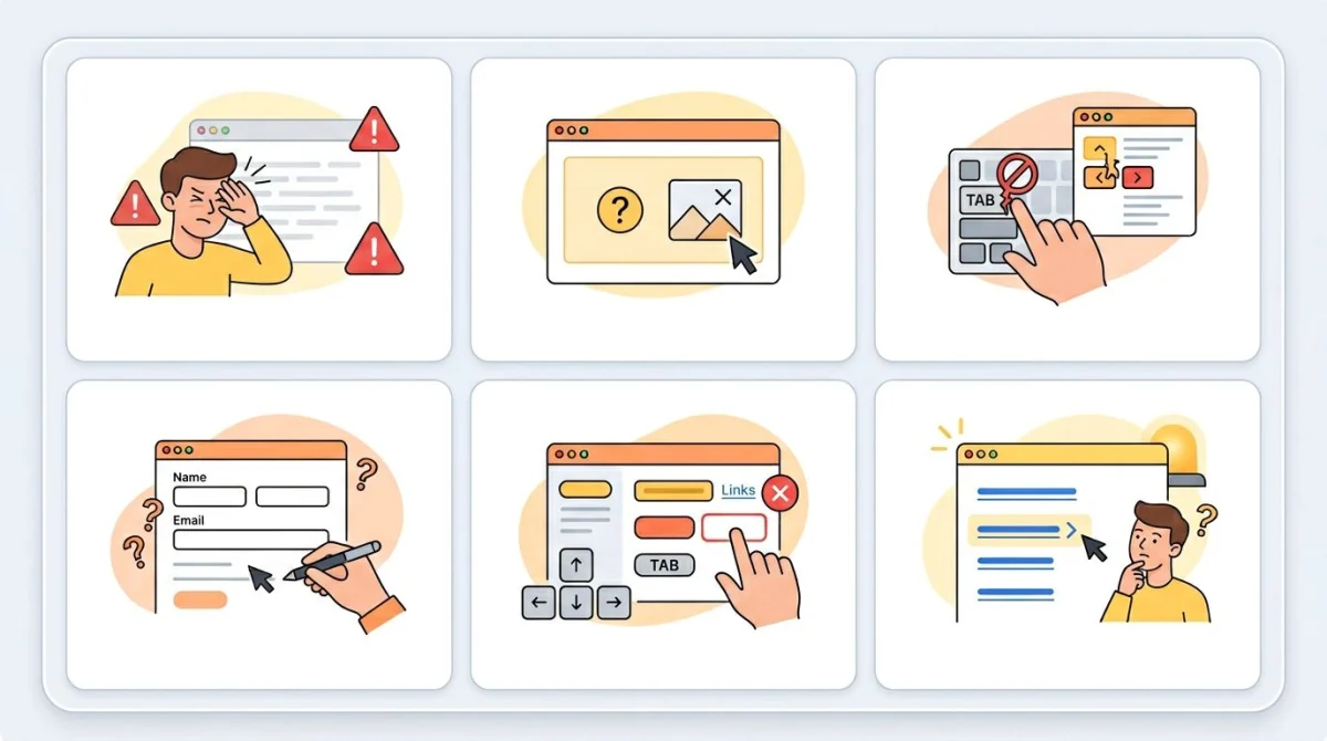\n\nWebAIM publishes an annual analysis of the top one million homepages. The same handful of issues come up year after year. If you fix these, you have done most of the work.\n\n### 1. Low color contrast (1.4.3)\n\nThe single most common WCAG failure. [WebAIM's annual Million analysis](https://webaim.org/projects/million/) consistently finds low-contrast text on around 80% of homepages. That ratio has barely moved in years.\n\nThe rule itself is simple. Normal text needs a 4.5:1 contrast ratio against its background. Large text (24px or 18.66px bold and up) needs 3:1. Logos and incidental decoration are exempt.\n\nThe trouble is that designers love light gray on white. It feels modern. It also fails AA in seconds. Run any link, body text, or muted helper copy through our [free color contrast checker](/tools/color-contrast-checker), or read the longer explainer at [color contrast and WCAG](/blog/color-contrast-wcag) for ratios, formulas, and worked fixes.\n\n### 2. Missing alt text (1.1.1)\n\nThe second-most-common failure: images without `alt` attributes, or with placeholder values like `alt=\"image\"` or `alt=\"picture\"`. Both are barriers: the first leaves screen reader users guessing, the second wastes their time with noise.\n\nUseful alt text describes the image's purpose, not just its contents. Decorative images get `alt=\"\"` (empty, but the attribute is there). For everything else, our [image alt text guide](/blog/image-alt-text) walks through the rules.\n\n### 3. Form labels missing or wrong (1.3.1, 3.3.2)\n\nForms break under WCAG when fields lack visible labels, when labels are not programmatically connected to inputs, or when placeholder text is used as a label. Once the placeholder disappears on focus, screen reader users have no way to know what the field is for.\n\nThe fix is one HTML attribute: `\u003clabel for=\"email\"\u003eEmail\u003c/label\u003e` paired with `\u003cinput id=\"email\"\u003e`. Or wrap the input inside the label. Both work.\n\n### 4. Keyboard inaccessibility (2.1.1)\n\nCustom components built with `\u003cdiv\u003e` and click handlers (modals, menus, tabs, sliders) almost always fail keyboard access. Tab into them, and nothing happens. Tab past them, and you are trapped.\n\nThe pragmatic fix is to use real elements: `\u003cbutton\u003e`, `\u003ca href\u003e`, `\u003cinput\u003e`, `\u003cselect\u003e`. If you must build something custom, you have to add `tabindex`, key handlers for Enter/Space/Arrow keys, and the right ARIA roles.\n\n### 5. Focus not visible (2.4.7)\n\nDesigners strip default focus rings because they look \"ugly,\" and then forget to add a replacement. Keyboard users tab into the page and have no idea where they are.\n\nModern CSS has the answer: `:focus-visible` lets you show a focus ring only for keyboard users, not mouse clicks. Just do not delete the indicator without replacing it.\n\n### 6. Empty page titles (2.4.2)\n\nEvery page needs a unique, descriptive `\u003ctitle\u003e`. \"Home | Acme\" works. \"Untitled Document,\" \"Page 2,\" or just \"Acme\" do not. Screen reader users hear the title first when a page loads, and tab order in browsers depends on it too.\n\n### 7. Generic link text (2.4.4)\n\n\"Click here,\" \"read more,\" and \"learn more\" are all bad. A screen reader user navigating links-only on a page hears \"click here, click here, click here.\" Useful link text describes the destination: \"Read our refund policy,\" \"Download the iOS app.\"\n\n### 8. Heading hierarchy issues (1.3.1)\n\nSkipping from `\u003ch1\u003e` to `\u003ch4\u003e`, using headings for visual styling, or having multiple `\u003ch1\u003e` tags on a page all break the document outline that assistive tech relies on. Headings are the table of contents, so they should make sense if you read them in order.\n\n## How to test for WCAG compliance\n\n\n\nTesting for WCAG conformance is a layered job. No single tool catches everything. Here is the realistic stack.\n\n### Automated tools (catch about 30%)\n\nThese are the fast, free, repeatable checks you should run on every page.\n\n- **[axe DevTools](https://www.deque.com/axe/devtools/).** Browser extension and CI plugin from Deque. The de facto standard for automated checks.\n- **[WAVE](https://wave.webaim.org/).** WebAIM's tool, browser extension or web form. Visual and friendly for non-developers.\n- **Lighthouse.** Built into Chrome DevTools. Includes an accessibility section, though shallower than axe.\n- **[Pa11y](https://pa11y.org/).** Command-line accessibility testing. Good for CI pipelines and bulk site audits.\n\nThese tools catch missing alt text, low contrast, missing labels, invalid ARIA, and a long list of programmatic checks. They will not catch whether your alt text is meaningful, whether the focus order makes sense, or whether your custom dropdown is actually usable. That is what manual testing is for.\n\n### Manual testing\n\nThe other 70 percent of WCAG issues need a human. The basics:\n\n1. **Keyboard nav.** Unplug your mouse. Tab through every page. Can you reach everything? Can you escape every modal? Is the focus visible?\n2. **Screen reader.** VoiceOver on Mac, NVDA on Windows. Listen to a few flows and see whether they actually make sense.\n3. **Zoom.** Zoom the browser to 200% and 400%. Does the layout still work, or do controls disappear off-screen?\n4. **Reduced motion.** Turn on \"Reduce motion\" in your OS. Are autoplaying animations disabled?\n\nThe MDN team's [Understanding WCAG guide](https://developer.mozilla.org/en-US/docs/Web/Accessibility/Guides/Understanding_WCAG) is a good reference if you want to dig deeper into specific criteria during a manual pass.\n\n### Professional audits\n\nWhen the stakes are high (government contracts, healthcare, financial services, anything with regulatory exposure), bring in a professional team. Vendors like Deque, [Level Access](https://www.levelaccess.com/), and TPGi do full WCAG audits with expert reviewers and produce VPAT documents your procurement team will ask for.\n\nA serious audit costs in the low thousands per site for small projects and tens of thousands for large platforms. The output is a list of specific failures, severity ratings, and recommended fixes, typically delivered as both a WCAG conformance report and a VPAT.\n\n### Pro tip: capture issues with annotated screenshots\n\nWhen you find a WCAG issue, the fix often lives in a different codebase than where you found it. A short Loom or an annotated screenshot in your bug tracker is way faster than describing \"the focus ring disappears on the third tab inside the search modal\" in words.\n\nThis is where a quick capture-and-annotate tool earns its keep. ScreenSnap Pro lets you grab a region, draw an arrow on the broken focus state, blur any sensitive data, and drop the result straight into Linear or GitHub, which is useful when you are filing accessibility tickets day after day. It also runs on both Mac and Windows for cross-platform teams. Pay once, $39, and you keep it forever, which beats the per-seat pricing of most subscription capture tools.\n\n## Common WCAG myths, busted\n\nA few patterns come up over and over again. They are wrong, and they cost teams real time.\n\n**Myth: \"Automated tools catch everything.\"** False. Independent studies put automated coverage at around 30% of WCAG issues. Tools tell you that alt text exists; they cannot tell you whether the alt text is useful. Tools tell you that focus is visible; they cannot tell you whether the focus order makes sense.\n\n**Myth: \"WCAG is only for blind users.\"** False. WCAG covers visual, auditory, motor, cognitive, and speech disabilities. It also helps users with temporary impairments (broken arm, eye strain), situational ones (bright sun, noisy environment), and aging-related changes.\n\n**Myth: \"AA is mandatory by law everywhere.\"** Depends on jurisdiction. ADA Title III in the U.S. does not name a specific WCAG version, though courts and the DOJ consistently point at WCAG 2.1 AA. Section 508 does name a version. The EAA names WCAG 2.1 AA via EN 301 549. If you operate in multiple countries, talk to a lawyer who knows accessibility law.\n\n**Myth: \"Adding `alt=\"image\"` is enough.\"** Painfully false. That kind of placeholder is sometimes worse than nothing, because it tells screen readers \"there is an image here, called image.\" Useful alt text describes the purpose. Our [image alt text guide](/blog/image-alt-text) covers what good looks like.\n\n**Myth: \"Overlay widgets make my site WCAG-compliant.\"** Heavily disputed. Most accessibility experts and disability advocates argue that overlays do not fix underlying WCAG failures and sometimes introduce new ones. They are not a substitute for accessible code.\n\n**Myth: \"WCAG conflicts with good design.\"** Not really. Most WCAG criteria are about clear hierarchy, readable text, predictable behavior, and meaningful labels. Those are good design.\n\n## What's coming: WCAG 3.0\n\n\n\nWCAG 3.0 is the next major version, and it is a big rewrite. It is still a working draft with no firm release date, and most observers expect a full Recommendation no earlier than 2027.\n\nTwo changes worth knowing now:\n\n1. **Scoring instead of pass/fail.** WCAG 2.x is binary: you either meet the criterion or you fail. WCAG 3.0 introduces a scoring model with bronze, silver, and gold levels, weighting more impactful issues more heavily. The aim is to better reflect real user experience.\n2. **Broader scope.** WCAG 3.0 covers more than web pages. It explicitly includes apps, tools, AR/VR, and emerging interaction models.\n\nYou do not need to chase WCAG 3.0 today. Most laws and contracts will reference WCAG 2.1 or 2.2 AA for years. But if you are reading the [W3C's WCAG 3 introduction](https://www.w3.org/WAI/standards-guidelines/wcag/wcag3-intro/) and seeing your team in the silver-level descriptions, you are in good shape for the transition.\n\n## Resources and where to go next\n\nA short curated list of the resources that are actually worth bookmarking.\n\n### Official sources (start here)\n\n- **[W3C WAI's WCAG overview](https://www.w3.org/WAI/standards-guidelines/wcag/).** The canonical home of the standard.\n- **[WCAG 2.2 Quick Reference](https://www.w3.org/WAI/WCAG22/quickref/).** Every success criterion, filterable by level and version. The single most useful page for day-to-day work.\n- **[WebAIM intro](https://webaim.org/intro/).** The practical, plain-English explainer. Good to share with stakeholders who do not want to read the spec.\n\n### Tooling\n\n- **[axe DevTools](https://www.deque.com/axe/devtools/).** Browser extension for fast checks.\n- **[WAVE](https://wave.webaim.org/).** Visual reports for non-developers.\n- **[Pa11y](https://pa11y.org/).** Automated accessibility testing for CI.\n- **[Section508.gov](https://www.section508.gov/).** U.S. federal accessibility resources, including buying and policy guidance.\n\n### Hands-on tools we maintain\n\n- [Color contrast checker](/tools/color-contrast-checker): paste two colors, get an instant WCAG AA/AAA verdict.\n- [Color blindness simulator](/tools/color-blindness-simulator): see how your design looks under common forms of color vision deficiency.\n- [Color theory primer](/blog/color-theory): broader background on choosing palettes that hold up.\n\n### Where to go after the afternoon plan\n\nYou've already seen the [4-step afternoon plan](#the-4-step-afternoon-plan) at the top of this article. Once that's done, the next layer of work is:\n\n1. Schedule a manual screen reader pass (VoiceOver on Mac, NVDA on Windows) on your top user flows.\n2. Run a zoom test at 200% and 400% on every key page.\n3. Add accessibility checks (axe-core or pa11y) to your CI pipeline so regressions don't ship.\n4. If you have regulatory exposure (government, healthcare, finance), book a professional audit and get a VPAT.\n\nEach step is a multiple of the one before it in effort, but each catches a layer of issues automated tools miss.\n\n## Frequently Asked Questions\n\n### What does WCAG stand for?\n\nWCAG stands for Web Content Accessibility Guidelines. It is a set of international standards for making digital content accessible to people with disabilities, published by the W3C's Web Accessibility Initiative.\n\n### Is WCAG legally required?\n\nIt depends on your jurisdiction and what you publish. In the United States, federal agencies must follow WCAG via Section 508, and ADA Title III lawsuits routinely point at WCAG 2.1 AA. State and local governments are covered by a 2024 ADA Title II rule. In the European Union, the European Accessibility Act applies WCAG 2.1 AA to many private companies as of June 28, 2025. Even where it is not strictly required, most enterprise procurement contracts ask for it.\n\n### What's the difference between WCAG A, AA, and AAA?\n\nLevel A is the minimum, covering 30 success criteria. Level AA adds 20 more (50 cumulative) and is the level cited in most laws and contracts. Level AAA adds another 28 (78 cumulative) and is the highest bar, but the W3C explicitly says full AAA is not a realistic site-wide target. Most teams aim for AA, with AAA on safety-critical or high-impact content.\n\n### What is WCAG 2.2?\n\nWCAG 2.2 is the current published version, finalized in October 2023. It builds on WCAG 2.1 and adds 9 new success criteria covering focus appearance, dragging movements, target size, consistent help, redundant entry, and accessible authentication. Most existing WCAG 2.1 work carries forward, because 2.2 is additive, not a rewrite.\n\n### How do I check if my site is WCAG compliant?\n\nRun automated tools like axe DevTools, WAVE, or Lighthouse for the quick wins, then do a manual pass: keyboard navigation, screen reader (VoiceOver or NVDA), and zoom to 200%. Automated tools catch around 30% of issues, so manual testing is essential. For high-stakes work, hire a professional auditor for a full WCAG conformance report and a VPAT.\n\n### What are the POUR principles?\n\nPOUR stands for Perceivable, Operable, Understandable, and Robust, the four high-level principles every WCAG success criterion sits under. Perceivable means users can sense the content. Operable means they can interact with it. Understandable means the content and UI make sense. Robust means it works reliably across browsers and assistive tech.\n\n### Does WCAG apply to mobile apps?\n\nYes, in spirit. WCAG itself is web-focused, but mobile platforms map closely to the same principles. Apple's Accessibility guidelines and Google's Material Design accessibility documentation both align with WCAG. WCAG 3.0, currently in development, broadens the scope to explicitly include apps and other digital products.\n\n### What's the fastest accessibility win I can ship today?\n\nFix color contrast. It is the single most common WCAG failure (around 81% of homepages fail it), the criterion is unambiguous (4.5:1 for body text, 3:1 for large), and the fix is usually just a CSS color tweak. Run your text colors through our [color contrast checker](/tools/color-contrast-checker) and you will catch most issues in 15 minutes.\n\n## Bottom line\n\nWCAG is the standard. The current version is 2.2, the level most teams aim for is AA, and the four principles you will keep coming back to are Perceivable, Operable, Understandable, and Robust. Color contrast, alt text, keyboard access, and visible focus are the four areas where most sites fall short, and also the four areas where a small fix delivers the biggest user benefit.\n\nIf you want a free starting point, run your colors through our [color contrast checker](/tools/color-contrast-checker), tab through your homepage, and check your alt text. That is enough to ship a measurably more accessible product this week.\n","featured":false,"image":"https://files.screensnap.pro/blog/en14ladx33ysexdgxjqb.webp","tags":["what","wcag","plainenglish","accessibility","guide"],"category":null,"draft":false,"hidePromo":false},"relatedPosts":[{"slug":"color-contrast-wcag","title":"WCAG Color Contrast: AA, AAA Rules \u0026 How to Test (2026)","description":"WCAG 2.2 color contrast explained: 4.5:1, 3:1, 7:1 ratios, real UI examples, common failures, and a free tool to check any text/background pair.","date":"2026-07-12","lastModified":null,"publishDate":"2026-07-12","readTime":"8 min","author":{"name":"Morgan","role":"Indie Developer","twitter":"m_0_r_g_a_n_","guest":false,"bio":null,"hidden":false},"content":"\n# WCAG Color Contrast: The 2026 Practical Guide (AA, AAA, How to Test)\n\nA color contrast ratio is the luminance difference between two colors, expressed as a number from 1:1 (no contrast) to 21:1 (black on white). For text on a webpage, this single number decides whether people can read your content or have to squint and zoom. It also decides whether your site passes WCAG, the standard that backs ADA lawsuits in the US and EAA enforcement in the EU.\n\nThe magic number: **4.5:1 for normal body text**. Hit it and you pass WCAG 2.2 Level AA. This guide covers every threshold, the math, how to test in seconds, and fixes for the failures we see most often.\n\n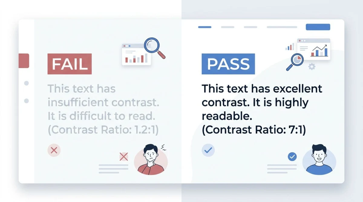\n\n## WCAG contrast ratios cheat sheet\n\nThe Web Content Accessibility Guidelines split contrast requirements by text size and element type. Here are the numbers you need to know.\n\n| Element | WCAG AA (minimum) | WCAG AAA (enhanced) |\n|---|---|---|\n| Normal text (under 18pt / 14pt bold) | **4.5:1** | **7:1** |\n| Large text (18pt+ or 14pt+ bold) | **3:1** | **4.5:1** |\n| UI components \u0026 graphical objects | **3:1** | No AAA requirement |\n| Logos \u0026 incidental text | No requirement | No requirement |\n\nA few notes that trip people up:\n\n- **Large text** means 18pt (~24px) regular, or 14pt (~18.66px) bold. Headings usually qualify; body copy does not.\n- **UI components** include form borders, focus rings, icons that convey meaning, and chart elements.\n- **Disabled controls** are exempt, but only if they are genuinely non-interactive.\n- **Logos** are exempt. Decorative watermarks are too.\n\nMost teams aim for AA. AAA is recommended for high-stakes content (government, healthcare) but is not legally required.\n\n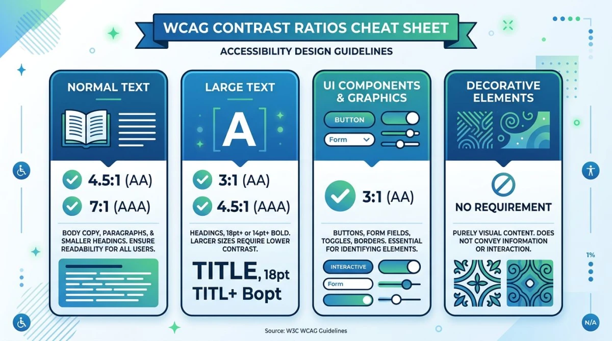\n\n## How to calculate a contrast ratio\n\nThe formula from the [W3C specification](https://www.w3.org/WAI/WCAG21/Understanding/contrast-minimum.html) is:\n\n```\n(L1 + 0.05) / (L2 + 0.05)\n```\n\nWhere `L1` is the relative luminance of the lighter color and `L2` the darker. Relative luminance is a gamma-corrected weighted sum of the sRGB channels (red 21.26%, green 71.52%, blue 7.22%). Green dominates because human eyes are most sensitive to it.\n\nYou will almost never compute this by hand. For the full equations, see the [W3C contrast minimum spec](https://www.w3.org/TR/WCAG21/#contrast-minimum). For everything else, use a checker.\n\n## How to check color contrast (5 ways)\n\nYou have plenty of options for testing contrast, most of them free. Pick the one that fits where you are in your workflow.\n\n### 1. Our free Color Contrast Checker (fastest)\n\nThe quickest way to test a pair of colors is our [Color Contrast Checker](https://www.screensnap.pro/tools/color-contrast-checker). Paste a hex or RGB value and you get the ratio plus AA/AAA pass/fail badges for normal text, large text, and UI components. No signup. Swap foreground and background with one click to test inverted schemes.\n\nRun it on every text/background combo in your design system before you ship.\n\n### 2. Browser DevTools\n\nChrome, Edge, and Firefox show contrast ratios in their color pickers. Inspect a text element, click the color swatch in the Styles pane, and the picker shows the ratio with AA/AAA checkmarks. It also draws a line on the spectrum at the closest passing color.\n\n### 3. Browser extensions\n\nFor full-page audits, use [axe DevTools](https://www.deque.com/axe/devtools/) or WAVE. Both scan a page and flag every contrast failure with selectors and values. axe is the engine behind most automated accessibility testing.\n\n### 4. Figma plugins\n\nCatch problems in design with Stark or Able. Both run live and grade every text layer against AA and AAA as you work.\n\n### 5. WebAIM Contrast Checker\n\nThe [WebAIM Contrast Checker](https://webaim.org/resources/contrastchecker/) is the long-running standard tool from a team that publishes the most-cited accessibility research on the web. Bookmark it as your sanity check.\n\n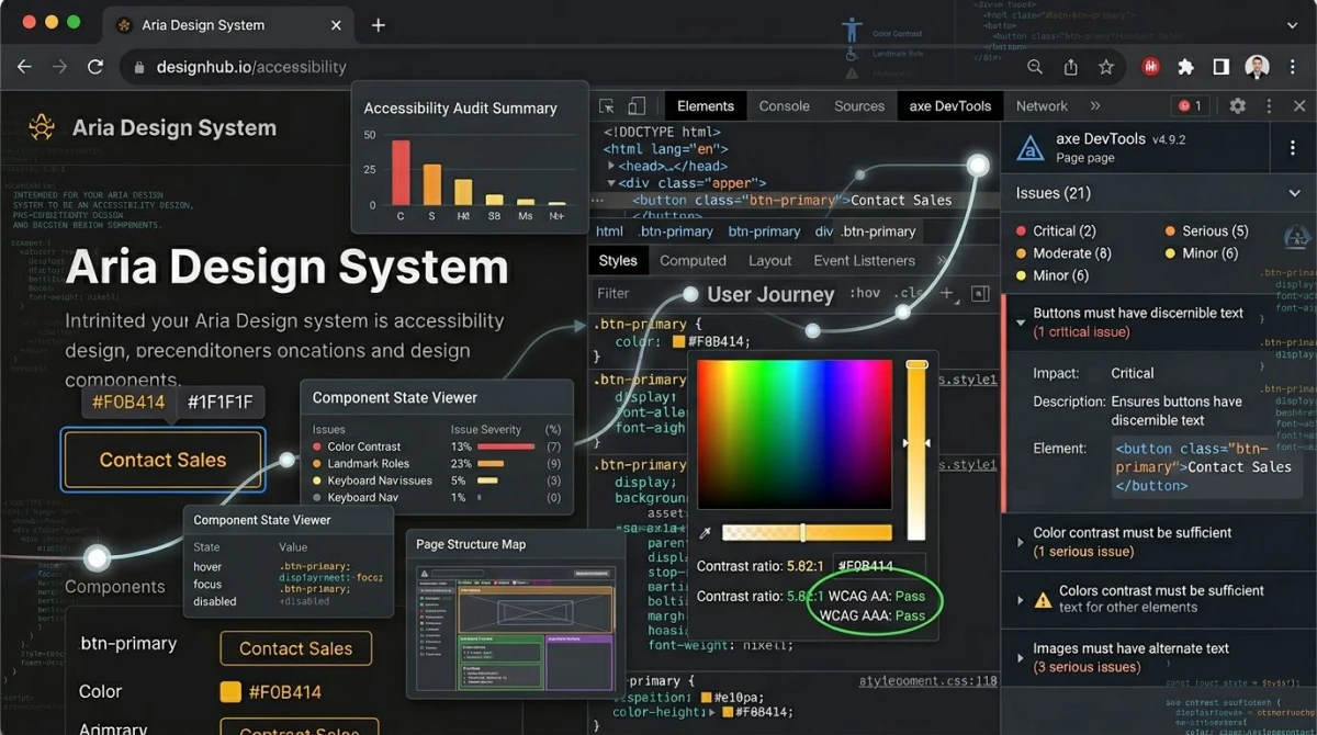\n\n## Common contrast failures (and how to fix them)\n\nThese are the five contrast bugs we see on almost every site we audit.\n\n### Light gray text on white\n\n`#999999` on white is 2.85:1 and fails. `#767676` is the lightest gray that passes 4.5:1 on white. Fix: darken the text to at least `#767676`, or bump font weight.\n\n:pair(#999999/#FFFFFF/2.85):\n\n:pair(#767676/#FFFFFF/4.54):\n\n### Brand color on dark background\n\nVibrant brand colors fall apart on dark UI. A medium blue like `#3B82F6` on `#1F2937` is only 3.4:1. It passes for large text and UI but fails for body. Fix: use a lighter tint of the brand color for body, or reserve the brand color for headings over 18pt.\n\n:pair(#3B82F6/#1F2937/3.4):\n\n### Text over images or gradients\n\nText on a hero image almost always fails somewhere. Fix: add a semi-transparent dark overlay (40-60% black) under the text, or float the text in a solid panel over the image.\n\n### Form placeholders too light\n\nDefault browser placeholder color is around `#A9A9A9`, well below 4.5:1. Fix: style placeholders to `#595959` minimum, and never use placeholders as a substitute for visible labels.\n\n:pair(#A9A9A9/#FFFFFF/2.5):\n\n:pair(#595959/#FFFFFF/7.0):\n\n### Faded disabled links and buttons\n\nDisabled controls are exempt, but only when clearly non-interactive. A \"disabled\" link users still try to click is a usability failure. Fix: hide non-applicable controls, or pair the disabled state with a short reason.\n\n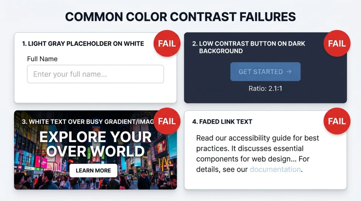\n\n## What about dark mode?\n\nDark mode has its own trap: pure white on pure black hits 21:1 but feels harsh and causes \"halation\" (text vibrating or blurring) for many readers, especially those with astigmatism. Soften both ends: off-white text (`#E5E7EB`) on a near-black surface (`#111827` or `#1F2937`) lands at 14:1+ while staying comfortable.\n\nThe same WCAG ratios apply in dark mode, just measured between the dark surface and the light text.\n\n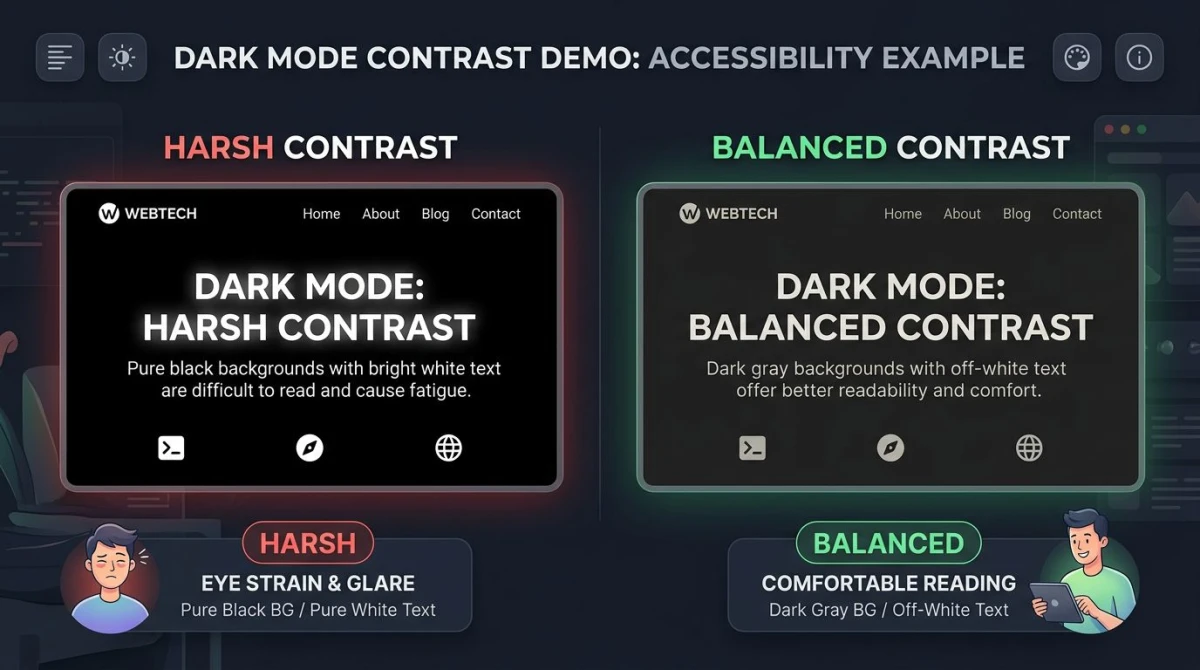\n\n## WCAG 3 and APCA: the new contrast model\n\nWCAG 2.x's formula was designed in the 1990s and treats every color the same. Researchers have since shown it over-rates dark-on-light pairs and under-rates some light-on-dark ones. The replacement, [**APCA**](https://github.com/Myndex/SAPC-APCA) (Advanced Perceptual Contrast Algorithm), is part of WCAG 3 and produces a more accurate score that accounts for font weight, size, and contrast direction. Its output, `Lc`, uses thresholds like `Lc 75` instead of `4.5:1`. WCAG 3 is still in draft and won't replace 2.2 for years. Stick with WCAG 2.2 for compliance and treat APCA as a quality bonus.\n\n## WCAG basics in 60 seconds\n\nWCAG (Web Content Accessibility Guidelines) is the international standard for web accessibility. It groups requirements into three conformance levels (A, AA, and AAA) across four principles: perceivable, operable, understandable, robust. AA is the level cited by most laws, including the ADA in the US and the European Accessibility Act. Color contrast lives under the \"perceivable\" principle.\n\nFor the full breakdown of WCAG levels, what each principle means, and how to plan a full audit, read our [What is WCAG guide](/blog/what-is-wcag). It pairs with this article: that one explains the framework, this one drills into one rule.\n\n## Where contrast fits in your workflow\n\nContrast is one of the easiest WCAG rules to test and one of the most common to fail. Ten-minute fix: pull every text/background combo from your design system into the [Color Contrast Checker](https://www.screensnap.pro/tools/color-contrast-checker), record the ratios in your style guide, and patch anything under 4.5:1. Pair that with [alt text on images](/blog/image-alt-text), a sensible [website color palette](/blog/website-color-palette), and a foundation of [color theory](/blog/color-theory) and you cover the visual half of WCAG.\n\n## Frequently Asked Questions\n\n### What is the WCAG color contrast ratio?\n\nThe luminance difference between a foreground color (usually text) and its background, on a scale from 1:1 to 21:1. WCAG 2.2 Level AA requires at least 4.5:1 for normal text and 3:1 for large text or UI components.\n\n### What is the difference between WCAG AA and AAA contrast?\n\nAA is the minimum required by most accessibility laws (4.5:1 normal, 3:1 large). AAA is the enhanced level for high-stakes content (7:1 normal, 4.5:1 large). Most teams target AA.\n\n### How do I check color contrast for free?\n\nUse a free online checker. Our [Color Contrast Checker](https://www.screensnap.pro/tools/color-contrast-checker) gives you the ratio plus AA/AAA pass/fail in a second. WebAIM's checker is another trusted option, and Chrome DevTools shows contrast right in its color picker.\n\n### Does WCAG color contrast apply to my website?\n\nIf your site serves users in the US, EU, UK, Canada, or Australia, almost certainly yes. The ADA, the European Accessibility Act, and AODA all cite WCAG AA. E-commerce and any business with a physical presence have the highest lawsuit exposure.\n\n### What contrast ratio is needed for dark mode?\n\nSame ratios as light mode (4.5:1 normal, 3:1 large) measured between the light text and dark background. Avoid pure white on pure black; soften to off-white on near-black for comfort.\n\n### Are logos required to meet WCAG contrast?\n\nNo. Logos, brand marks, and purely decorative elements are exempt. Text inside a logo that conveys real information (like a tagline) does still need to meet the threshold.\n\n## Next: the rest of WCAG\n\nContrast is the single highest-volume violation, but it's one rule out of dozens. Once your color pairs are clean, the next layer is keyboard navigation, alt text, focus visibility, and semantic markup. Our [What is WCAG guide](/blog/what-is-wcag) walks through the framework, the four POUR principles, and a 4-step afternoon plan that goes beyond contrast.\n\n---\n\nNeed to test a specific color pair right now? Drop them into our [Color Contrast Checker](https://www.screensnap.pro/tools/color-contrast-checker). Free, no signup, instant AA/AAA verdict.\n","featured":false,"image":"https://files.screensnap.pro/blog/o8uclmn1kfyc08zqspwa.webp","tags":["wcag","color","contrast","rules","test"],"category":"tutorial","draft":false,"hidePromo":false},{"slug":"image-alt-text","title":"Image Alt Text Guide: A11y + SEO + Screenshots (2026)","description":"Write better alt text in 2026: 4 image categories, 20 good vs bad examples, plus a screenshot-specific section for documentation and tutorials.","date":"2026-07-08","lastModified":null,"publishDate":"2026-07-08","readTime":"16 min","author":{"name":"Morgan","role":"Indie Developer","twitter":"m_0_r_g_a_n_","guest":false,"bio":null,"hidden":false},"content":"\n# Image Alt Text: A 2026 Guide for Accessibility, SEO, and Screenshots\n\n**Image alt text** is a short text description you add to an image so screen readers can read it to blind users and search engines can grasp what the image shows. Good alt text is brief (around 125 characters), specific, and skips filler like \"image of.\" Decorative images use `alt=\"\"` so screen readers skip them. The same alt attribute helps both accessibility (a WCAG 1.1.1 rule) and SEO (image rankings and page context).\n\nThis guide is the full reference: what alt text is, how to write it, the 7 rules, 20 good-vs-bad examples, common mistakes, and how to test. We also cover our niche: alt text for screenshots, where most guides fall short.\n\n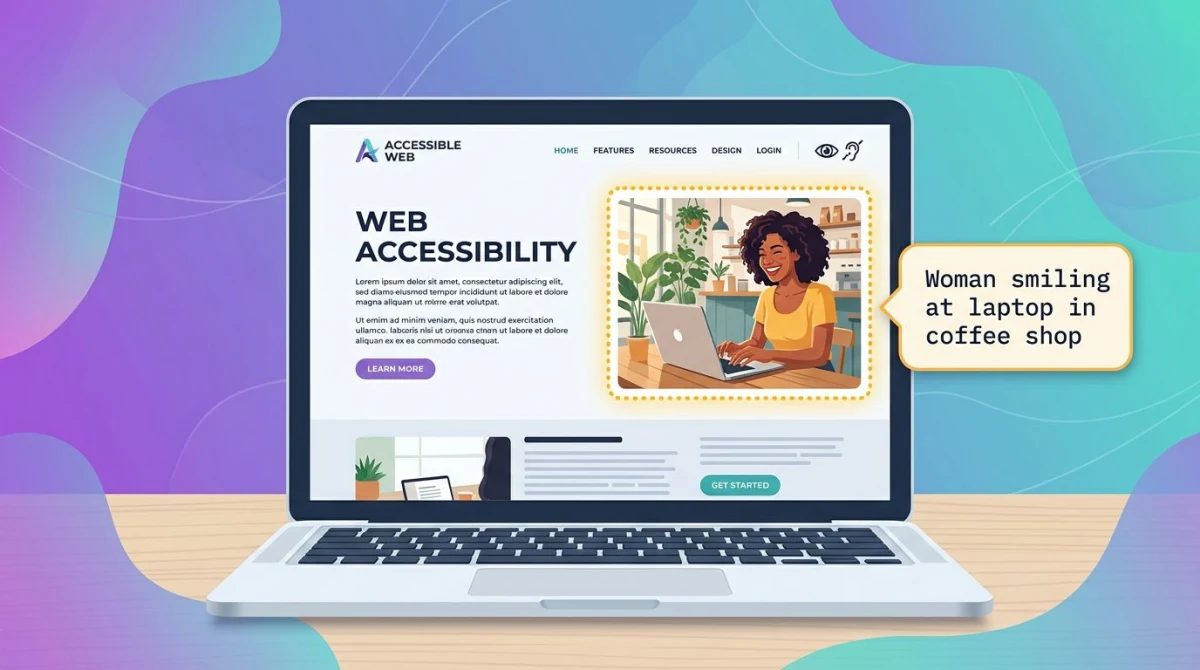\n\n## What Is Alt Text? A Plain-English Definition\n\nAlt text (short for \"alternative text\") is the value of the HTML `alt` attribute on an `\u003cimg\u003e` tag. It is a short description that stands in for the image when the image cannot be seen.\n\n```html\n\u003cimg src=\"red-running-shoe.jpg\" alt=\"Red running shoe with white sole on hardwood floor\" /\u003e\n```\n\nThe `alt` attribute serves three real audiences:\n\n- **Screen-reader users.** Tools like VoiceOver, NVDA, and JAWS read the alt aloud so a blind or low-vision user knows what the image shows.\n- **Search engines.** Google, Bing, and image crawlers use alt text to rank images and grasp page context.\n- **Anyone whose image fails to load.** When the network drops, browsers show the alt text in place of the broken image.\n\nA note on terms. \"Alt tag\" is common but wrong: alt is an attribute on the `img` tag, not a tag itself. \"Alternative text\" is the formal name used in [WCAG 2.1 Success Criterion 1.1.1](https://www.w3.org/TR/WCAG21/#non-text-content). The MDN page for the [`alt` attribute on `\u003cimg\u003e`](https://developer.mozilla.org/en-US/docs/Web/HTML/Element/img) is the spec reference.\n\n### How browsers use the alt attribute\n\nA sighted user usually never sees the alt, because the image renders normally. Under the hood:\n\n- Screen readers announce: \"image, [alt content].\" Empty alt (`alt=\"\"`) means skip.\n- If `src` fails, browsers show the alt text inline. That is why \"image of a sunset\" reads oddly when an image breaks.\n- Voice-control tools (Dragon, macOS Voice Control) use alt text to target images by name.\n\nThat last point matters for users who are not blind. A user navigating by voice can only click an image if it has a label.\n\n## Why Alt Text Matters: The Dual-Purpose Framing\n\nMost teams pick one camp. Designers see alt text as an accessibility chore. Marketers see it as an SEO lever. Both are right, and one good sentence can serve both jobs.\n\n**For accessibility,** alt text is required by law in many places. WCAG 1.1.1 is cited by the ADA, the European Accessibility Act, Canada's ACA, and Section 508 in the U.S. Missing alt text is one of the most common audit failures at scale.\n\n**For SEO,** alt text helps Google rank your images and gives the page extra topical context. Image traffic is real in product, recipe, and how-to niches.\n\nThe trick: one sentence often does both jobs. \"Red running shoe with white sole on hardwood floor\" works for a screen-reader user and for the query \"red running shoe.\" You don't need two versions.\n\n## The 7 Rules of Writing Good Alt Text\n\nThese seven rules will get you 90% of the way there. The rest is judgment about context.\n\n\n\n### 1. Be specific, not generic\n\n\"Image\" or \"photo\" tells the reader nothing. Pick concrete nouns and adjectives. \"Woman smiling at a desk in a sunny home office\" beats \"person.\"\n\n### 2. Convey purpose, not just description\n\nAsk \"what is this image doing here?\" not just \"what is in it?\" A photo of a chef on a restaurant homepage might be alt = \"Chef plating spaghetti carbonara at Trattoria Lupo.\" The same photo on a recipe blog might be alt = \"Plated spaghetti carbonara with parsley.\" Same pixels, different jobs.\n\n### 3. Skip \"image of\" and \"picture of\"\n\nScreen readers already say \"image\" before the alt. \"Image of a sunset\" reads as \"image, image of a sunset.\" Just describe the content.\n\n### 4. Aim for around 125 characters\n\nThere is no hard limit, but some older screen readers cut off long alt strings. Around 125 characters keeps it tight. If you need more space, use a caption or extra body text nearby.\n\n### 5. Functional images describe the function\n\nIf an image acts as a button or link, describe what it does, not what it looks like. A search icon is `alt=\"Search\"`, not `alt=\"Magnifying glass icon.\"`\n\n### 6. Decorative images get an empty alt\n\nIf the image is purely visual (a divider, a gradient, a hero pattern), use `alt=\"\"`. The empty attribute tells screen readers to skip it. Do not omit the attribute. That is worse, because some readers fall back to reading the filename.\n\n### 7. Don't repeat the surrounding caption\n\nIf a `\u003cfigcaption\u003e` already describes the image, don't repeat it in alt. Screen-reader users will hear it twice. Use the alt to add what the caption misses, or set it empty if the caption covers it.\n\n## 20 Examples: Good vs Bad Alt Text\n\nThe fastest way to internalize the rules is to see them applied. Here are 20 paired examples across 10 image categories.\n\n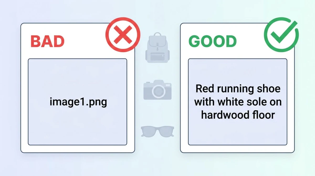\n\n### Product photos\n\n- Bad: `alt=\"shoe.jpg\"`\n- Good: `alt=\"Red Nike running shoe with white sole, side profile on white background\"`\n\n- Bad: `alt=\"Image of a coffee maker\"`\n- Good: `alt=\"Stainless-steel drip coffee maker brewing into a glass carafe\"`\n\n### Instructional screenshots\n\n- Bad: `alt=\"screenshot1\"`\n- Good: `alt=\"macOS System Settings showing the Privacy tab with Screen Recording highlighted\"`\n\n- Bad: `alt=\"how to do it\"`\n- Good: `alt=\"Excel toolbar with the Insert Chart button circled in red\"`\n\n### Diagrams\n\n- Bad: `alt=\"diagram\"`\n- Good: `alt=\"Three-tier system diagram with web server, app server, and database connected by arrows\"`\n\n- Bad: `alt=\"flowchart\"`\n- Good: `alt=\"User login flowchart showing email entry, password check, and dashboard redirect\"`\n\n### Decorative images\n\n- Bad: `alt=\"decorative gradient\"`\n- Good: `alt=\"\"`\n\n- Bad: (no alt attribute at all)\n- Good: `alt=\"\"`\n\n### Infographics\n\n- Bad: `alt=\"infographic\"`\n- Good: `alt=\"Infographic showing 7 alt-text rules; full text below image\"` (then expand the rules in body text)\n\n- Bad: `alt=\"stats\"`\n- Good: `alt=\"Bar chart showing 67% of users abandon sites with broken images, 2024 survey\"`\n\n### Button icons\n\n- Bad: `alt=\"trash icon\"`\n- Good: `alt=\"Delete\"`\n\n- Bad: `alt=\"three dots\"`\n- Good: `alt=\"More options\"`\n\n### Profile photos\n\n- Bad: `alt=\"headshot\"`\n- Good: `alt=\"Maya Chen, lead designer at Acme, smiling in front of a blue wall\"`\n\n- Bad: `alt=\"author\"`\n- Good: `alt=\"Jordan Park, author of this article\"`\n\n### Hero illustrations\n\n- Bad: `alt=\"hero image\"`\n- Good: `alt=\"Illustrated workspace with laptop, plant, and coffee cup on a wooden desk\"`\n\n- Bad: `alt=\"background\"`\n- Good: `alt=\"\"` (if purely decorative) or `alt=\"Team of remote workers collaborating on video call\"` (if it carries meaning)\n\n### Charts and graphs\n\n- Bad: `alt=\"chart\"`\n- Good: `alt=\"Line chart of monthly active users from Jan to Dec 2025, growing from 12k to 38k\"`\n\n- Bad: `alt=\"bar graph\"`\n- Good: `alt=\"Bar chart comparing Q1 sales across 4 regions; West leads at $1.2M\"`\n\n### Brand logos\n\n- Bad: `alt=\"logo\"`\n- Good: `alt=\"ScreenSnap Pro logo\"`\n\n- Bad: `alt=\"our logo image\"`\n- Good: `alt=\"Acme Corporation\"` (when the logo functions as a link to the homepage)\n\n## Alt Text for Screenshots: Our Niche\n\nMost generic guides skip screenshots, but screenshots are where docs teams, marketers, and bloggers spend the most effort. The rule is simple: **describe the UI state, not the pixels.**\n\nA screenshot of a Mac Finder window with a file picked should not be alt = \"rectangular screenshot.\" It should be alt = \"macOS Finder window with budget.xlsx selected in the Documents folder.\" The reader needs to know what to see and do, not the shape of the rectangle.\n\nThree quick rules for screenshot alt text:\n\n1. **Name the app and the screen.** \"Slack settings, Notifications tab\" beats \"settings page.\"\n2. **Call out the highlighted element.** If you drew an arrow or box, say so: \"Excel toolbar with the Format Cells button highlighted in red.\"\n3. **State the action if relevant.** \"After clicking Save, the success banner appears at the top\" turns a static image into a useful step.\n\nIf you build documentation, capture and annotate in [ScreenSnap Pro](https://www.screensnap.pro). The annotation layer makes alt text easier to write, because you've already labeled what's important. Pair it with our [step-by-step screenshot tutorial guide](/blog/how-to-create-step-by-step-instructions-with-screenshots) or our [technical documentation screenshots guide](/blog/technical-documentation-screenshots-guide) for the full workflow.\n\n## SEO Benefits of Alt Text\n\nAlt text is one of the oldest and most stable on-page SEO signals.\n\n**Image search ranking.** Google Images is a top-five search property. Alt text is the main text signal Google uses to rank an image. If your image is well-described, on a relevant page, and a sensible size, it has a real shot at ranking.\n\n**Page keyword context.** Search engines read the words around an image as a relevance signal. If your page targets \"red running shoes,\" images of red shoes with descriptive alt reinforce the topic.\n\n**Featured-snippet hooks.** Google often pulls images from a page for snippets and image carousels. Well-described images get picked more often.\n\nWhat alt text **does not** do: it does not give you a ranking boost when stuffed with keywords. Google downrates over-optimized alt that reads as repeated terms.\n\n## Accessibility Benefits of Alt Text\n\nThe accessibility case is older and stronger than the SEO case.\n\n**WCAG 1.1.1 (Non-text Content)** requires that all non-text content have a text alternative. The [W3C WAI alt-text tutorial](https://www.w3.org/WAI/tutorials/images/) has the canonical decision tree. Harvard's [guide for content images](https://accessibility.huit.harvard.edu/describe-content-images) is one of the clearest practical references.\n\n**Screen-reader UX.** A blind user on a recipe site without alt text hears \"graphic, graphic, graphic\" and gets no information. With alt text, they hear \"Plated spaghetti carbonara, Recipe of the Week\" and decide whether to read on.\n\n**Voice control.** Users on Dragon, macOS Voice Control, or Windows Speech Recognition target images by name. Without alt text, the image does not exist for them.\n\n**Cognitive and bandwidth.** Alt text helps users with reading difficulties or slow connections (where images load late or never). It is one of the cheapest, highest-impact fixes you can ship.\n\n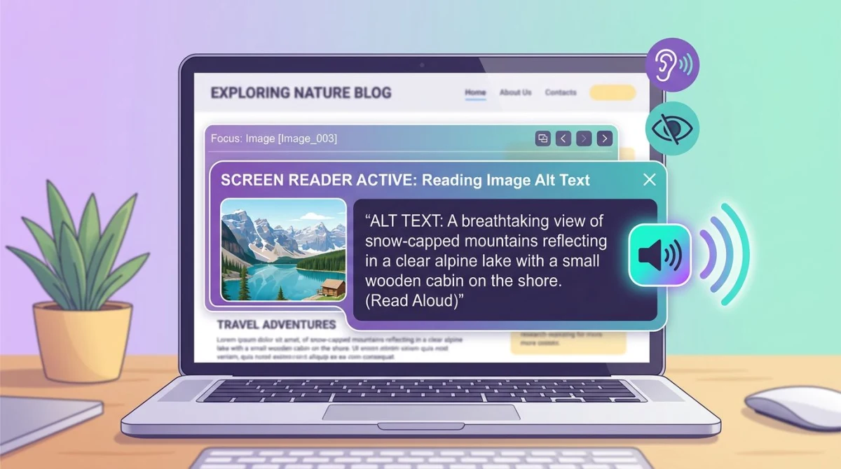\n\n## The 4 Image Categories (And How to Treat Each)\n\nThe W3C groups images into four practical categories. Knowing the bucket tells you how to write the alt.\n\n### Informative images\n\nImages that carry meaning not already in the text: a photo of a person, a product, an icon with meaning.\n\n**Rule:** describe the meaning briefly. Around 125 characters.\n\n### Functional images\n\nImages that act as buttons or links: a search icon, a logo that links home.\n\n**Rule:** describe the function, not the look. `alt=\"Search\"`, `alt=\"Acme Corporation home\"`.\n\n### Decorative images\n\nImages that are purely visual: gradients, dividers, background patterns.\n\n**Rule:** `alt=\"\"`. Empty, not omitted.\n\n### Complex images\n\nCharts, graphs, infographics, maps. Information too dense for one sentence.\n\n**Rule:** short alt to identify, plus a longer description nearby (body text, `\u003cfigcaption\u003e`, or a linked detail page). The legacy `longdesc` attribute is deprecated.\n\n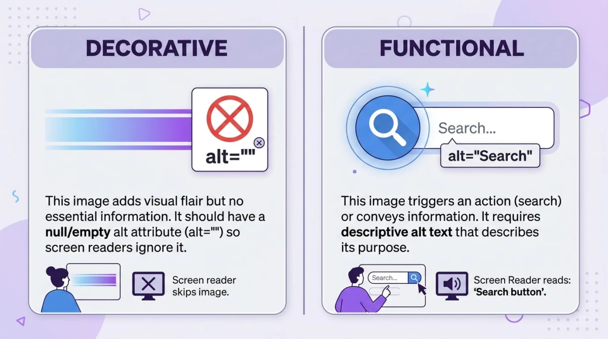\n\n## Common Mistakes to Avoid\n\nMost bad alt text falls into one of these five buckets.\n\n**1. Keyword stuffing.** `alt=\"red shoe red running shoe red Nike shoe red sneakers buy red shoe online\"` reads as spam to readers and search engines.\n\n**2. Skipping alt entirely.** Worse than empty alt. With no `alt`, many screen readers read the file URL aloud. Try listening to \"uploads-2024-IMG-4521-final-v3-FINAL-real.jpg\" and you'll see why.\n\n**3. Using filenames as alt.** \"screenshot.png\" or \"DSC_0492\" is the most common bad alt in the wild. Most CMSes default to this. Always rewrite.\n\n**4. Generic placeholders.** \"image\", \"photo\", \"picture\", \"graphic\" add zero info.\n\n**5. Repeating the caption.** If a caption already covers the image, alt = caption is noise. Trim the alt or set it empty.\n\n## How to Test Alt Text\n\nYou don't have to ship blind. Three layers of testing catch most issues.\n\n### Browser DevTools\n\nRight-click any image and pick **Inspect** in Chrome, Edge, Firefox, or Safari. The Elements panel shows the `\u003cimg\u003e` tag and its `alt`. The fastest spot-check is scrolling the DOM for missing or empty alt on content images.\n\n### Screen-reader testing\n\nThe real test is what a screen reader says. Run through your page with one of these:\n\n- **VoiceOver** on macOS (Cmd+F5 to toggle) and iOS. Built in.\n- **NVDA** on Windows. Free, open source, the most popular screen reader.\n- **JAWS** on Windows. Paid, common in enterprise.\n- **TalkBack** on Android.\n\nListen for \"graphic\" or \"image\" with no description. That's missing alt. Listen for filenames being read. That's a missing alt attribute (worse than empty alt).\n\n### Automated tools\n\nAutomation catches obvious failures fast: missing attributes, generic strings, decorative images that aren't marked. The Deque team's [intro to great alt text](https://www.deque.com/blog/great-alt-text-introduction/) covers what automation can and can't do. The big three:\n\n- **axe DevTools**: browser extension from Deque, the dev standard.\n- **WAVE**: WebAIM's free extension, great for non-developers.\n- **Lighthouse**: built into Chrome DevTools, includes an a11y audit.\n\nThese tools catch missing alt but cannot judge quality. \"image\" passes axe; it fails review. Pair automation with manual screen-reader testing.\n\n### Reverse-checking what's in an image\n\nSometimes you inherit a folder of images with no idea what's in them: a marketing handoff, a CMS migration, a folder of screenshots from a colleague. Our free [extract text from image tool](https://www.screensnap.pro/tools/extract-text-from-image) runs OCR on any image so you can pull out visible text as a starting point for the alt. For screenshots full of UI labels, it gives you a head start. Our [image annotation tool](https://www.screensnap.pro/tools/image-annotation) is useful for marking up images so the highlighted region matches what you describe.\n\n\n\n## How to Add Alt Text in Different Platforms\n\n**Raw HTML:** `\u003cimg src=\"photo.jpg\" alt=\"Your alt text\" /\u003e`. Decorative: `\u003cimg src=\"divider.svg\" alt=\"\" /\u003e`.\n\n**Markdown:** ``. Decorative: ``.\n\n**WordPress:** the media library shows an **Alt text** field on upload. The block editor also has one in the sidebar when an image block is selected.\n\n**Other CMS platforms:** Webflow, Squarespace, Shopify, Wix, and Ghost all show an alt field on upload, usually labeled \"Alt text\" or \"Alternative text.\"\n\n**Social media:** Twitter/X, LinkedIn, Facebook, Instagram, and Bluesky all support alt via an \"Add description\" or \"ALT\" button after upload. Always fill it in.\n\n## Alt Text vs Title Attribute vs Caption\n\nThese three are often confused.\n\n| Attribute | Purpose | Visible? | Read by screen readers? |\n|-----------|---------|----------|-------------------------|\n| `alt` | Text alternative when image cannot be seen | Only if image fails to load | Yes (always) |\n| `title` | Tooltip on hover | Yes (on hover, mouse-only) | Inconsistent |\n| `\u003cfigcaption\u003e` | Visible caption below image | Yes | Yes |\n\n**Use `alt` for the description.** Always. **Skip `title`** unless you have a specific reason. It's mouse-only, ignored on touch devices, and inconsistently read by screen readers. **Use `\u003cfigcaption\u003e`** when you want a visible caption everyone sees.\n\n## Frequently Asked Questions\n\n### What's the maximum length for alt text?\n\nThere is no hard HTML limit, but most experts suggest keeping alt around 125 characters. Some older screen readers (older JAWS in particular) cut off longer strings. If you need more, put the extra detail in a caption or body text.\n\n### Should I include \"image of\" or \"picture of\" in alt text?\n\nNo. Screen readers already say \"image\" before the alt, so \"image of a sunset\" reads as \"image, image of a sunset.\" Just describe the content: \"Sunset over the Pacific.\"\n\n### What's the difference between the alt and title attributes?\n\n`alt` is the text alternative for users who can't see the image. It's required. `title` is a tooltip on mouse hover, invisible on touch, and read inconsistently by screen readers. Use `alt` for the description; skip `title` unless you have a specific tooltip need.\n\n### How do I write alt text for decorative images?\n\nUse an empty alt attribute: `alt=\"\"`. This tells screen readers to skip the image, which is what you want for dividers, gradients, and background patterns. Do not omit the alt attribute. That's worse, because some readers fall back to reading the filename.\n\n### Does alt text help SEO?\n\nYes, but modestly. Alt text is the main text signal Google uses to rank images, and it gives the page extra topical context. It is not a magic boost, and stuffing it with keywords backfires. Write for humans first; the SEO benefit follows.\n\n### How do I add alt text in WordPress?\n\nWhen you upload an image to the media library, fill in the **Alternative Text** field. In the block editor, select an image block and use the **Alt text** field in the sidebar. WordPress saves the alt with the image, so it carries over.\n\n### How do I add alt text in Markdown?\n\nThe text in square brackets is the alt: ``. For decorative images, use empty brackets: ``. Most static-site generators (Hugo, Jekyll, Astro, Next.js MDX) honor this directly.\n\n### What's the difference between alt text, alt tag, and alt attribute?\n\nThey mean the same thing casually, but technically: `alt` is an **attribute** on the `\u003cimg\u003e` **tag**. \"Alt tag\" is common but wrong. \"Alt text\" is the value: the sentence that describes the image. Use whichever your team prefers; the HTML is the same.\n\n## Wrap-Up: Ship It Today\n\nAlt text is one of the highest-leverage fixes on any site. It costs minutes per image, helps real users daily, and gives image search a quiet boost.\n\nThe short version:\n\n- Describe the image specifically and in context.\n- Skip \"image of.\"\n- Around 125 characters.\n- Decorative images get `alt=\"\"`.\n- Functional images describe the function.\n- Test with a real screen reader, not just a tool.\n\nIf you write screenshots for a living (docs, tutorials, marketing), pair good alt with good capture and annotation tools. [ScreenSnap Pro](https://www.screensnap.pro) is our $39 one-time-purchase screenshot and recording app for Mac and Windows. The 15-tool annotation layer makes alt easier to write, because you've already labeled what's important. For capture quality, see our [guide to high-quality screenshots on Mac](/blog/high-quality-screenshots-mac).\n","featured":false,"image":"https://files.screensnap.pro/blog/cclmpmn1ylne0bdh12up.webp","tags":["image","text","guide","a11y","screenshots"],"category":null,"draft":false,"hidePromo":false},{"slug":"color-theory","title":"Color Theory for Designers (2026 Guide \u0026 Cheat Sheet)","description":"Master color theory in 2026: color wheel, harmonies, psychology, and contrast rules, with worked design examples, hex values, and free tools.","date":"2026-07-02","lastModified":null,"publishDate":"2026-07-02","readTime":"18 min","author":{"name":"Morgan","role":"Indie Developer","twitter":"m_0_r_g_a_n_","guest":false,"bio":null,"hidden":false},"content":"\n# Color Theory: A Practical Guide for Designers and Developers\n\n**Color theory** is the framework designers use to mix, pair, and apply colors so they look good and feel right. It blends three things: how the color wheel groups hues, how the brain reads color as emotion, and how contrast keeps text readable. Get those three down and every palette gets easier to build.\n\nThis guide is the short version of everything you need. We will cover the wheel, every common color scheme, the three properties of any color, what each color means, and how to ship palettes for real brands and websites. Each section links to a deeper guide when you want to go further.\n\n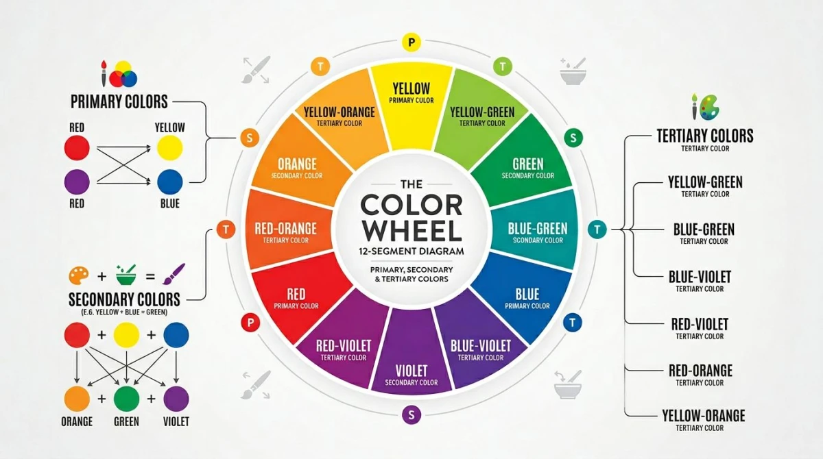\n\n## Why color theory still matters in 2026\n\nDesign tools keep getting smarter, but color choices still come down to you. A logo, a landing page, a chart, a slide: every visual asset starts with a palette. Pick the wrong one and the design feels off, even if you cannot say why.\n\nThree forces make color theory more useful in 2026, not less:\n\n- **Brand systems are bigger.** Most brands now ship dozens of touchpoints: web, app, ads, email, social, video. A clear palette holds them together.\n- **Marketing is multi-channel.** A button color that pops on Instagram may flop on a billing dashboard. Color theory tells you why.\n- **Accessibility is a hard rule.** WCAG contrast rules are baked into more design reviews and lawsuits each year. Picking colors blindly is a real risk.\n\nThe good news: the rules are simple, and a handful of free tools do the math for you.\n\n## The color wheel: primary, secondary, tertiary\n\nThe color wheel is the core map of color theory. Every harmony, every palette, every clash you have ever seen comes back to where colors sit on this wheel.\n\nThere are three families:\n\n- **Primary colors:** red, yellow, blue (in the traditional artist's wheel). You cannot mix these from other colors. Everything else starts here.\n- **Secondary colors:** orange, green, purple. Made by mixing two primaries.\n- **Tertiary colors:** six in-between hues like red-orange, yellow-green, or blue-purple. Made by mixing a primary with a neighboring secondary.\n\nDesigners also use a few other wheel models, depending on the medium:\n\n| Model | Used for | Primaries |\n|-------|----------|-----------|\n| RYB (artist's wheel) | Print, paint, traditional design | Red, yellow, blue |\n| RGB (additive) | Screens, web, video | Red, green, blue |\n| CMYK (subtractive) | Print production | Cyan, magenta, yellow, black |\n| HSL / HSB | Code, design tools | Hue, saturation, lightness/brightness |\n\nFor digital work, RGB and HSL are what you actually type into CSS. The artist's wheel still rules for picking harmonies, though, because the relationships between hues are easier to see. If you are new to color codes, our [hex color codes guide](/blog/hex-color-codes) covers hex, RGB, and HSL notation in detail.\n\nA quick note on RGB vs RYB: the RGB primaries on a screen (red, green, blue) are different from the artist primaries (red, yellow, blue) because screens add light, while paint blocks light. That is why mixing red and green light gives you yellow on a monitor, but mixing red and green paint gives you mud. For day-to-day digital design, you can build palettes on the artist's wheel and translate to hex without losing anything important. The math sorts itself out.\n\n## Color schemes (color harmonies)\n\nA **color scheme** (sometimes called a color harmony) is a set of colors that work together because of where they sit on the wheel. Six schemes do most of the work in real design.\n\n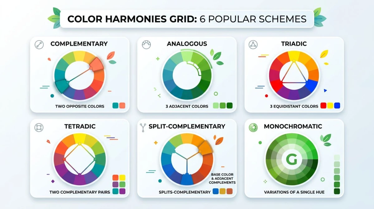\n\n### Complementary\n\nTwo colors directly across from each other on the wheel, like blue and orange, or red and green. The contrast is high, the energy is high, and one color makes the other pop. Great for calls to action and sports brands. Use one color for the bulk of the design and the second as an accent, or the eye gets tired fast.\n\nFor the deep dive (including 10 worked examples and CSS variables), see our [complementary colors guide](/blog/complementary-colors).\n\n### Analogous\n\nThree colors that sit next to each other on the wheel, for example blue, blue-green, and green. Analogous palettes feel calm and natural because the brain reads them as one mood. Use one as the dominant color and the other two as supporting tones. Think landscape photography, gentle gradients, or wellness brands.\n\nRead more in our [analogous colors guide](/blog/analogous-colors).\n\n### Triadic\n\nThree colors evenly spaced around the wheel: red, yellow, and blue, or orange, green, and purple. Triadic palettes feel playful and bold without the brute-force contrast of complementary. The trick is to pick one as the lead and let the other two play support. Cartoons, kids' brands, and Mondrian-style design love triadic. Burger King, Lego, and Toy Story posters all lean on triadic harmony: bright, balanced, and impossible to miss on a shelf.\n\n### Tetradic (square or rectangle)\n\nFour colors arranged as a square or rectangle on the wheel: two complementary pairs at once. Powerful and dynamic, but harder to balance. Pick one dominant color and treat the other three as supporting roles. Works well for editorial design and dashboards with multiple data categories. If you have ever seen a chart with four data series and thought \"those colors fight each other,\" that is a tetradic palette without a clear hero.\n\n### Split-complementary\n\nA milder version of complementary. Pick a base color, then use the two colors on either side of its complement instead of the complement itself. You keep most of the contrast but lose the harshness. Many brand systems lean on this scheme because it feels striking without screaming. It is also forgiving: if your accent feels too loud, slide it one notch over and the design relaxes.\n\n### Monochromatic\n\nOne hue, many shades, tints, and tones. Take a single blue, then add white for tints and black for shades, and vary the saturation. Monochromatic palettes feel polished and minimal, which is why luxury brands and SaaS dashboards lean on them. The downside: the design can feel flat without an accent.\n\nFor the full step-by-step on building monochromatic palettes, see our [monochromatic color palette guide](/blog/monochromatic-color-palette).\n\nIf you want to skip the theory and grab a ready-made palette, our [color palette ideas listicle](/blog/color-palette-ideas) has 60+ palettes you can lift today.\n\n## The three properties of any color\n\nEvery color has three knobs you can turn. Once you can name them, color picking gets a lot less mysterious.\n\n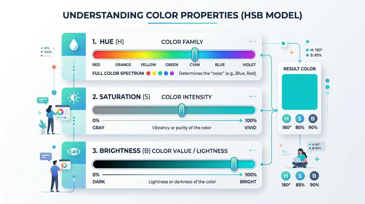\n\n### Hue\n\nThe pure color itself: red, blue, green. Hue is the H in HSL and HSB. It is what most people mean when they say \"color.\" On the wheel, hue is the angle (0° red, 120° green, 240° blue).\n\n### Saturation (chroma)\n\nHow pure or muted a color is. A fully saturated red is fire-engine red. Drop saturation and you get dusty, washed-out tones. Set it to zero and you land on gray. Saturation is the S in HSL and HSB.\n\nDesigners use saturation to set tone:\n\n- **High saturation:** bold, energetic, eye-catching. Used for buttons and alerts.\n- **Low saturation:** calm, sophisticated, easy on the eyes. Used for backgrounds and body content.\n\n### Brightness / Value (lightness)\n\nHow light or dark a color is. The L in HSL stands for lightness; the B in HSB stands for brightness. Both move from black at the bottom to white at the top, with the pure hue somewhere in the middle.\n\nA few related terms you will hear:\n\n- **Tint:** a hue mixed with white. Pastels are tints.\n- **Shade:** a hue mixed with black. Deep, moody colors are shades.\n- **Tone:** a hue mixed with gray. Sophisticated, grounded colors are tones.\n\n### Color temperature\n\nOne more property worth knowing. **Warm colors** (reds, oranges, yellows) feel close, active, and exciting. **Cool colors** (blues, greens, purples) feel distant, calm, and trustworthy. Most balanced palettes mix one warm and one cool color so the design has tension without chaos.\n\nTemperature also changes how a design \"reads\" at a glance. Warm-heavy palettes feel like restaurants, sales, and energy drinks. Cool-heavy palettes feel like banking apps, hospitals, and meditation tools. Knowing which side of the wheel you are leaning on is half the battle when matching color to brand.\n\n## Color psychology and meaning\n\nColors carry meaning. Some of it is hardwired (red = blood = danger), and some of it is cultural (white = weddings in the West, funerals in parts of Asia). Either way, your audience reads color before they read words.\n\n\n\nHere are the rough Western associations most designers work with:\n\n- **Red:** urgency, passion, appetite, danger. Used for sales, food, sports.\n- **Orange:** friendly, energetic, affordable. Used for fitness, kids' brands, deals.\n- **Yellow:** optimistic, sunny, attention-grabbing. Used for warnings and happy brands.\n- **Green:** growth, money, nature, health. Used for finance, wellness, eco brands.\n- **Blue:** trust, calm, professional. Used for banks, software, healthcare.\n- **Purple:** luxury, creativity, royalty. Used for beauty, premium, fantasy.\n- **Pink:** playful, romantic, modern. Used for beauty, dating, fashion.\n- **Brown:** earthy, rugged, dependable. Used for outdoor, food, craft.\n- **Black:** sophisticated, powerful, premium. Used for luxury, tech, fashion.\n- **White:** clean, simple, modern. Used for SaaS, healthcare, minimalism.\n\nTwo caveats keep this useful, not gimmicky:\n\n1. **Context beats list.** Red on a checkout button signals \"buy\"; red on an error toast signals \"stop.\" Same hue, different meaning. The surrounding shape, copy, and motion all pull the meaning one way or the other.\n2. **Culture shapes meaning.** If you ship globally, run your palette by someone in each major market before launch. White means purity in the West and mourning in parts of East Asia. Red means luck in China and danger on a US dashboard. Industry matters too: green means \"growth\" in finance but \"go\" on a traffic signal and \"natural\" on a food package.\n\nThe takeaway: treat color psychology as a starting hypothesis, not a rule. Test the palette in context, with real copy, on real screens, before you commit.\n\n## Color in practice\n\nTheory is fine. The real test is whether you can ship a palette to a brand, a website, and an accessible UI without breaking it.\n\n### Brand identity\n\nA brand color palette is more than a logo color. Most brands ship five roles:\n\n- **Primary:** the hero color (think Spotify green, Slack purple).\n- **Secondary:** a supporting color, often a complement or analogous neighbor.\n- **Accent:** the loud one, used for buttons and highlights.\n- **Neutrals:** grays, off-whites, and dark surfaces for backgrounds and text.\n- **Functional:** green for success, red for error, yellow for warning, blue for info.\n\n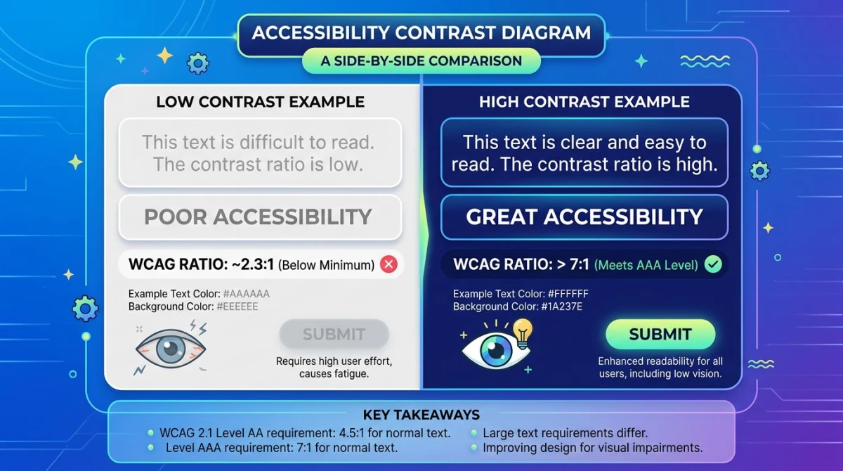\n\nThe biggest mistake is shipping a logo color and stopping there. Real brand systems define every role above, plus tints and shades for each. Our [brand color palette guide](/blog/brand-color-palette) walks through each role with hex values from real companies.\n\n### Web design\n\nA website palette is a brand palette with extra rules. You need:\n\n- A background color that is easy on the eyes.\n- A text color with enough contrast to read.\n- A primary action color that pops without screaming.\n- Hover and active states for every interactive element.\n- A color for links, errors, and disabled states.\n\nMost designers start with the brand colors and then build the rest with [Material Design's color system](https://m3.material.io/styles/color/system/overview) or a similar token framework. For full website palettes with code, see our [website color palette guide](/blog/website-color-palette).\n\n### Accessibility (WCAG contrast)\n\nColor is not just decoration: for people with low vision or color blindness, it is the difference between using your product and bouncing. The [W3C's WCAG 2.1 standard](https://www.w3.org/TR/WCAG21/) sets the minimum contrast ratios:\n\n| Text size | Minimum (AA) | Enhanced (AAA) |\n|-----------|--------------|----------------|\n| Normal text | 4.5:1 | 7:1 |\n| Large text (18pt+ or 14pt bold) | 3:1 | 4.5:1 |\n| UI components and graphics | 3:1 | n/a |\n\nLight gray on white might look elegant, but if it falls below 4.5:1, you are leaving readers behind. Always check ratios before shipping. For the full breakdown, see our [color contrast and WCAG guide](/blog/color-contrast-wcag).\n\nBeyond contrast, three more accessibility habits go a long way:\n\n- **Never use color alone to carry meaning.** Pair color with an icon, a label, or a shape. A red error border without an error message fails users with red-green color blindness.\n- **Test with a color blindness simulator.** Around 8% of men and 0.5% of women have some form of color vision deficiency. Run every palette through a sim before shipping.\n- **Mind dark mode.** A palette that passes WCAG on white may fail on a dark background. Test both themes against the same content.\n\n## Tools that take color theory off your hands\n\nYou do not need to do the math by hand. A handful of free tools cover every part of the workflow.\n\n\n\n- For building harmonies from a single base color, use our [color palette generator](/tools/color-palette-generator). Pick a hex, choose a scheme, copy the output.\n- For lifting a palette from a photo or screenshot, use the [color palette extractor](/tools/color-palette-extractor). Drag in a reference image and grab the dominant colors.\n- For grabbing a single color from any image, use the [color picker](/tools/color-picker). Eyedropper meets hex copy.\n- For verifying WCAG contrast on text-and-background pairs, use the [color contrast checker](/tools/color-contrast-checker). Paste two colors, get the ratio.\n- For checking how your palette reads with color blindness, use the [color blindness simulator](/tools/color-blindness-simulator). Try every common type of color vision deficiency.\n- For mixing two colors into a smooth gradient, use the [gradient generator](/tools/gradient-generator). Dial in stops, copy the CSS.\n- For converting a hex code to RGB for CSS or design tokens, use [hex to RGB](/tools/hex-to-rgb).\n- For going the other way (RGB to hex), use [RGB to hex](/tools/rgb-to-hex).\n\nThese tools cover most of what designers used to do by eye. For inspiration browsing, [Adobe Color](https://color.adobe.com/) and [Coolors](https://coolors.co/) are also worth bookmarking.\n\n## A simple workflow for picking a palette\n\nIf you are staring at a blank canvas, here is the order most designers follow.\n\n1. **Pick your one anchor color.** This is the color the brand or product is built around. Often it is a logo color or a feeling word (\"calm blue\").\n2. **Pick a scheme.** Need contrast? Complementary or split-complementary. Need calm? Analogous or monochromatic. Need playful? Triadic.\n3. **Generate the palette.** Plug your anchor into the [color palette generator](/tools/color-palette-generator) and pick the scheme.\n4. **Add neutrals.** Almost every palette needs a near-white, a near-black, and two or three grays in between.\n5. **Test for contrast.** Pair your text and background colors in the [color contrast checker](/tools/color-contrast-checker) and aim for at least 4.5:1.\n6. **Test for color blindness.** Run the palette through the [color blindness simulator](/tools/color-blindness-simulator) and make sure functional colors (success / error) are still distinguishable.\n7. **Ship and document.** Save hex values for every color and every role. Future you will thank present you.\n\nYou can repeat this workflow in 15 minutes once you have done it a few times.\n\n## Common color mistakes (and quick fixes)\n\nEven seasoned designers trip on the same handful of color problems. Here are the ones that show up in design review week after week, plus the fix for each.\n\n### Too many colors\n\nA palette with eight equal-weight colors looks like a circus. Cut down to one dominant, two supporting, and one or two accents. Use the 60-30-10 rule as your guide. Functional colors (success, error, warning) do not count toward your main palette: they are role colors that sit on top.\n\n### Pure black and pure white\n\nPure `#000000` on pure `#FFFFFF` is technically the highest contrast you can get, but it feels harsh on screens. Most production palettes shift slightly off: `#1A1A1A` for \"black\" text and `#FAFAFA` for \"white\" backgrounds. The eye relaxes, contrast still passes WCAG, and the design feels modern instead of clinical.\n\n### Saturation set to max\n\nA wall of fully saturated colors fights for attention and tires the eye. Pull saturation down 10 to 20% on supporting colors and reserve full saturation for the one element you actually want the user to notice, usually the primary call to action.\n\n### Ignoring color blindness\n\nRed and green carry meaning (\"yes\" and \"no,\" \"good\" and \"bad\") but they are also the most common forms of color blindness. If your dashboard uses only red and green to flag status, roughly 1 in 12 men cannot tell them apart. Add an icon, a label, or a shape so the meaning survives without the color.\n\n### Skipping the documentation\n\nYou picked a great palette. Two months later you cannot remember whether the secondary green is `#22C55E` or `#16A34A`. Save every hex value with its role next to it (primary, accent, neutral-100, success, error) and store the file with the design system. Future you will thank present you.\n\n## Frequently Asked Questions\n\n### What is the most important rule of color theory?\n\nThe 60-30-10 rule. Use one color for 60% of the design (usually a neutral or background), a second for 30% (a supporting color), and a third for 10% (the accent). This keeps any palette balanced, even when you cheat on every other rule.\n\n### Hex vs RGB vs HSL: which should I use?\n\nHex codes (`#3B82F6`) are short and easy to copy, which is why they dominate design tool output. RGB (`rgb(59, 130, 246)`) is the same value in a different format and is easier to read in CSS variables. HSL (`hsl(217, 91%, 60%)`) is better for code because you can change lightness or saturation without picking a new color. Most pros use hex for storage and HSL for tweaking. Our [hex color codes guide](/blog/hex-color-codes) covers each format in depth.\n\n### How do I check color contrast for accessibility?\n\nPaste your text color and background color into a contrast checker. Aim for at least 4.5:1 for normal text and 3:1 for large text: the WCAG AA minimum. The fastest way is our [color contrast checker](/tools/color-contrast-checker), which gives you the ratio plus a pass / fail badge. The [W3C's official WCAG documentation](https://www.w3.org/WAI/WCAG21/Understanding/contrast-minimum.html) explains the rules in detail.\n\n### What are complementary colors?\n\nComplementary colors sit directly across from each other on the color wheel: blue and orange, red and green, yellow and purple. Pairing them gives the strongest possible contrast, which is why complementary schemes are so common on call-to-action buttons. For a deeper look at how to use them without making the design feel loud, see our [complementary colors guide](/blog/complementary-colors).\n\n### What is the difference between hue, tint, shade, and tone?\n\nHue is the pure color (pure red). A tint is hue plus white (pink). A shade is hue plus black (maroon). A tone is hue plus gray (dusty rose). Designers use all three to extend a single hue into a full palette without picking new colors. This is the basis of monochromatic schemes. Read more in our [monochromatic palette guide](/blog/monochromatic-color-palette).\n\n### What is the 60-30-10 rule in color design?\n\nA simple ratio for balanced color use: 60% dominant color, 30% secondary, 10% accent. The dominant is usually a neutral or background. The secondary supports it. The accent is what the eye lands on: the button, the heading, the call to action. It works for interiors, posters, websites, and slides.\n\n### How do I pick a color palette for my brand?\n\nStart with one anchor color tied to your brand's mood. Add a complementary or analogous neighbor as a secondary. Add a loud accent for buttons. Add neutrals for backgrounds and body text. Add functional colors for success, error, and warning states. That is a five-role brand palette. See our [brand color palette guide](/blog/brand-color-palette) for hex examples from real companies.\n\n### Where can I learn more about color theory?\n\nThe [Wikipedia article on color theory](https://en.wikipedia.org/wiki/Color_theory) covers the academic history and physics. Adobe and the design community have great applied content. Our cluster of color guides (schemes, palettes, hex codes, and accessibility) is built to take you from \"I know nothing\" to \"I can ship a palette\" without leaving the site.\n\n---\n\nIf you build product visuals, screenshots, or marketing assets all day, ScreenSnap Pro gives you the capture-and-annotate side of the workflow. Pair it with the color tools above and you have a full design loop on Mac and Windows for a one-time $39.\n","featured":false,"image":"https://files.screensnap.pro/blog/mvunbbo5gae1zso5h2b5.webp","tags":["color","theory","designers","2026","guide"],"category":null,"draft":false,"hidePromo":false}],"hreflangEnOnly":false,"publishedSlugs":["how-to-make-a-study-guide","how-to-annotate-a-pdf","ai-agent-website-screenshots-mcp","scan-qr-code-from-picture","remove-metadata-from-photos","tango-alternatives","guidde-alternatives","red-flags-testing-new-ad-network","screenshot-on-chromebook","screen-record-chromebook","screenshot-only-one-monitor","consolidating-visual-languages-react-library","scribe-alternatives","recover-deleted-screenshots","release-notes-template","mov-vs-mp4","anki-image-occlusion","compress-mov-file","iloveimg-upscale","screenshot-black-screen-fix","snipping-tool-screen-recording-windows","how-to-use-snipping-tool-windows-11","how-to-screenshot-on-computer","screenshot-lenovo-laptop","best-mac-apps-for-developers","screenshot-asus-laptop","screenshot-thinkpad","how-to-record-a-zoom-meeting","screenshot-dell-laptop","sustainable-cloud-esg-score","screenshot-acer-laptop","screenshot-surface","how-to-record-a-google-meet","screenshot-hp-laptop","combine-photos-with-ai","record-google-slides-presentation","how-to-record-a-webinar","monochromatic-color-palette","website-color-palette","what-is-wcag","brand-color-palette","color-contrast-wcag","screenshot-ai","ai-video-summarizer","redact-text","image-alt-text","color-palette-ideas","complementary-colors","gradient-backgrounds","obs-not-recording-audio-windows","analogous-colors","how-to-make-a-tutorial-video","hex-color-codes","how-to-record-a-presentation","color-theory","screen-recording-no-sound","pinterest-pin-size-guide","record-facetime-call-mac","how-to-record-a-video-call","linkedin-banner-size-guide","standard-operating-procedure-template","facebook-cover-photo-size-guide","best-free-game-recorder-windows","xbox-game-bar-not-working","obs-black-screen-fix-windows","always-on-top-windows","screenshot-webpage-windows","crop-video-on-windows","screenshot-youtube-video-windows","record-whatsapp-video-call-windows","record-discord-call-windows","best-way-share-screenshots-windows","record-screen-as-gif-windows","record-computer-audio-windows","record-teams-meeting-windows","extract-frame-from-video-windows","xbox-game-bar-guide-windows","record-google-meet-windows","make-gif-from-video-windows","best-way-edit-screen-recordings-windows","does-hinge-notify-screenshots","does-bumble-notify-screenshots","does-tinder-notify-screenshots","does-reddit-notify-screenshots","does-twitter-notify-screenshots","does-facebook-notify-screenshots","does-linkedin-notify-screenshots","does-telegram-notify-screenshots","does-whatsapp-notify-screenshots","does-bereal-notify-screenshots","does-snapchat-notify-screenshots","best-study-notes-app","reduce-video-file-size-windows","win-shift-s-not-working-windows","record-gameplay-pc","record-zoom-meeting-windows","bandicam-review-alternatives","best-snagit-alternatives-windows","camtasia-alternatives-windows","best-lightshot-alternatives-windows","loom-alternatives-windows","best-obs-alternatives-mac","best-sharex-alternatives-windows","cap-so-review","picpick-alternatives-windows","best-camtasia-alternatives-mac","loom-alternatives-mac","best-free-loom-alternatives","best-greenshot-alternatives-windows","best-tella-alternatives","print-screen-not-working-windows","shottr-alternatives-mac","clipboard-history-windows","obs-studio-alternatives-windows","screen-studio-vs-loom","snipping-tool-not-working-windows","best-snipping-tool-alternatives-windows","screen-grab-mac","lightshot-review-windows","how-to-record-terminal-session","sharex-vs-greenshot","greenshot-review-windows","flameshot-for-windows-review","screenshot-productivity-workflow","best-vidyard-alternatives","sharex-vs-snagit","does-instagram-notify-screenshots","linkedin-post-size-guide","sharex-review-windows","loom-vs-vidyard","picpick-review-windows","image-color-picker","selenium-screenshot-guide","image-color-changer","twitter-image-size-guide","best-lecture-recording-software","how-to-make-a-meme","pdf-to-jpg","screen-studio-for-windows","shopify-product-image-size-guide","puppeteer-screenshot-guide","best-training-video-software","font-identifier","best-ai-image-upscalers","playwright-screenshot-guide","capcut-vs-davinci-resolve","convert-webp-to-jpg","obs-vs-streamlabs","screen-record-windows","tiktok-video-size-guide","facebook-ad-size-guide","screenshot-linux","visual-regression-testing","youtube-thumbnail-size-guide","process-documentation-guide","windows-screenshot-shortcuts","puppeteer-vs-playwright","screenshot-windows-11","instagram-reels-size-guide","screenshot-with-cursor-mac","compress-images-without-losing-quality","instagram-story-size-guide","licecap-mac-review","twitter-banner-size-guide","youtube-banner-size-guide","screen-record-shortcut-mac","jumpshare-review-mac","steam-screenshot-folder-location","always-on-top-mac","create-gif-for-presentation-mac","free-screen-recorder-windows","ocr-pdf-mac","partial-screenshot-windows","change-image-dpi","crop-screenshot-windows","screen-record-with-audio-windows","color-blindness-simulator","convert-svg-to-png","crop-gif","edit-screenshot-windows","faststone-capture-for-mac","full-page-screenshot-windows","gif-screen-capture-windows","image-upscaler","ocr-software-windows","placeholder-image-generator","scrolling-screenshot-windows","where-do-screenshots-go-windows","image-to-link-mac","pick-color-from-screen-mac","watermark-photos-mac","vlc-screenshot-mac","pdf-to-png","convert-webp-to-png","how-to-create-step-by-step-instructions-with-screenshots","resize-image-mac","awesome-screenshot-for-mac","free-photoshop-alternatives","how-to-screen-record-on-macbook","best-ocr-software-mac","change-screenshot-format-mac","convert-heic-to-jpg-mac","best-image-censoring-tools","snipaste-for-mac","reduce-gif-file-size","screenshot-excel-spreadsheet","text-compare","jpg-vs-jpeg","png-to-svg","make-image-transparent","screenshot-android","best-watermark-removers","gif-to-png","jpg-to-png","quicktime-to-gif-mac","imgur-alternative-screenshot-sharing","png-vs-jpg","best-process-documentation-tools","flameshot-for-mac","youtube-screenshot","canva-screenshot-guide","high-quality-screenshots-mac","emoji-maker","gifski-alternative-mac","best-screenshot-apis","best-screenshot-tools-windows","screenpresso-for-mac","screenshot-firefox","convert-images-to-gif","free-screenshot-tools-mac","best-markup-tools","bug-report-template","screenshot-google-chrome","screenshot-twitter-mac","fireshot-mac-review","image-format-converter-mac","blur-faces-photos-mac","does-tiktok-notify-screenshots","best-screenshot-chrome-extensions","screenshot-zoom-meeting-mac","markup-hero-review","nimbus-screenshot-review","automate-screenshots-mac","mac-preview-app-guide","screenshot-to-text","gif-to-mp4","remove-text-from-image","screentogif-for-mac","snagit-for-mac-review","ascii-art-generator","best-image-annotation-tools","gyazo-alternative-mac","screenshot-spotify","svg-to-jpg","image-to-gif-mac","screenshot-google-meet-mac","screenshot-jira","screenshot-microsoft-teams-mac","shottr-mac-review","snagit-vs-snipping-tool","screenshot-slack-mac","snagit-vs-greenshot","screenshot-video-call-mac","social-media-image-sizes","full-page-screenshot-mac","how-to-screenshot-on-mac","best-screen-capture-tools-mac","snagit-vs-camtasia","gif-screen-capture-mac","skitch-for-mac","discord-screenshot-mac","monosnap-alternative-mac","best-gif-screen-capture-tools","screencast-mac","timed-screenshot-mac","best-screen-recorder-mac","where-do-screenshots-go-mac","kap-screen-recorder-mac-review","screen-studio-alternative-mac","screenshot-to-pdf-mac","xnapper-alternative-mac","disable-screenshot-sound-mac","stop-screen-recording-mac","giphy-capture-mac-alternatives","sharex-for-mac","partial-screenshot-mac","print-screen-on-mac","best-code-to-image-tools","mac-screenshot-settings","app-store-screenshot-sizes","edit-screenshot-mac","screenshot-facetime-mac","screenshot-to-clipboard-mac","convert-mov-to-gif-mac","crop-screenshot-mac","combine-screenshots-mac","screenshot-window-mac","cloud-screenshot-sharing-guide","quicktime-screen-recording","snagit-pricing","technical-documentation-screenshots-guide","lightshot-alternative-mac","mac-screenshot-shortcuts","cleanshot-x-vs-shottr","how-to-add-backgrounds-to-screenshots","copy-text-from-screenshot-mac","edit-screen-recording-mac","scrolling-screenshot-mac","snipping-tool-mac","greenshot-for-mac","screen-record-with-audio-mac","best-screenshot-apps-for-mac","change-screenshot-location-mac","how-to-annotate-screenshots-on-mac-professionally","mac-screenshot-not-working","best-cleanshot-x-alternative-in-2026-plus-4-more-options-for-mac-users","best-snagit-alternative-for-mac-in-2026","how-to-blur-or-pixelate-sensitive-information-on-mac","how-to-record-gifs-on-mac","screensnap-pro-vs-shottr"],"__lang":"en","__namespaces":{"common":{"nav":{"home":"Home","features":"Features","download":"Download","documentation":"Documentation","changelog":"Changelog","pricing":"Pricing","support":"Support","faq":"FAQ","blog":"Blog","tools":"Free Tools","compare":"Compare","about":"About"},"cta":{"buyNow":"Buy now","buyMac":"Get ScreenSnap Pro — {{price}}","downloadMacWindows":"Download for macOS \u0026 Windows","tryFree":"Try free"},"header":{"openMenu":"Open main menu","closeMenu":"Close menu"},"footer":{"tagline":"Beautiful screenshots with stunning backgrounds and powerful annotation tools. Create, edit, and share professional-quality screenshots with ease.","rightsReserved":"All rights reserved.","affiliateDisclosure":"Some links on this site are affiliate links. If you buy through one, we may earn a commission at no extra cost to you. It never changes what we recommend.","columnProduct":"Product","columnFreeTools":"Free Tools","columnConverters":"Converters","columnCompare":"Compare","columnResources":"Partnerships","columnLegal":"Legal","downloadFor":"Download for","macos":"macOS","windows":"Windows","downloadAriaLabel":"Download ScreenSnap Pro for macOS or Windows","links":{"allFreeTools":"All Free Tools","screenshotBackgrounds":"Screenshot Backgrounds","imageResizer":"Image Resizer","imageFormatConverter":"Image Format Converter","colorPaletteExtractor":"Color Palette Extractor","gifCompressor":"GIF Compressor","macKeyboardShortcuts":"Mac Keyboard Shortcuts","imageToPdf":"Image to PDF","whatIsScreenSnapPro":"What is ScreenSnap Pro?","bestScreenshotApps":"Best Screenshot Apps","sitemap":"Sitemap","privacyPolicy":"Privacy Policy","termsOfUse":"Terms of Use","affiliates":"Affiliate Program"},"getFor":"Get ScreenSnap Pro for","getAriaLabel":"Get ScreenSnap Pro for macOS or Windows","columnAffiliate":"Affiliate"},"faq":{"heading":"Frequently Asked Questions"},"tools":{"backToTools":"Back to Tools","relatedTools":"Related Tools","learnMore":"Learn More"},"languageSwitcher":{"label":"Language","english":"English","german":"Deutsch"},"popup":{"close":"Close","productDescription":"Make every screenshot and screen recording look polished. One shortcut to capture, 15 tools to annotate, 500+ designer backgrounds, and instant cloud links.","title":"Wait — before you go","subtitle":"{{discount}}% off, one-time. Won't be shown again.","originalPrice":"{{priceOld}}","discountedPrice":"{{priceNew}}","oneTime":"one-time","licensesIncluded":"1 license, 2 seats","licensesSubtitle":"Activate on 2 computers — Mac, Windows, or one of each","ctaDiscount":"Get {{discount}}% Off — {{priceNew}}","guarantee":"No subscription. 30-day money-back guarantee.","pricesNote":"Prices in USD. Taxes and VAT may apply.","features":["1 license, 2 seats · Mac \u0026 Windows","Forever Updates","Cloud Image Sharing","500+ Professional Backgrounds","15 Annotation Tools","Screen \u0026 GIF Recording"],"urgencyBadge":"Exit offer"},"floatingPromo":{"badge":"{{discount}}% OFF","title":"ScreenSnap Pro deal","priceOld":"{{priceOld}}","priceNew":"{{priceNew}}","oneTime":"one-time","ariaOpen":"Open the {{discount}}% discount offer","dismiss":"Dismiss offer"}},"blog":{"meta":{"title":"Screenshot Tips, Tutorials \u0026 Mac + Windows Productivity Blog","description":"Tips, tutorials, and guides for capturing better screenshots on Mac and Windows. Annotation, backgrounds, screen recording, and productivity workflows.","ogDescription":"Tips, tutorials, and guides for capturing better screenshots on Mac and Windows."},"headline":"Screenshot Tips \u0026 Tutorials","subtitle":"Tips, tutorials, and guides for capturing better screenshots on Mac. Comparisons, workflows, and productivity hacks.","latestBadge":"Latest","readArticle":"Read article","readSuffix":"read","previous":"Previous","next":"Next","promoTools":{"kicker":"Free Tools","title":"50+ Screenshot \u0026 Image Tools","desc":"Color picker, GIF compressor, image resizer, format converter, and more — all free, right in your browser.","cta":"Browse tools"},"promoDownload":{"kicker":"ScreenSnap Pro","title":"Screenshot \u0026 GIF Recording for Mac","desc":"Annotate, beautify, and share screenshots instantly. Record GIFs. One-time purchase — {{price}}, no subscription.","cta":"Get ScreenSnap Pro"},"post":{"backToBlog":"Back to Blog","tableOfContents":"On this page","published":"Published","updated":"Updated","read":"read","by":"By","share":"Share","authorKicker":"Author","relatedTitle":"Related articles"},"promos":{"midArticle":{"kicker":"From the makers of this site","title":"Tired of plain screenshots? Try ScreenSnap Pro.","desc":"Beautiful backgrounds, pro annotations, GIF recording, and instant cloud sharing, all in one app. Pay {{price}} once, own it forever.","cta":"See pricing and features"}}}}},"__N_SSG":true},"page":"/blog/[slug]","query":{"slug":"what-is-wcag"},"buildId":"4RWAOhVJ8OKPnsVhv1v8O","isFallback":false,"gsp":true,"locale":"en","locales":["en","de","es"],"defaultLocale":"en","scriptLoader":[]}</script></body></html>




