Color Theory for Designers (2026 Guide & Cheat Sheet)
Color theory is the framework designers use to mix, pair, and apply colors so they look good and feel right. It blends three things: how the color wheel groups hues, how the brain reads color as emotion, and how contrast keeps text readable. Get those three down and every palette gets easier to build.
This guide is the short version of everything you need. We will cover the wheel, every common color scheme, the three properties of any color, what each color means, and how to ship palettes for real brands and websites. Each section links to a deeper guide when you want to go further.
Why color theory still matters in 2026
Design tools keep getting smarter, but color choices still come down to you. A logo, a landing page, a chart, a slide: every visual asset starts with a palette. Pick the wrong one and the design feels off, even if you cannot say why.
Three forces make color theory more useful in 2026, not less:
- Brand systems are bigger. Most brands now ship dozens of touchpoints: web, app, ads, email, social, video. A clear palette holds them together.
- Marketing is multi-channel. A button color that pops on Instagram may flop on a billing dashboard. Color theory tells you why.
- Accessibility is a hard rule. WCAG contrast rules are baked into more design reviews and lawsuits each year. Picking colors blindly is a real risk.
The good news: the rules are simple, and a handful of free tools do the math for you.
The color wheel: primary, secondary, tertiary
The color wheel is the core map of color theory. Every harmony, every palette, every clash you have ever seen comes back to where colors sit on this wheel.
There are three families:
- Primary colors: red, yellow, blue (in the traditional artist's wheel). You cannot mix these from other colors. Everything else starts here.
- Secondary colors: orange, green, purple. Made by mixing two primaries.
- Tertiary colors: six in-between hues like red-orange, yellow-green, or blue-purple. Made by mixing a primary with a neighboring secondary.
Designers also use a few other wheel models, depending on the medium:
| Model | Used for | Primaries |
|---|---|---|
| RYB (artist's wheel) | Print, paint, traditional design | Red, yellow, blue |
| RGB (additive) | Screens, web, video | Red, green, blue |
| CMYK (subtractive) | Print production | Cyan, magenta, yellow, black |
| HSL / HSB | Code, design tools | Hue, saturation, lightness/brightness |
For digital work, RGB and HSL are what you actually type into CSS. The artist's wheel still rules for picking harmonies, though, because the relationships between hues are easier to see. If you are new to color codes, our hex color codes guide covers hex, RGB, and HSL notation in detail.
A quick note on RGB vs RYB: the RGB primaries on a screen (red, green, blue) are different from the artist primaries (red, yellow, blue) because screens add light, while paint blocks light. That is why mixing red and green light gives you yellow on a monitor, but mixing red and green paint gives you mud. For day-to-day digital design, you can build palettes on the artist's wheel and translate to hex without losing anything important. The math sorts itself out.
Color schemes (color harmonies)
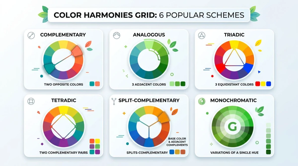
A color scheme (sometimes called a color harmony) is a set of colors that work together because of where they sit on the wheel. Six schemes do most of the work in real design.
Complementary
Two colors directly across from each other on the wheel, like blue and orange, or red and green. The contrast is high, the energy is high, and one color makes the other pop. Great for calls to action and sports brands. Use one color for the bulk of the design and the second as an accent, or the eye gets tired fast.
For the deep dive (including 10 worked examples and CSS variables), see our complementary colors guide.
Analogous
Three colors that sit next to each other on the wheel, for example blue, blue-green, and green. Analogous palettes feel calm and natural because the brain reads them as one mood. Use one as the dominant color and the other two as supporting tones. Think landscape photography, gentle gradients, or wellness brands.
Read more in our analogous colors guide.
Triadic
Three colors evenly spaced around the wheel: red, yellow, and blue, or orange, green, and purple. Triadic palettes feel playful and bold without the brute-force contrast of complementary. The trick is to pick one as the lead and let the other two play support. Cartoons, kids' brands, and Mondrian-style design love triadic. Burger King, Lego, and Toy Story posters all lean on triadic harmony: bright, balanced, and impossible to miss on a shelf.
Tetradic (square or rectangle)
Four colors arranged as a square or rectangle on the wheel: two complementary pairs at once. Powerful and dynamic, but harder to balance. Pick one dominant color and treat the other three as supporting roles. Works well for editorial design and dashboards with multiple data categories. If you have ever seen a chart with four data series and thought "those colors fight each other," that is a tetradic palette without a clear hero.
Split-complementary
A milder version of complementary. Pick a base color, then use the two colors on either side of its complement instead of the complement itself. You keep most of the contrast but lose the harshness. Many brand systems lean on this scheme because it feels striking without screaming. It is also forgiving: if your accent feels too loud, slide it one notch over and the design relaxes.
Monochromatic
One hue, many shades, tints, and tones. Take a single blue, then add white for tints and black for shades, and vary the saturation. Monochromatic palettes feel polished and minimal, which is why luxury brands and SaaS dashboards lean on them. The downside: the design can feel flat without an accent.
For the full step-by-step on building monochromatic palettes, see our monochromatic color palette guide.
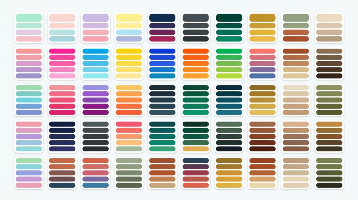
If you want to skip the theory and grab a ready-made palette, our color palette ideas listicle has 60+ palettes you can lift today.
The three properties of any color
Every color has three knobs you can turn. Once you can name them, color picking gets a lot less mysterious.
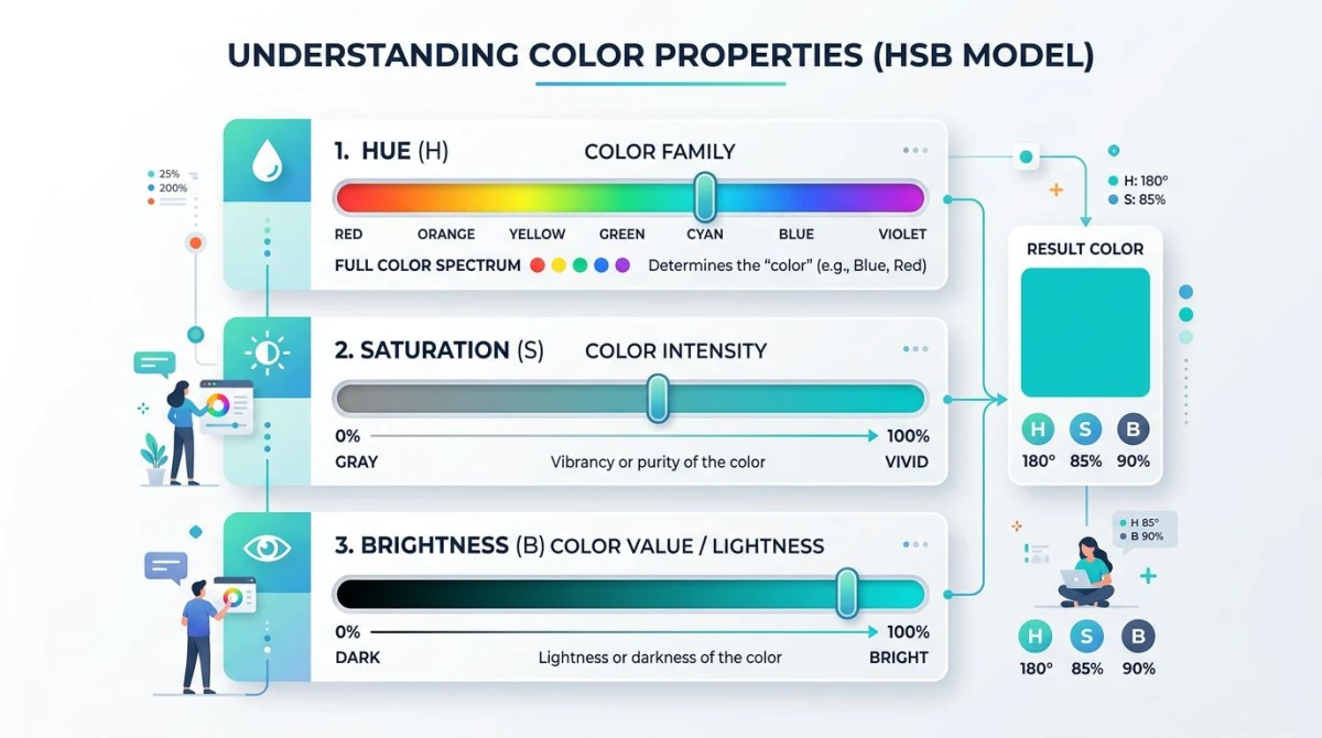
Hue
The pure color itself: red, blue, green. Hue is the H in HSL and HSB. It is what most people mean when they say "color." On the wheel, hue is the angle (0° red, 120° green, 240° blue).
Saturation (chroma)
How pure or muted a color is. A fully saturated red is fire-engine red. Drop saturation and you get dusty, washed-out tones. Set it to zero and you land on gray. Saturation is the S in HSL and HSB.
Designers use saturation to set tone:
- High saturation: bold, energetic, eye-catching. Used for buttons and alerts.
- Low saturation: calm, sophisticated, easy on the eyes. Used for backgrounds and body content.
Brightness / Value (lightness)
How light or dark a color is. The L in HSL stands for lightness; the B in HSB stands for brightness. Both move from black at the bottom to white at the top, with the pure hue somewhere in the middle.
A few related terms you will hear:
- Tint: a hue mixed with white. Pastels are tints.
- Shade: a hue mixed with black. Deep, moody colors are shades.
- Tone: a hue mixed with gray. Sophisticated, grounded colors are tones.
Color temperature
One more property worth knowing. Warm colors (reds, oranges, yellows) feel close, active, and exciting. Cool colors (blues, greens, purples) feel distant, calm, and trustworthy. Most balanced palettes mix one warm and one cool color so the design has tension without chaos.
Temperature also changes how a design "reads" at a glance. Warm-heavy palettes feel like restaurants, sales, and energy drinks. Cool-heavy palettes feel like banking apps, hospitals, and meditation tools. Knowing which side of the wheel you are leaning on is half the battle when matching color to brand.

Tired of plain screenshots? Try ScreenSnap Pro.
Beautiful backgrounds, pro annotations, GIF recording, and instant cloud sharing, all in one app. Pay $34 once, own it forever.
See pricing and featuresColor psychology and meaning
Colors carry meaning. Some of it is hardwired (red = blood = danger), and some of it is cultural (white = weddings in the West, funerals in parts of Asia). Either way, your audience reads color before they read words.
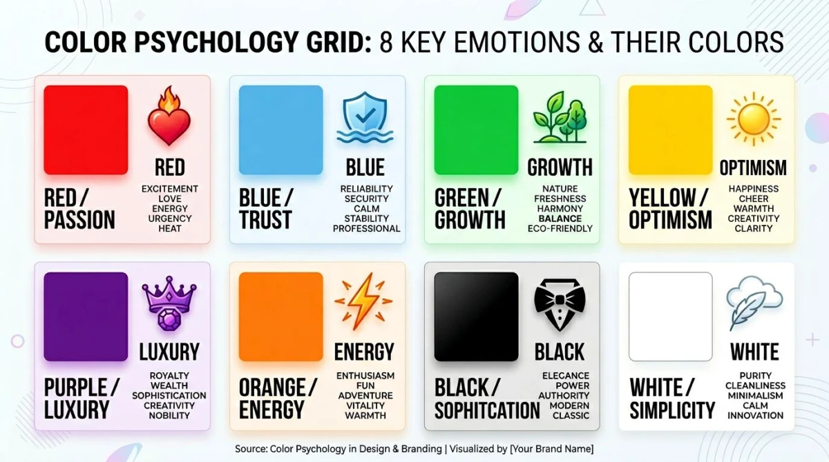
Here are the rough Western associations most designers work with:
- Red: urgency, passion, appetite, danger. Used for sales, food, sports.
- Orange: friendly, energetic, affordable. Used for fitness, kids' brands, deals.
- Yellow: optimistic, sunny, attention-grabbing. Used for warnings and happy brands.
- Green: growth, money, nature, health. Used for finance, wellness, eco brands.
- Blue: trust, calm, professional. Used for banks, software, healthcare.
- Purple: luxury, creativity, royalty. Used for beauty, premium, fantasy.
- Pink: playful, romantic, modern. Used for beauty, dating, fashion.
- Brown: earthy, rugged, dependable. Used for outdoor, food, craft.
- Black: sophisticated, powerful, premium. Used for luxury, tech, fashion.
- White: clean, simple, modern. Used for SaaS, healthcare, minimalism.
Two caveats keep this useful, not gimmicky:
- Context beats list. Red on a checkout button signals "buy"; red on an error toast signals "stop." Same hue, different meaning. The surrounding shape, copy, and motion all pull the meaning one way or the other.
- Culture shapes meaning. If you ship globally, run your palette by someone in each major market before launch. White means purity in the West and mourning in parts of East Asia. Red means luck in China and danger on a US dashboard. Industry matters too: green means "growth" in finance but "go" on a traffic signal and "natural" on a food package.
The takeaway: treat color psychology as a starting hypothesis, not a rule. Test the palette in context, with real copy, on real screens, before you commit.
Color in practice
Theory is fine. The real test is whether you can ship a palette to a brand, a website, and an accessible UI without breaking it.
Brand identity
A brand color palette is more than a logo color. Most brands ship five roles:
- Primary: the hero color (think Spotify green, Slack purple).
- Secondary: a supporting color, often a complement or analogous neighbor.
- Accent: the loud one, used for buttons and highlights.
- Neutrals: grays, off-whites, and dark surfaces for backgrounds and text.
- Functional: green for success, red for error, yellow for warning, blue for info.
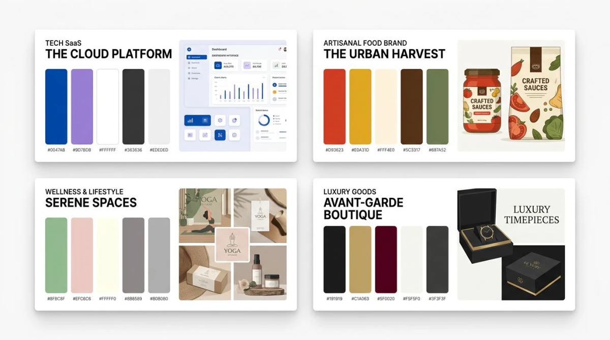
The biggest mistake is shipping a logo color and stopping there. Real brand systems define every role above, plus tints and shades for each. Our brand color palette guide walks through each role with hex values from real companies.
Web design
A website palette is a brand palette with extra rules. You need:
- A background color that is easy on the eyes.
- A text color with enough contrast to read.
- A primary action color that pops without screaming.
- Hover and active states for every interactive element.
- A color for links, errors, and disabled states.
Most designers start with the brand colors and then build the rest with Material Design's color system or a similar token framework. For full website palettes with code, see our website color palette guide.
Accessibility (WCAG contrast)
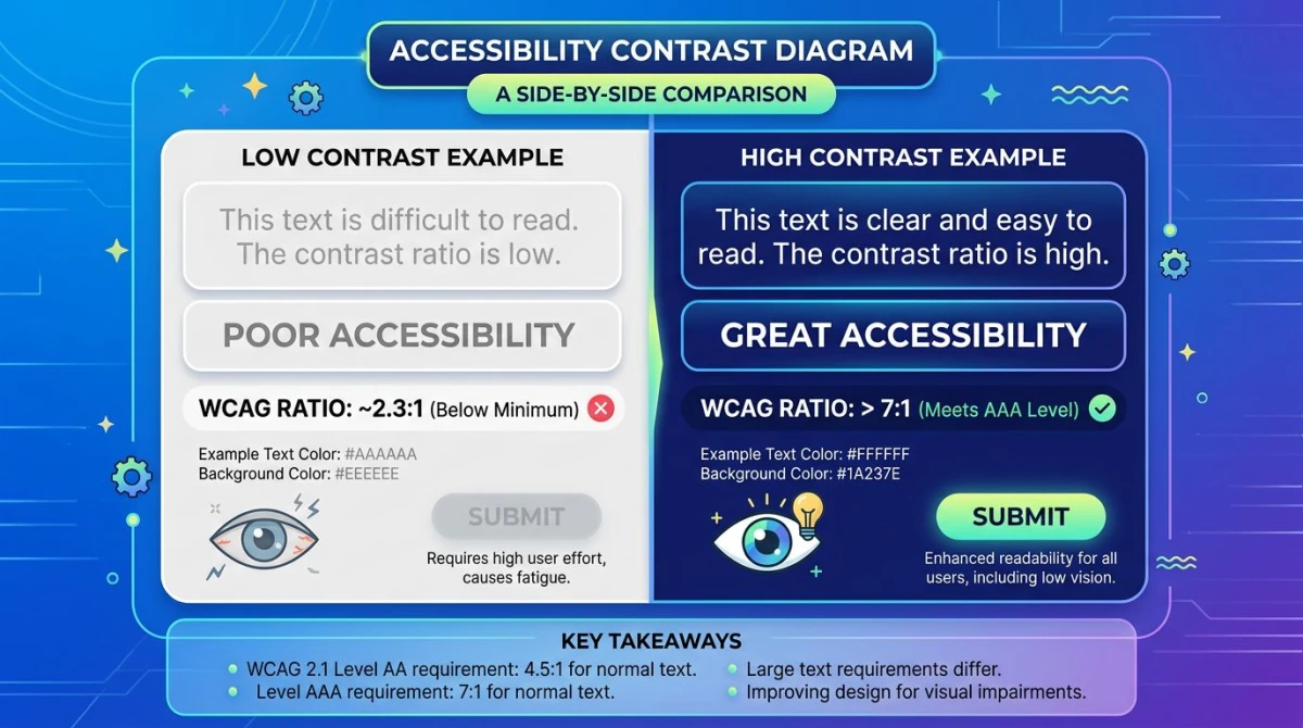
Color is not just decoration: for people with low vision or color blindness, it is the difference between using your product and bouncing. The W3C's WCAG 2.1 standard sets the minimum contrast ratios:
| Text size | Minimum (AA) | Enhanced (AAA) |
|---|---|---|
| Normal text | 4.5:1 | 7:1 |
| Large text (18pt+ or 14pt bold) | 3:1 | 4.5:1 |
| UI components and graphics | 3:1 | n/a |
Light gray on white might look elegant, but if it falls below 4.5:1, you are leaving readers behind. Always check ratios before shipping. For the full breakdown, see our color contrast and WCAG guide.
Beyond contrast, three more accessibility habits go a long way:
- Never use color alone to carry meaning. Pair color with an icon, a label, or a shape. A red error border without an error message fails users with red-green color blindness.
- Test with a color blindness simulator. Around 8% of men and 0.5% of women have some form of color vision deficiency. Run every palette through a sim before shipping.
- Mind dark mode. A palette that passes WCAG on white may fail on a dark background. Test both themes against the same content.
Tools that take color theory off your hands
You do not need to do the math by hand. A handful of free tools cover every part of the workflow.
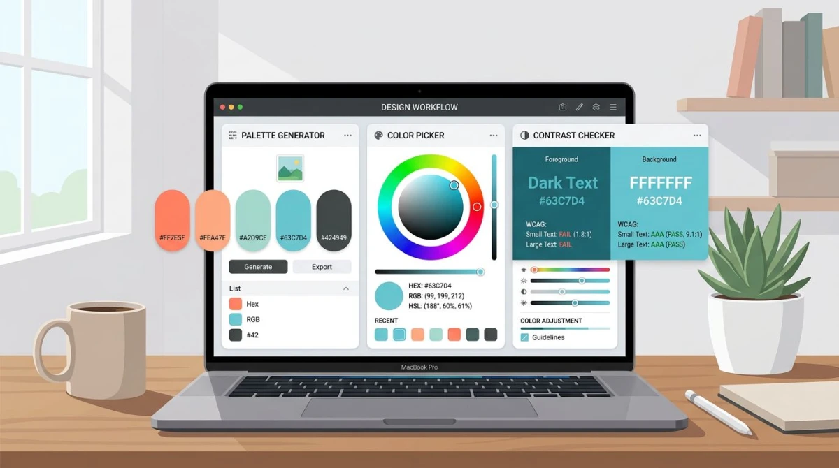
- For building harmonies from a single base color, use our color palette generator. Pick a hex, choose a scheme, copy the output.
- For lifting a palette from a photo or screenshot, use the color palette extractor. Drag in a reference image and grab the dominant colors.
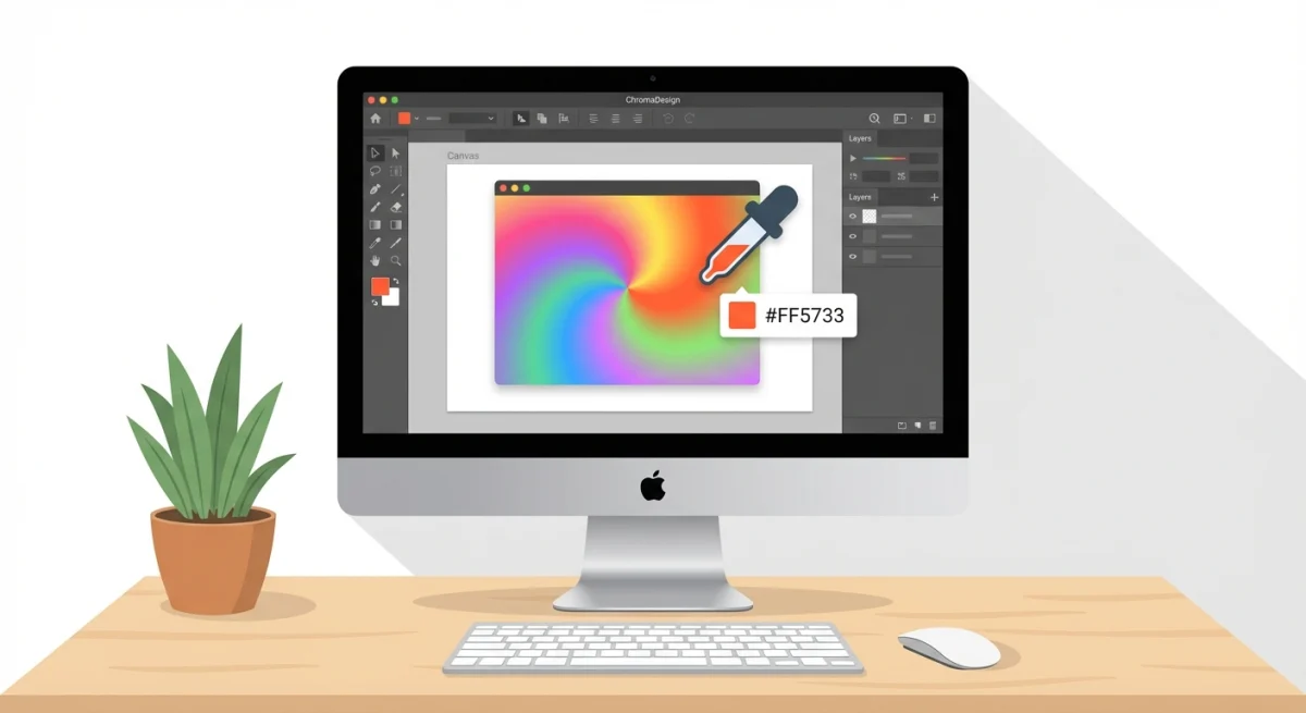
- For grabbing a single color from any image, use the color picker. Eyedropper meets hex copy.
- For verifying WCAG contrast on text-and-background pairs, use the color contrast checker. Paste two colors, get the ratio.
- For checking how your palette reads with color blindness, use the color blindness simulator. Try every common type of color vision deficiency.
- For mixing two colors into a smooth gradient, use the gradient generator. Dial in stops, copy the CSS.
- For converting a hex code to RGB for CSS or design tokens, use hex to RGB.
- For going the other way (RGB to hex), use RGB to hex.
These tools cover most of what designers used to do by eye. For inspiration browsing, Adobe Color and Coolors are also worth bookmarking.
A simple workflow for picking a palette
If you are staring at a blank canvas, here is the order most designers follow.
- Pick your one anchor color. This is the color the brand or product is built around. Often it is a logo color or a feeling word ("calm blue").
- Pick a scheme. Need contrast? Complementary or split-complementary. Need calm? Analogous or monochromatic. Need playful? Triadic.
- Generate the palette. Plug your anchor into the color palette generator and pick the scheme.
- Add neutrals. Almost every palette needs a near-white, a near-black, and two or three grays in between.
- Test for contrast. Pair your text and background colors in the color contrast checker and aim for at least 4.5:1.
- Test for color blindness. Run the palette through the color blindness simulator and make sure functional colors (success / error) are still distinguishable.
- Ship and document. Save hex values for every color and every role. Future you will thank present you.
You can repeat this workflow in 15 minutes once you have done it a few times.
Common color mistakes (and quick fixes)
Even seasoned designers trip on the same handful of color problems. Here are the ones that show up in design review week after week, plus the fix for each.
Too many colors
A palette with eight equal-weight colors looks like a circus. Cut down to one dominant, two supporting, and one or two accents. Use the 60-30-10 rule as your guide. Functional colors (success, error, warning) do not count toward your main palette: they are role colors that sit on top.
Pure black and pure white
Pure #000000 on pure #FFFFFF is technically the highest contrast you can get, but it feels harsh on screens. Most production palettes shift slightly off: #1A1A1A for "black" text and #FAFAFA for "white" backgrounds. The eye relaxes, contrast still passes WCAG, and the design feels modern instead of clinical.
Saturation set to max
A wall of fully saturated colors fights for attention and tires the eye. Pull saturation down 10 to 20% on supporting colors and reserve full saturation for the one element you actually want the user to notice, usually the primary call to action.
Ignoring color blindness
Red and green carry meaning ("yes" and "no," "good" and "bad") but they are also the most common forms of color blindness. If your dashboard uses only red and green to flag status, roughly 1 in 12 men cannot tell them apart. Add an icon, a label, or a shape so the meaning survives without the color.
Skipping the documentation
You picked a great palette. Two months later you cannot remember whether the secondary green is #22C55E or #16A34A. Save every hex value with its role next to it (primary, accent, neutral-100, success, error) and store the file with the design system. Future you will thank present you.
Frequently Asked Questions

Morgan
Indie DeveloperIndie developer, founder of ScreenSnap Pro. A decade of shipping consumer Mac apps and developer tools. Read full bio
@m_0_r_g_a_n_