Complementary Colors: Pairs, Examples & Hex Values (2026)
Complementary colors are pairs of colors that sit on opposite sides of the color wheel: red and green, blue and orange, yellow and purple. Side by side, each color makes the other look brighter. That's why brands reach for them when they want a focal point to pop. They have the highest contrast of any color pair, and that contrast is both their power and their pitfall.
This guide is for designers who want to use these pairs in real UI, brand work, or social media. We'll cover 12 useful pairs with hex codes, the 60-30-10 rule, brand examples you've seen a hundred times, accessibility, and the variants (split-complementary, double-complementary) that soften the clash. By the end, you'll know when complementary works, when it fails, and how to build a palette that doesn't give your users a headache.
What are complementary colors, exactly?
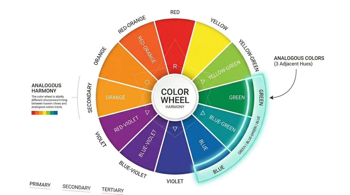
Complementary colors are two colors that sit on opposite sides of the color wheel. On a 12-spoke wheel, that means they're 180 degrees apart. The eye treats these pairs as the most contrast you can get. There's no overlap in their wavelengths, so they don't blend the way neighbors on the wheel do.
There are two common color models, and each has its own complement pairs:
- RYB wheel (traditional, paint-based): red and green, blue and orange, yellow and purple. This is the wheel taught in art class.
- RGB wheel (digital screens): red and cyan, green and magenta, blue and yellow. This is what your monitor uses.
For most design work (brand, web, print) the RYB pairs are still the standard. Screens render in RGB, but designers think in RYB. The hex codes in this guide use the RYB pairs because that's what you'll see in design briefs, brand guides, and Pinterest mood boards.
For the broader picture of how the color wheel works and how all the schemes fit together, see our guide to color theory.
Why complementary colors look so vibrant
Two things happen when complementary pairs sit next to each other:
Simultaneous contrast. Your brain compares neighboring colors and pushes them apart. A gray next to red looks slightly green. The same gray next to green looks slightly red. With true complements, both sides get amped up: the orange looks more orange, the blue looks more blue.
Afterimage retention. Stare at a red shape for 20 seconds, then look at a white wall. You'll see a green ghost. Your retina tires out red-sensing cells, and the green-sensing cells take over for a moment. Designers use this: a red CTA on a green background already looks "active" because your eye is primed for the opposite signal.
The science behind this is called the opponent process theory. It's why complementary palettes hit harder than any other harmony.
The 12 most useful complementary color pairs
Below are the 12 pairs you'll actually use. Each pair has a pure version (max vibration) and a softer variant for when you need the same harmony at lower volume.
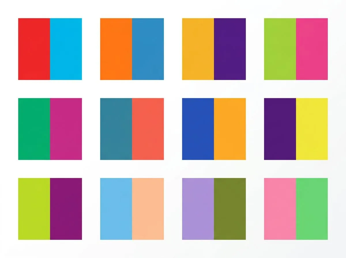
1. Red and green: `#E63946` / `#2A9D8F`
The classic Christmas pair, but also FedEx, Heineken, and most sports kits. Pure #FF0000 / #00FF00 is too hot for UI. These muted versions keep the energy without scorching eyes.
2. Blue and orange: `#264653` / `#F4A261`
The most-used pair in movie posters since 2005, because it's the most visible at small sizes. Hi-vis safety gear uses it for the same reason. Hex above is the muted "movie poster" version. Pure is #0000FF / #FFA500.
3. Yellow and purple: `#FFD60A` / `#5A189A`
Lakers basketball, Crown Royal, Cadbury. Yellow is the brightest hue your eye can see, and deep purple is the darkest. The brightness gap carries this pair even before the color gap kicks in.
4. Red-orange and blue-green: `#E76F51` / `#2EC4B6`
The "warm sunset" pair. Photo brands, food brands, travel sites. Softer than red/green because both colors are warm. Still high contrast.
5. Yellow-orange and blue-violet: `#FFB627` / `#3D348B`
Used by banks and fintech apps that want to feel both safe (blue) and friendly (yellow-orange). Common in challenger banks and budgeting apps.
6. Yellow-green and red-violet: `#9BC53D` / `#C3447A`
The rarest pair on the list because both colors are unusual. That's exactly why upstart brands love it: instant stand-out. Beauty and lifestyle brands use it heavily.
7. Coral and teal: `#FF6F61` / `#008080`
Coral is a warm, slightly muted red-orange. Teal is a cool blue-green. Together they read as "modern" and "designed". Common on landing pages, SaaS hero sections, and Instagram brands.
8. Mustard and indigo: `#D4A017` / `#3F37C9`
Mustard is muted yellow-orange. Indigo is deep blue-violet. The combo feels editorial and confident. Magazines, art galleries, and high-end photo brands use this one.
9. Salmon and sage: `#FA8072` / `#9CAF88`
Both colors are very muted. The pair is technically complementary but reads almost as neutral. Perfect for wedding stationery, beauty packaging, and any brand that wants warmth without volume.
10. Burgundy and forest: `#800020` / `#228B22`
Deep red and deep green. The grown-up version of the Christmas pair. Used by luxury brands, classic restaurants, and heritage labels. Has weight without looking festive.
11. Peach and dusty blue: `#FFCBA4` / `#6E8898`
Tints (lighter versions) of the orange/blue pair. Soft enough for backgrounds, baby brands, and wellness apps. The complement still works, just at a whisper.
12. Tangerine and azure: `#F28C28` / `#007FFF`
Both colors are saturated but at different brightness levels. Tangerine is bright, azure is deep. This is the pair Spotify, Reddit, and many gaming brands use when they want energy without the migraine.
For a tool that lets you sample any complement from an image or screen, our free color picker returns the hex value and its exact complement in one click.
How to use complementary pairs without ruining your design
Knowing the pairs is the easy part. Using them well is where most palettes fall apart.
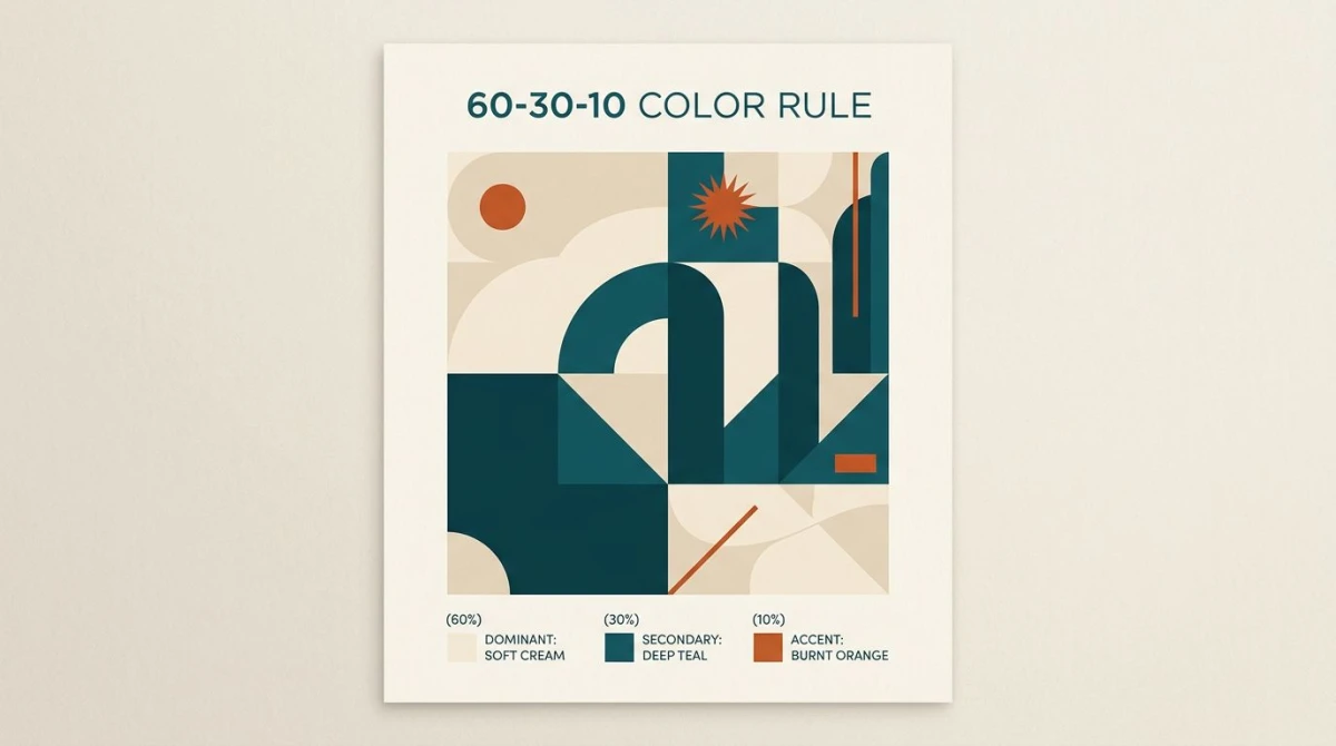
The 60-30-10 rule
The single most useful rule when working with complementary colors:
- 60%: main color (a neutral or one color of the pair, muted)
- 30%: second color (the other half of the pair)
- 10%: accent (the pure, saturated version of either color)
You almost never use both halves of a complementary pair at full strength in equal amounts. That's the recipe for a 1990s GeoCities page. Instead, one color carries the room. The other shows up as an accent: a button, a highlight, an icon.
Where complementary pairs shine
- Call-to-action buttons. Orange "Sign up" on a blue page is the most-clicked button in SaaS for a reason.
- Focal points. Pulling the eye to one item on a busy page: a pricing tier, a hero image, a sale tag.
- Sports and team identity. Where you want fans to spot the kit from the back row.
- Movie posters and book covers. High visibility at thumbnail size.
- Data viz. Two-bucket charts (gain vs loss, before vs after) where you need the eye to split them at a glance.
Where complementary pairs fail
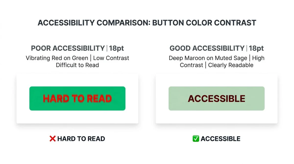
- Body text. Red text on green (or the reverse) is unreadable. Save complements for headlines and accents only.
- Large equal blocks. Two huge blocks of pure complement next to each other vibrate. Your users will feel it before they can name it.
- Busy dashboards. An interface where every element fights for attention is one nobody uses.
- Print at low resolution. Newspaper printing in particular: the pair separates badly and looks muddy.
Modifiers that tame the clash
If a pure complement is too loud, you have three knobs to turn:
- Tints: add white.
#FF0000becomes#FFB3B3. Same hue, lower volume. - Shades: add black.
#FF0000becomes#660000. Deep, classy, less aggressive. - Muting: pull toward gray.
#FF0000becomes#B36B6B. Modern, designed, "soft brand" look.
Most pro palettes use a muted main color and a saturated accent. That keeps the harmony of the complement while skipping the clash.
Complementary colors in famous brands
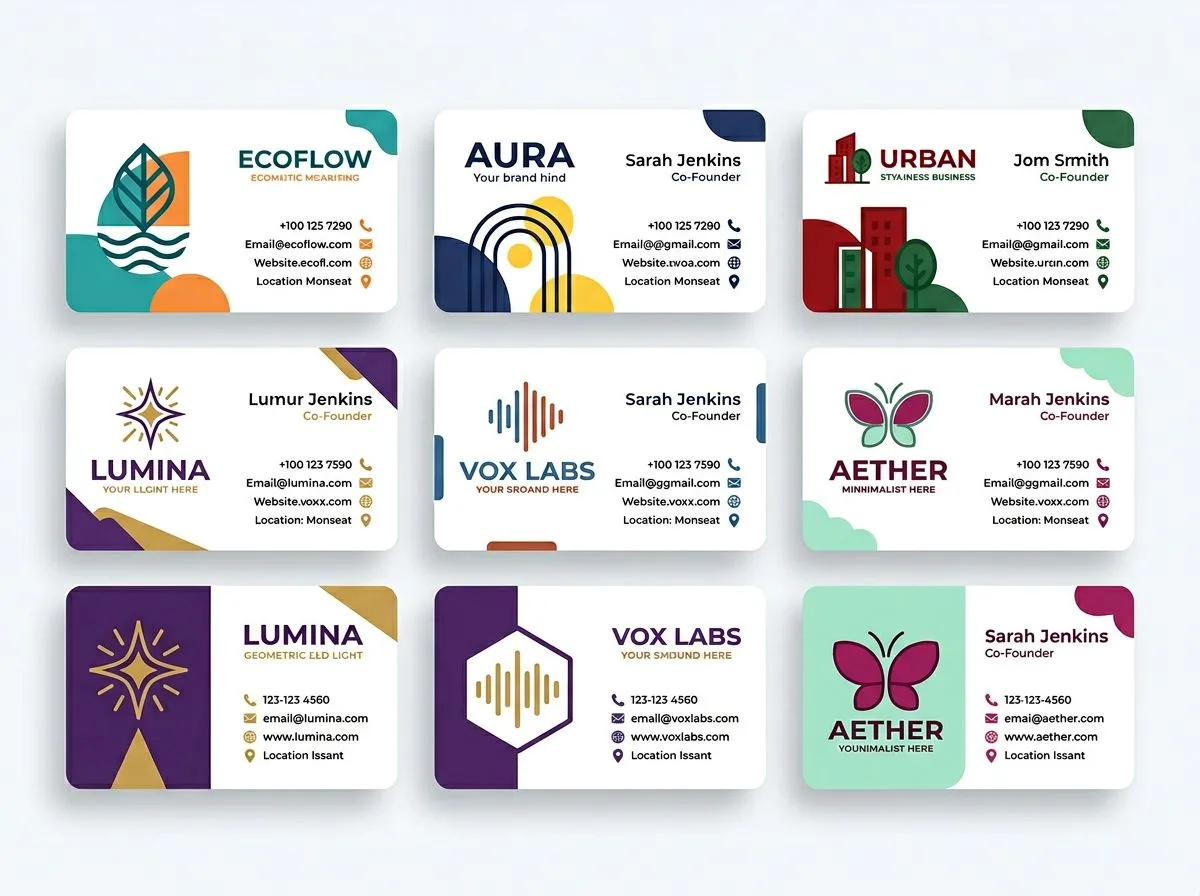
You see complementary palettes every day without naming them. Here are eight you've seen for sure.
- FedEx: purple
#4D148Cand orange#FF6600. The arrow in the negative space gets all the press. But the color choice is what makes the wordmark visible from a delivery van at 60 mph. - Mastercard: red
#EB001Band yellow-orange#F79E1B. Not pure complement, but very close. The overlap between the circles makes a third color, which is part of the brand magic. - Lakers: purple
#552583and yellow-gold#FDB927. Pure yellow and purple, tuned for arena visibility and TV broadcast. - The Simpsons: yellow skin, blue hair (Marge). Matt Groening picked colors that let viewers ID a character at the speed of an animation cel. The complementary pair makes the silhouette pop.
- IKEA: blue
#0058A3and yellow#FBD914. Swedish flag colors, but also the most visible color pair from a highway sign. - Nickelodeon (classic): orange
#F47D31against the blue-toned media around it. The orange splat is readable at 1/100th of a screen. - Heineken: green
#007A33label with a red#E1001Astar. The red star is small but does most of the heavy lifting for the brand. - Dunkin': pink
#FF671F(orange-leaning) and brown-purple#522398. A modern complement softened by the warm pink and the cool brown.
What unites these? None of them use 50/50 splits. Every brand here picks a main color and uses the complement as an accent, usually 80/20 or steeper.

Tired of plain screenshots? Try ScreenSnap Pro.
Beautiful backgrounds, pro annotations, GIF recording, and instant cloud sharing, all in one app. Pay $34 once, own it forever.
See pricing and featuresVariations on the complementary scheme
Pure complementary is the highest-contrast scheme, but it's also the hardest to balance. Three variants give you most of the punch with less risk of a clash.
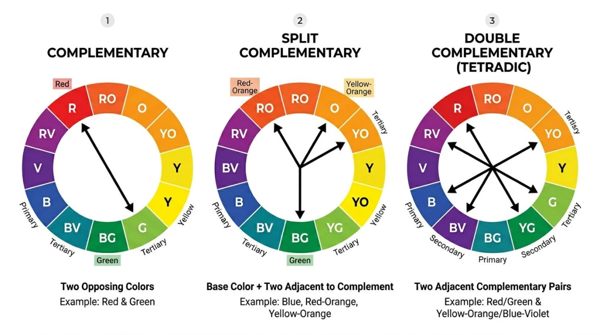
Split-complementary
Pick one color, then use the two colors next to its direct complement instead of the complement itself. So instead of blue + orange, you'd use blue + red-orange + yellow-orange.
This gives you contrast without the head-on clash. It's the safest "high-energy" scheme, and probably the most-used in modern web design. If pure complementary feels like shouting, split-complementary feels like emphasis.
Sample palette: #264653 (blue) + #E76F51 (red-orange) + #F4A261 (yellow-orange).
Double-complementary (tetradic)
Two complementary pairs at once: four colors, forming a rectangle on the wheel. So blue + orange + yellow + purple, or red + green + blue + orange.
This is the most expressive scheme, but also the easiest to ruin. The rule: pick one color as the main, use the others as accents. Editorial design and lifestyle brands use this when they want a "rich, layered" feel.
Near-complementary
One color, paired with a hue 20-30 degrees off its true complement. Slightly less harmonic, but feels more modern. Works great when pure complement reads as too cliché, as with brands that want "blue and orange" without looking like every other startup.
For other schemes (the calm, side-by-side analogous palette or the single-hue monochromatic palette), see those guides. This article stays on complementary.
Tools for picking complementary palettes
You can build complementary palettes in a few ways:
- Sample from an image. Pull a brand color from a logo, hero photo, or rival's site. Our color palette extractor takes any image and returns the top 5-color palette plus suggested complements.
- Pick from your screen. When you spot a great palette mid-Pinterest, the color picker grabs the exact hex of any pixel and shows its complement right away.
- Build from scratch. Start with one seed color and let the color palette generator produce a full complementary, split-complementary, or analogous scheme, with hex, RGB, and HSL for each swatch.
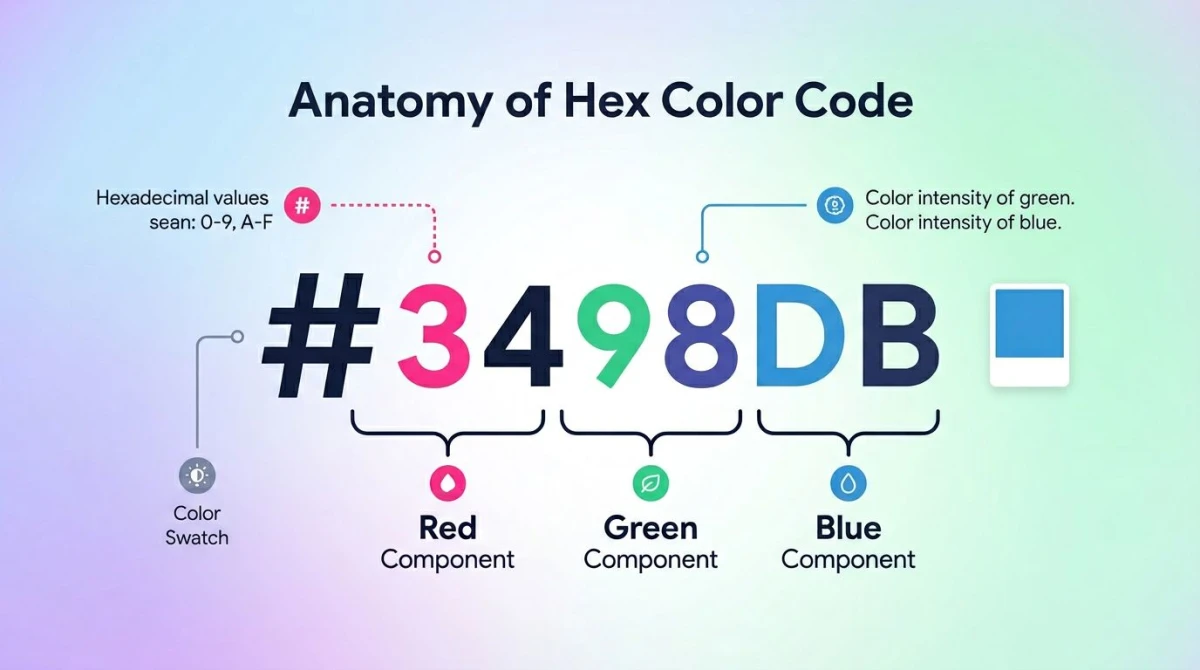
- Convert hex to RGB. Once you've picked your palette, our hex to RGB converter gives you the values for CSS, design tools, or print specs.
External tools worth knowing: Adobe Color shows every scheme on a live wheel. Coolors is the fastest way to lock-and-spin until you find a combo that works. The Sessions College color calculator is a handy quick reference for the math behind each scheme.
Accessibility: complementary colors and contrast
The big trap with complementary pairs: high color contrast does not mean high brightness contrast. Red and green have max color contrast but similar brightness. They fail WCAG contrast for body text, and they're invisible to red-green color-blind users (about 8% of men).
Two rules to keep this from biting you:
- Always check brightness contrast on its own. Use a contrast checker to make sure your pair clears WCAG AA (4.5:1 for normal text, 3:1 for large text). Many "vibrant" pairs fail at small text sizes.
- Never encode meaning in color alone. A red error icon next to a green success icon is invisible to a color-blind user. Add an icon, a label, or a shape so the message lands even when the color doesn't.
For a deeper dive into WCAG color contrast standards, including the math behind the 4.5:1 ratio, see our full guide. The W3C's contrast minimum spec is the official source.
Capturing complementary palettes in the wild
When you spot a great palette in someone else's product, social post, or brand asset, the fastest way to save it is to grab the screen and pull the colors. ScreenSnap Pro takes the screenshot, and our color tools handle the rest. Drop the image into the palette extractor and you have the hex codes in seconds.
ScreenSnap Pro is a one-time $34 buy (no subscription). It works on Mac and Windows, and ships with the annotation tools and 500+ gradient backgrounds you'd want for marking up reference shots. Built-in OS screenshots get you the bitmap. The extractor turns it into a usable palette.
Frequently asked questions
Build palettes faster with the right tools
Complementary colors are the highest-contrast harmony you can get. That makes them perfect for accents, CTAs, and focal points, and a disaster for body text or equal-size blocks. Pick one color as the main, use the complement at 10-30%, lean on tints, shades, and muting when the pure pair feels too loud, and always check brightness contrast on its own for accessibility.
When you're ready to build, the color palette generator takes a seed hex and returns full complementary, split-complementary, and tetradic palettes in seconds. The color picker samples any pixel from screen or image and shows its complement live. And for catching inspiration in the wild, ScreenSnap Pro's screenshot and annotation workflow ($34 one-time, Mac and Windows) feeds straight into the palette extractor so you never lose a great combo.
For the bigger picture of how complementary fits with the other harmonies, the color theory hub covers all six schemes side by side.

Morgan
Indie DeveloperIndie developer, founder of ScreenSnap Pro. A decade of shipping consumer Mac apps and developer tools. Read full bio
@m_0_r_g_a_n_