30 Gradient Background Examples (CSS Code Included) 2026
Gradient backgrounds blend two or more colors smoothly across an element. In CSS you build them with linear-gradient(), radial-gradient(), or conic-gradient(): no images, no extra HTTP requests, infinite resolution. In 2026 they show up in three main spots: subtle SaaS heroes, bold marketing accents, and abstract mesh art. Below are 30 copy-paste examples grouped into six categories, every one with full CSS, hex codes, and a recommended use case (hero, button, or card). Want to remix any of these? Build your own in our free gradient generator.
CSS gradient syntax (60-second primer)
Three functions cover almost every gradient you will ever need.
Linear: colors flow along a straight line.
background: linear-gradient(135deg, #6366f1, #ec4899);Radial: colors radiate from a center point.
background: radial-gradient(circle at 30% 20%, #fde68a, #f43f5e);Conic: colors sweep around a center like a clock hand.
background: conic-gradient(from 0deg at 50% 50%, #06b6d4, #6366f1, #ec4899, #06b6d4);Add as many color stops as you want, and pin each to a percentage (#6366f1 0%, #ec4899 60%, #f43f5e 100%) for precise control.
Subtle / SaaS hero backgrounds
Five quiet gradients that sit behind product screenshots without stealing attention. Pastel, single-hue, low contrast.
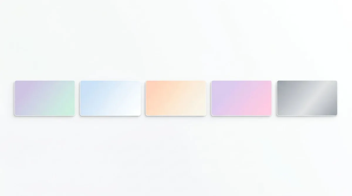
1. Lavender mist: #ede9fe → #c4b5fd
background: linear-gradient(180deg, #ede9fe 0%, #c4b5fd 100%);2. Mint whisper: #ecfdf5 → #a7f3d0
background: linear-gradient(160deg, #ecfdf5 0%, #a7f3d0 100%);3. Cream peach: #fff7ed → #fed7aa
background: linear-gradient(135deg, #fff7ed 0%, #fed7aa 100%);4. Sky fade: #eff6ff → #bfdbfe
background: linear-gradient(180deg, #eff6ff 0%, #bfdbfe 100%);5. Slate hush: #f8fafc → #cbd5e1
background: linear-gradient(180deg, #f8fafc 0%, #cbd5e1 100%);Use these behind dark text or product mockups. They keep contrast high and never compete with foreground UI. The 180-degree linear flow gives a soft "sky fading to ground" feel that reads as calm and modern.
Bold / marketing accent
Five saturated gradients for CTAs, pricing cards, and high-energy heroes.
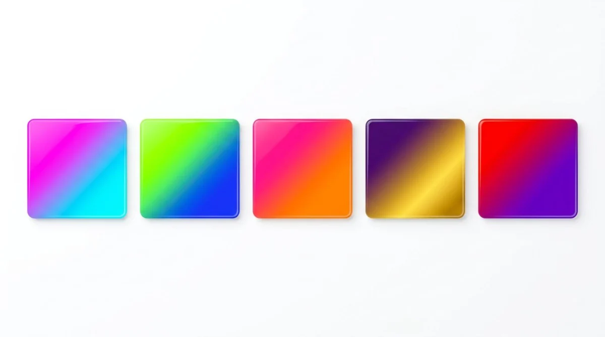
6. Electric punch: #8b5cf6 → #06b6d4
background: linear-gradient(135deg, #8b5cf6 0%, #06b6d4 100%);7. Hot magenta: #ec4899 → #f97316
background: linear-gradient(120deg, #ec4899 0%, #f97316 100%);8. Neon lime: #22c55e → #06b6d4
background: linear-gradient(135deg, #22c55e 0%, #06b6d4 100%);9. Royal gold: #7c3aed → #f59e0b
background: linear-gradient(135deg, #7c3aed 0%, #f59e0b 100%);10. Cherry pop: #ef4444 → #a855f7
background: linear-gradient(135deg, #ef4444 0%, #a855f7 100%);These work great on buttons. Add color: white and a slight box-shadow and you have a CTA that converts. Pair them with a darker variant on :hover for that satisfying click affordance.
Sunset / atmospheric
Five warm, cinematic gradients inspired by golden-hour skies.
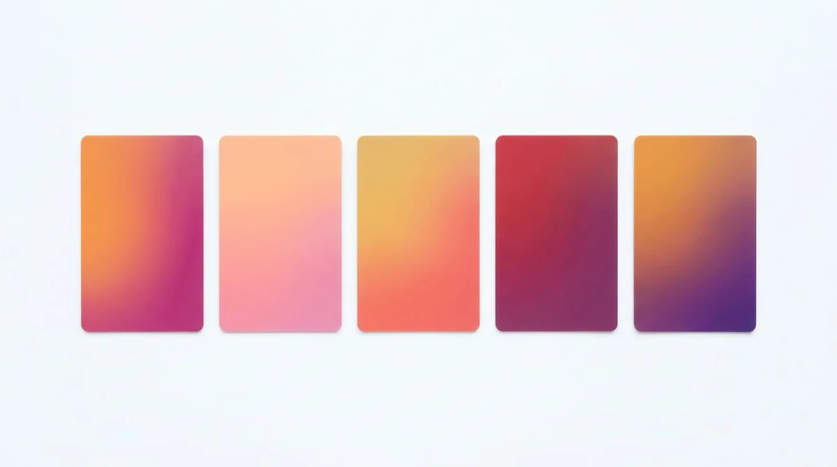
11. Beach dusk: #fb923c → #db2777 → #6d28d9
background: linear-gradient(135deg, #fb923c 0%, #db2777 50%, #6d28d9 100%);12. Peach blossom: #fda4af → #fdba74
background: linear-gradient(180deg, #fda4af 0%, #fdba74 100%);13. Coral flame: #fbbf24 → #f43f5e
background: linear-gradient(135deg, #fbbf24 0%, #f43f5e 100%);14. Plum horizon: #dc2626 → #4c1d95
background: linear-gradient(160deg, #dc2626 0%, #4c1d95 100%);15. Amber violet: #f59e0b → #7c3aed
background: linear-gradient(135deg, #f59e0b 0%, #7c3aed 100%);Sunset gradients work especially well behind hero text on creator portfolios, podcast cover art, and event landing pages.
Cool / tech
Five blue-and-purple combos that read as confident and modern. Perfect for dev tools, fintech, and infrastructure brands.
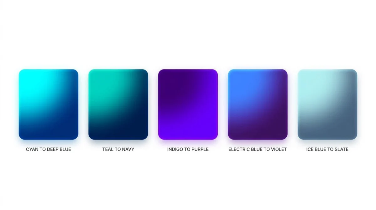
16. Cyan deep: #22d3ee → #1e3a8a
background: linear-gradient(135deg, #22d3ee 0%, #1e3a8a 100%);17. Indigo violet: #4f46e5 → #a855f7
background: linear-gradient(135deg, #4f46e5 0%, #a855f7 100%);18. Teal navy: #14b8a6 → #1e293b
background: linear-gradient(160deg, #14b8a6 0%, #1e293b 100%);19. Glacier: #dbeafe → #6366f1
background: linear-gradient(180deg, #dbeafe 0%, #6366f1 100%);20. Aurora tech: #06b6d4 → #6366f1 → #c026d3
background: linear-gradient(135deg, #06b6d4 0%, #6366f1 50%, #c026d3 100%);
Tired of plain screenshots? Try ScreenSnap Pro.
Beautiful backgrounds, pro annotations, GIF recording, and instant cloud sharing, all in one app. Pay $34 once, own it forever.
See pricing and featuresMesh / multi-stop
Five gradients built by stacking multiple radial-gradient() calls. They look painted, not algorithmic: the modern hero look behind brands like Stripe and Linear.
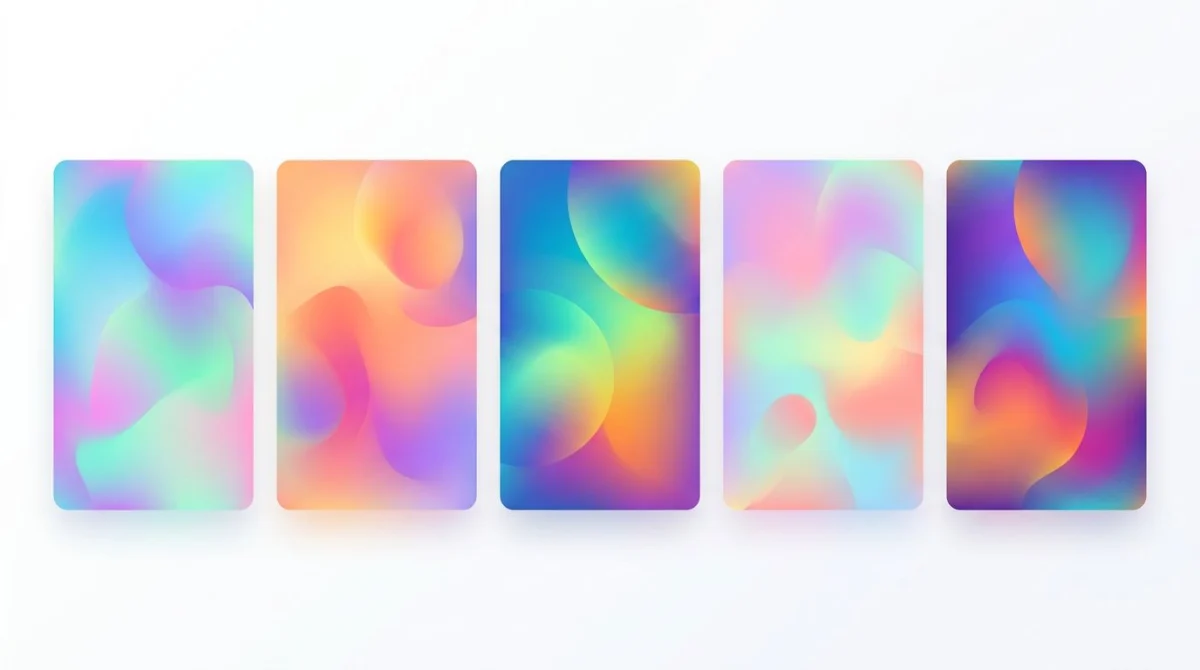
21. Soft mesh: pink, peach, lilac
background:
  radial-gradient(at 20% 20%, #fbcfe8 0px, transparent 50%),
  radial-gradient(at 80% 0%, #fde68a 0px, transparent 50%),
  radial-gradient(at 0% 80%, #c4b5fd 0px, transparent 50%),
  #fff7ed;
22. Aurora mesh: cyan, indigo, magenta
background:
  radial-gradient(at 10% 10%, #06b6d4 0px, transparent 50%),
  radial-gradient(at 90% 30%, #6366f1 0px, transparent 50%),
  radial-gradient(at 50% 90%, #ec4899 0px, transparent 50%),
  #0f172a;
23. Citrus mesh: yellow, coral, mint
background:
  radial-gradient(at 0% 0%, #fde047 0px, transparent 50%),
  radial-gradient(at 100% 50%, #fb7185 0px, transparent 50%),
  radial-gradient(at 50% 100%, #34d399 0px, transparent 50%),
  #ffffff;
24. Cosmic mesh: violet, blue, magenta on dark
background:
  radial-gradient(at 15% 30%, #7c3aed 0px, transparent 60%),
  radial-gradient(at 85% 70%, #2563eb 0px, transparent 60%),
  radial-gradient(at 50% 50%, #db2777 0px, transparent 50%),
  #020617;
25. Pastel mesh: sky, mint, pink
background:
  radial-gradient(at 25% 25%, #bae6fd 0px, transparent 50%),
  radial-gradient(at 75% 25%, #bbf7d0 0px, transparent 50%),
  radial-gradient(at 50% 80%, #fbcfe8 0px, transparent 50%),
  #fafafa;
Animated gradients
Five gradients that move. Use sparingly: motion grabs attention but burns it fast.
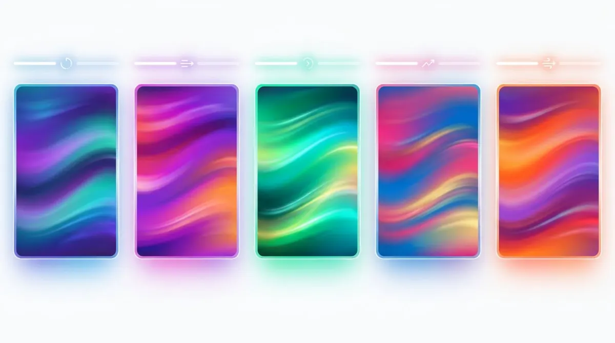
26. Slow shift: looping linear sweep
.bg {
  background: linear-gradient(135deg, #6366f1, #ec4899, #f59e0b, #6366f1);
  background-size: 300% 300%;
  animation: shift 12s ease infinite;
}
@keyframes shift {
  0%   { background-position: 0% 50%; }
  50%  { background-position: 100% 50%; }
  100% { background-position: 0% 50%; }
}
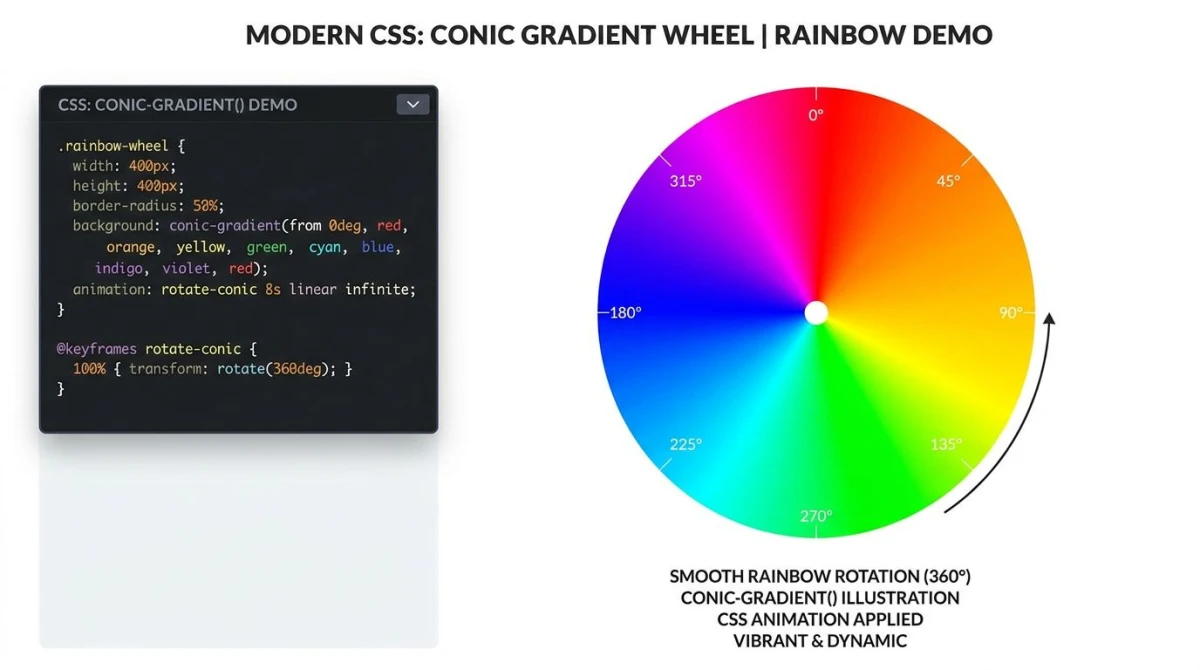
27. Conic spin: rotating rainbow
.bg {
  background: conic-gradient(from 0deg, #06b6d4, #8b5cf6, #ec4899, #06b6d4);
  animation: spin 20s linear infinite;
}
@keyframes spin {
  to { transform: rotate(1turn); }
}
28. Hover swap: interactive button
.btn {
  background: linear-gradient(135deg, #6366f1, #ec4899);
  background-size: 200% 200%;
  transition: background-position 0.6s ease;
}
.btn:hover { background-position: 100% 0%; }
29. Aurora drift: slow mesh
.bg {
  background:
    radial-gradient(at 20% 20%, #06b6d4, transparent 50%),
    radial-gradient(at 80% 60%, #ec4899, transparent 50%),
    #0f172a;
  background-size: 200% 200%;
  animation: drift 18s ease-in-out infinite;
}
@keyframes drift {
  0%, 100% { background-position: 0% 0%; }
  50%      { background-position: 100% 100%; }
}
30. Pulse glow: radial breathing effect
.bg {
  background: radial-gradient(circle at 50% 50%, #f472b6, #1e1b4b);
  animation: pulse 6s ease-in-out infinite;
}
@keyframes pulse {
  0%, 100% { background-size: 100% 100%; }
  50%      { background-size: 140% 140%; }
}
Pair animated gradients with prefers-reduced-motion: reduce to disable motion for users who need it. A simple wrapper:
@media (prefers-reduced-motion: reduce) {
  .bg { animation: none; }
}
This single rule keeps your design accessible without losing the static look for everyone else.
Browser support in 2026
linear-gradient(), radial-gradient(), and conic-gradient() all ship in every evergreen browser: Chrome, Edge, Safari, Firefox, plus iOS and Android. The caniuse data on CSS gradients puts global support above 99%. The only thing still in flux is the proposed mesh-gradient() function from CSS Images Module Level 4, which is not yet shipped anywhere. Until it lands, fake mesh gradients with stacked radial gradients (examples 21-25 above).
For deep syntax details and edge cases, the MDN gradient reference and the MDN guide to using gradients are the canonical sources.
Best practices for gradient backgrounds
File size beats PNGs. A 1920x1080 hero saved as PNG can hit 500 KB. A CSS gradient is bytes: the browser paints it. Always pick CSS over an image for solid color blends.
Test contrast at every point. A gradient that fades from #6366f1 to #fde68a may pass WCAG against white text on the dark end and fail on the light end. Sample multiple points along the path. Our color contrast checker verifies WCAG AA and AAA in one click.
Performance. CSS gradients are GPU-accelerated and reflow cheaply. Stacked mesh gradients with 6+ layers can hurt paint performance on low-end mobile. Keep it under four layers if you target older devices.
Don't trap text inside busy mesh gradients. Add a darkened overlay (background: rgba(0,0,0,0.4) on a child element) so headings stay legible.
Generate custom gradients
Browsing 30 examples is fun, but eventually you'll want exact colors that match your brand. Skip the trial-and-error and use our free gradient generator: pick colors, drag stops, switch between linear/radial/conic, copy the CSS, done. It also exports the gradient as a PNG for slide decks and social posts.
If you also need to extract gradient-friendly palettes from a reference image, run it through our color palette extractor first. Paste the hex codes straight into the generator, and if the reference image itself has to move onto your palette, the image color changer recolors it before you build the gradient around it.
A quick word on color theory
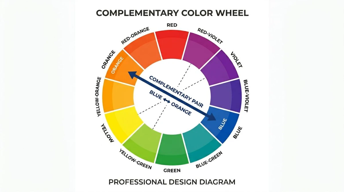
Why do some gradients pop while others feel muddy? Two rules of thumb. Complementary colors (opposites on the wheel: orange and blue, red and green) create high contrast and visual energy; great for CTAs and bold heroes. Analogous colors (neighbors on the wheel: blue, blue-violet, violet) feel calm and cohesive; great for subtle SaaS backdrops. Most of the bold gradients above use complementary pairs; most of the subtle ones lean analogous. When a gradient feels "off," check whether the two endpoints sit too close to grey on the wheel: that is usually the culprit. For a deeper primer on hue, saturation, and harmony, our color theory guide walks through the full wheel.
For Mac users who want to grab gradient colors directly from any app or webpage, see our guide to picking colors from your screen on Mac.
Frequently Asked Questions

Morgan
Indie DeveloperIndie developer, founder of ScreenSnap Pro. A decade of shipping consumer Mac apps and developer tools. Read full bio
@m_0_r_g_a_n_