Analogous Colors: Palettes, Hex Codes & UI Examples (2026)
Analogous colors are three to five hues that sit next to each other on the color wheel, such as blue, blue-green, and green. They share an underlying tone, so they blend without clashing. Designers reach for them when a layout needs to feel calm, cohesive, or natural rather than loud and high-contrast. This guide goes deep on analogous colors specifically: what they are, eight ready-to-paste palettes with hex codes, where they shine, where they fail, and how to build your own in under a minute. For the full theory of how every scheme on the wheel relates, see our color theory guide.
What makes a color scheme analogous
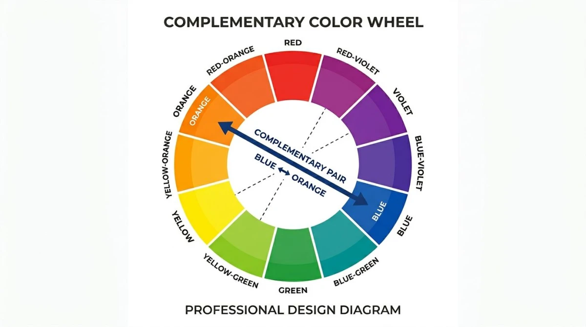
An analogous color scheme uses neighbors. Pick any color on a 12-spoke wheel, then take the two or three slots on either side. Because each step shares pigment with the last, your eye reads the group as one family.
That's why analogous palettes feel harmonious. There's no opposing hue fighting the dominant one. Contrast comes from value (light vs dark) and saturation, not hue, which makes it ideal for nature scenes, calm brands, and gradients.
Three colors feels tight and controlled. Five gives you a longer ramp for gradients and illustrations.
8 ready-to-use analogous palettes
Each palette below is a working set of hex codes you can paste into Figma, Tailwind, or CSS today. Use the first color as your dominant, the rest as supporting tones.
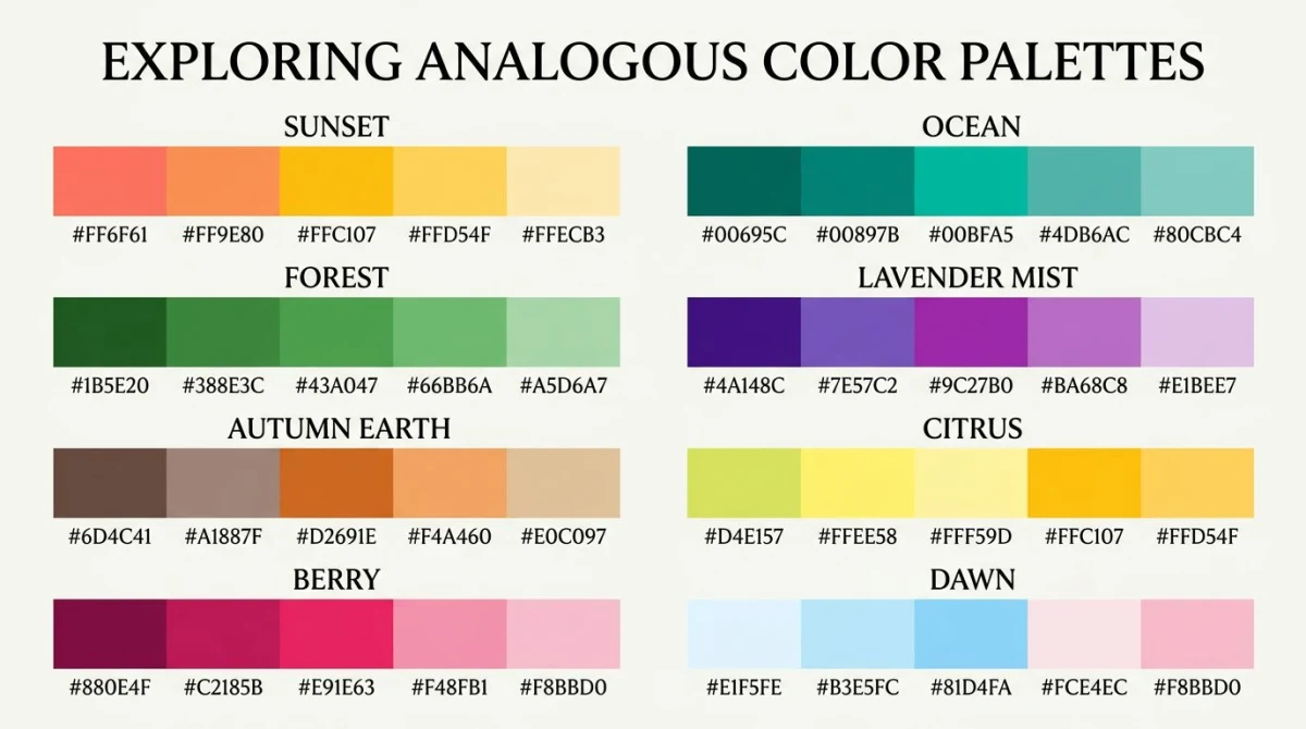
1. Sunset (warm)
#F94144 #F3722C #F8961E #F9C74F
Red into orange into yellow. Use it for travel, food, and lifestyle brands that want energy without being neon.
2. Ocean (cool)
#0077B6 #0096C7 #00B4D8 #48CAE4
Pure blue stepping toward cyan. Perfect for SaaS, fintech, and anything that wants to read as "calm and trustworthy."
3. Forest
#386641 #6A994E #A7C957 #F2E8CF
Deep green to yellow-green with a cream off-tone. Great for outdoor brands, wellness apps, and editorial sites.
4. Lavender Mist
#3A0CA3 #7209B7 #B5179E #F72585
Violet stepping into magenta. Reads as creative and modern. Common in beauty, gaming, and lifestyle.
5. Autumn Earth
#582F0E #7F4F24 #936639 #A68A64
Brown into tan into ochre. Use it for skincare, food, and any brand chasing a warm, grounded feel.
6. Citrus
#FFBA08 #FAA307 #F48C06 #E85D04
Yellow into deep orange. Loud but not chaotic: a strong choice for food delivery and fitness.
7. Berry
#7B2D26 #A63A50 #D33F49 #E8505B
Wine into red into coral. Editorial and confident; works well for restaurants and bold lifestyle brands.
8. Dawn
#264653 #2A9D8F #8AB17D #E9C46A
Teal moving through green to gold. The widest of the eight: useful when you need a longer gradient ramp.
How analogous schemes work in practice
The trick to making an analogous palette feel intentional, not mushy, is hierarchy. You're not using all four colors equally.
Pick a dominant, then 1 to 2 supporting
Choose one color to carry 60% of the surface (usually the most saturated). Pick one or two neighbors as supporting tones for cards and secondary buttons. Drop the rest into accents.
The 60-30-10 ratio (with an accent CTA)
Designers use a 60-30-10 split. Your dominant covers backgrounds. The supporting color covers blocks and headings. The third tone handles details. Contrast stays naturally low: great for mood, bad for a "Buy Now" button that needs to pop.
The fix: borrow one accent from outside the family. A single complementary or neutral pop is enough. We cover that tradeoff in the complementary colors spoke.
Where they shine
- Nature scenes and illustration. Sunsets, forests, and seascapes are inherently analogous.
- Calming brand systems. Wellness, finance, and meditation apps lean on these schemes for a reason.
- Gradient backgrounds. A three-stop gradient through neighbors looks smooth. Our gradient backgrounds guide shows the CSS.
Where they fail
The biggest pitfall is contrast. Light yellow text on a slightly darker yellow background may feel pretty in Figma but fail WCAG color contrast for accessibility. Test body text with a contrast checker. If the ratio is below 4.5:1, swap one tone for a darker or lighter neighbor.
Analogous color schemes in famous brands
Real-world examples make the theory click.
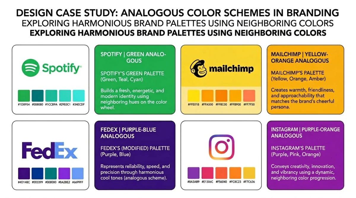
- Mailchimp uses yellow stepping into orange for its core illustrations: pure citrus analogous.
- FedEx pairs purple with a blue-violet wordmark, sitting two steps apart on the wheel.
- Spotify wraps its green logo in teal and lime gradients across marketing surfaces.
- BP's sunburst logo flows from yellow through yellow-green to green.
- Firefox moves from red-orange through orange into yellow on its fox.
- Starbucks sits inside a green-only family with darker forest accents, a tight three-color analogous run.
Notice the pattern: when a brand wants to feel approachable or natural, it picks neighbors. When it wants to feel sharp and urgent (think Target, Coca-Cola), it picks opposites instead.

Tired of plain screenshots? Try ScreenSnap Pro.
Beautiful backgrounds, pro annotations, GIF recording, and instant cloud sharing, all in one app. Pay $34 once, own it forever.
See pricing and featuresHow to find analogous colors
You don't need to memorize the wheel. You just need a starting hue.
The color wheel walkthrough
Open any 12-spoke wheel and pick your dominant. Slide two or three slots left and right: those are your neighbors. For the full primary/secondary/tertiary breakdown, our color theory hub walks through the wheel from scratch.
Tool walkthrough
Faster than counting slots: use a generator. Our free color palette generator has an analogous mode: drop in any hex code and it returns four neighbors at the right intervals.
To lift a palette from a photo (sunset, forest, ocean), use the color palette extractor. For exact hex codes from a screenshot, the color picker handles that in one click.
Variations: warm, cool, and desaturated
Inside the analogous family, you have three useful flavors.
Warm analogous runs through reds, oranges, and yellows. Energetic but not aggressive. Good for food, fitness, and lifestyle.
Cool analogous runs through greens, blues, and violets. Calming and pro. Good for finance, healthcare, and B2B SaaS.
Desaturated analogous pulls saturation down by 30 to 50%. Often this works better than the vivid version: pure palettes can feel cartoonish, while muted ones feel editorial.

Analogous vs complementary vs monochromatic
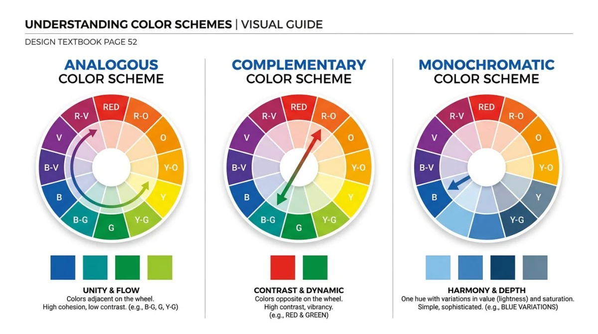
Three of the most common color schemes, side by side:
| Scheme | How it's built | Feels like | Best for |
|---|---|---|---|
| Analogous | 3 to 5 neighbors on the wheel | Calm, cohesive, natural | Nature, wellness, gradients |
| Complementary | 2 colors directly opposite | Bold, high-contrast, urgent | CTAs, sports, alerts |
| Monochromatic | 1 color in many shades/tints | Minimal, refined, focused | Editorial, luxury, dashboards |
Each scheme has its own strengths. For the deep dive on the other two, see the complementary colors and monochromatic color palette spokes. They share a hub with this guide: color theory.
Pro tip: lift palettes from screenshots
Spot an analogous scheme in the wild (a website, a magazine, a product photo), capture it and run it through a palette extractor. ScreenSnap Pro is a $34 one-time purchase that handles capture and quick annotation in one step, so you grab the reference, mark the bits you want, and feed it to a palette tool without bouncing between apps. Works on Mac and Windows.
Frequently Asked Questions
Wrapping up
Analogous palettes are the easiest scheme to build well. Pick a dominant color, take its neighbors, mind your contrast for accessibility, and borrow one outside accent if you need a CTA to pop. The eight palettes above are paste-ready.
For more on how every scheme fits together, head to our color theory hub. To experiment now, try the color palette generator or lift palettes from real photos with the color palette extractor. For deeper background, see the Wikipedia entry on analogous colors, the Sessions College color calculator, and Adobe's color wheel. For a broader primer, the Interaction Design Foundation's color theory page is worth a read.

Morgan
Indie DeveloperIndie developer, founder of ScreenSnap Pro. A decade of shipping consumer Mac apps and developer tools. Read full bio
@m_0_r_g_a_n_