50 Color Palette Ideas for 2026 (Hex Codes Included)
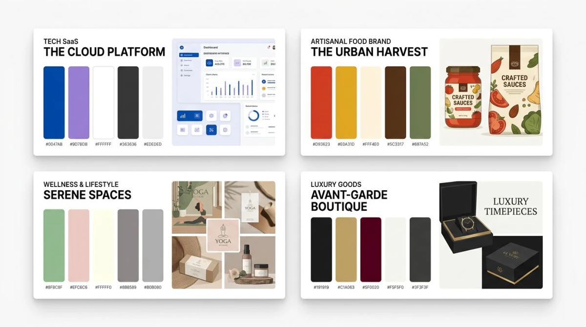
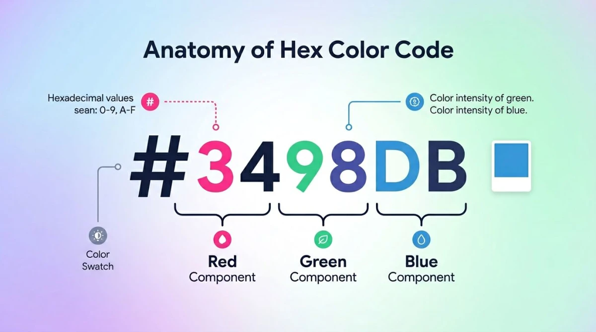
Picking colors from scratch is hard. Picking them from a curated list is easy. Below are 50 fresh color palette ideas for 2026, each one tagged with hex codes you can copy straight into Figma, Tailwind, or Adobe Color.
The palettes are sorted by mood, season, industry, era, and nature. Each one lists a "best for" use case so you can pick fast. Tweak the hex values from there: bump saturation, swap an accent, drop one swatch. These are starting points, not rules.
Want to build your own from a photo? Skip to the tools section. Want the theory behind why these work? See our color theory guide.
How to use this list
Every palette has 4 to 5 hex codes. Click into your design tool, paste the hex, and you have a working scheme. The "best for" tag tells you the kind of project it suits. Mix palettes if you want: pull a base from one, an accent from another.
For accessibility, run any pair through a color contrast checker before shipping. Body text on background should hit WCAG AA (4.5:1). Need a quick hex-to-RGB conversion for CSS variables? Use our hex to RGB tool.
Mood-based palettes (10)
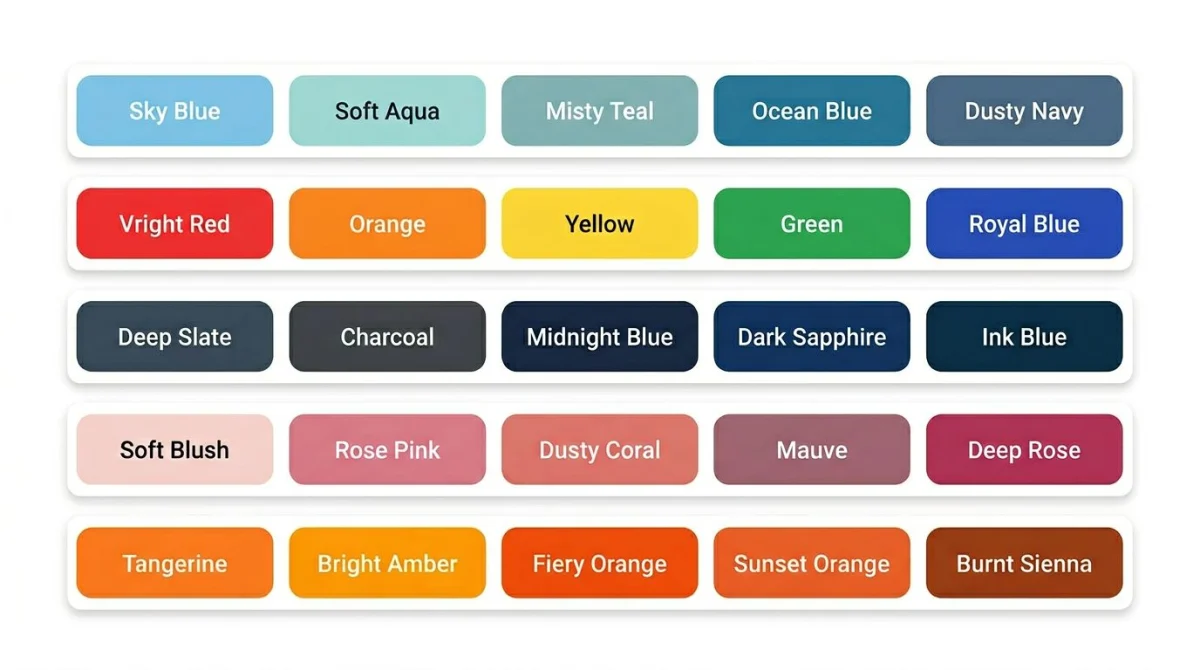
1. Soft Calm
#E0F2F1 #B2DFDB #80CBC4 #26A69A #004D40
Best for: wellness apps, meditation sites, spa brands.
2. Cloud Mist
#F5F7FA #E4E7EB #CBD2D9 #9AA5B1 #3E4C59
Best for: SaaS dashboards, productivity tools, minimal portfolios.
3. Vibrant Pop
#FF006E #FB5607 #FFBE0B #8338EC #3A86FF
Best for: youth brands, music apps, bold landing pages.
4. Electric Citrus
#FFD60A #FFC300 #FF5400 #FF006E #240046
Best for: event posters, fitness apps, energy drink brands.
5. Moody Dusk
#22223B #4A4E69 #9A8C98 #C9ADA7 #F2E9E4
Best for: photography portfolios, premium blogs, editorial sites.
6. Midnight Ink
#0D1B2A #1B263B #415A77 #778DA9 #E0E1DD
Best for: dark mode UIs, finance apps, developer tools.
7. Romantic Blush
#FFE5EC #FFC2D1 #FFB3C6 #FF8FAB #FB6F92
Best for: wedding sites, beauty brands, lifestyle blogs.
8. Velvet Rose
#641220 #85182A #A11D33 #BD1F36 #E01E37
Best for: luxury fashion, wine brands, valentines campaigns.
9. Energetic Sunrise
#F72585 #B5179E #7209B7 #3A0CA3 #4361EE
Best for: music festivals, gaming brands, creative agencies.
10. Lemon Spark
#F94144 #F3722C #F8961E #F9C74F #90BE6D
Best for: food delivery, kids apps, summer campaigns.
Seasonal palettes (8)
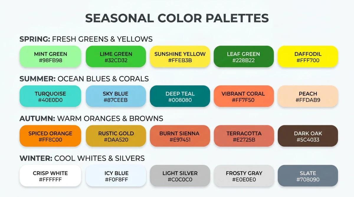
11. Fresh Spring
#CDE7B0 #A7CE95 #84BC9C #FFE194 #F49E4C
Best for: garden centers, easter campaigns, kids brands.
12. Spring Bloom
#F8BBD0 #E1BEE7 #C5CAE9 #BBDEFB #B3E5FC
Best for: floral shops, baby products, soft lifestyle brands.
13. Summer Coast
#003049 #00B4D8 #90E0EF #FFD60A #F77F00
Best for: travel sites, beach resorts, summer ad campaigns.
14. Summer Sorbet
#FF99C8 #FCF6BD #D0F4DE #A9DEF9 #E4C1F9
Best for: ice cream brands, kids apps, gen-z social campaigns.
15. Autumn Harvest
#582F0E #7F4F24 #936639 #A68A64 #C2C5AA
Best for: coffee shops, bakeries, fall fashion lookbooks.
16. Crisp Autumn
#9C2A2A #D17B0F #E8A33D #7A8B3A #3D4A2A
Best for: thanksgiving menus, outdoor gear, woodworking blogs.
17. Winter Frost
#CAF0F8 #90E0EF #00B4D8 #0077B6 #03045E
Best for: ski resorts, holiday cards, tech product launches.
18. Winter Gray
#F8F9FA #E9ECEF #DEE2E6 #ADB5BD #212529
Best for: fashion editorials, architecture sites, minimal stationery.
Industry palettes (10)
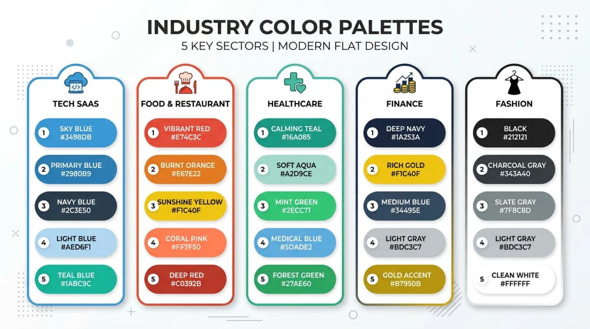
19. Tech / SaaS Blue
#F8FAFC #E2E8F0 #3B82F6 #1E40AF #0F172A
Best for: B2B SaaS, dev tools, productivity apps. Stripe vibes.
20. SaaS Mint
#F0FDF4 #86EFAC #22C55E #15803D #052E16
Best for: finance SaaS, eco tech, growth dashboards.
21. Food / Restaurant Warm
#FFF1E6 #F4A261 #E76F51 #D62828 #003049
Best for: burger joints, pizzerias, bistro menus.
22. Cafe Roast
#FAF3E0 #D4A373 #A47148 #6B4226 #3E2C1C
Best for: coffee shops, artisan bakeries, chocolate brands.
23. Healthcare Calm
#E3F2FD #90CAF9 #42A5F5 #1976D2 #0D47A1
Best for: clinics, telemedicine apps, dental practices.
24. Wellness Sage
#F1F8E9 #C5E1A5 #7CB342 #558B2F #33691E
Best for: therapy apps, organic skincare, yoga studios.
25. Finance Trust
#0A2540 #1E3A5F #2D5F8B #C9A961 #F4E9D8
Best for: banks, fintech apps, investment platforms.
26. Crypto Neo
#0D0D0D #262626 #F0B90B #FCD34D #FFFFFF
Best for: crypto exchanges, web3 sites, NFT marketplaces.
27. Fashion Mono
#FFFFFF #E5E5E5 #A3A3A3 #525252 #000000
Best for: luxury fashion, streetwear, minimal jewelry brands.
28. Beauty Nude
#FFF8F0 #F5DEB3 #D4A574 #A0826D #5C3D2E
Best for: cosmetics, skincare, candle brands.
Era / retro palettes (8)
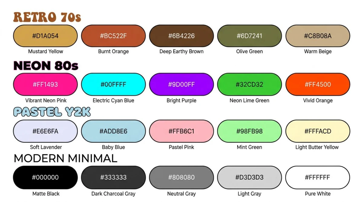
29. 70s Mustard
#D4A017 #B8860B #8B4513 #CD853F #FFEAA7
Best for: retro-themed sites, vintage fashion, vinyl shops.
30. 70s Avocado
#6B8E23 #808000 #BDB76B #F5DEB3 #8B4513
Best for: mid-century furniture, organic groceries, retro diners.
31. 80s Neon
#FF006E #FB5607 #FFBE0B #00F5FF #7B2CBF
Best for: synthwave brands, gaming sites, retro 80s campaigns.
32. Miami Sunset
#FF6B9D #C44569 #F8B500 #3DDAD7 #2C3E50
Best for: vacation rentals, cocktail bars, vaporwave aesthetics.
33. Y2K Pastel
#C8B6FF #B8C0FF #BBD0FF #E7C6FF #FFD6FF
Best for: gen-z apps, dating apps, lo-fi music brands.
34. Y2K Cyber
#FF61D2 #FE9090 #83F4FF #FFC971 #A09AE5
Best for: trendy ecommerce, fashion drops, music videos.
35. Modern Minimal
#FAFAFA #F4F4F5 #A1A1AA #27272A #09090B
Best for: portfolios, agencies, premium product pages.
36. Scandi Soft
#FAF9F6 #EDE6DC #D4B996 #A1887F #5D4037
Best for: home decor, lifestyle blogs, ceramic studios.

Tired of plain screenshots? Try ScreenSnap Pro.
Beautiful backgrounds, pro annotations, GIF recording, and instant cloud sharing, all in one app. Pay $34 once, own it forever.
See pricing and featuresNature palettes (8)
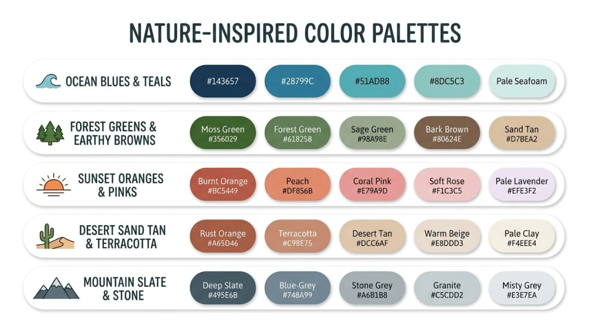
37. Deep Ocean
#03045E #0077B6 #00B4D8 #90E0EF #CAF0F8
Best for: marine charities, swim brands, water-themed apps.
38. Coastal Sea
#264653 #2A9D8F #E9C46A #F4A261 #E76F51
Best for: travel blogs, surf brands, mediterranean restaurants.
39. Forest Pine
#1B4332 #2D6A4F #52B788 #95D5B2 #D8F3DC
Best for: outdoor brands, environmental nonprofits, hiking apps.
40. Misty Woodland
#3A5A40 #588157 #A3B18A #DAD7CD #344E41
Best for: botanical shops, garden services, nature photography.
41. Sunset Glow
#FF7B00 #FF8800 #FF9500 #FFA200 #3D348B
Best for: travel campaigns, podcast brands, sunset event posters.
42. Tropical Sunset
#F72585 #FF6B35 #F7B801 #7209B7 #3A0CA3
Best for: beach resorts, summer playlists, festival branding.
43. Desert Sand
#EDC9AF #D2B48C #C19A6B #A0522D #5C4033
Best for: boho fashion, southwest decor, ceramics studios.
44. Mountain Slate
#2F3E46 #354F52 #52796F #84A98C #CAD2C5
Best for: hiking gear, eco lodges, mens grooming brands.
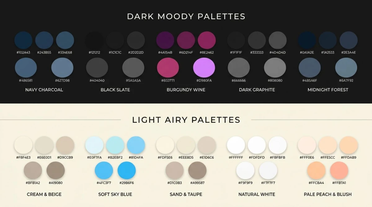
Dark and light variants (6)
45. Dark Mode Default
#0F172A #1E293B #334155 #94A3B8 #F1F5F9
Best for: dark mode UIs, code editors, terminal themes.
46. Inky Plum
#10002B #240046 #3C096C #5A189A #9D4EDD
Best for: premium streaming services, music apps, gaming sites.
47. Charcoal Wine
#1A1A1A #3E1F1F #6B2C2C #A03E3E #D4A574
Best for: steakhouses, whiskey brands, tattoo studios.
48. Soft Cream
#FFFEF7 #FFF8E7 #FFEDC2 #F5DEB3 #D4A574
Best for: stationery shops, bakeries, paper goods.
49. Light Sky
#F0F9FF #E0F2FE #BAE6FD #7DD3FC #0EA5E9
Best for: kids apps, weather apps, school websites.
50. Dusty Pastel
#F4E1D2 #F0D9DA #E9C5C5 #D9B5B5 #B89B9B
Best for: boudoir photography, vintage shops, lifestyle blogs.
How to actually use these palettes
A palette is just a starting point. Here is the workflow most designers follow.
Copy the hex into your tool. Figma, Sketch, Adobe XD, and Tailwind config all accept hex codes directly. Paste them as design tokens or CSS variables so a swap later is one edit, not fifty.
Adjust for accessibility. Pretty doesn't mean readable. Take any color pair you plan to use for body text and check the contrast. A light gray on white might score 2.1:1, well below the WCAG AA bar of 4.5:1. Bump saturation or shift the lightness until it passes. The color contrast checker does this in two clicks. For a deeper walkthrough of contrast ratios and the math behind WCAG, see our guide on WCAG color contrast.
Apply the 60-30-10 rule. Use 60% of one color (background), 30% of a second (sections, cards), and 10% of a third (buttons, accents). The remaining swatches are reserved for hover states, errors, and edge cases. This rule alone saves most amateur designs.
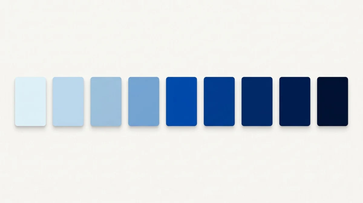
Pick the scheme behind the palette. Most of these are not random. They're built on classic color schemes. Want pairs that pop? See complementary colors. Want softer harmony? See analogous colors. Want clean and tonal? Mix in shades and tints from the same family.
Tools to build your own
Curated palettes are great. But sometimes a project demands something specific: a palette pulled from a client's photo, a logo color matched exactly, or a custom set built from a single brand color. That's where tools earn their keep.
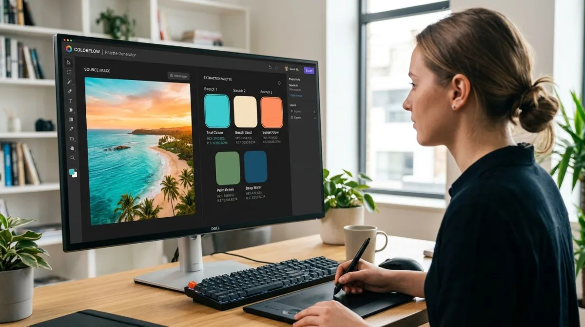
Color Palette Extractor drops in any image (a photo, a moodboard, a competitor screenshot) and pulls a 5 to 8 color palette out of it. Hex codes ready to copy.
Color Palette Generator starts with one base color and generates complementary, analogous, triadic, or monochromatic variations. Great when a client gives you a single brand hex.
Color Picker lets you hover over any pixel in any image and grab the exact hex. Useful for matching a screenshot or brand asset.
Color Blindness Simulator previews how your palette looks to users with deuteranopia, protanopia, and tritanopia. Catches contrast issues before launch.
If you want hands-on color picking from your own desktop, see our guide on picking colors from the screen on Mac.
More inspiration sources
When 50 isn't enough, the design community publishes thousands more. Some favorites:
- Coolors popular palettes: community voted, refreshed daily.
- Adobe Color Explore: built-in harmony rules, downloadable as ASE.
- Color Hunt: curated 4-color palettes, easy browsing.
- UI Gradients: for two-color CSS gradients.
- Behance galleries: full design projects, palette in context.
The theory behind why palettes work
Every palette above leans on one or more classical color relationships: complementary, analogous, triadic, monochromatic, or split-complementary. Those rules come from the color wheel, which is the foundation of every design school course. If you want the full grounding (why warm and cool feel different, why some pairings clash, how the wheel maps to RGB and HSL), read our hub article on color theory. It pairs naturally with this list.
Frequently asked questions

Morgan
Indie DeveloperIndie developer, founder of ScreenSnap Pro. A decade of shipping consumer Mac apps and developer tools. Read full bio
@m_0_r_g_a_n_