Monochromatic Color Palettes: 10 Examples & Hex Codes (2026)
# Monochromatic Color Palettes: A Designer's Guide with 10 Examples
A monochromatic color palette uses one hue: the same base color taken lighter (tints), darker (shades), or grayer (tones). Every swatch shares one hue, so the look feels calm and clean on its own. No second color has to fit in. That is why monochromatic schemes show up so often in tech and SaaS brands, where teams want a calm, sure look with no visual noise. They are easy to extend, easy to make readable, and hard to get wrong once you know the three knobs you can turn. This guide walks through those knobs, gives you 10 ready-to-use palettes with hex codes, and shows where monochromatic shines and where it falls flat.
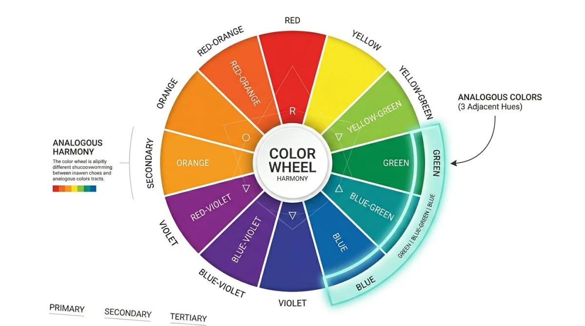
For the wider view of how monochromatic fits among the other schemes, start with our color theory guide. It covers the wheel, the schemes, and how to pick one. This article goes deep on monochromatic alone.
The 3 ways to vary a single hue
Every monochromatic color scheme starts from three moves on one base hue. Pick a base color, then push it in one of three directions.
Tints (add white)
A tint is your base color mixed with white. The hue stays the same; the color gets lighter and softer. Tints feel airy and calm: think pastel blue, baby pink, mint. In design tools you make a tint by raising the L value toward 100% in HSL, or by laying white on top at low opacity.
Shades (add black)
A shade is your base color mixed with black. The hue stays the same; the color gets darker and heavier. Shades feel grounded and serious: think navy, oxblood, forest green. In HSL you make a shade by lowering L toward 0%.
Tones (add gray)
A tone is your base color mixed with gray. The hue stays the same, but the color gets less vivid and more muted. Tones feel grown-up and quiet: think dusty rose, muted teal, sage. In HSL you make a tone by lowering S while keeping L near the middle.
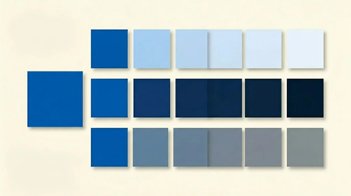
You can mix all three in one palette. A typical 5-step monochromatic ramp uses 1 light tint, 1 mid-light tone, the pure hue, 1 dark tone, and 1 deep shade. That gives you enough range for backgrounds, text, borders, and accents while you stay inside the hue family.
The 10 most-useful monochromatic palettes
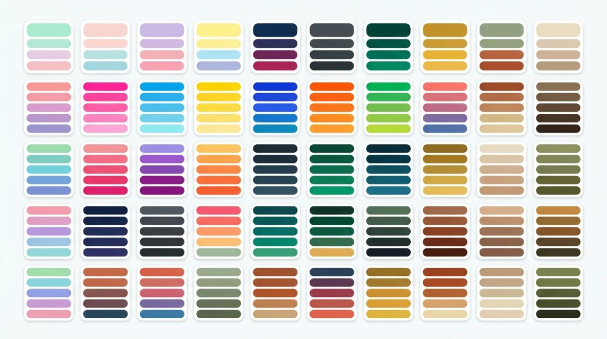
Here are ten monochromatic color palettes tuned for real product, brand, and editorial work. Each has 5 hex codes from light to dark, plus a one-line use case so you know where it fits.
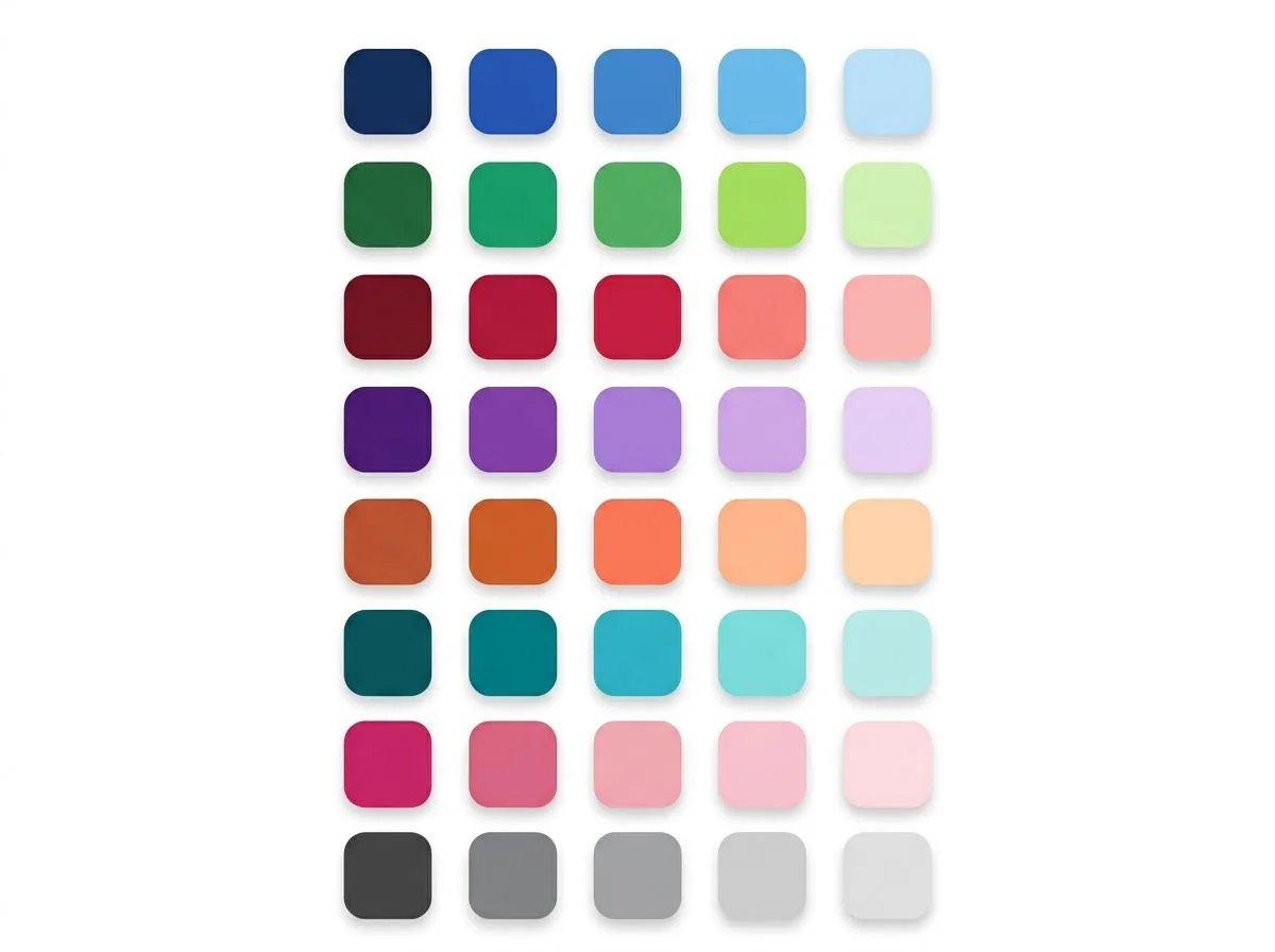
1. Monochrome blue (tech & SaaS)
#EFF6FF #BFDBFE #3B82F6 #1D4ED8 #1E3A8A
The default mono scheme for tech, fintech, and SaaS. Reads as safe, calm, and modern. Great for dashboards where you want order with no second color in the way.
2. Monochrome green (sustainability & health)
#F0FDF4 #BBF7D0 #22C55E #15803D #14532D
Green stands for growth, climate, and health. This mono green palette works for climate brands, health apps, and any product that wants to feel natural with no twee tone.
3. Monochrome red (passion & food)
#FEF2F2 #FECACA #EF4444 #B91C1C #7F1D1D
Red is energy and appetite. Use this mono scheme for food brands, alert states, or any place you want urgency with no full alarm. Stick to one or two strong reds at a time, because too much vivid red wears the eye out.
4. Monochrome purple (luxury & creative)
#FAF5FF #E9D5FF #A855F7 #7E22CE #581C87
Purple has been the luxury hue for ages, ever since Tyrian dye was rare. A mono purple scheme reads as creative, premium, and a bit playful. Strong fit for design tools, beauty brands, and creator products.
5. Monochrome orange (energy & playful)
#FFF7ED #FED7AA #F97316 #C2410C #7C2D12
Orange is warmth and energy. This palette is friendly with no childish edge, which makes it good for fitness apps, food delivery, and brands that want to feel open. Pair with deep brown shades for a grounded look.
6. Monochrome teal (modern minimal)
#F0FDFA #99F6E4 #14B8A6 #0F766E #134E4A
Teal sits between blue and green and borrows good traits from both. It feels modern and clean with less punch than pure blue. Strong for clean SaaS, wellness, and editorial sites that want a voice with no loud color.
7. Monochrome pink (lifestyle & wellness)
#FDF2F8 #FBCFE8 #EC4899 #BE185D #831843
Pink has shed its old box and now reads as bold, playful, and modern. Use this mono pink palette for lifestyle, beauty, dating, and wellness brands. The deep shades keep it from feeling too sweet.
8. Monochrome neutral / gray (editorial & photography)
#F9FAFB #E5E7EB #9CA3AF #4B5563 #111827
A mono gray scale isn't really one hue, but it acts like one. This is the editorial designer's safe pick: it never fights the photos, it never feels dated, and it always reads as serious. Great for portfolio sites, news, and any layout where the content has to be the loudest thing on the page.
9. Monochrome yellow (optimism & finance)
#FEFCE8 #FEF08A #EAB308 #A16207 #713F12
Yellow is hard to use alone, because pure yellow on white fails contrast in seconds. This ramp solves that by reaching deep into amber and dark mustard at the high end, so you can build text-safe pairs without losing the warmth. Strong for fintech with personality (Mailchimp, Snap), creator tools, and any brand that wants to feel sunny and confident without sliding into childish.
10. Monochrome brown (hospitality & craft)
#FAF6F2 #E8D9C7 #A0764B #6B4423 #3E2A1B
Brown went from "dated" to "premium" once luxury hospitality, specialty coffee, and slow-fashion brands rebuilt their identities around it. This palette sits warm and grounded; the lightest cream is gentle on eyes for body text against, and the darkest shade is a real near-black with a warm cast. Great for restaurants, lifestyle e-commerce, and any brand that wants to feel handmade with no twee tone.
How to build a monochromatic palette
You can pick a palette off this list, or you can build your own from any starting color. The process has four steps.
1. Pick the dominant hue
Start with one color you're sure about. This usually comes from the brand: a logo color, a key product color, or a hue tied to the field (blue for fintech, green for climate). Don't pick "two close colors", because that's analogous, not mono. Stick to one hue.
If you're starting from a photo or screenshot, run it through our color palette extractor. It pulls the main hex codes out of any image, so you can lift a color from a real-world source and use it as your base.
2. Choose 3 to 5 variants
Most useful mono schemes have 3 to 5 steps. A typical setup looks like this:
- 1 light tint. For backgrounds, hover states, and large surfaces
- 1 normal. The pure base hue, for primary buttons and highlights
- 1 dark shade. For body text, headlines, and dense UI
- (optional) 1 muted tone. For secondary elements that need to recede
- (optional) 1 accent tint. A brighter, slightly different lightness for callouts
Five steps is the sweet spot. Three feels thin in real product UI. Seven or more means you're building a full design system, and you can make those steps with code once you have the anchors.
3. Use HSL, not RGB, for adjustments
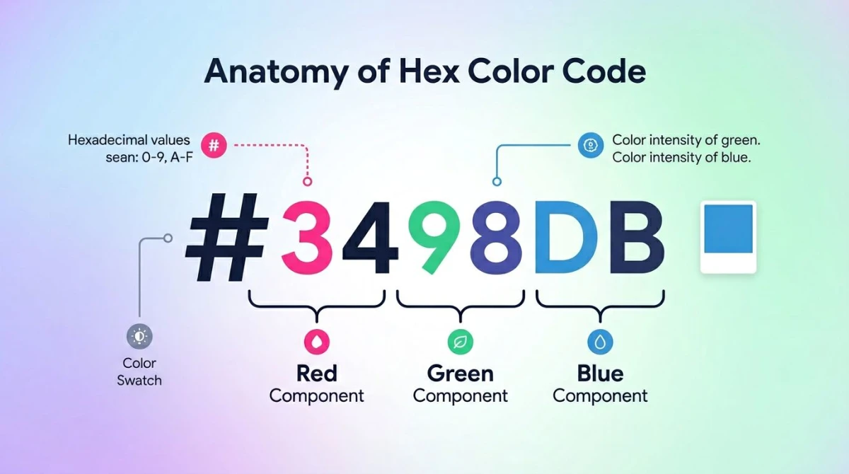
Hex and RGB are great for defining a color, but bad for changing one. If you want a lighter blue, you don't want to nudge red, green, and blue channels by hand. You want to keep the hue and shift the lightness. That's what HSL is for.
- H (hue) is the angle on the color wheel. Keep this fixed for mono.
- S (saturation) is how vivid the color is. Lower it to make tones.
- L (lightness) is how light or dark the color is. Lower it for shades, raise it for tints.
So the rule: only change L (for tints and shades), or only change S (for tones). Hold H steady. Every modern design tool (Figma, Tailwind, CSS) has HSL inputs. Use them.
If you need to turn hex into HSL or RGB to tweak a value, our hex to RGB converter gives you all three formats at once.
4. Generate the steps
Once you have your base hue and your lightness anchors (say 95%, 80%, 50%, 30%, 15%), you can build the steps by hand or use a tool. Our color palette generator takes any base color and gives you a mono ramp at the steps you pick. That saves you the math and hands you copy-ready hex codes.
Monochromatic in famous brands
Most strong brand identities lean mono in their core palette, then add an accent only where it's needed. Here are seven you've seen a hundred times.
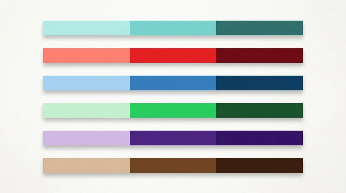
- Tiffany & Co. Tiffany Blue (
#0ABAB5) is so tied to the brand it's a Pantone color. Their full palette is just tints and shades of that one hue, plus white. - Coca-Cola. Coke Red (
#F40009) is the heart of the brand. Marketing leans on lighter pinks and deeper crimsons of that same red. - IBM. IBM Blue (
#0F62FE) anchors a full mono system. The Carbon design system pulls it into a 10-step ramp from#F4F4F4to#161616. - Spotify. Spotify Green (
#1DB954) sits in a near-mono dark UI, with darker greens for hover states and near-black backgrounds. - Cadbury. Cadbury Purple (
#3D0079) has been so steady for so long they've fought court cases to protect it. The whole brand reads as one purple. - UPS. UPS Brown (
#351C15) is a mono study in warm browns. Even the trucks match. - Apple's marketing pages. Many product pages use a near-mono gray system with one accent color pulled from the product itself.
The lesson: a strong mono palette gives a brand fast recall. You don't need ten colors. You need one hue everyone knows is yours.

Tired of plain screenshots? Try ScreenSnap Pro.
Beautiful backgrounds, pro annotations, GIF recording, and instant cloud sharing, all in one app. Pay $39 once, own it forever.
See pricing and featuresWhere monochromatic shines
Mono isn't a fallback. It's the right answer for several jobs.
Minimalist branding
When you want the brand to feel premium, calm, and sure, one hue does more than five. Think high-end shops, B2B SaaS, and editorial sites. The restraint signals taste.
Photography-heavy layouts
If your site is photo-driven, a colorful palette will fight the images. A mono gray or single-hue scheme stays in the back and lets the photos do the talking. This is why portfolio sites lean so hard on grayscale.
Data visualization (sequential scales)
Mono palettes are the standard for sequential data, meaning any data where the value goes from low to high in one direction. A light-to-dark blue ramp on a heatmap shows scale clearly with no false hint that two cells are different in kind. Diverging or category data needs other schemes, but for sequential, mono is the gold standard.
Dark mode
A good dark mode is in effect mono: a near-black background, a few steps of dark gray for surfaces, and one accent hue used in small doses. Building dark mode is much easier when you've already worked in mono, because the lightness ramp flips cleanly.

Where monochromatic fails
Mono isn't always right. Here's where it breaks down.
It lacks contrast for CTAs
If every button, link, and headline shares the same hue, nothing stands out. The "click here" button gets lost in a sea of blue. The fix is to add one accent color: a single opposite or near-by hue used only on the top CTA. See our guide to complementary colors for how to pick that accent without breaking the look.
It can feel monotonous
A poorly built mono palette feels flat. The trick is range: the lightest tint and the darkest shade need to be far apart, with enough steps in between to give real order. If your palette has five swatches that all look like "kind of blue," you don't have a palette. You have a smudge.
It carries accessibility risk
Pure mono schemes can fail color-contrast checks, mostly when teams pair near-equal lightness values for text and background. The lightest tint is too pale for body text on white. The mid hue often fails on a slightly lighter version of itself. Always check your text-on-background pairs against the WCAG color contrast standard. The fix is to pick the lightest and darkest steps for text-and-background pairs and skip mid-mid combos.
For users with color blindness, mono is in fact safer than most schemes (there's only one hue to confuse), but contrast still matters. A mono green palette where every step is near-equal lightness will be hard to read for everyone.
Monochromatic vs analogous vs complementary
Mono is one of three core color-scheme types. Here's how it stacks up.
| Scheme | Hues used | Feeling | Best for |
|---|---|---|---|
| Monochromatic | 1 | Calm, cohesive, minimal | Branding, dashboards, photography |
| Analogous | 3 adjacent on the wheel | Harmonious, natural | Editorial, illustration, gradients |
| Complementary | 2 opposite on the wheel | High-contrast, bold | CTAs, sports, alerts |
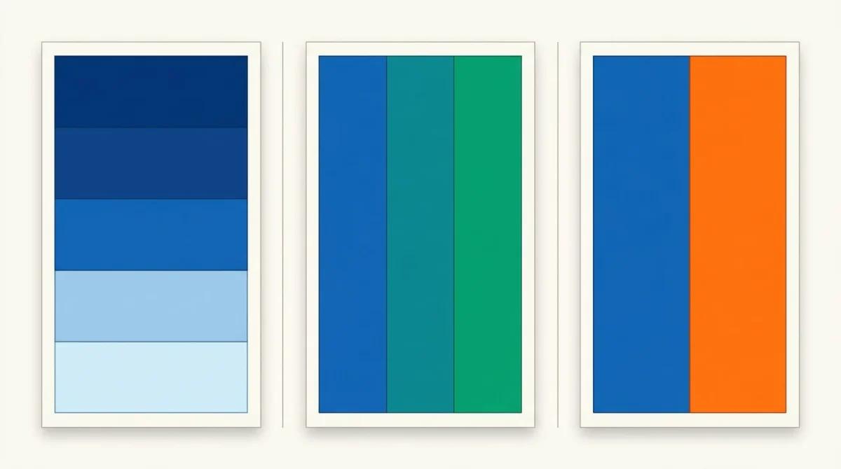
If your project needs more range than mono offers but you still want harmony, analogous colors is the next step. If you want a single accent against a calm base, the complementary colors guide shows how to pick one without breaking your scheme. The full overview lives in our color theory hub.
In real life, a lot of strong systems are 80% mono with a 20% opposite accent. That gives you the calm of one hue and the punch of two.
Tools to build and use monochromatic palettes
You don't have to build palettes by hand. Here's the workflow that takes you from "I have one base color" to "I have a working mono system."
Start with the base color. If you already have a hex code, skip to the next step. If you're pulling from a screenshot, photo, or website, use our color picker to grab the exact hex from any pixel on screen. If you're starting from a full image (a logo, a moodboard, a photo), the color palette extractor pulls the main hex codes out of the whole image so you can pick the strongest hue as your anchor.
Generate the ramp. Drop your base hex into our color palette generator and pick mono mode. It outputs 5 to 9 steps from light to dark, holding H and S steady while shifting L. You can copy hex, RGB, or HSL for each swatch.
Convert and tune. When you need to hand a value to a dev, switch formats with the hex to RGB converter. It returns hex, RGB, and HSL side by side so you can drop in the format your codebase needs.
Document and share. Once you have your palette, capture and annotate the swatches with hex codes for handoff. ScreenSnap Pro is built for this kind of quick capture-and-mark-up flow.
For outside ideas, Adobe Color and Coolors both have huge libraries of palettes you can browse. The Wikipedia entry on monochromatic color covers the formal art-theory roots if you want the deeper background.
Frequently Asked Questions
Wrapping up
Mono is the cheat code of color design. One hue, three moves (tints, shades, tones), a handful of variants, and you have a palette that feels thought through, easy to extend, and easy to make readable. That's why so many strong brands lean on it: less to manage, more to know on sight.
Pick your base color, build the ramp, and use one accent only where it earns its place. If you want to see how mono fits among the other schemes, head back to the color theory hub for the wider view. And if you're starting a palette right now, our color palette generator is the fastest way from one hex code to a working mono system.
Whether you're building a brand, a dashboard, or a portfolio, the rule is the same: one strong hue, used with care, beats five colors fighting each other every time. For more on the theory behind these schemes, Smashing Magazine's color theory primer and the Interaction Design Foundation's color theory overview are both worth a read.

Morgan
Indie DeveloperIndie developer, founder of ScreenSnap Pro. A decade of shipping consumer Mac apps and developer tools. Read full bio
@m_0_r_g_a_n_