WCAG Color Contrast: AA, AAA Rules & How to Test (2026)
# WCAG Color Contrast: The 2026 Practical Guide (AA, AAA, How to Test)
A color contrast ratio is the luminance difference between two colors, expressed as a number from 1:1 (no contrast) to 21:1 (black on white). For text on a webpage, this single number decides whether people can read your content or have to squint and zoom. It also decides whether your site passes WCAG, the standard that backs ADA lawsuits in the US and EAA enforcement in the EU.
The magic number: 4.5:1 for normal body text. Hit it and you pass WCAG 2.2 Level AA. This guide covers every threshold, the math, how to test in seconds, and fixes for the failures we see most often.
WCAG contrast ratios cheat sheet
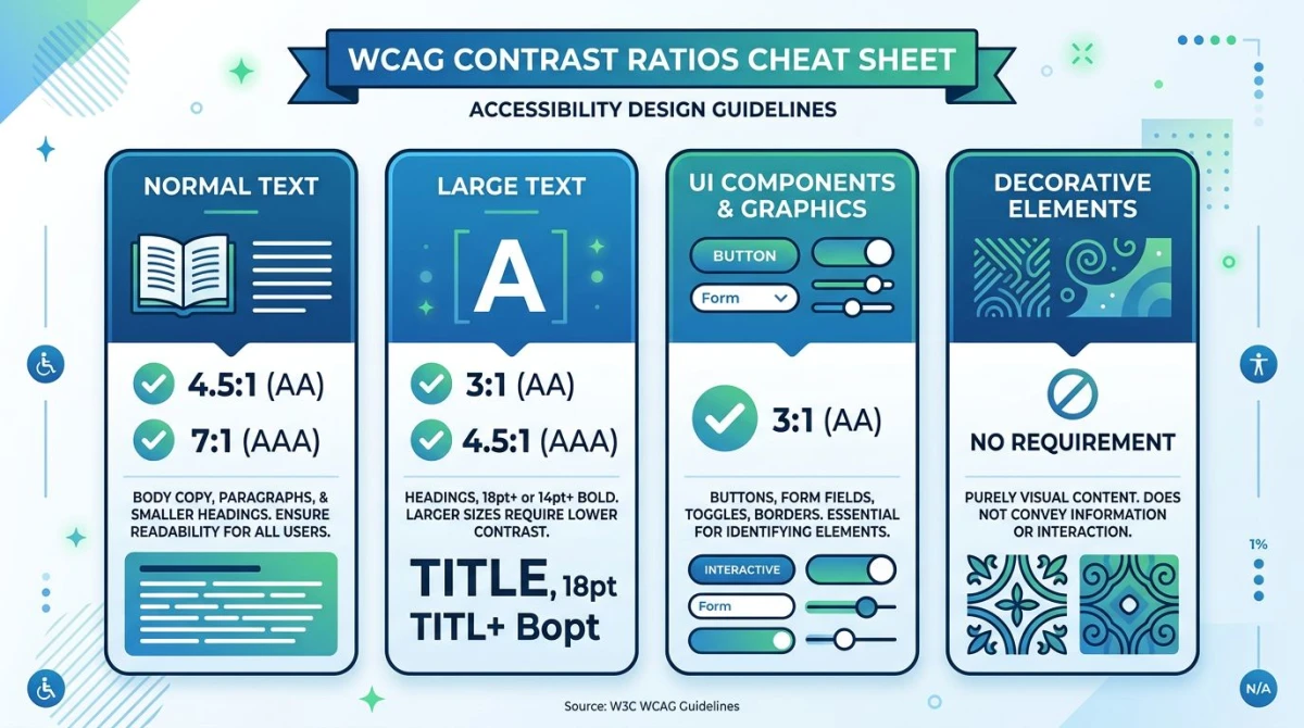
The Web Content Accessibility Guidelines split contrast requirements by text size and element type. Here are the numbers you need to know.
| Element | WCAG AA (minimum) | WCAG AAA (enhanced) |
|---|---|---|
| Normal text (under 18pt / 14pt bold) | 4.5:1 | 7:1 |
| Large text (18pt+ or 14pt+ bold) | 3:1 | 4.5:1 |
| UI components & graphical objects | 3:1 | No AAA requirement |
| Logos & incidental text | No requirement | No requirement |
A few notes that trip people up:
- Large text means 18pt (~24px) regular, or 14pt (~18.66px) bold. Headings usually qualify; body copy does not.
- UI components include form borders, focus rings, icons that convey meaning, and chart elements.
- Disabled controls are exempt, but only if they are genuinely non-interactive.
- Logos are exempt. Decorative watermarks are too.
Most teams aim for AA. AAA is recommended for high-stakes content (government, healthcare) but is not legally required.
How to calculate a contrast ratio
The formula from the W3C specification is:
(L1 + 0.05) / (L2 + 0.05)Where L1 is the relative luminance of the lighter color and L2 the darker. Relative luminance is a gamma-corrected weighted sum of the sRGB channels (red 21.26%, green 71.52%, blue 7.22%). Green dominates because human eyes are most sensitive to it.
You will almost never compute this by hand. For the full equations, see the W3C contrast minimum spec. For everything else, use a checker.
How to check color contrast (5 ways)
You have plenty of options for testing contrast, most of them free. Pick the one that fits where you are in your workflow.
1. Our free Color Contrast Checker (fastest)
The quickest way to test a pair of colors is our Color Contrast Checker. Paste a hex or RGB value and you get the ratio plus AA/AAA pass/fail badges for normal text, large text, and UI components. No signup. Swap foreground and background with one click to test inverted schemes.
Run it on every text/background combo in your design system before you ship.
2. Browser DevTools
Chrome, Edge, and Firefox show contrast ratios in their color pickers. Inspect a text element, click the color swatch in the Styles pane, and the picker shows the ratio with AA/AAA checkmarks. It also draws a line on the spectrum at the closest passing color.
3. Browser extensions
For full-page audits, use axe DevTools or WAVE. Both scan a page and flag every contrast failure with selectors and values. axe is the engine behind most automated accessibility testing.
4. Figma plugins
Catch problems in design with Stark or Able. Both run live and grade every text layer against AA and AAA as you work.
5. WebAIM Contrast Checker
The WebAIM Contrast Checker is the long-running standard tool from a team that publishes the most-cited accessibility research on the web. Bookmark it as your sanity check.

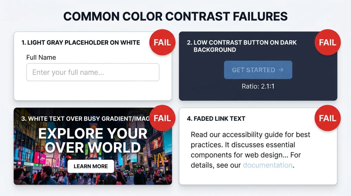
Common contrast failures (and how to fix them)
These are the five contrast bugs we see on almost every site we audit.
Light gray text on white
#999999 on white is 2.85:1 and fails. #767676 is the lightest gray that passes 4.5:1 on white. Fix: darken the text to at least #767676, or bump font weight.
Sample body text2.85:1fails AA
Sample body text4.54:1AA pass
Brand color on dark background
Vibrant brand colors fall apart on dark UI. A medium blue like #3B82F6 on #1F2937 is only 3.4:1. It passes for large text and UI but fails for body. Fix: use a lighter tint of the brand color for body, or reserve the brand color for headings over 18pt.
Sample body text3.4:1AA large only
Text over images or gradients
Text on a hero image almost always fails somewhere. Fix: add a semi-transparent dark overlay (40-60% black) under the text, or float the text in a solid panel over the image.
Form placeholders too light
Default browser placeholder color is around #A9A9A9, well below 4.5:1. Fix: style placeholders to #595959 minimum, and never use placeholders as a substitute for visible labels.
Sample body text2.5:1fails AA
Sample body text7.0:1AAA pass
Faded disabled links and buttons
Disabled controls are exempt, but only when clearly non-interactive. A "disabled" link users still try to click is a usability failure. Fix: hide non-applicable controls, or pair the disabled state with a short reason.

Tired of plain screenshots? Try ScreenSnap Pro.
Beautiful backgrounds, pro annotations, GIF recording, and instant cloud sharing, all in one app. Pay $39 once, own it forever.
See pricing and featuresWhat about dark mode?
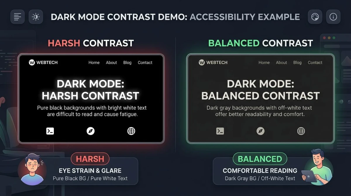
Dark mode has its own trap: pure white on pure black hits 21:1 but feels harsh and causes "halation" (text vibrating or blurring) for many readers, especially those with astigmatism. Soften both ends: off-white text (#E5E7EB) on a near-black surface (#111827 or #1F2937) lands at 14:1+ while staying comfortable.
The same WCAG ratios apply in dark mode, just measured between the dark surface and the light text.
WCAG 3 and APCA: the new contrast model
WCAG 2.x's formula was designed in the 1990s and treats every color the same. Researchers have since shown it over-rates dark-on-light pairs and under-rates some light-on-dark ones. The replacement, APCA (Advanced Perceptual Contrast Algorithm), is part of WCAG 3 and produces a more accurate score that accounts for font weight, size, and contrast direction. Its output, Lc, uses thresholds like Lc 75 instead of 4.5:1. WCAG 3 is still in draft and won't replace 2.2 for years. Stick with WCAG 2.2 for compliance and treat APCA as a quality bonus.
WCAG basics in 60 seconds
WCAG (Web Content Accessibility Guidelines) is the international standard for web accessibility. It groups requirements into three conformance levels (A, AA, and AAA) across four principles: perceivable, operable, understandable, robust. AA is the level cited by most laws, including the ADA in the US and the European Accessibility Act. Color contrast lives under the "perceivable" principle.
For the full breakdown of WCAG levels, what each principle means, and how to plan a full audit, read our What is WCAG guide. It pairs with this article: that one explains the framework, this one drills into one rule.
Where contrast fits in your workflow
Contrast is one of the easiest WCAG rules to test and one of the most common to fail. Ten-minute fix: pull every text/background combo from your design system into the Color Contrast Checker, record the ratios in your style guide, and patch anything under 4.5:1. Pair that with alt text on images, a sensible website color palette, and a foundation of color theory and you cover the visual half of WCAG.
Frequently Asked Questions
Next: the rest of WCAG
Contrast is the single highest-volume violation, but it's one rule out of dozens. Once your color pairs are clean, the next layer is keyboard navigation, alt text, focus visibility, and semantic markup. Our What is WCAG guide walks through the framework, the four POUR principles, and a 4-step afternoon plan that goes beyond contrast.
Need to test a specific color pair right now? Drop them into our Color Contrast Checker. Free, no signup, instant AA/AAA verdict.

Morgan
Indie DeveloperIndie developer, founder of ScreenSnap Pro. A decade of shipping consumer Mac apps and developer tools. Read full bio
@m_0_r_g_a_n_