How to Choose a Website Color Palette: 5-Step Process (2026)
# How to Choose a Website Color Palette (Step-by-Step with Examples)
A website color palette is the small set of colors used across the user interface of a site: the background, the body text, links, buttons, accents, borders, and state colors like success or error. It is not the same thing as a brand color palette. A brand palette has to work on a billboard, a coffee cup, a printed brochure, and a tiny favicon. A website color palette only needs to work on screens, but it has to clear hurdles those other surfaces never face: accessibility laws, dark mode, color blindness, and the wild range of monitors people actually use.
This guide walks you through a repeatable process for choosing a website color palette in 2026. Pick a primary color. Build a neutral scale. Add an accent. Layer in semantic colors. Verify every text-on-background pair against WCAG contrast rules. Then translate the palette into CSS variables your developers can wire straight into the codebase. By the end, you will have a palette that ships, not a Pinterest board.
If you want the broader theory first (color wheels, harmonies, why certain combinations feel right), read our color theory hub. If you want strategy advice for an entire brand (logos, packaging, ads), see brand color palette. This article is for the website specifically.
The 60-30-10 web design rule
The 60-30-10 rule is the oldest, most reliable starting point for a website palette. It comes from interior design, but it maps cleanly to web layouts.
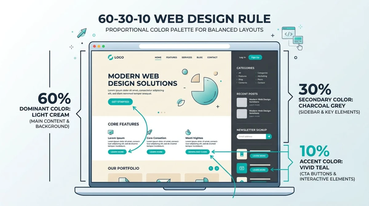
Here is the breakdown:
- 60% dominant color. This is almost always the background. It might be off-white, a very pale tint, or in dark mode a near-black. The 60% color sets the mood and gives your eyes a place to rest.
- 30% secondary color. This supports the dominant color. Think sidebars, cards, alternating sections, footers. It is often a tint or shade of the primary brand color, or a slightly different neutral.
- 10% accent color. This is the color that grabs attention. CTAs, links, badges, alert highlights. The 10% should be loud enough to draw the eye but used sparingly so it never goes ignored.
The big mistake is letting the accent creep up to 30% or 40%. When everything is loud, nothing is. Most landing pages that feel chaotic have inverted ratios: too much accent, not enough breathing room.
A quick sanity check: take a screenshot of your homepage, blur it heavily, and look at the color distribution. The dominant tone should win. The accent should appear as small bright dots, not large patches.
The 7-color website palette structure
Once you accept the 60-30-10 rule, the next question is how many distinct colors you actually need. The honest answer for most websites is seven.
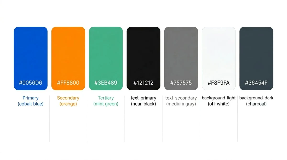
Here is the structure I recommend for a working website palette:
- Primary. The brand color. Used for buttons, links, key UI elements.
- Secondary. A complementary or analogous accent. Used for highlights, badges, hover states.
- Tertiary. Decorative. Charts, illustrations, marketing surfaces. Optional.
- Text-primary. The main body text color. Usually a very dark gray, not pure black.
- Text-secondary. Captions, hints, disabled states. A medium gray.
- Background-light. The canvas in light mode. An off-white or very pale tint.
- Background-dark. The canvas in dark mode. A near-black, often slightly tinted.
Some teams expand this with surface colors (cards, modals) and semantic colors (success, warning, error, info), and that is fine. The point is that the decorative colors stay small while the functional colors (text, background, and primary) do most of the work.
If your design team hands you a 16-color brand palette, your job as a web designer is to pick the seven that actually translate. The rest get archived for use elsewhere.
Pick your primary color first
Start with one color. It is usually the brand color, and if a brand color does not exist yet, this is where you commit. Everything else builds around it.
Three rules for picking a web primary:
- Avoid full saturation. Pure 100% saturation colors like
#FF0000or#0000FFlook harsh on screens and clash with photographs. Pull saturation back into the 60-80% range. - Test it at small sizes first. A color that looks great in a 400px swatch might disappear in a 14px button. View the swatch on a real button before committing.
- Pick a hue you can live with. This color shows up in every link, every CTA, every focus ring. If you are tired of it after a week, the audience will be too.
Once you have the primary, generate variations. Most design systems define 9 or 11 steps from very light to very dark, as in Tailwind's 50, 100, 200, ..., 900, 950 scale. This is essentially a monochromatic palette of your primary, and the same tints/shades/tones rules apply. Use our color palette generator to produce that scale from a single hex value, then nudge each step by hand if needed.
Picking colors that work on screens
Web colors live in the sRGB color space. That is the canonical color space of the modern web: every browser, every operating system, and every monitor calibrates against it as the baseline. When you pick #3B82F6, that hex code resolves to specific RGB values inside sRGB.
Why does this matter? Because print designers often work in CMYK, and a CMYK color converted to RGB rarely lands where you expect. If your brand book says "Pantone 286 C," you cannot just paste a Pantone code into CSS. You convert it to its sRGB hex equivalent and accept the small shift.
A few format notes:
- HEX is the canonical web format.
#3B82F6. Six characters, easy to memorize, supported everywhere. Read our hex color codes guide for a full primer. - RGB is what HEX becomes under the hood.
rgb(59, 130, 246). Use it when you need an alpha channel:rgba(59, 130, 246, 0.5). - HSL is hex's smarter cousin:
hsl(217, 91%, 60%). Hue, saturation, lightness. The huge win is that you can adjust lightness without re-eyeballing the hue. To make a hover state, drop the lightness by 5%. Done. - OKLCH is the new kid. It is a perceptually uniform color space, supported in modern browsers since 2023. If you are starting a fresh design system in 2026, give it a serious look.
For most teams, HEX in the design tool, HSL or OKLCH in the CSS. The conversion is one click in any modern color picker.
Accessibility: the web's killer constraint
Print designers can pick any color combination they want. Web designers cannot. The web has a legal floor for color contrast, and ignoring it is the single most common reason websites fail accessibility audits.
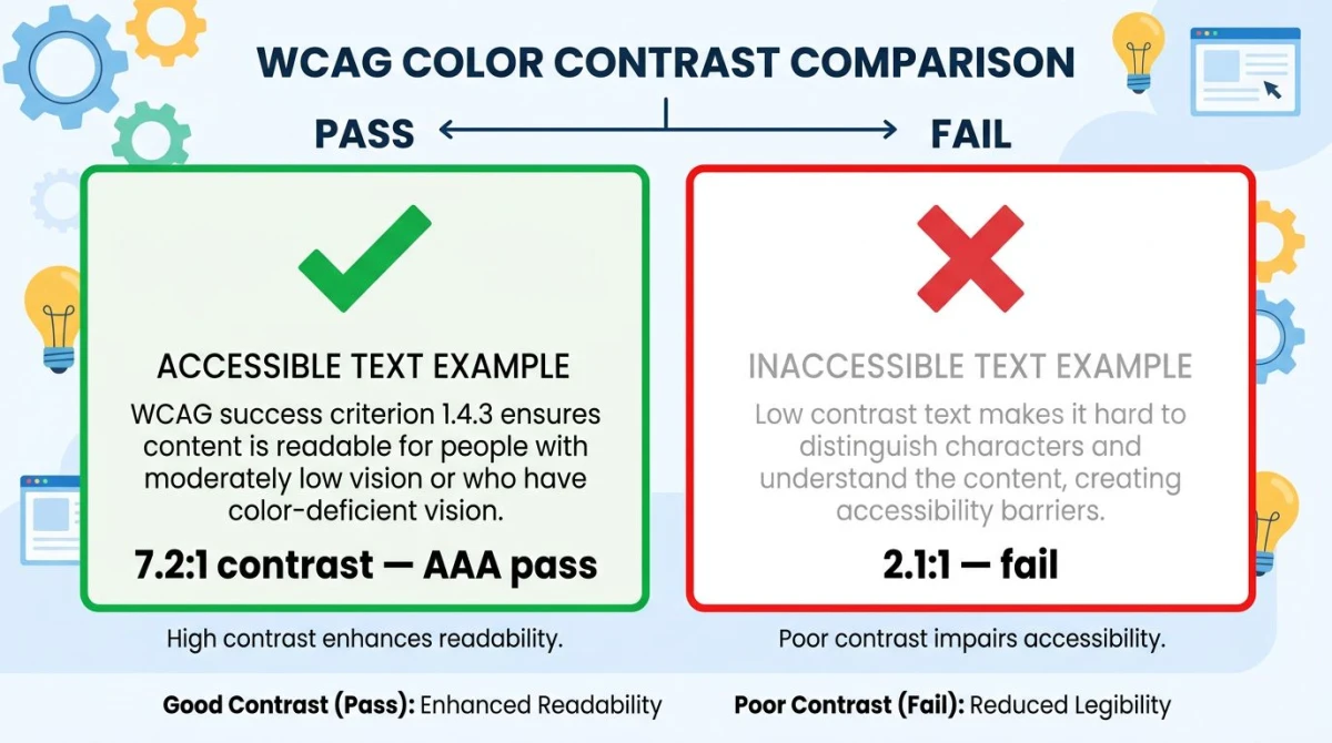
The rules from the W3C WCAG 2.1 guidelines are simple to remember:
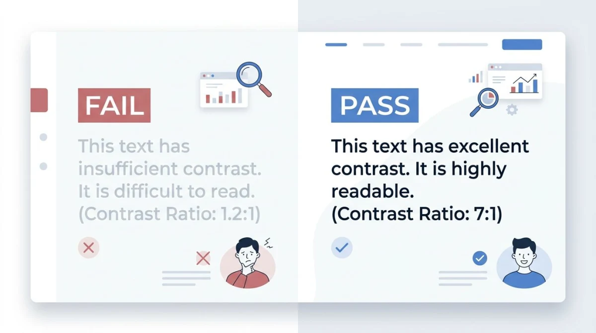
- 4.5:1 minimum contrast ratio for normal body text against its background (AA level).
- 3:1 minimum for large text (18pt or 14pt bold) and for UI components like icons, focus rings, and form borders.
- 7:1 for AAA-level body text, recommended for sites with older audiences or critical content.
Light gray text on white was a design trend a decade ago. It is now a lawsuit risk in many jurisdictions. The Americans with Disabilities Act has been used in plaintiff suits against websites that fail WCAG AA, and the European Accessibility Act took effect in 2025.
The fix is simple: validate every text-on-background pair before you ship. Our color contrast checker takes two hex values and spits out the ratio plus pass/fail badges for AA and AAA at both normal and large text sizes. Browser DevTools show contrast inline when you inspect text in Chrome and Firefox, which is the fastest way to catch issues during development.
For the deeper dive (including why "looks fine to me" is not a substitute for the math), read our WCAG color contrast guide.
A pragmatic rule I use: if a color combination barely clears 4.5:1, push the contrast harder. Real users have older monitors, glare from windows, anti-glare film, fatigue, and bifocals. The math is a floor, not a target.
Dark mode planning
In 2026, every website needs a dark mode. Operating systems default to it overnight. Browsers respect the system preference. Power users live in it. If your site forces them back into a glaring white background at 11pm, they leave.
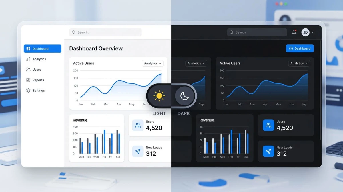
There are two ways to build a dark palette:
The inverse approach. Take your light palette and swap light values for dark ones. Background becomes near-black, text becomes near-white, and the accents stay roughly the same. This is fast and it works for content-heavy sites. The downside is that some accent colors that pop on white look washed out on black, and you end up tweaking them anyway.
The purpose-built approach. Treat dark mode as its own palette with its own decisions. Slightly desaturate the accents. Use a tinted near-black instead of pure black (pure #000000 looks too aggressive next to bright UI). Add a separate set of surface colors for cards and modals so they have hierarchy without bright shadows.
Notion, GitHub, and Linear all use the purpose-built approach. Look at any well-done dark mode and you will notice the dark background is not pure black. It is usually a very dark slate or near-black with a hint of blue or warm gray. That hint of color softens the contrast and reduces eye strain.
The implementation hook is the CSS prefers-color-scheme media query:
@media (prefers-color-scheme: dark) {
  :root {
    --color-background: #0F172A;
    --color-text-primary: #F1F5F9;
  }
}
Pair this with a manual toggle so users can override the system default. Save the preference to localStorage and apply it on page load before the first paint to prevent the dreaded flash of the wrong theme.

Tired of plain screenshots? Try ScreenSnap Pro.
Beautiful backgrounds, pro annotations, GIF recording, and instant cloud sharing, all in one app. Pay $39 once, own it forever.
See pricing and featuresColor palette to CSS workflow
Once the palette is decided, it has to live somewhere your developers can use. The standard answer in 2026 is CSS custom properties, also called CSS variables.
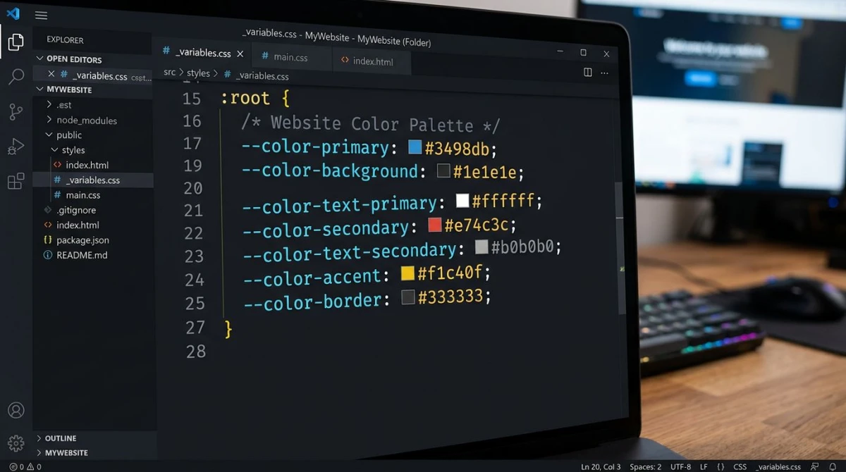
A clean setup looks like this:
:root {
  /* Primary scale */
  --color-primary-50: #EFF6FF;
  --color-primary-500: #3B82F6;
  --color-primary-900: #1E3A8A;

  /* Neutrals */
  --color-text-primary: #0F172A;
  --color-text-secondary: #64748B;
  --color-background: #FFFFFF;
  --color-surface: #F8FAFC;

  /* Semantic */
  --color-success: #10B981;
  --color-warning: #F59E0B;
  --color-error: #EF4444;
}
Then in your stylesheet, you reference var(--color-primary-500) instead of hardcoding hex values. When a color changes, you change one line at the top of the file and the entire site updates. Read the MDN reference on custom properties for the full syntax.
If you use Tailwind CSS, define these in your tailwind.config.js so utility classes like bg-primary-500 work. The Tailwind customizing colors guide walks through the exact syntax. If you use a component library like Chakra UI or Material UI, those have their own theme objects that follow the same idea: design tokens at the top, references throughout the code.
Material Design 3 takes the design-token idea even further with role-based names (surface, surface-container, on-surface) instead of literal color names. That extra abstraction pays off on large multi-product teams, but for a single product website it is overkill.
One more rule: always pair color with another visual signal. A red error message should also have an icon and the word "error" in it. A required form field should have an asterisk, not just a red border. Around 8% of men and 0.5% of women have some form of color blindness, and they cannot rely on color alone. Test your palette in our color blindness simulator to see what your interface looks like to a user with deuteranopia or protanopia.
Tools workflow
The end-to-end workflow for a website palette uses several tools in sequence. Here is the chain:
- Inspiration. Browse curated palettes for ideas. Our color palette ideas list is a solid starting point with categorized examples. Save five or six that match the brand's mood.
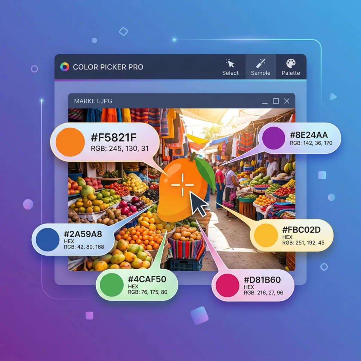
- Extract from a reference image. If the client supplies a moodboard, photograph, or existing brand asset, run it through our color palette extractor to pull the dominant colors as hex codes.
- Generate variations. Once you have a primary color, our color palette generator builds matching scales (analogous, complementary, triadic) and produces a full 9-step tint scale in one click.
- Validate accessibility. Pipe every text-on-background pair through our color contrast checker. Fix anything that fails AA. This step is non-negotiable.
- Pick exact hexes from real designs. When approving final mockups, use our color picker to grab values from screenshots and confirm they match the palette spec.
- Add gradients sparingly. Gradients are a fashionable web treatment. Generate web-friendly gradients with our gradient generator, and read our gradient backgrounds guide for placement and performance tips.
- Test for color blindness. Run the final designs through our color blindness simulator. If a status badge is unreadable to a deuteranope, redesign it.
This pipeline turns a fuzzy "we want a blue website" brief into a documented, accessible, ship-ready palette in an afternoon.
Famous website palettes: analyzed
Looking at how successful websites use color is the fastest way to build instinct. Here are six modern websites with strong palettes, broken down.
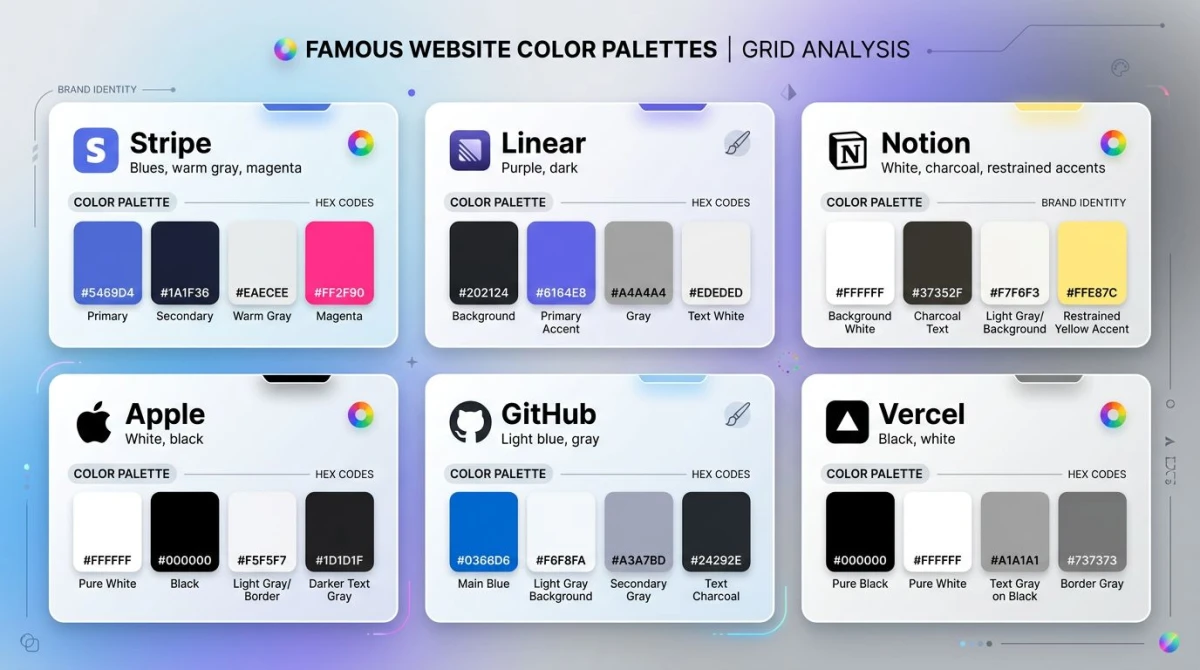
Stripe
Stripe is the textbook example of a controlled, layered palette. Primary blue (#635BFF), warm gray neutrals (rather than the more common cool grays), white backgrounds, and a magenta-pink accent that appears in gradients on marketing pages. Body text is a near-black, never pure black. The result feels modern, premium, and confident. It also ages well, which most pure-trend palettes do not.
Linear
Linear is the modern minimal benchmark. Native dark mode is the default. Primary purple (#5E6AD2) layered over a dark slate background (#1A1A1A area). Sparse use of color overall: most of the screen is shades of gray, with the purple appearing only in interactive elements and brand surfaces. The lesson: a great palette can be 90% neutrals.
Notion
Notion goes the opposite direction from Linear: pure white backgrounds, near-black text, and a wide rotating palette of accents because user-generated content (page emoji, callouts, tags) needs many colors. The secret is that Notion's chrome (the sidebar, header, buttons) uses almost no color. The accents come from user content, not from the UI itself.
Apple
Apple is the master class in restraint. White backgrounds, black text, and accent colors borrowed from product photography rather than a fixed brand palette. When the iPhone is gold, the page is gold. When it is silver, the page is silver. This requires confident product photography and strong typography to carry the weight that color usually carries.
GitHub
GitHub ships both a polished light mode and a polished dark mode, with a primary blue (#0969DA in light, lighter in dark) for links, and semantic colors (green for added lines, red for removed) baked into the product itself. The palette has to work for syntax highlighting, diff visualization, and marketing pages, which is a much harder constraint than a typical SaaS site.
Vercel
Vercel is the most extreme black-and-white site of the modern era. Primary palette is literally black, white, and a small set of grays. Color appears only when the product itself shows it: deployment status indicators, gradients on demo screens. Brave choice, executed well, and unmistakable.
The pattern across all six: most of the palette is neutrals. Color appears where it has to, not everywhere it could.
Common website palette mistakes
After auditing dozens of sites, the same handful of mistakes show up over and over.
Too many accent colors. A website is not a paint chip catalog. If you have five accents and use them all on the same page, none of them mean anything. Pick one accent for primary actions, maybe a second for warnings or highlights. Save the rest for charts and illustrations.
Insufficient contrast on body text. Light gray text on white is the most common failure. If your body text contrast ratio is below 4.5:1, fix it before anything else.
Brand palette transplanted without adjustment. A logo color that works on a business card may not work as a button background. Saturated colors look fine in print and harsh on screens. Adjust saturation and lightness for the web.
No dark mode plan. In 2026, this is conspicuous. Even if you cannot ship dark mode immediately, design the palette so it could be inverted later. Avoid trapping yourself in light-mode-only colors.
Ignoring color blindness. A red error and green success message look identical to a deuteranope. Pair every status color with an icon and a word.
Using pure black for text. #000000 on #FFFFFF is a 21:1 contrast ratio, which is way more than needed, and visually it looks heavy. Most well-designed sites use a near-black like #1A1A1A or #0F172A for body text. The page feels softer without losing readability.
Skipping the design-token step. If colors are scattered as hex literals across hundreds of CSS files, future palette changes become a hunt-and-replace nightmare. Define tokens at the top, reference everywhere.
Stale color trends. Neon gradients, brutalist red-on-blue, glassmorphism. Trends are fun for portfolio sites and risky for products that need to last five years. The websites in the famous-palettes section above mostly look like they did three years ago, and that is the point.
For ongoing color inspiration and case studies, Smashing Magazine's color category is a steady source of well-reasoned articles.
Worked example: SaaS landing page palette in 5 steps
Here is the process applied to an imaginary SaaS product called Metric, a developer-focused analytics tool.
- Pick the primary. Brand brief says "trustworthy, technical, modern." That points to a deep blue. We pick
#2563EB, saturated enough to feel modern and dark enough to feel trustworthy. We test it on a 16px button with white text: contrast ratio is 4.7:1 against white. Passes AA.
- Build the neutral scale. Generate a 9-step gray scale from
#F8FAFC(lightest) to#0F172A(darkest). Slight blue tint to harmonize with the primary. Text-primary becomes#0F172A, text-secondary becomes#64748B.
- Pick the accent. We need a color that stands out on a blue button-heavy interface. Orange
#F97316is the complement, sitting opposite on the wheel with plenty of contrast. Used only for upgrade CTAs and free-trial badges.
- Add semantic colors. Success
#10B981(emerald), warning#F59E0B(amber), error#EF4444(red), info#06B6D4(cyan). All four pass AA against white background and dark mode background.
- Verify all combinations. Run every text-on-background pair through the contrast checker. Fix the two failures (text-secondary on background-light surface needs nudging darker). Document final hex codes in the design tokens file.
Total time: about three hours for a designer who knows the workflow. Result: a documented, accessible, ship-ready palette.
Worked example: e-commerce store palette
Same process, different brief: an artisan coffee roaster.
- Primary. Warm earthy brown
#8B4513, which pulls on the visual of roasted beans.
- Neutrals. Cream-tinted scale. Background-light is
#FAF7F2(warm off-white), text-primary is#2A1F1A. The whole site feels like a paper bag.
- Accent. Burnt orange
#D2691Efor "Add to Cart" buttons, analogous to the brown but brighter.
- Semantic. Success uses a slightly muted forest green so it does not clash with the warm palette. Error stays a clear red.
- Verify. Body text passes 7:1, which is AAA. Buttons against cream pass. Done.
Two different briefs, same five steps. The process is the product.
Final pre-launch checklist
Before you ship, run through this list:
- Every text-on-background pair tested against WCAG 4.5:1 minimum.
- UI elements (icons, focus rings, form borders) tested against 3:1.
- Dark mode palette built and toggled in DevTools.
- Color blindness simulation run on every key page.
- Design tokens documented in CSS or the design system.
- Accent color usage stays under 10% of any given page.
- Every status color paired with an icon or text label.
- Brand color tested at small sizes (12px text, 14px button).
If all eight pass, the palette is ready.
For finishing touches on assets, our image annotation tool is useful for marking up screenshots during design reviews.
Frequently Asked Questions

Morgan
Indie DeveloperIndie developer, founder of ScreenSnap Pro. A decade of shipping consumer Mac apps and developer tools. Read full bio
@m_0_r_g_a_n_