How to Build a Brand Color Palette (2026 Examples)
# How to Build a Brand Color Palette: Strategy, Examples & Hex Codes
A brand color palette is the small set of colors that represent your brand on every surface: your logo, your website, your packaging, your ads, your social posts. Most strong brands use 5 to 7 colors total: a primary, one or two secondary colors, an accent, and a couple of neutrals. The right palette makes you recognizable, signals what kind of company you are, and keeps every touchpoint feeling like the same brand. The wrong one makes you look generic, or worse, like the competitor next door.
Often-cited industry research suggests that signature colors can boost brand recognition by up to 80 percent. See Color Matters' brand color overview for a summary of the underlying studies. That is a big lift for one design decision. This guide walks you through how to choose yours.
The 5-color brand palette structure
Most well-built brand systems share the same skeleton. You do not need 20 colors. You need five roles, filled well.
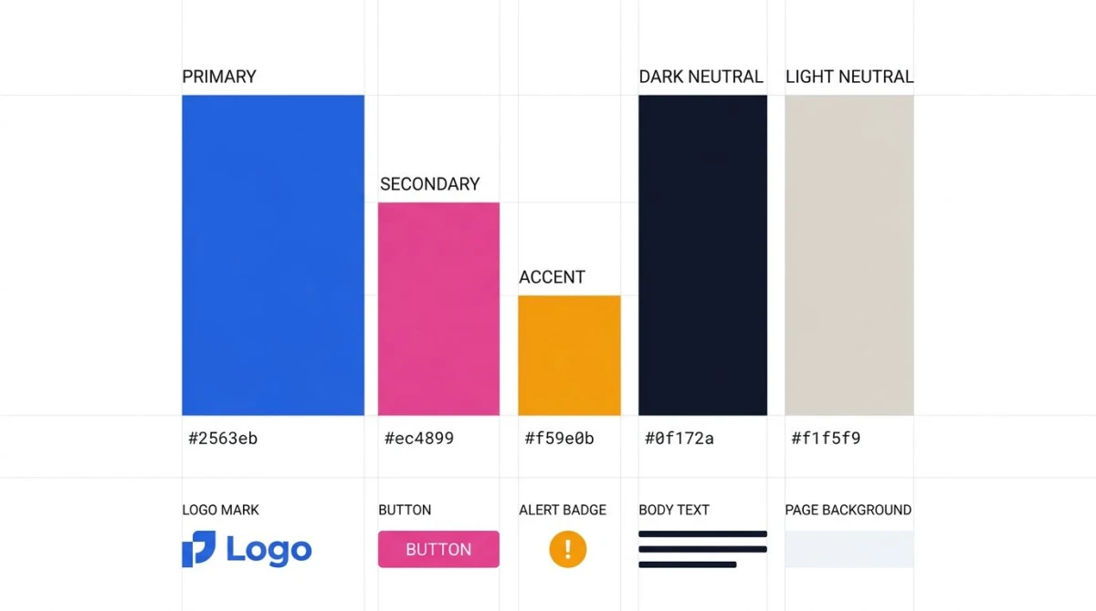
Primary: your signature color. The one people picture when they hear your name. It carries the most weight: logo, hero sections, primary buttons. Stripe owns indigo. Coca-Cola owns red. Tiffany owns that specific robin-egg blue.
Secondary: supports the primary. Used for section backgrounds, secondary buttons, illustrations. Stripe pairs its indigo with a warm magenta and a soft orange, which keeps the brand feeling energetic instead of corporate.
Accent: used sparingly, on purpose. Calls-to-action, alerts, sale badges. Because it is rare, it grabs attention. Notion's red error state is an accent: you barely notice it until something matters.
Neutrals (two of them): a dark and a light. These do most of the heavy lifting in real interfaces: body text, page backgrounds, dividers, card surfaces. Notion's whole brand is essentially white, black, and a stack of warm grays, and that restraint is the brand.
A simple test: cover up the primary color in any well-known brand's site, and you can usually still tell which brand it is from the neutrals and type alone. That is the structure working.
Color psychology by industry
Different industries lean on different colors because audiences expect them to. You do not have to follow the convention, but you should know what it is before you break it.
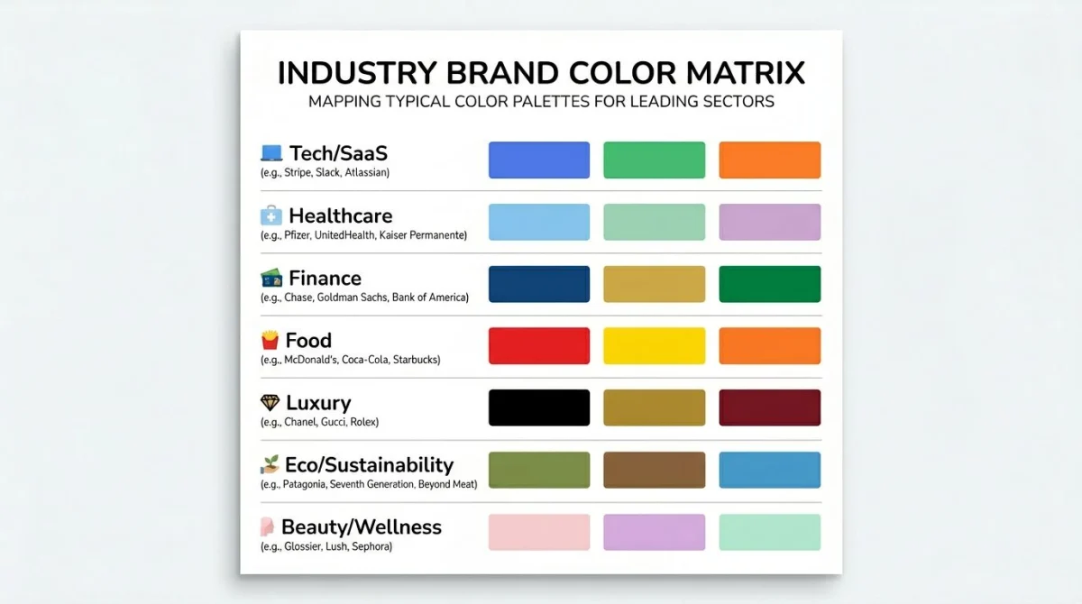
Tech and SaaS: blue and purple. Trust plus innovation. Think Stripe (indigo #635bff), Slack (the aubergine and yellow combo), Linear (deep purple), and Notion (mostly black and white, an outlier). Blue reads as "we will not lose your data". Purple reads as "we are the new way".
Healthcare: blue and green. Calm and health. Pfizer's clinical blue, the green crosses on pharmacies worldwide. Medical apps almost never use red as a primary because red signals warning, not care.
Finance: blue, navy, green. Trust and money. Chase, American Express, Visa, and PayPal are all blue. Green works for the "money" association (US dollar, growth). Robinhood broke convention with green-on-black and made it a brand of its own.
Food: red, orange, yellow. Appetite and energy. McDonald's red and yellow, KFC's red, Burger King's red and orange. Reds and yellows are tied to hunger response in study after study, which is why fast-food chains keep landing on the same combinations.
Luxury: black, gold, deep purple. Restraint and value. Chanel, Rolex, Lamborghini. Luxury palettes are almost monochromatic: a single dark color, a single metallic, white space. Adding a fifth color usually breaks the feel.
Eco and sustainability: green and earth tones. Patagonia's olive and brown, Allbirds' soft greens and creams, Oatly's beige-and-black. Green by itself is a cliché now: pairing it with terracotta, sand, or moss is what makes it modern.
Beauty and wellness: pink, pastel, rose gold. Glossier's baby pink basically owns this category. Beauty brands skew warm, soft, and pastel; wellness apps add sage greens and warm whites.
A reputable longer breakdown lives in the HubSpot color psychology guide and at Color Matters if you want to go deeper.
Step by step: how to choose your brand palette
Picking colors at random is how you end up with a palette that looks fine but says nothing. Use this process instead.
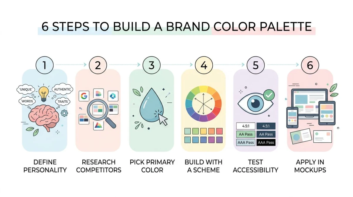
1. Start from your brand personality. Write down three adjectives that describe the brand: not what it does, but what it feels like. "Warm, playful, trusted" leads to very different colors than "sharp, bold, technical". If you cannot agree on three adjectives, you are not ready for colors yet.
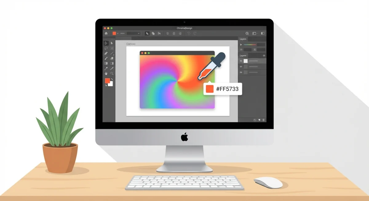
2. Audit your competitors. Pull up the top five brands in your space and list their primary colors. The goal is not to copy. It is to find a gap. If every fintech competitor uses blue, going blue means blending in. Green or black might give you more room. Use our color picker tool to grab exact hex codes from competitor sites.
3. Pick the primary first. Everything else flows from this one decision. Match it to your three adjectives, check it against the industry conventions above, and confirm it is different enough from your top three competitors.
4. Build the rest with a scheme. Once you have a primary, use a real color scheme to build out the supporting colors, not just "what looks nice". Complementary, analogous, triadic, and split-complementary schemes all work for brands. Our color theory guide walks through which scheme fits which mood.
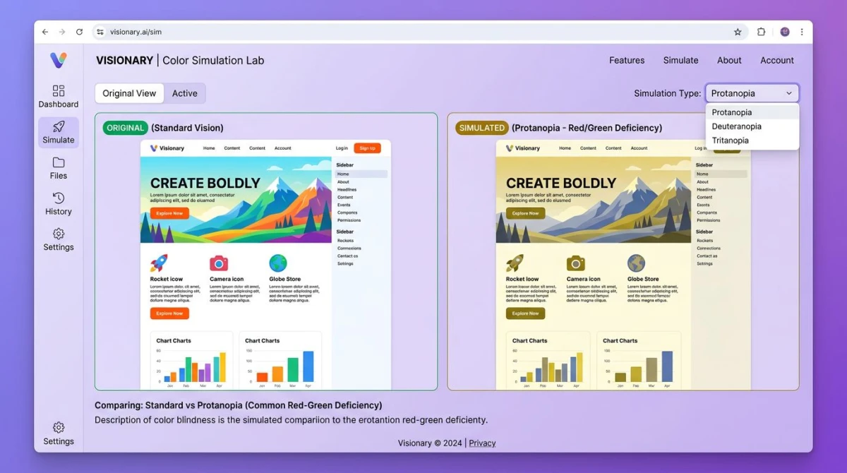
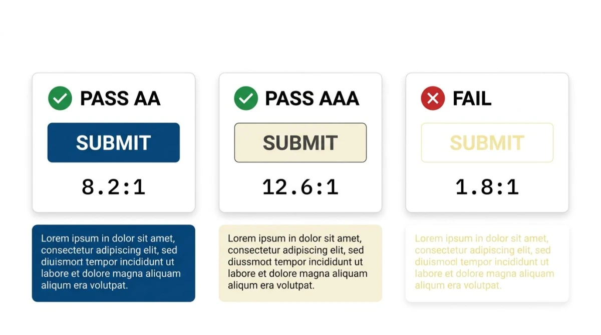
5. Test for accessibility. Every color combination that holds text needs to meet WCAG contrast requirements. Body text needs a 4.5:1 ratio against its background. Run every text-on-color pair through our WCAG color contrast guide or the contrast checker tool before locking anything in.
6. Test in context. A palette that looks great on a Coolors page often falls apart on a real site. Mock up a hero section, a business card, a social post, and a dark-mode UI before you commit. If any of those break, the palette is not done.
8 brand color palette case studies
Eight working palettes from brands you already know, with the hex codes pulled from their current style guides and design systems. Each one shows the structure (primary, supporting, neutrals) and a one-line read on why the palette holds together.
1. Stripe (tech / payments)
- Primary:
#635BFF(Stripe Indigo) - Supporting:
#FF80BF(warm pink) and#FFE15A(soft yellow), used mainly inside marketing-page gradients - Neutrals:
#0A2540(near-black navy),#425466(slate body text),#F6F9FC(off-white background) - Why it works: the indigo is technical without being cold; the magenta and yellow only show up in gradients, which keeps the chrome calm and the marketing pages alive. A near-navy, never pure black, is the move that reads "premium" everywhere.
2. Spotify (music / streaming)
- Primary:
#1ED760(Spotify Green, refreshed from the older#1DB954) - Neutrals:
#191414(near-black background),#FFFFFF(text on dark) - Why it works: a single high-energy green against a near-black canvas. There is no secondary brand color: playlist art and album covers carry all the variety. The brand can disappear into user content without losing identity.
3. Notion (productivity)
- Primary:
#FFFFFFand#000000(yes, both) - Supporting: a fixed user-content palette of 9 colors (gray, brown, orange, yellow, green, blue, purple, pink, red) for tags, callouts, and emoji
- Neutrals: a 12-step warm-gray scale (
#37352Fis the body-text dark,#F7F6F3the surface light) - Why it works: the chrome is monochrome on purpose. Color enters only through user content, which means a billion notes can look colorful without the product ever fighting itself. Restraint as a feature.
4. Tiffany & Co. (luxury / jewelry)
- Primary:
#0ABAB5(Tiffany Blue, registered as Pantone 1837) - Supporting:
#000000(black),#FFFFFF(white) - Why it works: a single hue so tied to the brand that it has its own Pantone number. Black-and-white type pairs with it on every box, bag, and ad. The whole palette is two non-colors plus one hue, and it has held for over a century.
5. Coca-Cola (food / beverage)
- Primary:
#F40009(Coca-Cola Red) - Supporting:
#FFFFFF(white), with deeper crimsons (#B00712) used in shadow and dimensional treatments - Why it works: one of the most recognizable brand colors on earth. The Spencerian script logo sits on red almost everywhere. When the brand modernizes, only the type evolves: the red is the constant.
6. IBM (enterprise / tech)
- Primary:
#0F62FE(IBM Blue 60) - Supporting: the full Carbon Design System ramp from
#EDF5FF(Blue 10) to#001141(Blue 100) - Neutrals: Gray 10 (
#F4F4F4) through Gray 100 (#161616) - Why it works: IBM treats the palette as a 10-step token set, not a fixed 5 colors. That makes dark mode, accessibility variants, and product-line theming a config change instead of a redesign. The blue is the brand; the system is the moat.
7. Cadbury (confectionery)
- Primary:
#3D0079(Cadbury Purple, formally Pantone 2685C) - Supporting:
#FFFFFF(white) and a metallic gold for premium ranges - Why it works: Cadbury has fought (and won and lost) trademark battles over this exact purple. That level of commitment to one hue is rare and is exactly what makes the brand instantly recognizable on a packed shelf.
8. Mailchimp (marketing / SMB tools)
- Primary:
#FFE01B(Cavendish Yellow) - Supporting:
#000000(Peppercorn black), illustration accents in coral and teal - Neutrals: off-white backgrounds, never pure white
- Why it works: yellow is the hardest brand color to use (it fails contrast against white instantly), so Mailchimp pairs it with a heavy black background for type and CTAs. The yellow becomes a flag, not a foundation, and the brand stays warm without ever becoming hard to read.
The pattern across all eight: one strong primary, one or two supporting roles, and disciplined neutrals doing the structural work. None of these brands runs a 10-color palette. They run a small palette, perfectly.

Tired of plain screenshots? Try ScreenSnap Pro.
Beautiful backgrounds, pro annotations, GIF recording, and instant cloud sharing, all in one app. Pay $39 once, own it forever.
See pricing and featuresWhere to get inspiration and extract palettes
You do not have to invent every color from scratch. The strongest source of inspiration is usually a single image (a photo, a piece of art, a moodboard) that already captures the feel you want.
From a photo or image. Pick an image that matches your brand mood. Drop it into our color palette extractor and the tool pulls the dominant five to seven colors with hex codes. This is how a lot of fashion and lifestyle brands start.
From an existing color. If you already have a primary (a logo, a founder favorite), use the color palette generator to build out a full scheme around it. The tool gives you complementary, analogous, and triadic options side by side.
From competitors. Open their site, screenshot it, and use the color picker to lift exact hex codes from any pixel. Useful for the audit step above. Galleries like UnderConsideration's Brand New and Behance branding are also good for browsing real-world brand systems with the rationale written out.
For more inspiration broken down by mood, season, and industry, see our 50 color palette ideas roundup.
Common brand palette mistakes
Most palettes do not fail because they are ugly. They fail for one of these four reasons.
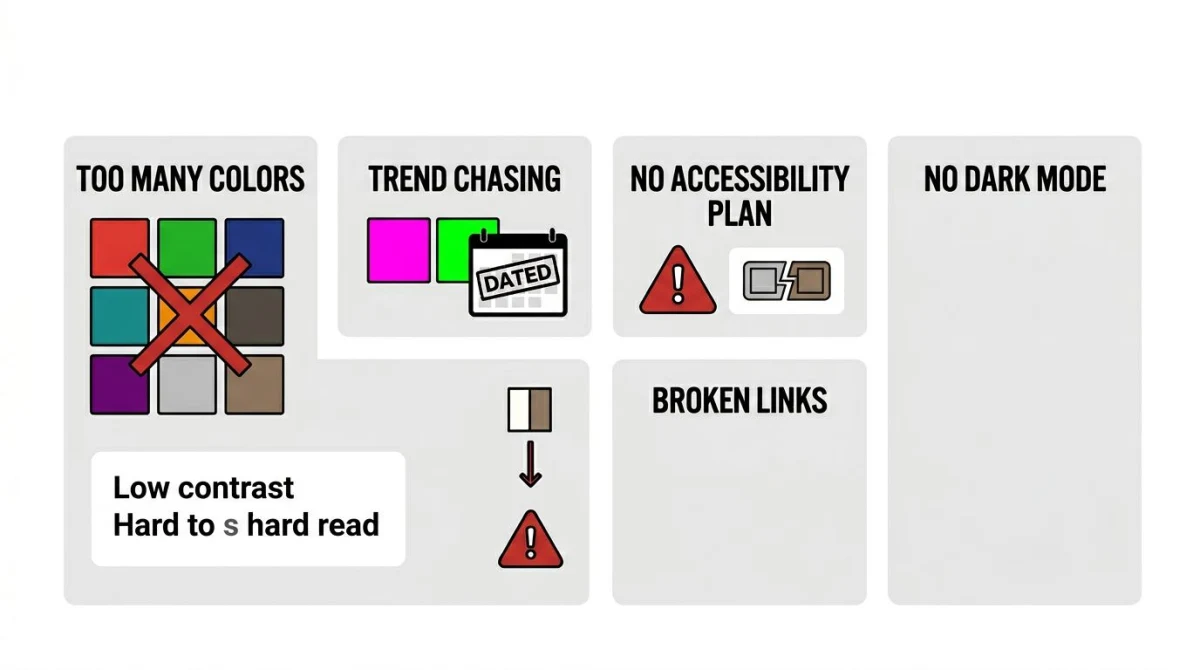
Too many colors. Anything past five or six core colors weakens recognition. If your palette has nine swatches, your brand is harder to remember, not richer. Notion runs almost the entire product on white, black, and gray. That is a feature.
Trend chasing. Neon green was everywhere in 2023. By 2025 it looked dated. Pick colors you can live with for five years, not five months. Trend colors are fine as accents, never as primaries.
No accessibility plan. Lots of palettes have one or two colors that pair beautifully with each other but fail WCAG contrast against text. If you cannot put readable body copy on your secondary background, your palette is incomplete. Build with accessibility in mind, not as an afterthought.
No dark mode plan. Plenty of brand palettes only work on a white page. The minute you put them on a dark UI (and most users now spend half their time in dark mode), they break. Test every color on both a #ffffff and a #0f0f0f background before you ship.
A complementary read here is our website color palette guide, which covers the web-specific constraints in more detail.
Documenting your palette
The last step is the one most small teams skip, and it is the one that keeps a palette intact as you grow.
A brand color guide does not have to be a 60-page PDF. A single page is fine. It needs to include:
- Hex for digital (
#635bff) - RGB for digital fallback (
rgb(99, 91, 255)) - HSL for design systems and dark-mode generation
- CMYK for print (business cards, packaging): get these from a printer or a tool like Colorhexa
- Pantone equivalents if you do any spot-color print work
- Usage rules: where each color is allowed, how much of each to use (a 60-30-10 split is common: 60% neutral, 30% primary, 10% accent), and what not to do
You can build this in Notion, Figma, or a single PDF. Templates from The Smashing Magazine guide to color theory give you a starting structure if you want one.
When you screenshot final mockups for the brand guide, ScreenSnap Pro speeds up the capture-and-annotate step, which is useful for marking do/don't rules on real screens.
Frequently Asked Questions
Wrapping up
A brand color palette is one of the highest-leverage design decisions you will make. Five colors, picked with intent, will outperform fifty colors picked at random. Every single time. Start from personality, audit your space, pick a primary you can live with, build the rest on a real scheme, and test for accessibility before you commit.
When you are ready, our color palette generator and extractor will get you from blank canvas to working palette in a few minutes.

Morgan
Indie DeveloperIndie developer, founder of ScreenSnap Pro. A decade of shipping consumer Mac apps and developer tools. Read full bio
@m_0_r_g_a_n_