← Back to Tools
Screen Resolution Calculator
Find PPI, aspect ratio, and megapixels for any display. Compare devices instantly.
100% browser-based — no uploads, your inputs stay on your device.
Screen specs
Results
Pixel density (PPI)
253.9 PPI
Retina-class densityAspect ratio
756:491
1.5397 decimalTotal pixels
5.94 MP
5,939,136 pixelsPhysical size
11.91 × 7.73
inches (30.2 × 19.6 cm)Display class
QHD / 1440p
Sharp without the GPU cost of 4KDevice presets
PPI reference
Below 100Low DPI
100-140Standard
140-220High DPI
220-400Retina
400+Super Retina
How to use
- 1.Enter pixel width and height
- 2.Enter diagonal screen size in inches
- 3.Read off PPI, aspect ratio, and megapixels
- 4.Try a preset to compare devices
Formula
PPI = √(width² + height²) ÷ diagonal inches
Diagonal pixels divided by diagonal inches. Works for any rectangular display.
Frequently Asked Questions
What is PPI?+
PPI stands for pixels per inch — the number of pixels packed into one linear inch of screen. Higher PPI means sharper images and smoother text. Apple's Retina threshold is around 220 PPI for laptops and 300+ for phones.
How do I calculate PPI?+
PPI = sqrt(width² + height²) ÷ diagonal inches. For example, a 1920x1080 screen at 24 inches diagonal has sqrt(1920² + 1080²) ÷ 24 = 2202 ÷ 24 ≈ 92 PPI. Our calculator does this for you automatically.
What is the difference between DPI and PPI?+
PPI describes screen pixel density, while DPI (dots per inch) refers to printer output. The terms are often used interchangeably, but technically PPI is for displays and DPI is for print.
What PPI is considered Retina?+
Apple's marketing term 'Retina' has no fixed PPI — it depends on viewing distance. Roughly: ~220 PPI for laptops viewed at arm's length, ~300 PPI for phones at 10-12 inches, ~190 PPI for desktop monitors at greater distance.
Is higher resolution always better?+
Not always. Beyond your eye's resolving power at a given viewing distance, extra pixels are wasted and just consume GPU power. A 1440p 27-inch monitor at desk distance is often a better experience than 4K at the same size.
What screen resolution should I design for?+
For web: 1920x1080 is still the most common desktop resolution. For mobile: design at 390x844 (iPhone 15) and scale up. Always export 2x or 3x raster assets to look sharp on high-DPI displays.
Learn more
Available formacOS&Windows
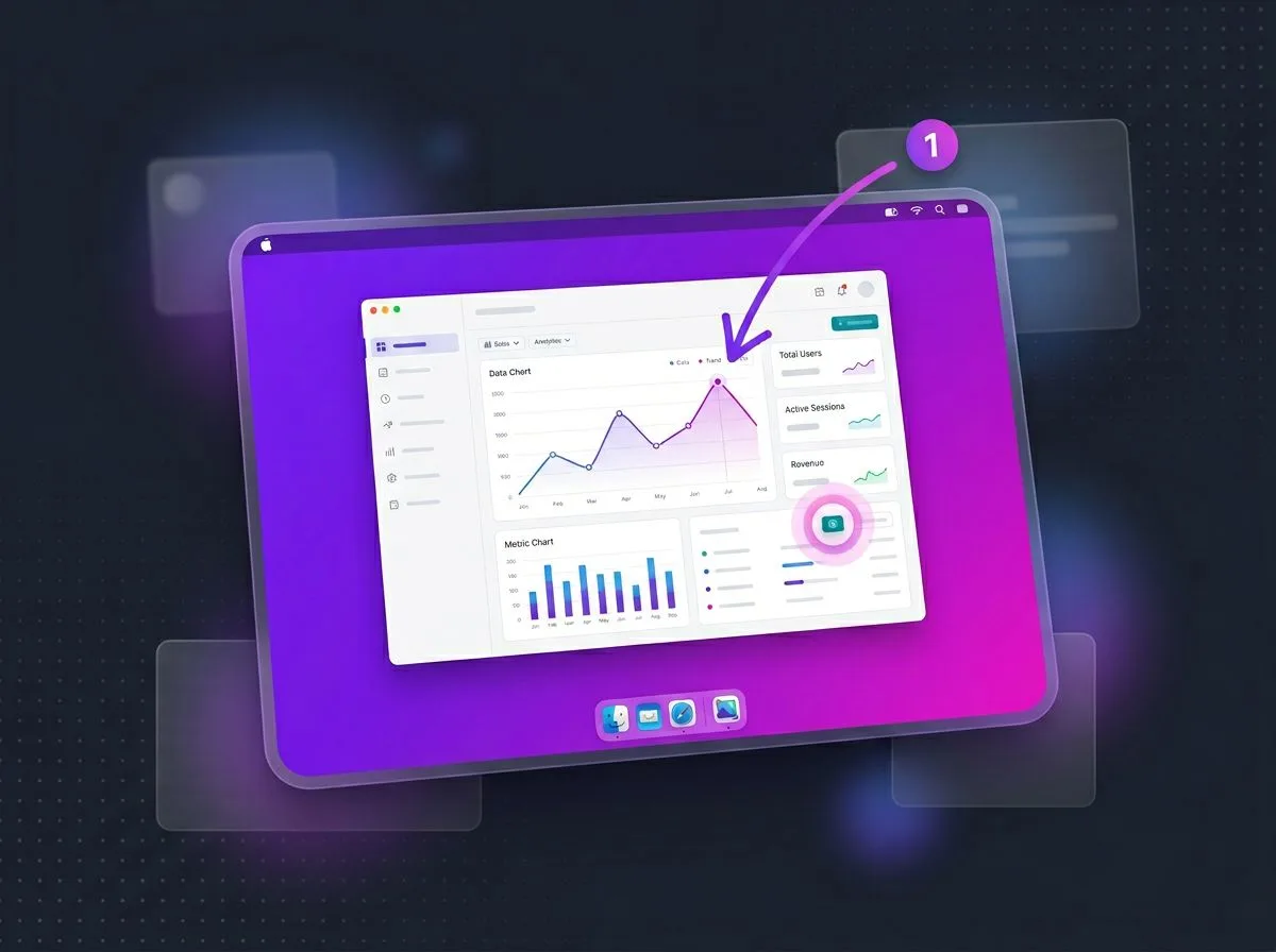
Make every screenshot look pro.
ScreenSnap Pro turns plain screenshots into polished visuals — backgrounds, annotations, GIF recording, and instant cloud links.
See ScreenSnap Pro