Consolidating Visual Languages Across A Multi-Team React Library
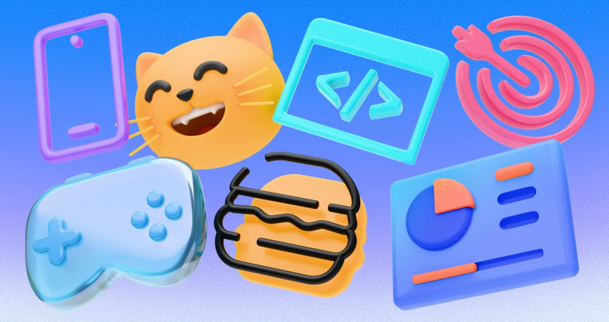
Maintaining a central React component library demands strict boundaries. Letting five different product teams consume your UI components usually ends in disaster. Visuals degrade quickly without a unified system. Developers start injecting their own arbitrary inline styles.
My breaking point hit hard during a routine application audit. We had fourteen variations of a standard settings cog. Some featured barely visible 1px strokes. Others were totally filled black blobs. A few intricate vector graphics looked absurd next to our minimalist typography. Chaos had completely overtaken the codebase.
Standardizing iconography across multiple products requires a massive, consistent source of truth. That exact realization pushed me toward integrating Icons8 into our frontend architecture.
Escaping The Asset Trap
Late on a Thursday afternoon before a major release, panic set in. Analytics teams requested a specific database rollback graphic for a new feature toggle. Simultaneously, the billing department needed a visually identical set for a pricing table overhaul. Our existing open-source pack lacked both concepts.
I spent three agonizing hours manipulating a generic vector file. Matching the exact 1.5px stroke weight and corner radius of our current assets proved infuriating. Hand-tweaking individual vector paths for minor UI updates wastes valuable engineering time.
We needed a visual library capable of supporting complex enterprise software straight out of the box.
Evaluating The Market Alternatives
Finding basic icons online is ridiculously easy. Locating thousands of them perfectly designed on the exact same mathematical grid takes serious effort.
Open-source libraries like Feather or Heroicons work perfectly for simple landing pages. They'll fall apart rapidly in massive applications. With only a few hundred assets available, you inevitably hit a solid brick wall. Highly specific engineering concepts simply don't exist in basic packs. You end up drawing it yourself or mixing in horribly mismatched graphics.
Platforms like Noun Project or Flaticon solve the volume problem. But they'll introduce severe consistency issues immediately. Because they aggregate vector work from thousands of independent creators, searching for a user profile graphic yields fifty wildly different artistic interpretations. Putting an intricate, heavily shaded icon next to a flat graphic instantly cheapens the software interface.
Building everything in-house provides perfect consistency. That route demands having dedicated illustrators permanently on staff. Most engineering departments can't afford to commission custom vectors for every new dropdown menu.
Icons8 occupies a sweet spot by maintaining a full in-house design team. They produce massive, scalable asset sets governed by strict visual styles.
Standardizing Base Components
My first objective meant replacing our highly fragmented base assets. Icons8 categorizes their entire library into over 45 distinct styles. We selected the iOS 17 Outlined style immediately. It contains over 30,000 icons. That sheer volume guaranteed we'd never run out of matching graphics for obscure edge cases.
Structuring our new React navigation module workflow started right in their web interface. Rebuilding the complex pagination controls meant searching for a baseline arrow icon. Filtering the results matched our chosen iOS 17 style perfectly.
Instead of downloading it immediately, I clicked the asset. An intuitive in-browser editor popped up. Our frontend components required exact padding and spacing. So I adjusted the inner padding and scaled the graphic uniformly online.
Next came the powerful subicon feature. Overlaying a tiny lock symbol onto the arrow created our restricted navigation paths instantly.
You can resize and recolor these subicons directly in the browser. Zero dedicated vector software needed.
Finished graphics went straight into a custom Collection. Applying our primary brand hex code to the entire set happened via the bulk recolor tool. Then I downloaded them as a single SVG sprite. Dropping that clean, standardized sprite into our React codebase took minutes instead of hours.
Implementing Lottie Animations
Mobile app developers eventually wanted to upgrade the tab bar micro-interactions. They needed animated feedback states matching our newly standardized static graphics perfectly.
Icons8 offers a dedicated section exclusively for animated assets. Filtering search results revealed only animations sitting within our established style guidelines. Over 4,500 options populated the screen. Locating exact matches for the home, profile, and settings tabs took no time at all. Exporting them directly in the Lottie JSON format saved us completely.
Lottie uses mathematical vectors rather than bulky raster frames. Files stay incredibly small. Everything renders flawlessly on high-density mobile retina displays.
Integrating those JSON files into our React Native tab navigator simply meant passing data directly to the Lottie wrapper component. Animations transitioned smoothly and retained the exact line weights of our static desktop UI.
Where The Platform Fails To Meet Developer Expectations
No tool fits every single engineering constraint. Operating on a strict zero-dollar budget guarantees intense frustration here.
Free tiers are heavily restricted. Users face a strict 100px size cap on PNG files. Unlocking all file formats only works for three highly specific categories like Popular or Logos. Relying on PNGs for modern web development remains a total non-starter. Retina displays demand crisp vector graphics always. Accessing production-ready SVGs requires an active paid subscription.
Here's one massive catch: mandatory attribution rules. Placing a hyperlink back to the platform inside your application is required. Enterprise SaaS platforms cannot plaster external attribution links across their user interfaces. Paying to remove that requirement becomes your only valid option.
Niche feature development also exposes gaps in the library. Specialized medical or deep industrial applications might lack highly specific graphics in your chosen visual style. Submitting ideas to the icon request feature helps slightly. Production only begins after receiving eight community votes. Predicting that exact timeline proves completely impossible. Needing a graphic for tomorrow's sprint ending means you're completely out of luck.
Draw it yourself instead.
Integrating The Tool Into Daily Workflows
Optimizing daily usage requires a few specific practices to avoid massive technical debt.
- Disable simplified vectors: Downloads default to simplifying SVG paths heavily. Uncheck that setting in your preferences before manipulating nodes later in Figma.
- Use desktop integrations: Install the Pichon Mac app. Bypass browsers completely by dragging uncompressed assets directly into your IDE.
- Prototype with base64: Rapid prototyping demands ultimate speed. Use the base64 HTML fragment export option. Paste encoded strings directly into inline image tags. Skip local file management entirely until interface designs are finalized.
- Maintain central collections: Don't let individual developers download graphics randomly. Create shared Collections online. Generate cloned share links so your entire engineering department pulls from the exact same curated list.
Crafting complex component libraries takes serious engineering discipline. Shifting basic asset creation to a massive, style-controlled platform changes everything. You stop worrying about inconsistent line weights forever. Focus completely on writing brilliant application logic.