How to Create Step-by-Step Instructions + Screenshots
Good step-by-step instructions turn complex tasks into simple actions. Add screenshots to each step — captured and annotated with a tool like ScreenSnap Pro — and even a first-time user can follow along without getting lost.
Whether you're writing training docs, SOPs, help articles, or software guides, the method is the same: plan your steps, capture clean screenshots, annotate them clearly, and write short descriptions. This guide walks you through the full process.
TL;DR: Plan your steps first, capture only the relevant screen area, annotate with numbered badges and arrows, write 2-3 sentence descriptions per step, and assemble in your preferred format. Use a tool like ScreenSnap Pro for capture and annotation, or auto-capture tools like Scribe for quick internal docs.
Why screenshots make better instructions
Text-only instructions force readers to translate words into actions. They need to find the right button, guess which menu you mean, or figure out where to look on screen.
Screenshots remove that guesswork. A picture of the exact button, with an arrow pointing at it, tells the reader everything in a glance. The Nielsen Norman Group recommends visual methods for complex interactions, noting that graphics help users better understand and mimic instructions. Our own guide on technical documentation covers this in more depth.
Screenshots help in three key ways:
- They reduce errors. Readers click the right button because they can see it, not just read about it.
- They speed things up. Scanning a screenshot takes 1-2 seconds. Reading a paragraph describing the same screen takes 15-30 seconds.
- They work across languages. A screenshot of a button looks the same whether your reader speaks English, Spanish, or Japanese. Visual cues are universal.
The trade-off is that screenshot-based guides take longer to create and need updating when the software changes. But the payoff in clarity and fewer support tickets is worth it.
How to plan step-by-step instructions before you capture
Don't start taking screenshots yet. Plan first. A few minutes of planning saves hours of rework.
Define your audience
Who is reading this guide? The answer changes everything:
- New employees need more context and basic terms explained.
- Power users want quick steps without hand-holding.
- Customers need friendly language and clear CTAs.
- Developers prefer code samples and exact paths over screenshots of menus.
Write for one audience. Don't try to serve everyone in one guide.
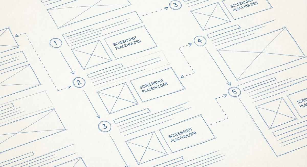
Outline the steps first
Open a text file and list every step in order. Be specific:
1. Open Settings from the top menu bar
2. Click "Account" in the left sidebar
3. Scroll down to "Password" section
4. Click "Change Password"
5. Enter current password
6. Enter new password (twice)
7. Click "Save Changes"
8. Confirm via email link
Walk through the process yourself as you write the outline. Note every click, every page change, every confirmation. It's easy to skip a step that feels obvious to you but confuses someone doing it for the first time.
Decide what needs a screenshot
Not every step needs a screenshot. Here's a simple rule:
- Needs a screenshot: Any step where the user interacts with a button, menu, toggle, or form. Anything where they might click the wrong thing.
- Skip the screenshot: Simple text steps like "Enter your email address" don't need a visual unless the form is confusing.
A typical 8-step guide needs 5-6 screenshots. Don't overdo it — too many screenshots make guides feel overwhelming.
Capturing screenshots the right way
Now it's time to capture. The quality of your screenshots affects how professional your guide looks.
Clean up your screen first
Before capturing anything:
- Close extra tabs and windows. Only show what's relevant.
- Use test data, not real data. Don't expose customer info, real passwords, or internal data. Create a test account.
- Zoom to 100%. Zoomed-in or zoomed-out screens look off in docs.
- Hide bookmarks and personal sidebar items. Readers don't need to see your browser favorites.
- Set a clean desktop wallpaper if any desktop is visible.
Choose the right capture method
The capture method depends on what you're documenting:
Full screen — Rarely useful for guides. Too much noise. Only use when the reader needs to see the full layout.
Window capture — Good for showing one app at a time. Capture a specific window to exclude the desktop and taskbar.
Area selection — Best for most guides. Grab just the part of the screen that matters. This keeps images focused and file sizes small.
Scrolling capture — Use for long pages, settings panels, or chat threads. A scrolling screenshot grabs content beyond what fits on one screen.
Capture tools for step-by-step guides
| Tool | Platform | Auto-Capture | Step Numbers | Price |
|---|---|---|---|---|
| ScreenSnap Pro | Mac | ❌ | ✅ | $39 one-time |
| Scribe | Web/Desktop | ✅ | ✅ | Free / $12/mo |
| Tango | Chrome | ✅ | ✅ | Free / $22/mo |
| Snagit | Mac/Win | ❌ | ✅ | $63 |
| Greenshot | Windows | ❌ | ❌ | Free |
Auto-capture tools like Scribe and Tango record your clicks and build the guide for you. They're fast but give you less control over what each screenshot shows.
Manual tools like ScreenSnap Pro give you full control. You choose exactly what to capture, how to frame it, and what to annotate. The results are more polished.
For most teams, manual capture with a good annotation tool produces the best guides. Auto-capture tools work well for quick internal docs where polish matters less.
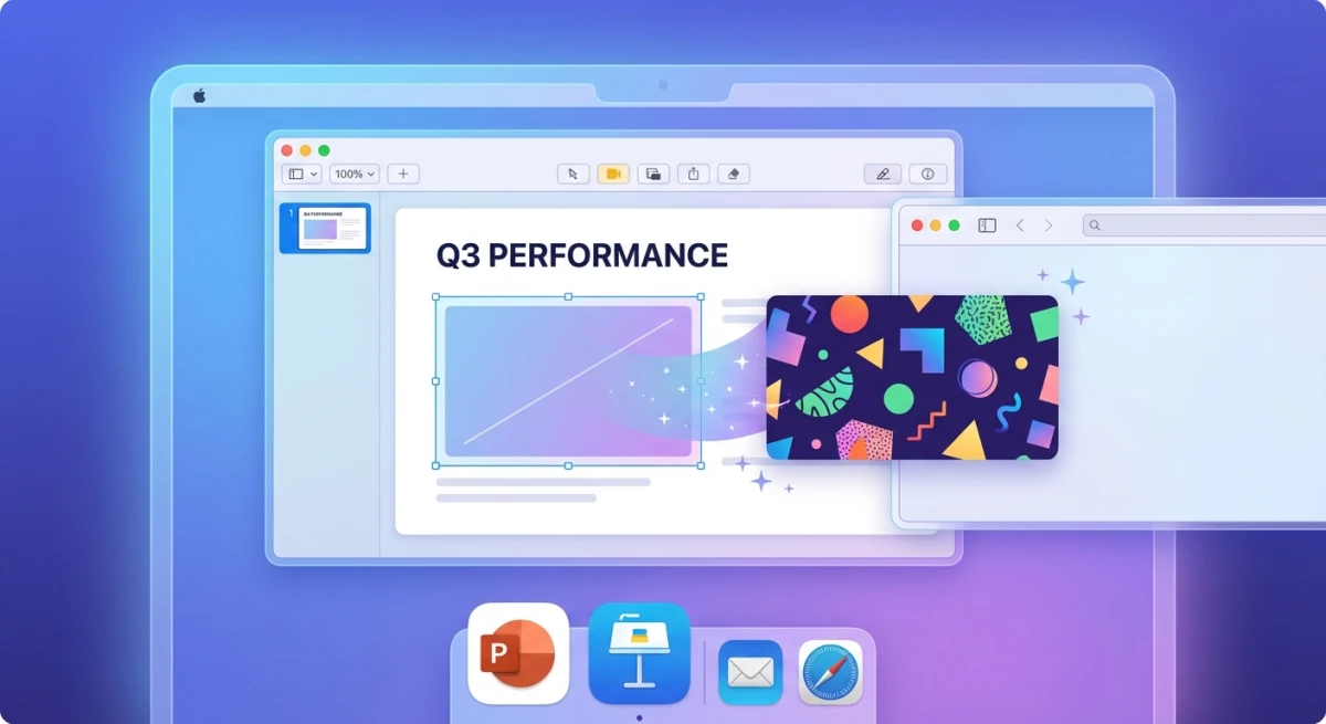
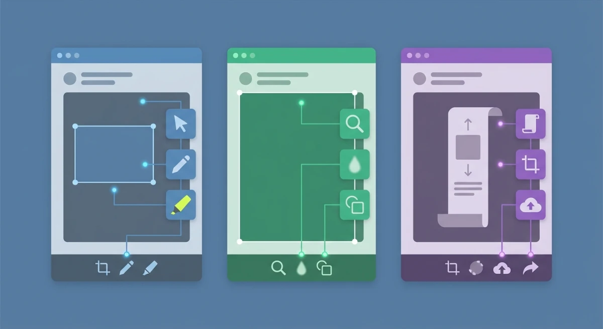
Annotating screenshots for clarity
A raw screenshot isn't enough. Readers need to know where to look. Annotations guide their eyes to the right spot.
The must-have annotations
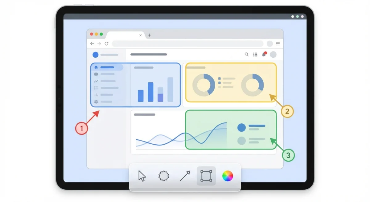
Numbered step badges. Place a circled number on the element the reader needs to click. This is the single most useful annotation for guides. Tools like ScreenSnap Pro and Snagit have built-in step counters.
Arrows. Point from the step number or label to the exact button or field. Use a bright color (red or orange) that stands out against the UI.
Highlight boxes. Draw a rectangle around the area of focus. This helps when the target element is small or hard to spot in a busy interface.
Text labels. Add short labels like "Click here" or "Enter your email" next to the relevant field. Keep text brief — 3-5 words max.
Annotations to use carefully
Blur or pixelate. Use to hide sensitive data like emails, names, or account numbers. Important for any guide using real data.
Callout boxes. Text boxes with extra context ("Note: This requires admin access"). Use sparingly — one per screenshot at most.
Crop marks. If you're showing a detail view, add a border or shadow to show it's a close-up of a larger screen.
Annotation best practices
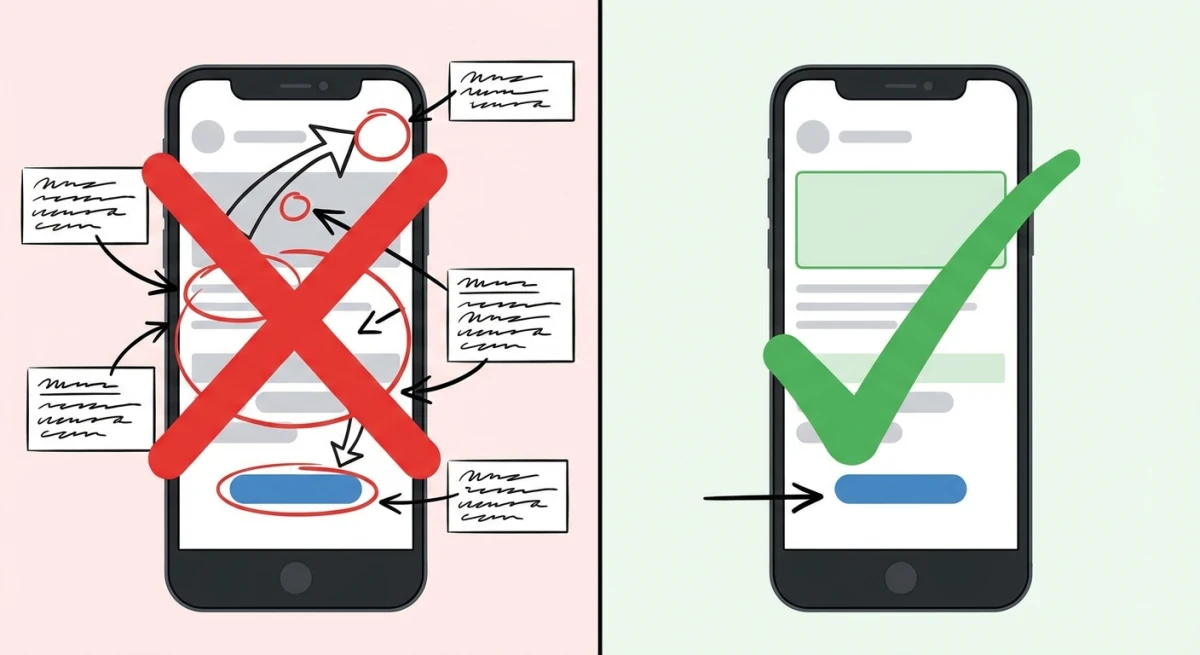
- One action per screenshot. Don't mark three different buttons in one image. One step, one screenshot, one annotation.
- Consistent colors. Pick one color for arrows (red works well) and one for highlights (yellow or blue). Don't rainbow your annotations.
- Same style throughout. Use the same arrow thickness, font size, and badge style across all screenshots. Visual consistency makes guides look professional.
- Don't cover important UI. Place annotations near the target, not on top of it. The reader needs to see the actual button, not just your arrow.
Writing clear step text
The text next to each screenshot matters as much as the image. Bad text can confuse even with a perfect screenshot.
The anatomy of a good step
Step 3: Click "Save Changes" in the bottom-right corner

After entering your new password, click the blue "Save Changes"
button. You'll see a green "Password updated" message at the top
of the page.
Every step should have:
- A numbered heading — "Step 3: Click Save Changes"
- One clear action — what to click, type, or select
- Where to find it — location on screen (top-right, sidebar, bottom of page)
- What happens next — the expected result so readers know it worked
Writing tips for step text
Start with a verb. "Click," "Enter," "Select," "Open," "Scroll to." Action words tell readers what to do. The Microsoft Writing Style Guide recommends leading every instruction with an action verb for maximum clarity.
Use the exact button text. Write "Click Save Changes" — not "Click the save button." Match the words on screen exactly. Bold the UI text so it stands out.
Be specific about location. "In the top-right corner" is better than "on the page." "In the left sidebar under Account" is better than "in the menu."
Keep it short. Two to three sentences per step. If a step needs more explanation, break it into two steps.
Add a "what you'll see" line. After the action, describe the expected result. "A dropdown menu appears with three options." This confirms the reader is on the right track.
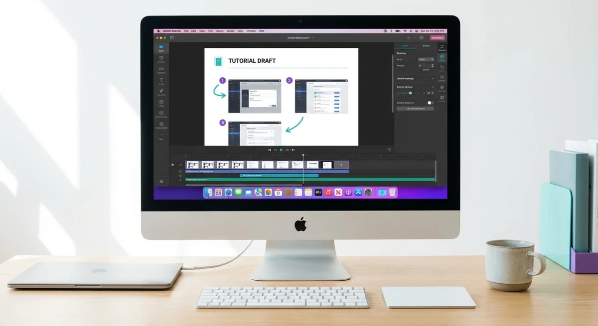
Tired of plain screenshots? Try ScreenSnap Pro.
Beautiful backgrounds, pro annotations, GIF recording, and instant cloud sharing — all in one app. Pay $39 once, own it forever.
See what it doesAssembling the final document
With screenshots captured and annotated, it's time to put it all together.
Choose your format
| Format | Best For | Pros | Cons |
|---|---|---|---|
| Google Docs / Word | Internal teams | Easy to share, comments | Poor image handling, hard to maintain |
| Notion / Confluence | Wiki-based teams | Searchable, versioned | Requires platform access |
| External sharing | Looks consistent everywhere | Hard to update | |
| Web page (HTML/MDX) | Public docs | SEO-friendly, linkable | Needs hosting |
| Scribe / Tango | Quick docs | Auto-generated | Less control |
For internal SOPs, Notion or Confluence works well. For customer-facing docs, a web page or PDF is more professional. For quick internal guides, auto-capture tools save time.
Layout tips
- One step per section. Don't stack multiple steps in a paragraph.
- Screenshot first, text below. Readers scan the image first, then read for details.
- Consistent image size. Resize all screenshots to the same width (800px works well for most docs).
- Number everything. Even if it seems obvious, numbers help readers track their progress.
- Add a summary at the top. A 2-3 sentence overview of what the guide covers and who it's for.
Best tools for creating screenshot instructions
ScreenSnap Pro (Mac — $39 one-time)
Best for manual capture with full annotation control. Capture any part of your screen, then annotate with step numbers, arrows, text, blur, and beautiful backgrounds. Share via cloud link or save to file. The one-time price beats monthly tools after just two months.
Works great with any doc platform — capture in ScreenSnap Pro, paste into Notion, Google Docs, or your CMS.
Pros: One-time price (no subscription), 15 annotation tools including step counters, OCR for grabbing text from screenshots, cloud sharing links. Cons: Mac only, no auto-capture recording mode.
Scribe (Free / $12/seat/month)
Best for auto-generated guides. Turn on the recorder, click through your process, and Scribe builds the guide with screenshots and step descriptions. Edit, share, or embed in your wiki. The free plan works for basic guides.
Pros: Automatic step recording saves hours, browser extension and desktop app, team sharing built in. Cons: Screenshots are auto-cropped and sometimes miss context, limited annotation editing, monthly subscription adds up.
Snagit ($63 one-time)
Best for Windows and enterprise teams. Step tool auto-numbers clicks, Smart Move rearranges UI elements, and templates create consistent-looking guides. More expensive and complex than ScreenSnap Pro, but powerful for large documentation teams.
Pros: Cross-platform (Mac and Windows), advanced editing tools, video capture included, template library. Cons: Expensive at $63, heavier app with a steeper learning curve, annual maintenance fee for major upgrades.
Tango (Free / $22/user/month)
Best for free auto-capture. Chrome extension records your workflow and generates a step-by-step guide. Limited to browser-based workflows, but the free plan is generous.
Pros: Completely free for basic use, zero setup required, instant shareable links. Cons: Chrome-only (can't capture desktop apps), limited annotation options, paid plan required for custom branding.
Tips for maintaining your guides long-term
Creating a guide is only half the work. Keeping it accurate over time is what separates useful documentation from outdated clutter.
Assign an owner to every guide. Someone on the team should be responsible for each guide's accuracy. When the software updates, they review and re-capture any changed screens. Without ownership, guides rot.
Version your screenshots. Save original screenshot files in a shared folder organized by guide name and date. When you need to update one image, you won't have to re-capture the entire set. Tools like ScreenSnap Pro save to your preferred folder automatically, making this easy to manage.
Set a review schedule. Quarterly reviews work for most teams. Add a recurring calendar event to check your top 10 guides. Focus on the most-viewed guides first — those cause the most confusion when outdated.
Track software release notes. Subscribe to changelogs for the tools you document. When a UI change ships, you'll know which guides need updating before users report the issue.
Use consistent file naming. Name screenshot files with the guide slug and step number: password-reset-step-3.png. This makes finding and replacing individual screenshots painless. If you need to convert image formats for your platform, batch process them with consistent names.
Archive old versions. Don't delete previous guide versions immediately. Keep them in an archive folder for 90 days. If a rollback happens or users are on an older software version, you can restore the previous guide quickly.
Common mistakes to avoid
Too many steps in one screenshot. Each screenshot should show one action. If you're marking five buttons in one image, break it into five steps.
Using full-screen captures for everything. Readers don't need to see your entire desktop. Crop to the relevant area to reduce noise and keep focus tight.
Skipping steps that seem "obvious." What's obvious to you isn't obvious to a new user. If they need to click something, write it down. "Click OK" still needs to be a step.
Leaving sensitive data visible. Before sharing any guide, check every screenshot for email addresses, passwords, customer names, and internal URLs. Blur anything private.
Not updating when software changes. Outdated screenshots cause more confusion than no screenshots. When the app gets a UI update, re-capture the changed screens. Set a quarterly reminder to review your most-used guides.
Inconsistent formatting. Different arrow styles, random colors, varying image sizes — these make guides look sloppy. Pick a style and stick to it across all screenshots.
Writing walls of text. Two to three sentences per step. If you need a full paragraph, your step is too complex — split it into smaller steps.
Forgetting the expected result. After "Click Submit," tell the reader what should happen. "A green success message appears" confirms they're on track. Without this, they wonder if it worked.
Template: step-by-step instruction guide
Use this template for any screenshot-based guide:
Guide title: [Task name — e.g., "How to Reset Your Password"]
Audience: [Who is this for?]
Prerequisites: [What they need before starting — access, permissions, tools]
Step 1: [Action verb] + [what to do]
[Screenshot with annotation]
[1-2 sentences explaining the action and where to find it on screen.]
Step 2: [Action verb] + [what to do]
[Screenshot with annotation]
[1-2 sentences. Include what the reader should see after completing the step.]
[Repeat for each step]
Done! [Brief summary of what they achieved. Link to related guides if applicable.]
Save this as a starting point for your next guide. Fill in the blanks, capture your screenshots with Mac shortcuts or your preferred tool, and annotate with step numbers and arrows.
Frequently Asked Questions
Morgan
Indie DeveloperIndie developer, founder of ScreenSnap Pro. A decade of shipping consumer Mac apps and developer tools. Read full bio
@m_0_r_g_a_n_