Release Notes Template: Format & Examples (2026)
A release notes template is a fixed document structure you fill in for every release. It contains the version number, the release date, a one line summary, new features, improvements, bug fixes, known issues, deprecations, and any breaking changes with upgrade steps. Reuse the same order every time so readers learn where to look.
You shipped something. Now you have twenty minutes to write it up before the deploy window closes. So here is the template first, the reasoning after.
Copy-paste release notes template
Paste this into your repo, your docs page, or your GitHub Release body and fill in the brackets. Delete any section that has nothing in it. An empty "Known issues" heading is worse than no heading at all.
# [Product name] [version number]

**Released:** [YYYY-MM-DD]
**Applies to:** [platforms, editions, or plans affected]

## Summary

[One or two sentences on what this release is for. Written for
someone who will read nothing else.]

## New features

### [Feature name]
[What you can now do, in one sentence. Then one sentence on why
it helps. Add a screenshot or a short GIF.]

### [Feature name]
[Same shape.]

## Improvements

- [Faster, clearer, or smaller. Say the change and the effect.]
- [One change per bullet.]

## Bug fixes

- [Fixed: the symptom the user saw, not the internal cause.]
- [Fixed: same shape.]

## Known issues

- [Symptom, who it affects, and the workaround if there is one.]

## Deprecations

- [What is going away, what replaces it, and the removal date.]

## Breaking changes and upgrade steps

1. [Exact step, in order.]
2. [Include the command, flag, or setting name.]
3. [Say how to confirm the upgrade worked.]

## Credits

Thanks to [names or handles] for reporting and testing.
That is the long form. Most releases do not need all of it, which is why the next section splits it into three.
The three templates you actually need
Teams get stuck because they try to use one document for every release. A hotfix does not need a summary section. A minor UI tweak does not need upgrade steps. Pick the shape that matches the size of the change.
1. Major or feature release
Use this when you shipped something new that people have to learn. It earns the full structure and it earns visuals.
# Acme 3.4.0

**Released:** 2026-08-09
**Applies to:** Web, macOS, Windows

## Summary

Saved filters are here. You can now store any search as a named
filter and share it with your team.

## New features

### Saved filters
Save any search from the toolbar and reuse it with one click.
Named filters are shared with everyone in the workspace, so you
stop pasting query strings into chat.

[screenshot: the filter bar with the Save button annotated]

### Keyboard palette
Press Cmd K or Ctrl K to jump to any project, filter, or setting.

[GIF: 4 seconds, palette opening and jumping to a project]

## Improvements

- Board view loads roughly twice as fast on workspaces over
  5,000 items.
- Export now keeps your column order instead of resetting it.
- Date pickers respect the workspace time zone.

## Bug fixes

- Fixed: attachments over 25 MB failed silently on upload.
- Fixed: the sidebar collapsed after every page refresh.
- Fixed: invited users saw an empty project list for a few
  minutes after signing up.

## Known issues

- Saved filters are not yet available in the mobile apps.
  Filters you create on the web will appear there in 3.5.

## Breaking changes and upgrade steps

The v1 search API is now read only.

1. Move any script that writes filters to POST /v2/filters.
2. Run acme doctor --check-api to confirm nothing still calls v1.
3. v1 stops responding on 2026-11-01.

## Credits

Thanks to @dmitri and @sara-l for the filter sharing bug report.
2. Patch or hotfix one-liner
Most releases are this. Do not pad it. Four lines is a complete, honest release note.
# Acme 3.4.1

**Released:** 2026-08-12

- Fixed: saved filters with an apostrophe in the name failed to
  load. If you hit this, your filter is intact and will work
  after refreshing.
That is it. One version, one date, one symptom, one reassurance. Readers who were affected get exactly what they needed. Nobody else has to read a paragraph.
3. In-app "What's New" card
The card that pops up inside your product has a different job. It is not documentation. It is a two second pitch for one change, and it needs a visual, because a text-only modal gets dismissed.
Saved filters

Store any search as a named filter and share it with your team.
No more pasting query strings into chat.

[GIF: 4 seconds, saving a filter and clicking it once]

See all changes in 3.4.0 -> [link to full notes]
Two to four lines, one visual, one link out. If you cannot describe the change in two lines, it is probably two changes.
What goes in each section (and what to cut)
Each section has one job. Here is the job, plus a line that works and a line that does not.
Title and version number
The job: let someone scanning a long page find the release they care about. Use the same version scheme every time. Semantic versioning is the default in software for a reason: the number itself tells a reader whether the release will break their setup.
- Good:
Acme 3.4.0 - Bad:
August update (final, v2)
Release date
The job: let readers work out whether the bug they are hitting was already fixed. Use an unambiguous format. 2026-08-09 reads the same in every country. 08/09/2026 does not.
- Good:
Released: 2026-08-09 - Bad:
Released: last Thursday
Summary
The job: serve the reader who will read nothing else. One or two sentences. Name the headline change and skip the rest.
- Good: "Saved filters are here. You can store any search as a named filter and share it with your team."
- Bad: "This release contains a number of enhancements, optimisations and defect resolutions across the platform."
Cut the summary entirely on a patch release. There is nothing to summarise.
New features
The job: teach a capability. One heading per feature, one sentence on what the reader can now do, one on why it matters, and one visual. This is the section that justifies a screenshot.
- Good: "Save any search from the toolbar and reuse it with one click."
- Bad: "Added FilterPersistenceService with workspace-level scoping."
Improvements
The job: cover changes that need no teaching. Small wins to existing behaviour go here as flat bullets. Name the change and the effect in the same line.
- Good: "Export now keeps your column order instead of resetting it."
- Bad: "Various UX improvements."
"Various improvements" is the phrase readers have learned to skip. If you cannot name it, it does not need a line.
Bug fixes
The job: let a reader recognise their own problem. Describe the symptom they saw, not the code you changed. Drop the internal ticket ID from anything customer facing.
- Good: "Fixed: attachments over 25 MB failed silently on upload."
- Bad: "Fixed ACME-4417 in the upload chunker."
Keep the ticket ID in the internal version if your team needs it for traceability. Two audiences, two documents, same source of truth.
Known issues
The job: buy trust and cut support tickets. Naming a problem before a user finds it turns a complaint into a shrug. Give the symptom, who it affects, and the workaround.
- Good: "Saved filters are not yet available in the mobile apps. Filters you create on the web will appear there in 3.5."
- Bad: (silence, then forty support tickets)
Deprecations
The job: give people time. Say what is going away, what replaces it, and the date it stops working. A deprecation with no date is a surprise waiting to happen.
- Good: "The v1 search API is read only from today and stops responding on 2026-11-01. Use POST /v2/filters instead."
- Bad: "Legacy endpoints will be removed in a future release."
Breaking changes and upgrade steps
The job: get a reader from the old version to the new one without a support call. Numbered steps, in order, with the exact command or setting name. Finish with how to confirm it worked.
- Good: "Run
acme doctor --check-apito confirm nothing still calls v1." - Bad: "Update your integrations accordingly."
Credits
The job: make reporting bugs feel worth it. One line naming the people who reported or tested. It costs nothing and it visibly increases the quality of the next round of reports you get.
Release notes vs changelog vs patch notes vs App Store What's New
These four names get swapped around, and they are not the same document. Getting this right stops arguments about tone and length.
| Release notes | Changelog | Patch notes | App Store What's New | |
|---|---|---|---|---|
| Audience | Customers, admins, and support | Developers and integrators | People already on a shipped build | New and current app users |
| Language | Plain, benefit first | Short, technical, complete | Exact and symptom focused | Plain and upbeat |
| Length | Half a page to two pages | One line per change, forever | A few lines | Around 4 to 6 short lines |
| Where it lives | Docs site, in-app modal, email | CHANGELOG.md in the repo | Docs page or in-app | App Store or Play Store listing |
| Who owns it | Product or product marketing | Engineering | Engineering or support | Product marketing |
A changelog is a complete record that only ever grows. The Keep a Changelog format is the widely used convention: one file, newest version at the top, changes grouped under Added, Changed, Deprecated, Removed, Fixed, and Security. It is written for the reader who wants every change.
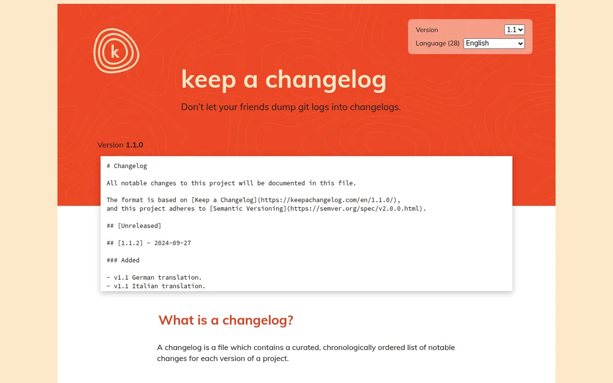
Release notes are curated. You choose what matters and you leave things out on purpose. That is the whole difference: a changelog is complete, release notes are edited.
Patch notes are the narrow case: a small build, a short list, usually fixes only. The term comes from games and it stuck because it is honest about scope.
App Store "What's New" text is its own constraint. Apple's App Store Connect guidance on updating your app version covers the field itself, and the practical rule is that most people see only the first two lines before tapping "more". Lead with the single change that matters and never ship "bug fixes and performance improvements" as your whole entry. Windows and enterprise products face the opposite pressure: Microsoft's own Windows release health notes show how much build and servicing detail admins expect when they are the audience.
How to write a change users understand
Most release notes are not badly structured. They are badly worded. These five drills fix nearly every line.
Lead with what the reader can now do
Start the sentence with the capability, not the mechanism. Your reader does not care which service you refactored.
- Before: "Implemented incremental indexing in the search pipeline."
- After: "Search results now appear as you type, even in workspaces with 100,000 items."
Drop internal names from customer-facing copy
Component names, service names, and ticket IDs are internal shorthand. They mean nothing to a reader. Worse, they make the notes read like a leaked Jira export. If you pull change detail straight out of tickets, translate it: the same discipline that makes a bug report template useful to a developer makes a release note useful to a customer. Our guide to getting clean detail out of a ticket queue with screenshots in Jira covers the source side of that workflow.
- Before: "Fixed a null reference in NotificationDispatcher (ACME-4417)."
- After: "Fixed: comment notifications stopped arriving after you renamed a project."
One change per bullet
Two changes in one bullet means one of them will be missed. Split them. Bullets are cheap.
- Before: "Improved export performance and fixed a column ordering bug and added CSV support."
- After: three bullets.
Verb first, present tense
"You can now export to CSV" beats "CSV export has been added". Active voice is shorter and it puts the reader in the sentence. For fixes, the convention "Fixed: [symptom]" scans fastest because the first word tells you the bullet type.
Say the number when you have one
"Faster" is a claim. "Roughly twice as fast on workspaces over 5,000 items" is a fact a reader can check. Numbers also protect you: a claim with a limit cannot be read as a promise about every setup.

Tired of plain screenshots? Try ScreenSnap Pro.
Beautiful backgrounds, pro annotations, GIF recording, and instant cloud sharing, all in one app. Pay $34 once, own it forever.
See pricing and featuresScreenshots and GIFs in release notes
Here is the part no template covers. Every release notes guide tells you to include visuals. None of them tell you how to produce them, which is why so many teams write the notes in ten minutes and then spend an hour fighting with images.
A few rules make the visual layer repeatable.
One annotated screenshot per shipped feature
Not per release, per feature. A screenshot with no annotation is just a picture of your app. Add an arrow to the new control and a short text label saying what it does. That single annotation is the difference between "here is the screen" and "here is the change".
Improvements and bug fixes usually need no image at all. Do not try to illustrate a faster export.
A short GIF for anything interactive
If the change only makes sense in motion (a drag interaction, a panel opening, a multi-step flow), record 3 to 6 seconds. Not thirty. Start the recording on the frame before the action and stop it on the frame after the result.
Mac readers can follow our walkthrough on how to record GIFs on Mac, and there is a Windows equivalent covering recording your screen as a GIF on Windows. If your capture ran long, trim it before you compress it: our free video trimmer cuts a long recording down to the five seconds that actually show the change.
Keep capture dimensions identical across releases
This is the single cheapest quality win available to you. Pick a capture width, write it in your release process, and never deviate. When every release uses the same frame, your notes page reads as a series. When they vary, the page looks improvised even if the writing is excellent.
The same principle drives good screenshots in technical documentation: consistency is what makes a set of images look deliberate.
Blur or pixelate customer data
Release screenshots are often taken from a real account, because that is the account with realistic data in it. Names, email addresses, invoice numbers, and workspace names all leak this way. Blur or pixelate them before the image leaves your machine, not after someone flags it.
Number multi-step changes
If a new feature takes three actions to use, put numbered markers on one screenshot instead of shipping three. A counter-style annotation keeps the whole flow in one frame. Our guide to building step-by-step instructions with screenshots goes deeper on sequencing multi-step visuals.
Host the images, do not attach them
Pasting a 4 MB PNG into an email newsletter is how release notes end up unread. Upload the image, get a link, and reference the link. That keeps the notes light and it means you can fix a wrong screenshot without republishing the whole document. Our cloud screenshot sharing guide covers the hosting side and the tradeoffs of each approach.
Capturing the visual is the one part of this workflow that no template solves, and it is where the time goes. ScreenSnap Pro handles the whole loop in one pass on Mac and Windows: region capture, 17 annotation tools including arrows, text, blur and pixelate for customer data, and a counter tool for numbered steps, plus screen-to-GIF recording with no video conversion step in between. Optional cloud upload returns a shareable link you can drop straight into the notes. It is a one-time $34 rather than another monthly line item, which matters when the tool is something you open once per release.
If your in-app changelog widget or email platform caps attachment size, run the GIF through our free GIF compressor before you publish. Dropping the frame rate and trimming a second off the end usually gets a 6 MB capture under 2 MB without a visible quality loss.
Where to publish and how to distribute
One release note, several destinations. Each destination wants a different length, and that is the point of having three templates.
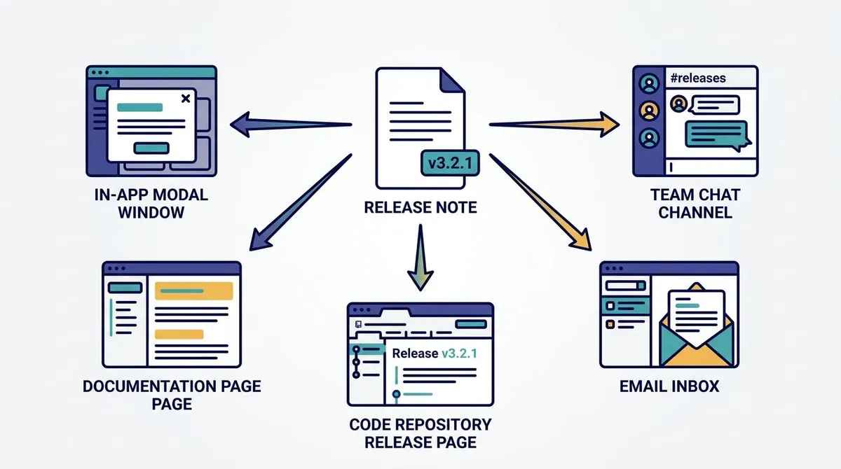
In-app modal or "What's New" panel
The highest read rate of any channel, because the reader is already in your product. Use the short card template: one change, one visual, one link to the full notes. Show it once per user per release and make it dismissible.
A permanent docs page
Your canonical version. Newest release at the top, one anchor link per version so support can send someone straight to #3-4-0. This is the page that ranks in search and the page you link from everywhere else.
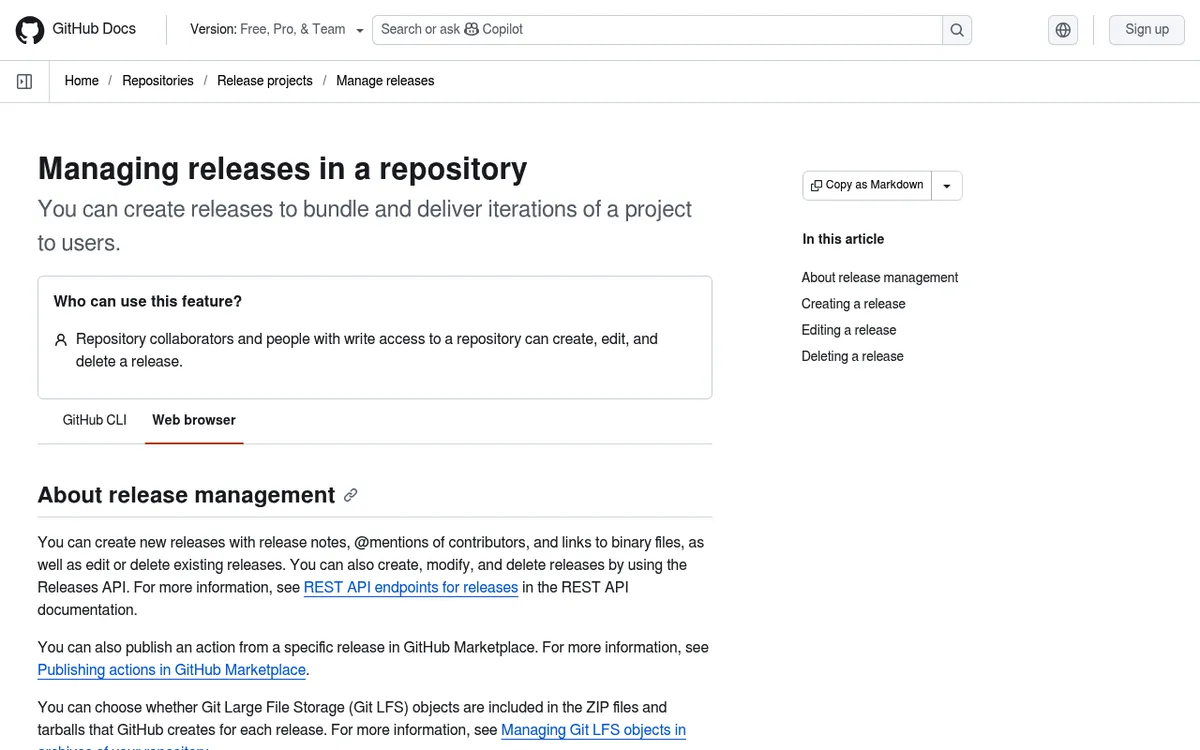
GitHub Releases
If you ship code, the release body is where developers look first. GitHub's docs on managing releases in a repository cover tagging and the auto-generated notes feature, which produces a decent first draft from merged pull requests. Treat that draft as raw material: it lists commits, not changes a user understands.
Best channel for breaking changes and deprecations, because you need to reach people who are not currently logged in. Keep it to the summary plus the one or two items that require action, then link out. Every image must be hosted, and every image needs alt text, because a meaningful share of recipients will see images blocked by default.
A team chat announcement
Internal first. Post the notes in a dedicated channel before the customer-facing version goes out, so support and sales are never surprised by a question about a feature they have not seen. This is also where the GIF earns its keep: a support agent who watched a 4 second clip can answer a ticket about the feature immediately.
Plain-text release notes get skimmed on every one of these channels. A single annotated screenshot per feature is what stops the scroll.
Troubleshooting: why nobody reads your release notes
If you publish consistently and nobody engages, it is usually one of these six.
It is a wall of text
Twelve bullets with no headings, no bolding, and no images reads as one grey block. Add the section headings from the template, then add one visual to the feature section. Structure alone recovers most of the lost attention.
Images break in email
Hotlinked images from an internal wiki, an S3 bucket with the wrong permissions, or a link that requires a login all render as a broken icon in a subscriber's inbox. Test the email in at least one desktop client and one mobile client with images blocked, and give every image real alt text so the blocked state still communicates something.
GIFs are too heavy for the widget
In-app changelog widgets and email platforms have size caps, and a 30 second screen recording will blow past them. The fix is upstream: record less, then compress. Six seconds at a moderate frame rate is almost always enough.
Screenshots go stale after a UI change
A release note from March showing a toolbar that no longer exists actively misleads people. Version your assets with the release: name the file after the version, keep it, and never overwrite an old image with a new one. Old notes should look like the product looked then.
Capture sizes are inconsistent
Three screenshots at three widths on the same page look sloppy. Readers read that as "this team does not sweat the details" long before they notice why. Fix the capture size in your process document and stop thinking about it.
You only publish to one channel
Docs page only means developers see it and customers do not. In-app only means logged-out customers never hear about the deprecation that affects them. Pick two channels minimum, one push and one permanent.
The pattern behind all six: release notes fail on production, not on writing. Once the format is a template and the visual step is a routine, the whole thing takes fifteen minutes.
Release notes checklist
Run this before you publish. It takes two minutes.
- [ ] Version number matches the tag you actually shipped
- [ ] Date is present and in
YYYY-MM-DDformat - [ ] Summary is one or two sentences and names the headline change
- [ ] Every bullet contains exactly one change
- [ ] Every fix describes the symptom, not the code
- [ ] No internal ticket IDs or component names in the customer version
- [ ] "Various improvements" appears nowhere
- [ ] Each new feature has one annotated screenshot or one short GIF
- [ ] Every image is hosted, sized consistently, and has alt text
- [ ] Customer data in screenshots is blurred or pixelated
- [ ] Known issues section lists workarounds, or is deleted
- [ ] Deprecations have a removal date
- [ ] Breaking changes have numbered upgrade steps and a way to verify
- [ ] Links resolve, including the link to the full notes from the in-app card
- [ ] Published to at least two channels
Once this checklist stops surprising you, promote it into your team's written process. Whoever owns the release note should be named there, the same way any other recurring task belongs in a standard operating procedure template. Teams formalising ownership across several recurring documents will find the wider pattern in our guide to process documentation.
Frequently asked questions
The short version
Structure is the easy half, and you now have it in three sizes. The half that actually costs time is the visual: one annotated screenshot per feature, a short GIF for anything interactive, the same capture width every release, and customer data blurred before the image leaves your machine.
If that capture and annotation step is the bottleneck in your release process, ScreenSnap Pro covers it in one pass on Mac and Windows, with a one-time $34 and no subscription attached.

Morgan
Indie DeveloperIndie developer, founder of ScreenSnap Pro. A decade of shipping consumer Mac apps and developer tools. Read full bio
@m_0_r_g_a_n_