Software User Manual: How to Write One (+ Template)
A software user manual is the end-user guide that explains how to install, set up, and use an app to get real work done. The best ones are organized by tasks, not menus: getting started, task chapters with numbered steps and matching screenshots, troubleshooting, reference, and a glossary.
What every software user manual should include:
- A getting started page that gets a new user to one useful result in under 5 minutes.
- Task chapters with verb-first titles, numbered steps, and one screenshot per step.
- A troubleshooting table that maps each symptom to its cause and fix.
- Reference pages for settings, keyboard shortcuts, limits, and terms.
- A version stamp that ties the manual to the app release it describes.
This guide is for engineers, architects, and QA leads who own a manual but don't write docs full time. You get a structure, a template to paste, worked examples, and screenshot rules that survive the next release. If you need one how-to for one task, start with this guide to step-by-step instructions with screenshots instead.
What is a software user manual?
A software user manual is the complete, versioned guide to one product for the people who use it. It answers "how do I do X?" for every task that matters, in the order a new user meets them.
The names overlap. A user guide is the same thing in practice, often a lighter web version. A help center is the web home for the manual plus FAQs and search. A knowledge base is a bigger pool of articles, often written by support from real tickets.
Audience matters more than the label. End users need tasks. Admins need setup, roles, security, and limits, so many teams ship a user guide and an admin guide that share one glossary.
User manual vs training manual, SOP, README and runbook
| Document | Audience | Purpose | Typical length |
|---|---|---|---|
| Software user manual | Customers and end users | Do tasks in the product | 20 to 200 pages, or a help site |
| Training manual | New employees | Learn a role, with exercises and sign-off | 10 to 60 pages |
| Standard operating procedure | Staff who run one process | Do one task the same way every time | 1 to 5 pages |
| README | Developers | Install, build, and contribute to a repo | 1 to 3 screens |
| Runbook | On-call engineers | Fix or run a system under pressure | 1 to 10 pages per alert |
PDF, web help or in-app help
Pick the format by how often you ship. A manual that lags behind the app is worse than none, because people follow steps that no longer work.
| Format | Best when | Weak spot |
|---|---|---|
| Web help | You release monthly or faster | Needs hosting and search |
| Offline, regulated, or printed use, slow releases | Stale the day a UI change ships | |
| In-app help | Short tips at the moment of need | Can't hold long procedures |
Most teams keep web help as the source, export a PDF per major version, and add in-app links to the right page. A web manual should also meet basic WCAG accessibility rules: real headings, alt text, and enough contrast.
What to include in a software user manual
Here is the anatomy of a good manual, front to back, grouped by job.
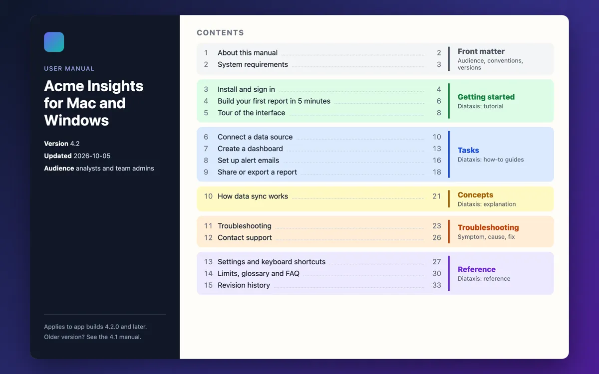
- Cover. Product name, app version, date, and audience.
- About this manual. Audience, scope, and conventions for labels, keys, and notes.
- System requirements. OS versions, browsers, hardware, network rules, and accounts.
- Install and sign in. Install, license or SSO setup, and first sign-in.
- Getting started. One useful task that takes under 5 minutes.
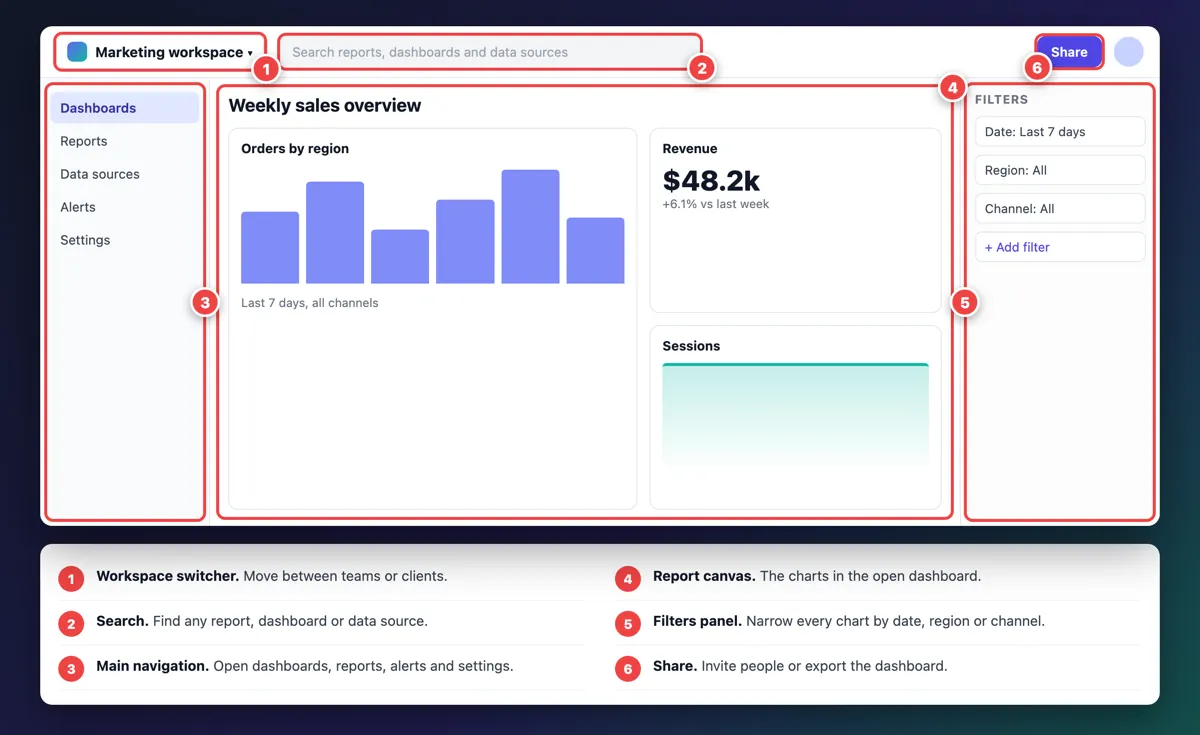
- Tour of the interface. One overview screenshot with numbered callouts and a legend.
- Task chapters. One topic per task, grouped by goal.
- Troubleshooting. A symptom, cause, and fix table.
- Reference. Settings, keyboard shortcuts, limits, and error codes.
- Glossary and FAQ. Product terms, each defined once.
- Contact support. Where to go, and what to put in a ticket.
- Revision history. What changed in each version.
A sample introduction for "About this manual"
Many writers stall on page one. Copy this and swap in your details:
This manual explains how to use Acme Insights 4.2 on Mac and Windows to connect data, build dashboards, and share reports. It is written for analysts and team admins. Tasks that need admin rights are marked Admin, and interface labels appear in bold. If your app shows a different version, check the version list on the cover first.
Map the sections to Diataxis
The Diataxis framework splits docs into four types by what the reader needs. A user manual uses all four, and keeping them apart keeps pages short.
| Diataxis type | Reader need | Manual section |
|---|---|---|
| Tutorial | "Teach me" | Getting started |
| How-to guide | "Help me do X" | Task chapters, troubleshooting |
| Reference | "Give me the facts" | Settings, shortcuts, limits, glossary |
| Explanation | "Help me understand" | Concept pages, such as how sync or roles work |
The formal standard is ISO/IEC/IEEE 26514. You don't need it to write a good manual, but regulated teams often cite it.
How to write a software user manual in 7 steps
1. Define readers and their top 10 tasks
List who reads the manual (end users, admins, support agents) and the 10 tasks they do most. Don't guess. Pull the tasks from support tickets, help center search terms, sales demos, and QA test cases, which already list every flow in order.
Those 10 tasks become your first chapters. Everything else can wait for version 2.
2. Build a task-based outline
Title each topic with a verb and an object: "Export a report", not "The Export menu". Readers search for what they want to do, not for where a button lives.
Group tasks by goal (Connect data, Build dashboards, Share results), in the order a new user meets them. Menu-by-menu manuals are easy to write and hard to use.
3. Set a style sheet before you write
A one-page style sheet stops five writers from making five different manuals. Decide these up front:
- UI labels in bold, with exact casing. Write Save as draft if the button says "Save as draft". The Google developer documentation style guide bolds UI elements too.
- One verb rule. The Microsoft Writing Style Guide says "select", since it works for mouse, touch, and keyboard. The Apple Style Guide has you click or tap a button. Pick one rule and keep it.
- One term per concept. If it's a "workspace" on page 3, it isn't a "project" on page 30.
- Notes and warnings. One look for Note, Important, and Warning. Use them rarely, or readers skip them.
- Screenshot rules. Crop, markers, redaction, and file names (see the standards below).
4. Write each task topic with a fixed pattern
Every task topic has the same five parts: a one-line goal, before you start (roles, plans, or data needed), numbered steps with one action each, the result the screen shows, and a link to the next step. Here is a full worked topic you can copy:
## Set up alert emails

Get one email a day that lists every report whose numbers changed.

**Before you start:** you need the Editor or Admin role. Alerts go to
the email address on your profile.

1. Go to **Settings** > **Notifications**.
2. In **Frequency**, select **Daily digest**.
3. Select **Save**.

**Result:** a green *Settings saved* banner appears. Your first digest
arrives at 08:00 in your time zone.

**Next:** [Choose which reports send alerts](choose-alert-reports.md)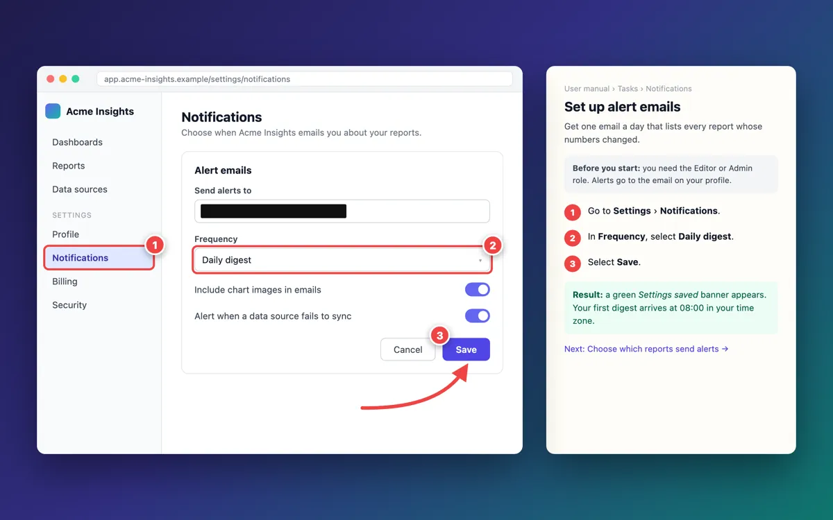
Marker 2 in the image is step 2 in the text. One arrow sits on the control that finishes the task, and the email field is under a solid box. The step-by-step guide linked above covers step writing in depth.
5. Capture and annotate screenshots
Capture after the text is final, on a demo account with fake data, at the window size your users run. Crop each image to the area its step talks about, and add markers that match the step numbers.
6. Test the manual against the build
Ask a colleague who didn't write the topic to follow it on a clean test account, against the release candidate. Stay quiet and log every place they pause, guess, or click the wrong thing. Each stall is a bug in the manual.
QA teams can fold this into user acceptance testing: add "follow manual topic X" as a test case, and file manual bugs next to product bugs. A good bug report template works for both.
7. Publish, version, and maintain
Publish where users already look: the app's Help menu, your docs site, or both. Stamp the cover or every page with the app version and date.
Then tie updates to releases. When the release notes mention a UI change, a manual ticket opens with it.
Software user manual template (copy and paste)
Paste this into your docs repo, Word, or Google Docs. Replace the brackets and delete sections that don't apply.
# [Product name] User Manual
- **Version:** [app version, for example 4.2]
- **Last updated:** [YYYY-MM-DD]
- **Applies to:** [Mac, Windows, web; editions or plans]
- **Audience:** [end users, admins]
## 1. About this manual
This manual explains how to use [product] to [main outcomes].
It is written for [audience]. Admin-only tasks are marked **Admin**.
UI labels appear in **bold**. Keys appear as `Ctrl+S`.
## 2. System requirements
- Operating systems: [minimum macOS and Windows versions]
- Browsers: [names and minimum versions]
- Hardware: [RAM, disk space]
- Network: [domains or ports to allow]
- Accounts: [license, SSO, roles]
## 3. Install and sign in
1. [Get the installer]
2. [Install]
3. [Activate or sign in with SSO]
## 4. Getting started: [first useful task]
Goal: [what the reader will have in under 5 minutes]
1. [Step]
2. [Step]
3. [Step]
Result: [what success looks like]
## 5. Tour of the interface

| # | Area | What it does |
|---|--------|--------------|
| 1 | [Name] | [One line] |
| 2 | [Name] | [One line] |
## 6. Tasks
### 6.1 [Verb + object, for example Export a report]
Goal: [one sentence]
Before you start: [roles, data, settings]
1. [One action per step, UI labels in **bold**]
2. [Step]
Result: [what the screen shows]
Next: [link to the next task]
### 6.2 [Next task]
## 7. Concepts
### 7.1 [How X works]
## 8. Troubleshooting
| Symptom | Likely cause | Fix |
|----------------------|--------------|-----------------|
| [What the user sees] | [Why] | [Steps or link] |
## 9. Reference
### 9.1 Settings
| Setting | Default | What it does |
|---------|---------|--------------|
| [Name] | [Value] | [One line] |
### 9.2 Keyboard shortcuts
| Action | Mac | Windows |
|----------|---------|----------|
| [Action] | [Cmd+S] | [Ctrl+S] |
### 9.3 Limits
[File sizes, row limits, rate limits, data retention]
## 10. Glossary
- **[Term]:** [definition]
## 11. FAQ
### [A question users ask]
[Answer in 2 to 4 sentences]
## 12. Contact support
Check Troubleshooting first. In your ticket, include the app version,
your OS, steps to reproduce, what you expected, what happened, and a
screenshot with personal data covered.
Contact: [support URL or email]
## 13. Revision history
| Manual version | App version | Date | Changes |
|----------------|-------------|--------------|-----------------|
| [1.0] | [4.2] | [YYYY-MM-DD] | [First release] |In Word or Google Docs: use real heading styles (Heading 1 for chapters, Heading 2 for topics), not bold text. Then insert an automatic table of contents in Word or Google Docs that updates as chapters change. In Word, save it as a .dotx template so every manual starts with the same styles.
Need a PDF? Convert the Markdown with the free Markdown to PDF tool. It handles tables and code blocks, and images need to be reachable URLs, such as files on your docs site.
Screenshot standards for user manuals
Screenshots are where most manuals break. They go stale, leak customer data, or show the whole screen when the step needs one button. Use this table as your visual style sheet. For sizing, tools, and the full capture-to-publish flow, see the technical documentation screenshots guide.
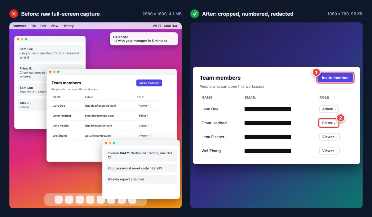
| Rule | What to do | Why |
|---|---|---|
| Crop to the task | Show the panel the step uses, plus enough context to find it | Full screens hide the target and leak other apps |
| One image per step that changes the screen | No image when nothing visible changes | Readers match step to image fast |
| Markers match step numbers | Marker 2 in the image is step 2 in the text | No guessing between text and image |
| One arrow, on the target | Point at the control the step names | Three arrows means no arrow |
| Box or highlight, never both | Box a control, highlight a value | Each mark keeps one meaning |
| Hide private data with a solid box | Use a demo tenant, then cover what's left with an opaque box | Blur and pixelate can be reversed (how to redact safely) |
| Same frame every time | Same padding, background, and window size | The manual looks like one product |
| Export at 2x, then compress | Capture on a Retina Mac or a Windows display at 200% scaling, then compress the images | Sharp text, fast pages |
| Alt text names the step | "Step 2: Frequency set to Daily digest" | Screen reader users get the steps too (alt text guide) |
| Version in the file name | export-report-step2_v4.2.png | You can find stale images after a release |
Blur or pixelate is fine for low-risk background details. Secrets, tokens, emails, and customer records always get the solid box. For alt text on images like these, the W3C images tutorial is the reference.
A screenshot tool with the right markup set covers most of this table in one pass. In ScreenSnap Pro, the counter tool drops numbered markers in order, so marker 3 always matches step 3. Arrows, the highlighter, text callouts, and a solid-fill rectangle for redaction are in the same set of 17 tools, and background presets keep every frame the same. It also has OCR, Pin Screenshot, GIF recording, and Website Capture for public URLs, which the next three tips use.
When a GIF beats a still
Use a short GIF when the motion is the instruction: drag and drop, hover menus that vanish when you click away, or a flow that crosses three screens in four seconds. Crop it as tight as a still, keep it under 8 seconds, and put the written steps next to it, since nobody can search a GIF.

Here is step 3 of the Getting started example below as a short loop. The step text sits in a caption bar on top, so the clip still makes sense when someone shares it on its own.
Platform guides: recording GIFs on Mac and recording your screen as a GIF on Windows.
Copy exact UI labels with OCR, and pin the reference screenshot
Labels in the text must match the build letter for letter. Don't retype "Save as draft" from memory. Capture the dialog and copy its text with OCR (on Mac, or any screenshot to text method).
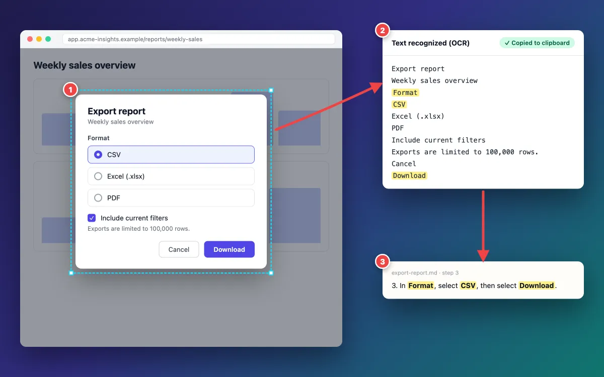
Paste the copied labels straight into the step. Format, CSV, and Download then match the build exactly, including casing.
Then pin that screenshot so it floats over your editor while you write (keep a window on top on Mac or on Windows). You check every label without switching windows.
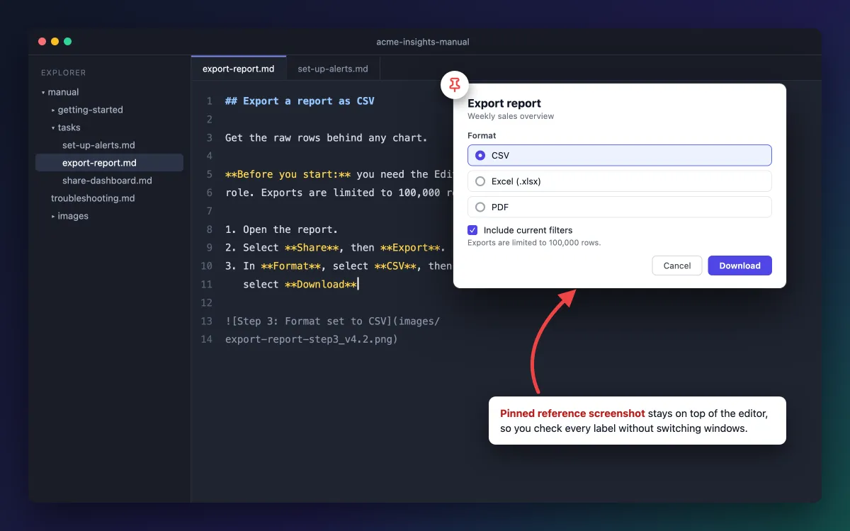
When the topic is done, close the pin and pin the next screen.
Long web-app pages: full-page capture by URL
A long public settings or status page won't fit on one screen. A full-page capture by URL grabs it in one image (on Mac, on Windows).
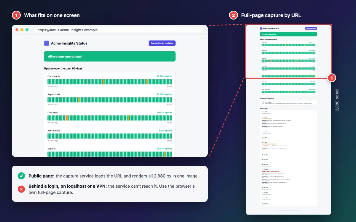
The status page above is public, so a capture service can load it. One image holds all 2,880 pixels of uptime bars and incident history, where a normal screenshot shows only the top part.
URL capture renders the page on a server, so it can't reach pages behind a login, on localhost, or inside a VPN. Most web-app manual pages sit behind a login, so use the browser's own full-page capture for those:
- Chrome or Edge: open DevTools, press Cmd+Shift+P (Mac) or Ctrl+Shift+P (Windows), and run Capture full size screenshot.
- Firefox: right-click the page, select Take Screenshot, then Save full page.
If the long part scrolls inside a panel instead of the page, capture the window or a region in sections.
Sending drafts for review: a cloud share link is the quick way to get an expert's sign-off on an image. Keep the final files in your docs repo or knowledge base, because share links are for quick sharing, not for hosting manual images.

Tired of plain screenshots? Try ScreenSnap Pro.
Beautiful backgrounds, pro annotations, GIF recording, and instant cloud sharing, all in one app. Pay $34 once, own it forever.
See pricing and featuresSoftware user manual examples
Three excerpts built from the template, then three real manuals worth studying.
Example 1: a Getting started page
## Build your first report in 5 minutes

Get a live sales chart from the sample data in every workspace.

1. In the left navigation, select **Dashboards**, then **New dashboard**.
2. Select **Use sample data**.
3. Drag **Orders** onto the canvas.

**Result:** a bar chart of orders by region appears. Next, take the
tour of the interface.
The reader gets a real result fast, with no data of their own. Step 3 is a drag, so it's the one place where a short GIF earns its spot, like the loop in the GIF section above. The tour page that follows uses one overview image with numbered callouts and a legend:
Example 2: a task topic
## Export a report as CSV

Get the raw rows behind any chart for use in a spreadsheet.

**Before you start:** you need the Editor role. Exports are limited
to 100,000 rows.

1. Open the report.
2. Select **Share**, then **Export**.
3. In **Format**, select **CSV**, then select **Download**.

**Result:** the file saves to your Downloads folder. If **Export** is
grayed out, see Troubleshooting.
Readers hit limits mid-task, so put them in "Before you start", then repeat them in the reference chapter.
Example 3: a troubleshooting table
| Symptom | Likely cause | Fix |
|---|---|---|
| Dashboard says "Data is 2 days old" | The data source token expired | In Data sources, select the source, then Reconnect |
| Export is grayed out | You have the Viewer role | Ask an admin for the Editor role |
| Alert emails never arrive | A mail filter, or the wrong profile email | Check spam, then the address in Profile |
| "Sync failed: 403" banner | The service account lost read access | Restore access, then select Retry sync |
Each row starts with what the user sees, names one likely cause, and gives a fix with exact labels.
What to steal from 3 real manuals
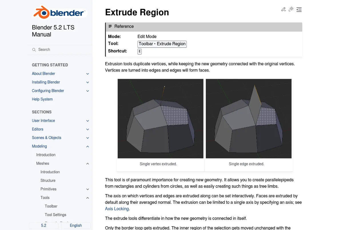
Blender Manual. Each tool page opens with a Reference box: the mode, where the tool lives, and its shortcut. For Extrude Region, that's Edit Mode, the Toolbar, and E, followed by images of a single vertex and a single edge being extruded. Steal the reference box, so readers who know the task get the facts in two seconds.
GIMP User Manual. The manual is wired into the app. Press F1 with the pointer over a dialog or menu item, and GIMP opens the manual page about it (Context Help). Every page also ends with a "Report a documentation error" link. Steal both: link each screen in your app to its manual topic, and give readers a fast way to flag a wrong page.
Visual Studio Code docs. The pages are Markdown files in a public GitHub repo, and readers can suggest edits. Each page covers one feature, with screenshots where the UI matters. Steal the docs-as-code model: the manual lives next to the code and ships with the release.
Tools for writing and publishing a user manual
There's no single best tool. It depends on who writes and how often you ship.
| Tool type | Best for | Output | Weak spot |
|---|---|---|---|
| Word or Google Docs | Small manuals, one or two writers | DOCX, PDF | Hard to version and reuse topics |
| Docs site generators (MkDocs, Docusaurus, Read the Docs) | Engineering teams, docs-as-code, frequent releases | Web help, PDF through plugins | Needs Git skills and a build pipeline |
| Help authoring tools (MadCap Flare) | Large manuals in many formats and languages | Web help, PDF, print | License cost, learning curve |
| Knowledge base platforms (Document360, GitBook, Confluence) | Support-led help centers | Hosted web help | Subscription, harder to move out |
| Auto step-capture tools (Scribe, Tango) | Fast drafts of click-by-click flows | Step guides with auto screenshots | Needs editing; screenshots can show private data |
For a wider comparison, see this roundup of process documentation tools, or the Scribe alternatives and Tango alternatives guides.
None of these tools makes good screenshots on its own. A screenshot tool is the capture and markup layer for all of them: capture, annotate, export a PNG, and drop it in. ScreenSnap Pro fits there. It doesn't auto-generate step guides like Scribe or Tango, and it doesn't host docs.
Keep the manual current after every release
A manual is right on release day and starts to drift the next morning. The fix is a checklist that runs with every release, plus a screenshot inventory: one row per image, with the app version it was captured on.
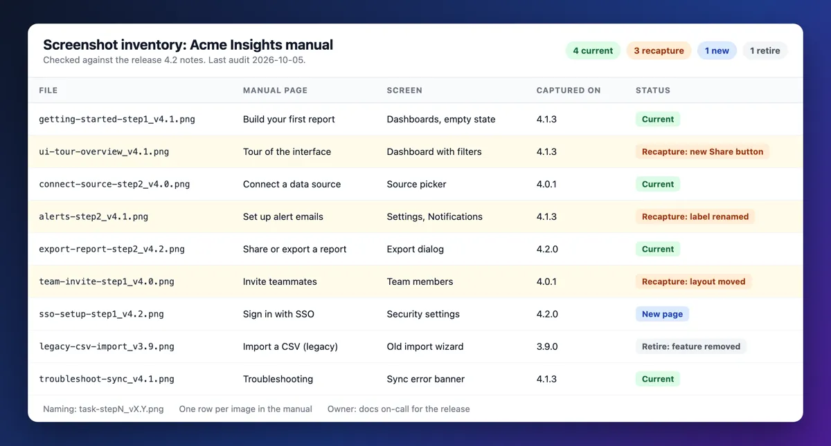
The release checklist:
- Read the release notes diff. List renamed labels, moved buttons, new screens, and removed features.
- Check the screenshot inventory. Mark each row the diff touches as "recapture", "new", or "retire".
- Recapture changed screens. Same demo tenant, window size, and frame.
- Fix labels in the text. Search the manual for each old label.
- Bump the version stamp. Add a revision history row.
- Review feedback and search terms. Failed searches and "not helpful" votes point at weak topics.
If your team keeps a changelog, these changelog examples show formats that make step 1 fast.
Common mistakes in software user manuals
- A feature tour instead of tasks. "The Reports menu" says what exists, not how to finish a job.
- Full-screen screenshots. The target is a speck, and other apps leak into the frame.
- Stale screenshots. One outdated image makes readers doubt every step around it.
- Labels that don't match the UI. If the text says "Export" and the button says "Download", trust is gone.
- No troubleshooting. People open the manual when something broke.
- Customer data in screenshots. Real names, emails, and tokens in a public manual are a data leak.
- Video-only manuals. Videos are hard to search and costly to update. Use them next to written steps, not in place of them.
Frequently Asked Questions
Ship the first version this week
Don't wait for a complete manual. Ship the getting started page, your top 5 tasks, and a troubleshooting table, all stamped with the current version. Then add a topic each time support answers the same question twice.
If your manual needs a lot of annotated screenshots, ScreenSnap Pro handles capture, numbered markers, solid-box redaction, and GIFs in one app. It's a one-time $34 purchase: 1 license, 2 seats (2 computers, Mac or Windows). See pricing.

Morgan
Indie DeveloperIndie developer, founder of ScreenSnap Pro. A decade of shipping consumer Mac apps and developer tools. Read full bio
@m_0_r_g_a_n_