Padding, Inset, Corners & Shadow
Control the space around a screenshot, add an inset border that matches it, round the corners and pick a Spread or Hug shadow in the editor.
Padding
Padding sets how much background shows around the screenshot, equally on all four sides. Drag it from 0 to 200. The default is 64. At 0 there is no background at all, so you get just the screenshot (plus any inset). If you keep rounded corners with no padding and no inset, the corners of a PNG are left transparent.
Leave room for the shadow. With very little padding the shadow has no space and is cut off at the edge of the image.
Inset
Inset adds a solid band of color between the screenshot and the background. Drag it from 0 to 200. It makes the screenshot look like it has extra room inside its own window, which is handy when you cropped tightly around the content. The inset is added around the screenshot, so the screenshot itself is not shrunk. When an inset is on, the rounded corners and the shadow apply to the outer edge of the inset, and the screenshot inside keeps square corners.

Inset color: auto-detect or custom
By default the inset color is detected from the edges and corners of your screenshot, so the band blends in with the app you captured. That is the small button with the sun icon next to Inset (Auto-detect from image). To use your own color, click the color swatch beside it (Pick custom color) and choose one. Click the auto-detect button again to go back to the detected color.
If the detected color looks off, for example because the screenshot has a colored border or a busy edge, pick a custom color that matches the main background of the app.
Rounded corners
Click Sharp for square corners, Curved for a gentle rounding or Round for a strong one. They set the radius to 0, 16 and 40. For an exact value, hover over the three buttons for a moment until the Radius slider appears, then drag it anywhere from 0 to 50. The button closest to your current radius stays highlighted.
Shadow
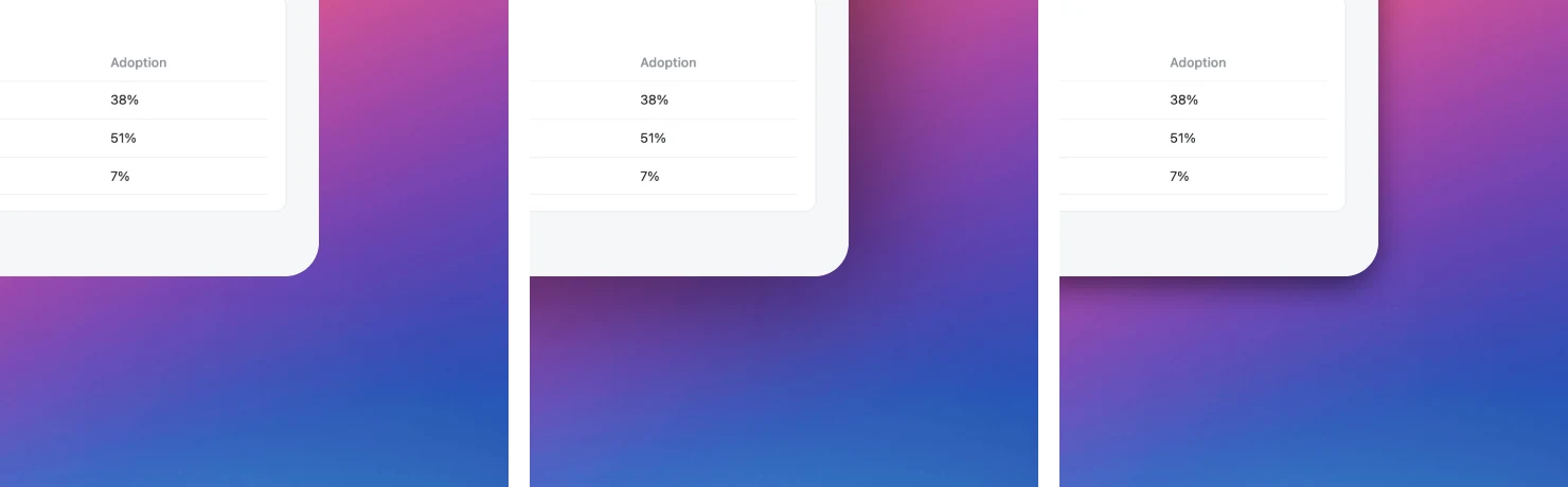
Choose how the screenshot sits on the background. None gives a flat look. Spread is a large, soft shadow that fades out evenly on all sides. Hug is a tighter shadow that stays close to the edges and falls slightly downward. Hover over the shadow buttons for a moment to reveal the Opacity slider, then drag it from 20 to 100 to make the shadow lighter or darker. Opacity is greyed out while the shadow is None.
Where is the Radius, Opacity or Intensity slider?
These sliders stay tucked away to keep the panel short. Rest the pointer over the corner, shadow or effect buttons for a moment and the matching slider slides into view. Move the pointer away and it hides again.
The shadow is cut off or missing
Increase Padding: the shadow is drawn in the padding area, so it needs space. Also check that the shadow is not set to None, and raise Opacity if the shadow is too faint. On a very dark wallpaper or plain color a black shadow is hard to see, so try Spread with a higher Opacity or a lighter background.